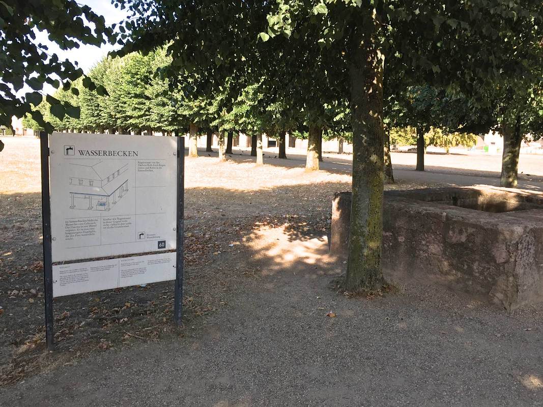
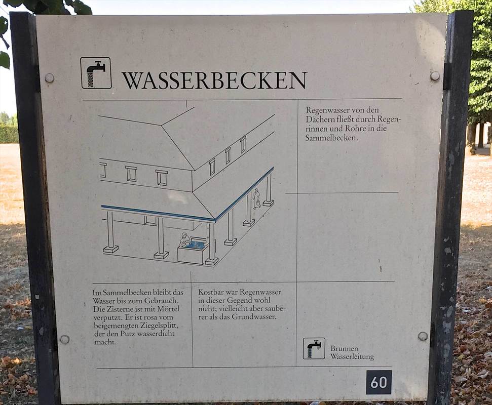
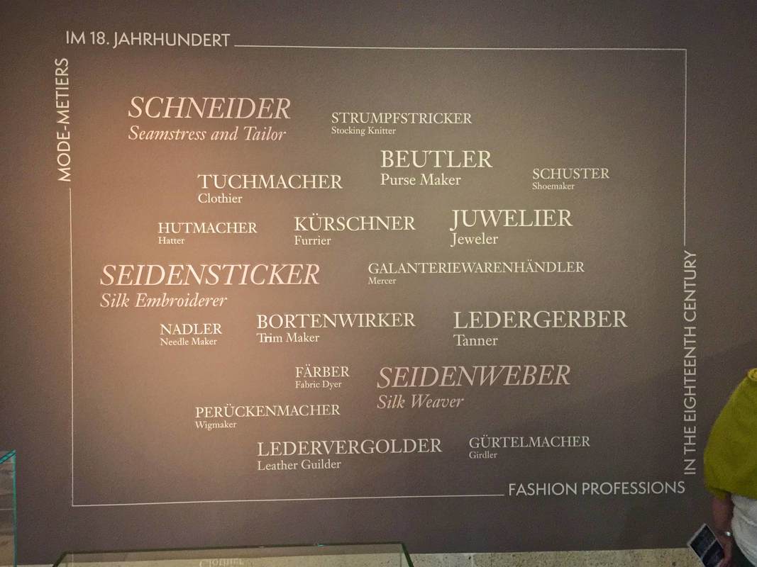
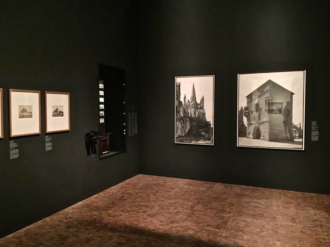
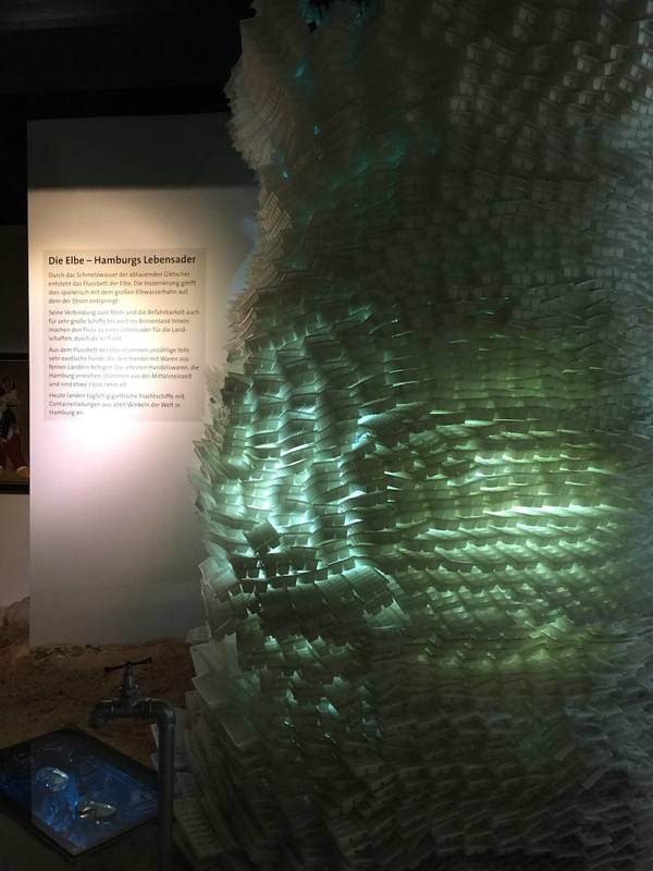
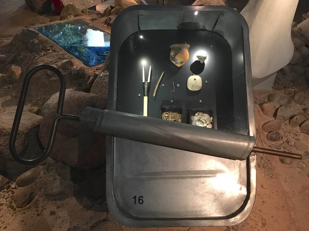
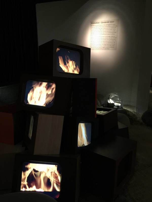
Walls of text are daunting. We all know it; so why is it so hard to get away from them? Well, it's hard to reduce the things we want to communicate to little bite-sized chunks. But those nibblets are infinitely more digestible! Just look at this example from the archaeological park in Xanten, Germany. Here the signage is consistently structured into a few nuggets so small that even an overheated, weary visitor like yours truly could bring herself to concentrate for just a darn minute. Despite being a museum veteran, I often have to trick myself into reading signage: "Ok, just that one sentence next to the picture. And maybe that one standing by itself right at the end." That is precisely the sort of self-deception that the Xanten signage makes the most of! Each sign beguiled me into tricking myself three or four times over—until, without realizing it, I had read the whole thing! The easy structure with lots of empty space for your eyes to rest (and your brain to think there isn't too much work involved) makes a huge difference. This is just one of the wonderful visitor-friendly aspects of this park. Three cheers for Xanten!
The feedback room of the Hamburger Bahnhof in Berlin impressed me with its way of cleanly showcasing visitor responses in multiple languages. In answer to a prompt (how would you define a certain term - values, trade, border, echo), visitors write their responses on paper sheets, some of which, presumably, then get printed onto the big colorful sheets you see on the wall. Emphasizing that the visitors respond in many languages, the museum has hung a copy of the original language beside one translated into English—overlapping, so that they are visually clearly joined.
For two more days, the Hamburger Bahnhof in Berlin is showing its critical exhibition Hello World. Divided into "chapters" which all have their own titles and are housed in different arms of the building, the exhibition as a whole addresses one question: What would a collection of contemporary art like the HB's look like if it weren't so Western-focused? Needless to say, particularly with the Humboldt Forum being built not far from here, this topic is urgent. Because I want this blog to continue focusing on design elements (for now, anyway), here I'll just point out a few sources for reading more about the immense debates that this show takes on. The "chapter" formed around a part of the permanent collection (the Erich Marx Collection, above), titled The Human Rights of the Eye, features the works of Rauschenberg, Warhol, Twombly, and others that don't fit into the exhibition's diversity- and global-oriented themes. To frame them in the terms of Hello World, the curators invited the graphic arts duo cyan to intervene. The artists created collages beside the Marx Collection paintings, each collage reflecting visual aspects as well as content from the painting nearby in order to "trace the multilayered cultural interweavings" in the paintings. I did not feel that this was successful to the point of recasting the collection as "global;" nonetheless, I liked very much the dialogue between modern masterpieces and contemporary collages offering a cloud of associations. I can imagine this format—particularly the large shapes like speech bubbles emerging from the artworks—for all sorts of material relevant to the object, including the usual label information, relevant archival material, or even calendar listings for related events in the museum. Here of course the focus was rather on the collages as art themselves. Still, one collage included archival material in the form of a letter by Rauschenberg about his teacher Albers, which I found philosophically inspiring; see below.
At the show Luxury in Silk (Luxus in Seide) in the Germanisches Nationalmuseum Nürnberg, the subject of yesterday's post as well, this wall caught my eye. Clearly the arrangement of words is based on the word clouds now used on websites to visualize the most frequent search terms and clicks. But here the cloud serves to show the plethora of jobs in the 18th century that had to do with creating clothing, shoes, and jewelry ("Mode-Metiers im 18. Jahrhundert"). It's interesting to see such an aesthetic transition from an online space to a physical one.
Salon and Black Box - Painting and Photography at the Germanisches Nationalmuseum Nürnberg7/11/2018 The second stunning exhibition I got to see recently at the Germanisches Nationalmuseum Nürnberg concerns painting and the birth of photography. Light and Canvas. Photography and Painting in the 19th Century does a wonderful job of presenting a complex subject: how did the invention of photography change painting, and how did the long tradition of painting influence early photography? The display underscores the dual protagonists of the story: the paintings are hung on vaguely kohlrabi-green walls, while the photographs inhabit black-walled chambers separated off from the main gallery space. The walls framing the entrance to the chambers are reflective silver overlain with black images, recalling early silver prints (visible above left). This is a genius conception for several reasons:
Overall I was hugely impressed by the effective presentation of such a complex subject and such a challenge in terms of display. You're in for a treat if you get a chance to go; it's open through September 9, 2018. Over the weekend I got to visit two beautiful exhibitions in the Germanisches Nationalmuseum Nürnberg. The one about painting and the birth of photography will be the subject of a future post; today it's all about silk dresses! The show Luxury in Silk (Luxus in Seide, through Jan. 6) centers on a newly acquired silk dress from the 18th century. It is displayed in a chamber of its own in the center of the square exhibition room, with the "supporting actors" surrounding it: brooches and other period jewelry, old books and caricatures documenting fashion trends, and several pieces of clothing and shoes in unfinished form.
A current special exhibition at the Altes Museum in Berlin called "Fleisch" (Meat) focuses on the cultural significance of meat. Ranging from the religious rites of animal sacrifice to the lustful gaze directed at nude female bodies, the theme is perhaps overstretched; but as an interdepartmental intitiative it is exemplary, and its design is beautiful. The most striking component is industrial-grade rebar lattices painted a fleshy pink, serving as the mount for signage and pictures; these are attached with simple S-hooks reminiscent of meathooks. It's a simple, cost-effective device which here also highlights the theme of the show—very tasteful!
Paging through Edward Tufte's book Visual Explanations (1997) is instructive not only for graphic designers, but anyone creating—or even reading!—visual displays. In a distinctly personal, engaging voice, Tufte explains what makes effective visual presentations for all sorts of information. He does not feel compelled to hide his disdain for a bad design, and he openly celebrates a good one. One example is the diagram of an ear at the top of the page above. Tufte so loathes the design at left, with its heavy lines almost indistinguishable from the ear itself and its cryptic letter labels, that he compares it to a Renaissance drawing of a man being stuck with swords (below). He juxtaposes the bad design with one he finds preferable, in which the indicator lines are finer than those delineating the ear and the nonsense letters are replaced with the names themselves. The thickness of the lines is highly significant, Tufte points out: one thickness should be used for the drawing of the ear (the object being explained), another for the indicator lines (the metalevel of our knowledge). The two grids at the bottom of the page show this again with two different thicknesses of line used in the background pattern; the diagonal lines overlying them are harder to distinguish in the lefthand example because they are nearly the same thickness as the background lines. The facing pages shown below illustrate not only Tufte's exasperation at bad design and his acerbic wit at its expense, but also the huge range of applicability of his principles. At left is a painting by Ad Reinhardt, which Tufte uses as another illustration of how subtle differences can have great meaning (here in the shades of blue rendered in three nearly imperceptible vertical bands; Reinhardt wanted to focus the viewer's attention on these simple and subtle differences).
Art historians, of course, are very accustomed to comparing two objects (a cornerstone of the discipline since Wölfflin), but they do it differently than people who are not trained to look for certain details or to already know certain things about the objects. This can lead to the display of a group of objects which makes art-historical sense but not intuitive, repeated-image-viewing sense. In the Neues Museum in Berlin (below), one room has a timeline written on the wall behind a row of Egyptian sculptures. The intent is to show how humans were portrayed in Egyptian art over time. But the earliest objects happen to be just heads, while the later ones represent entire bodies. The repetition of heads at first, and the subsequent break with this repetition, gives the false impression that what changed around 1600 BC is that the Egyptians started depicting people with bodies. Or perhaps in a different color of stone? Meaningful similarities and differences are hard to notice because of the many other factors at play beyond just the one meant to be highlighted.
Recently the Berliner Zeitung published an interview with me in their series of "Berliner Weltverbesserer" ("Berliners Bettering the World")—a title I can only hope to aspire to! I'm especially proud to be one of the first humanities scholars interviewed for the series. Archaeology can stand up to nanotechnology in bettering the world! That is my view, anyway, as I try to show in this short text about what I find important about my research. The understanding of other cultures is something I try to underscore in my work, since I think it helps us to better understand and respect our modern multicultural world. Greek, Roman, and Egyptian interactions 2000 years ago can tell us a surprising amount about our intercultural interactions today!
The building of a large drainage pipe under Berlin's Mauerpark is a triumphant example of how simple display concepts can be transformative. Rather than making yet another annoying construction zone in the city, and this one right in at the entrance to the most popular park, the organizers decided to make it an attraction in itself. They achieved this by erecting a wooden wall around the main building area and decorating it with fun and informative panels. The biggest and most iconic is the cartoon cross-section of the pipe itself (above). The pipe introduces itself through a speech bubble: "I'm a drainage pipe with a 4.4-meter diameter"! More detailed panels describe the water system in depth. Around the corner, a spin wheel with exercise challenges on it ("do 5 pushups!" etc.) is a further attraction. Most surprising of all, you can see it all and learn more on a beautiful modern website devoted to the project! Way to go, Berliner Wasserbetriebe.
The brand new special exhibition at the Plaster Cast Collection in Berlin features this piece, a cast of an ancient sculpture depicting two wrestlers. Just the head of one wrestler and his hand intertwined with the hand of his opponent is preserved. The fragmentary preservation adds to the drama of the piece, as it leaves the modern viewer to decipher what is going on in this tiny excerpt of tumult. The display heightens this even more, with the stark white of the piece brightly lit against its dark pedestal; the effect is a further disembodying of these twisted human parts. The display fits the piece, as the Germans would say, wie die Faust aufs Auge: literally, "like a fist in your eye"— that is, like a glove.
In the exhibition Repliken Wissen = Replica Knowledge, currently in Berlin's Tieranatomisches Theater, all of the objects are original—and none of them are. The exhibition displays modern replicas of Minoan and Mycenaean art in order to point out that replicas, far from being simply reproductions of some much more interesting "originals," have their own stories to tell. Their lifetimes may not be as old as that of the archaeological objects they copy, but they are complex, thrilling, and illuminating in their own way. Displaying multiple replicas made from the same model (such as the drinking cups above) highlights this theme of copying.
One of the display techniques that cleverly underscored this message consisted of pools of plaster under the objects on the glass shelves. These slightly irregular blobs form a much-needed opaque backdrop and injection of color to frame the pieces, which, many in shiny metal, would otherwise melt into a sea of reflections in the glinting vitrines. Moreover, the plaster pools (as curator Felix Sattler explained on a tour) recall the process of molding and pouring plaster replicas of the ancient objects. Thus the theme of the show is reinforced by its display. Definitely worth a visit, as is the Theater building itself; it's up through the end of March. An exhibition on Chinese antiquities currently in Berlin's Neues Museum uses a couple of display tricks worth noting. One consists of long banners stretching from the first few display cases up to the two-story-high glass ceiling—a wonderful use of the cavernous space! It's simple, cheap, and very eye-catching. The black banners are printed with the name "Egypt" in several languages; the red ones with "China." In this way the banners serve as the introduction to the second display tactic that caught my eye: throughout the exhibition (no photography allowed beyond the atrium, sadly), the Chinese objects are always placed on red risers or red squares as a background. The Egyptian objects get the same treatment but in black. Because the exhibition is arranged by theme rather than culture (e.g., how each culture respectively approached currency, votive offerings to gods, and so on), the red and black color-coding is a very useful visual cue for which culture produced any given object.
The upper floor of Hamburg's Archaeological Museum doesn't plunge the visitor into an immersive landscape as the lower floor does (subject of the last post). Rather than turning windowless walls into a black cave, this floor uses walls of windows to leverage its position on a park and pedestrian walk, bringing inside the natural light and greenery.
In one section of this airy space is an exhibit highlighting artifacts found around the museum. Arranged on a transit map of the area (similar to this room of Berlin's Friedrichshain-Kreuzberg Museum), the objects each have a grab bar near them like those in a bus or tram—complete with the red STOP button! When you push the button, a voice from the speaker in the pedestal first announces the name of the transit stop and then tells you about the artifact found there. It's a playful and effective way to show the visitor that history really comes from the places she commutes every day. Announcing the name of the stop reinforces this, as well as the transit theme itself. And ask any five-year-old: who doesn't love pressing those buttons!? Hamburg's Archaeological Museum in Harburg is a gem. The first-floor gallery, pictured above, is relatively small but packed with wildly creative displays. An artificial dirt-and-rock floor (all glued down, safe to walk and scramble on) strikes the right tone for the prehistoric collections. Just so the dark ceiling, recalling a cave or perhaps the night sky. It's atmospheric, certainly; but more than that, the playfulness helps to emphasize the content rather than distracting from it. Who could expect otherwise from the creative team, Ravensberger Freizeit und Promotion, famous for their educational board games! Here are just a few examples:
A new sort of art exhibition opened in Berlin about a month ago (running until January 28). From Monet to Kandinsky - Visions Alive is a similar presentation to last year's Van Gogh Alive exhibition in the same space (mentioned in this post on art as sensory experience). Using a combination of multiple projectors, sophisticated animation, and music in surround sound, the developers offer a way to experience art quite different from a gallery visit. The focus here is on sensory impact, not traditional pedagogy; all information about the artists whose work is shown is limited to a room on either side of the display space, each hung with a daunting set of text-dense posters. Really the viewer is meant to linger in the main exhibition space, a single large room with many folding chairs and bean bags—an invitation to relax and enjoy the sights and sounds.
The exhibition consists of moving images of paintings projected onto all four walls (and onto a freestanding, screen-clad A/V tower, at left in the photos here). Music plays. Various paintings by a single artist are shown on the multiple walls, at varying degrees of "zoom." The real variety, though, comes with the animation: every painting has been reworked into a psychedelic moving image. Lillies from Monet's waterlily series have been cut from their paintings and now tumble lightly from ceiling to floor over a background of other Monet gardenscapes. Mondrian's squares gain shadow and thus depth, first flickering on like so many lit windows in an apartment building at night, then becoming hundreds of wooden blocks tumbling through outer space like celestial child's toys. Klimt's spirals and gilded squares break free of their canvases and swirl like confetti. After 60 minutes the film starts over again; and to my own surprise, I found that I could have gladly stayed for another round, so complex and beautiful is the imagery. Not only nice for the eyes, but food for the brain. For although text in this room is limited to a short phrase from the artist projected over the door, the animation shows a firm knowledge of the artworks and artists. The animators were not just strutting their technical stuff; they implemented effects to enhance the art according to its content or even the artist's biography. Thus Van Gogh's painting Wheatfield with Crows is the last of his works to be shown (to the sound of cawing as the birds float over the horizon), just as it was the last work he ever painted. Toulouse-Lautrec's segment opens with silhouettes of the heads of various spectators he painted, as if seated in a theater, a spotlight playing across them as their voices titter—underscoring the importance of spectatorship and nightlife to the artist's repertoire. The many Van Gogh self portraits that morph into one after the other after the other emphasize the artist's obsessive nature, perhaps visible in the repeated attempts to capture his own likeness. By the end, I was enraptured. Quite a shift from my initial skepticism; I'm embarrassed to admit that at first, I was horrified by what seemed like an overly showy spectacle at the expense of an apparent substance (ahem, text?). How lucky that my companion convinced me to stay and relax into the colors and sounds—which indeed turned out to be wonderful, but also by far not the only merits of this exhibition. In one gallery of Berlin's Natural History Museum, all the video installations are plain white. They illuminate the taxidermied bison like the lights for a fashion shoot, but otherwise betray no special function. But if you grab a playing card from the big bin at the entrance, and you look through the little circle of polarizing filter that occupies half of the card, suddenly the white screens spring to life! Each one plays a captioned video about animals, some of which are also shown in taxidermied form nearby. Through the filter you can watch the video as usual—or watch the people around you as they realize, squint, look, and learn! It's a cute trick to get people to stop and engage in a concentrated way with video material. I certainly would have breezed past a lot of these screens if not for the polarizing gimmick to draw me in (on a visit last weekend during the 20th iteration of the Long Night of the Museums).
Wandering around Berlin's Bode Museum yesterday led past plenty a Medieval masterpiece of wood sculpture. The above pairing of two pieces is an especially delightful part of the exhibition because of the narrative it creates. Although made in different parts of central Europe by different hands (around the same time, within a generation or two of 1500), here the sculptures are placed together as if they belonged to a common story. As the ever-alluring Saint Sebastian twists his nude body against the arrow wounds that would make him a martyr, four apostles crane their necks from the adjoining wall to get a better look. The label for the latter piece tells us that the four men originally belonged to a scene of the death of the Virgin Mary; but their dramatic LOOKING makes them powerful directors of our attention to another piece in the museum gallery. They channel our gaze around the corner to the beautiful wind-blown Sebastian. The interaction between the two pieces encourages us to compare, contrast, appreciate—and maybe even chuckle at the insatiable human desire to look, look, look.
Divine#Design, an exhibition running through October at the Antikensammlungen and Glyptothek in Munich brings contemporary fashion into dialogue with ancient sculpture (somewhat like the exhibit in Aidone, Sicily described in a recent post). Students at the AMD Akademie Mode & Design were invited to create clothing inspired by the highlights of the antiquities collection. The juxtaposition of old and new is meant to raise questions about the social relevance and effect of clothing, makeup, and hairstyle. For perhaps the first time, an antiquities show has earned a slideshow in Vogue magazine! Flipping through the slides shows the many ways the students responded to the ancient objects: in texture ("swallowtail" folds in a hemline), color (lots of whites and beiges), content (a real snake posed beside a head of Medusa), and form (a petticoat cage shaped like a vase; a "fat suit" to imitate musculature). The sheer imagination of these designers brings new life to the collection.
Arranging objects in a gallery so that they communicate with each other (and with the visitor caught in their crosstalk) can take many forms. A unified color scheme among the individual vitrines can do it, as can a monochrome or gold color to the objects themselves, or a similarity in shape. The above pairing of paintings in Berlin's Alte Nationalgalerie highlights the similarly rosy tone of both pieces, but in an especially cunning way. The lefthand painting, August Kopisch's Pontine Marshes at Sunset, depicts a red sun sinking over the crimson wetlands like an ember. It smolders in the dome of clouds above it, a furnace between the eerie lunar landscape and the jaundiced sky. Lengthening toward the right, the red oval seems to cast its light upon the next wall—where it falls upon the straggling family painted by Eduard Magnus in his Return of the Palikares. The low sun cloaking this scene in pink lies just off the canvas to the left, allowing us to imagine that it might be the very same sun that sets over the Pontine marshes. Not only the warm color, then, connects the paintings, but the very light source itself; it calls for the two pieces to be looked at together, dynamically.
Remember the "talking statues" in London? Now the same folks (Sing London) have extended their project to Berlin. As they did in London, they are equipping numerous commemorative statues around town with audio clips that a visitor can access through small signs in front of the statue; snap the QR code and you're ready to listen. Two colleagues and I tried out the Lise Meitner statue and found it worked flawlessly. The voice actor brought a vibrant personal touch to the statue—a great way to bring it to life. One useful aspect of this concept is that such audio accompaniment can be overlain on any preexisting object; it does not have to be developed at the same time as the object installation. All that has to be added to the physical display space is a QR code (or a link to another technology—like Blinkster, used in Berlin's Ethnological Museum).
Well-designed signage is a rare and precious gem. In a museum, signage can set the tone for a visitor's entire visit: because if she starts by buying a ticket, checking her coat, using the bathroom, and then finally entering the gallery she most wants to see, she's already had to locate at least four separate areas of the museum, probably by following signs. And if that process was easy—i.e., well-signed—she'll ideally be in a fine mood; but if it was difficult, she may enter the galleries feeling grumpy or frazzled, and that will color her experience of the whole museum.
So kudos to Berlin's Kunstgewerbemuseum (the museum of decorative arts and design) for putting writing on the wall that no one can miss, and winning a design prize along the way. The eye-catching size and color of the signage creates a certain aesthetic effect that not all museums would want, but it accords well with the all-parts-visible idea behind Rolf Gutbrod's 1960s building. Even award-winning signage has two potential weak points, however. First, it has to be wriiten in a certain language—here German, which some visitors may not understand. Second, there is a compelling argument (nicely presented in an airport example in the addictive design podcast 99% Invisible) that the architecture itself, not just signage, should help guide the people in it. But since purpose-built buildings are not in the cards for most museums (and even if they are, wayfinding is only part of their mission), it's worth taking signage seriously. Who doesn't love a peek behind the curtains? At least when the venue is a museum, a look behind the scenes (or curtains, in the German idiom) is always thrilling. Making visible all the work that goes into readying objects for display is not only a highlight for visitors but a well-deserved kudos to the conservation teams whose hard work is rarely recognized by the public—because ideally, their work is invisible! The conservators at Berlin's Alte Nationalgalerie are now earning appreciation in a special exhibition about their three years of work restoring Caspar David Friedrich's two most famous paintings, Monk by the Sea and The Abbey in the Oakwood. Numerous series of photographs in the exhibition show the progression from yellowed, cracked, poorly-restored pieces to the radiant paintings now finally back on show. A few of the photographs even showed the conservators' coded markings and notes for planning the restoration, as well as the X-ray images they used to better understand the underdrawings and primer layers. Two full-size photographs of the unrestored paintings (seen above) allow viewers to compare the earlier with the present state (much clearer and less jaundiced!). It is an exciting story to see laid out like this—and today, at least, many people were there to enjoy it.
What a stroke of good luck when a major credit card company uses your museum as the backdrop for its billboards! This advertisement appears right at the entry to the security check in Berlin's Tegel Airport, so it also has a captive audience. I wonder if the Bode Museum worked with MasterCard in order to get this exposure. Certainly the museum is working hard to expand its reach—particularly to a younger crowd, as shown by its new Instagram project.
|
Ideas on Display
A humble space to reflect on concepts of museum display as enacted across a wide range of subjects, countries, and approaches.
Archives
April 2020
Categories
All
|