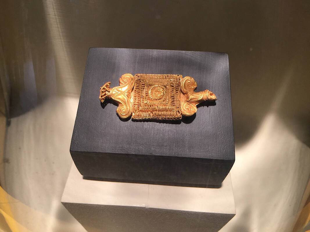
| One of the displays that I especially liked houses a piece of gold jewelry. While the exact function of the piece is unknown, it was probably the central element on a longer chain, whether a belt, necklace, or other adornment. Its workmanship is superb: the granulation of tiny gold spheres soldered onto the piece is on par with the best work from Etruria, the masters of this technique. (Here is a nice short video about gold granulation by the Met Museum.) |
|
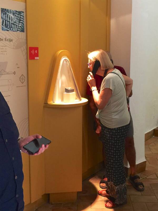
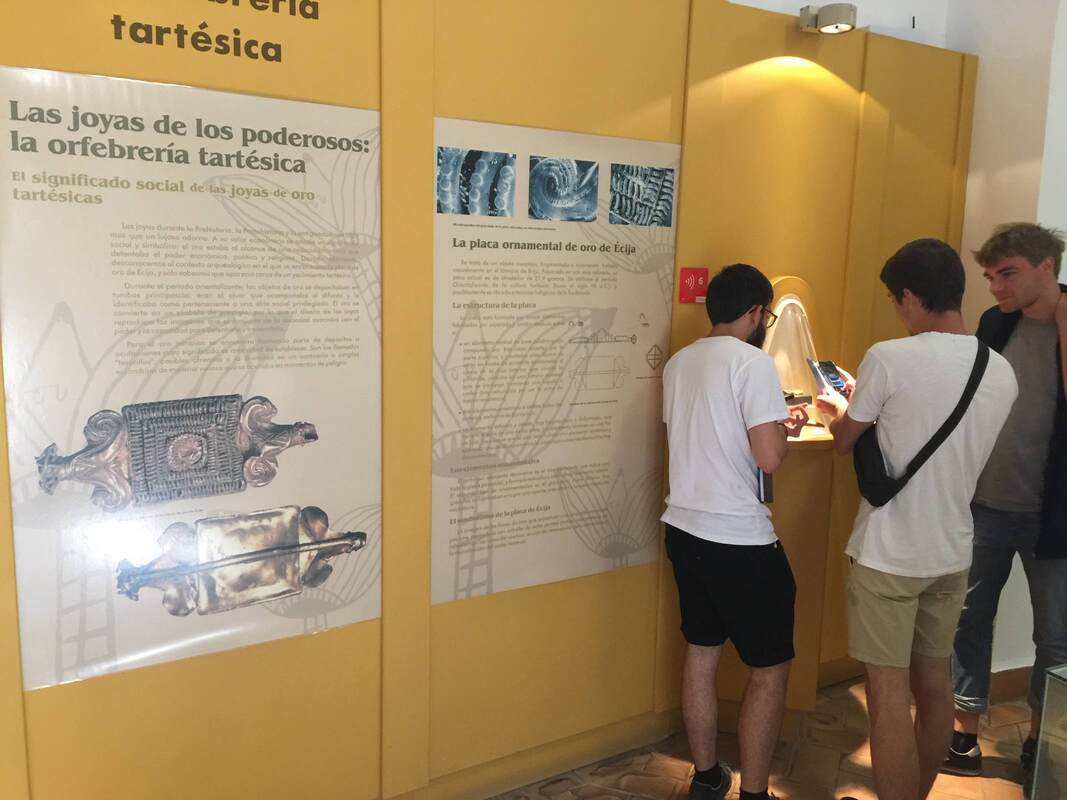
On a study trip with students recently, I got to visit the wonderful historical museum in Écija, Spain - the Museo Histórico Municipal housed in the beautiful Palacio de Benamejí. Both the town and the museum are less well-known than they should be; they are not only beautiful, but full of treasures waiting to be discovered! As archaeologists we were thrilled by the artifact collections and the exciting excavations that took place under the main plaza, once the Roman forum. In addition, the museologically oriented among us delighted in the presentation in the museum. Thanks to a tour by museum director Antonio Ugalde, we got an in-depth look at the history of the area from the prehistoric to the late Roman periods. The school groups that come through here can hardly know how lucky they are! Including a hugely enlarged photo of the piece (see below) is a good way to help viewers appreciate the detail. At the same time, it's important to lure them to look at the piece itself rather than stopping at the picture alone. This is done by the special case and lighting on the gold piece: the case is a cone shape projecting from the wall, highlighting the tiny treasure in a way that lures you irresistibly to take a closer peek. The conical bubble draws you in like a magnet! It is helped by the single light from overhead, lighting it in a golden glow. We were pulled toward it like a moth to the flame.
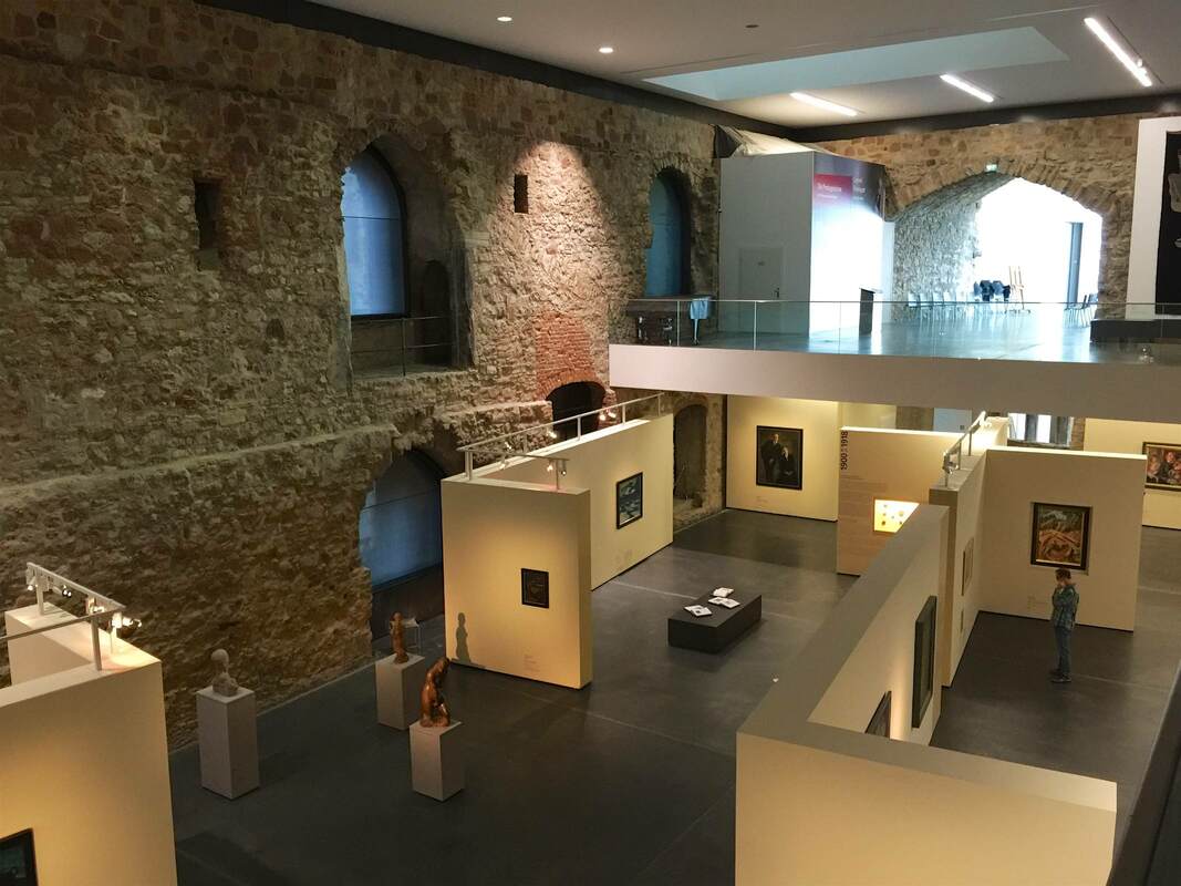
This is where cunning display tactics come in handy. The museum erected a series of freestanding interior walls to serve the needs of art display within the architectural shell (and constraints) of the castle. Many of the walls even have lighting rigged along the top, providing closer and more dirigible light than anything hung from the mile-high ceiling could:
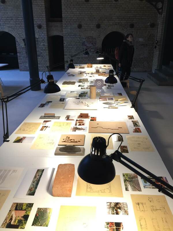
Another beautiful and effective display concept at Aedes Architecture Forum (if less mind-blowing than the subject of the last post) belongs likewise to the show FARAWAY SO CLOSE. A Journey to the Architecture of Kashef Chowdhury / URBANA, Bangladesh. Here the architect Chowdury's drawings, models, and materials (or photos of them) are laid out on drafting tables lit by arm lamps, as if you were looking over his shoulder as he works. It is an intimate way to experience the material, far more so than if it were hung on a wall, let alone pressed behind glass. The openness of the display couldn't directly translate to a bigger venue, where the chance that pieces would go missing is higher, or to an exhibition with originals that would be severely damaged by being touched. But it is such a lovely way to encounter the material on human terms, I wonder if it couldn't be adapted to more venues. Peeking into the artist's studio is, after all, endlessly alluring.
The three latest episodes of the podcast Working (tagline: "Slate interviews Americans about their jobs") are dedicated to the work processes in the Museum of Modern Art in New York City. One of them, "Working at MoMA: How Do Exhibition Designers Do Their Jobs?," features a conversation with Lana Hum and Mack Cole-Edelsack, the Director and Senior Design Manager respectively of MoMA's Exhibition Design & Production Department. (I was lucky enough to meet Lana Hum in 2014 as part of the Center for Curatorial Leadership/Mellon Foundation Seminar in Curatorial Practice.) It's a fun conversation to listen to: both the interviewees and interviewer (Jordan) have smart things to say and seem to be having a good time. A few novel points jumped out at me:
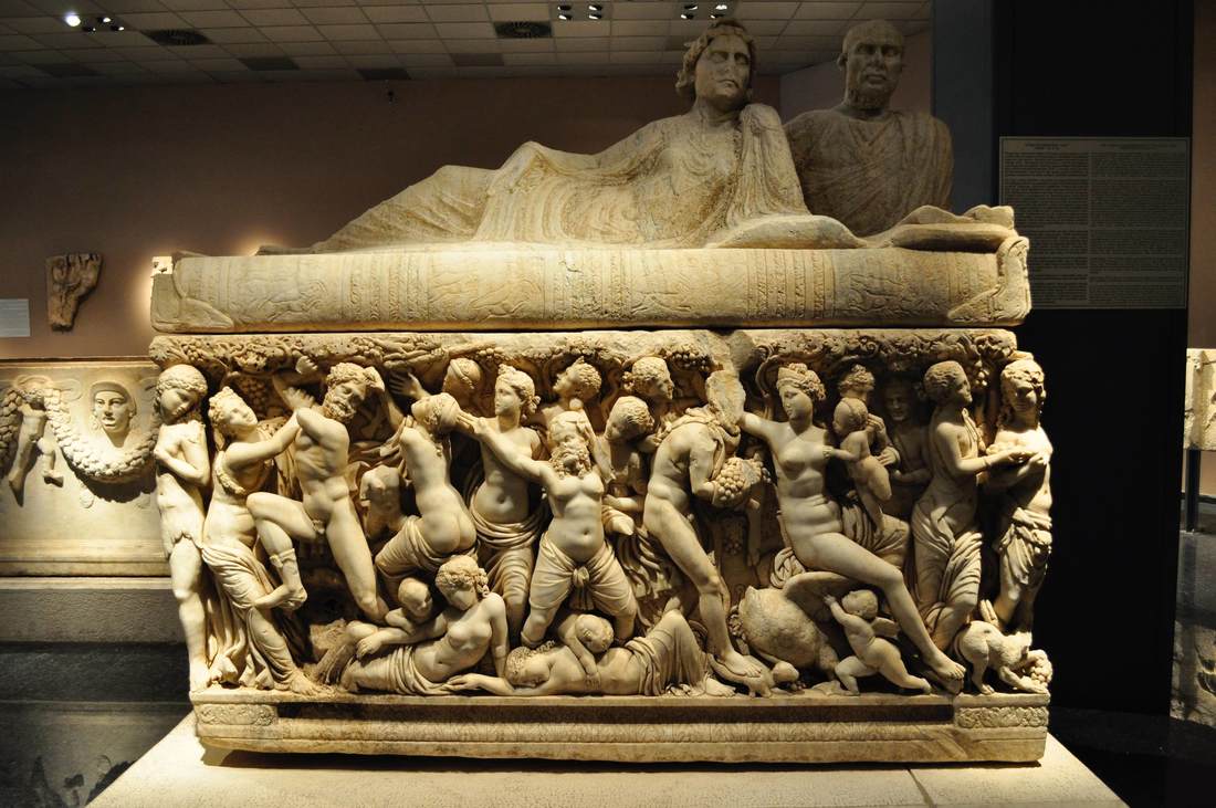
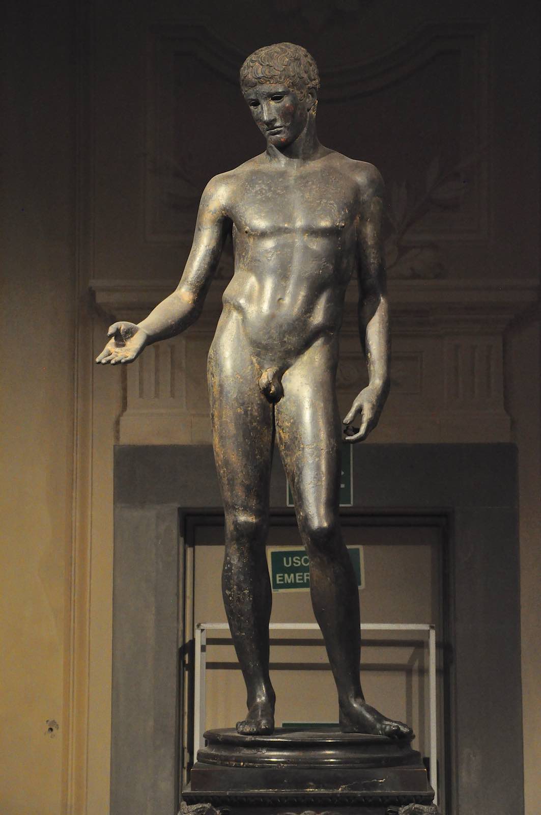
I look forward to hearing the other two episodes about MoMA's operations! A lot of objects are at home in the dark. However, in art museums, we are used to illuminating objects in the same even, "objective," investigative manner in which we also write the labels (my critique of the attempt to be objective, and my suggestions for other tactics, are laid out e.g. here and here). How would it be to put on a whole exhibition about objects in the dark? Not utter darkness, but a recreation of the low-light conditions in which they were originally used. A photograph on the ICOM member page (above) got me thinking about this, offering a stunning example of how this idea might play out. A beautiful piece of Islamic tracery or woodwork illuminated from the inside shows its form infinitely better than if it were put under standard museum lighting. Look at the gorgeous pattern it casts over the visitors and walls! Roman sarcophagi are another genre that would benefit hugely from such a display. Their figures in relief would have danced in the lamplight of the tombs. The dramatic lighting of a sarcophagus in the archaeological museum in Antalya, Turkey gives some idea of how this enlivens the object, but really the lighting has to be flickering orange to achieve the right effect. Lamps themselves look very different when they are their own sources of light than when lit from an external source. The Idolino in Florence, who once held a functional lamp in his hand, may have looked like a real person trying to find his way in the dark! Religious items too would be abundant in this display, as they are so often used in enclosed spaces—temples, caves, household niches, etc. This would be a really fun show to put together!
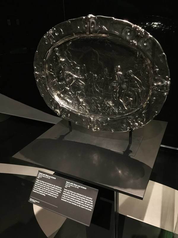
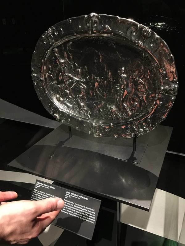
This last post about the KWAB exhibition in Amsterdam's Rijksmuseum concerns lighting. This show got me and my partner-in-museology thinking about the potential for self-directed lighting in museum display. The impetus was this lovely, huge, embossed silver platter. Its fabulously fine relief is hard to see in any detail, not because the lighting is poor per se, but because it is static. Especially for objects that would have been handled, passed around, held up to the light, or simply displayed in a space where people could view it from different angles, the viewing conditions offered by a museum could hardly be more different. And it can be frustrating to try to make out what all those tiny relief people are doing on this silver thing; even I was inclined to give up and move on to something more decipherable. But adding a couple of pink hands as a reflecting screen (above right) changed everything—even more so when moved from side to side! The addition of not only light but color and movement made the relief eminently more legible. This is the reason that Reflectance Transformation Imaging works so well (here's the process): under different lighting conditions, especially ones we can adjust and move at will, we can perceive relief and texture much more easily.
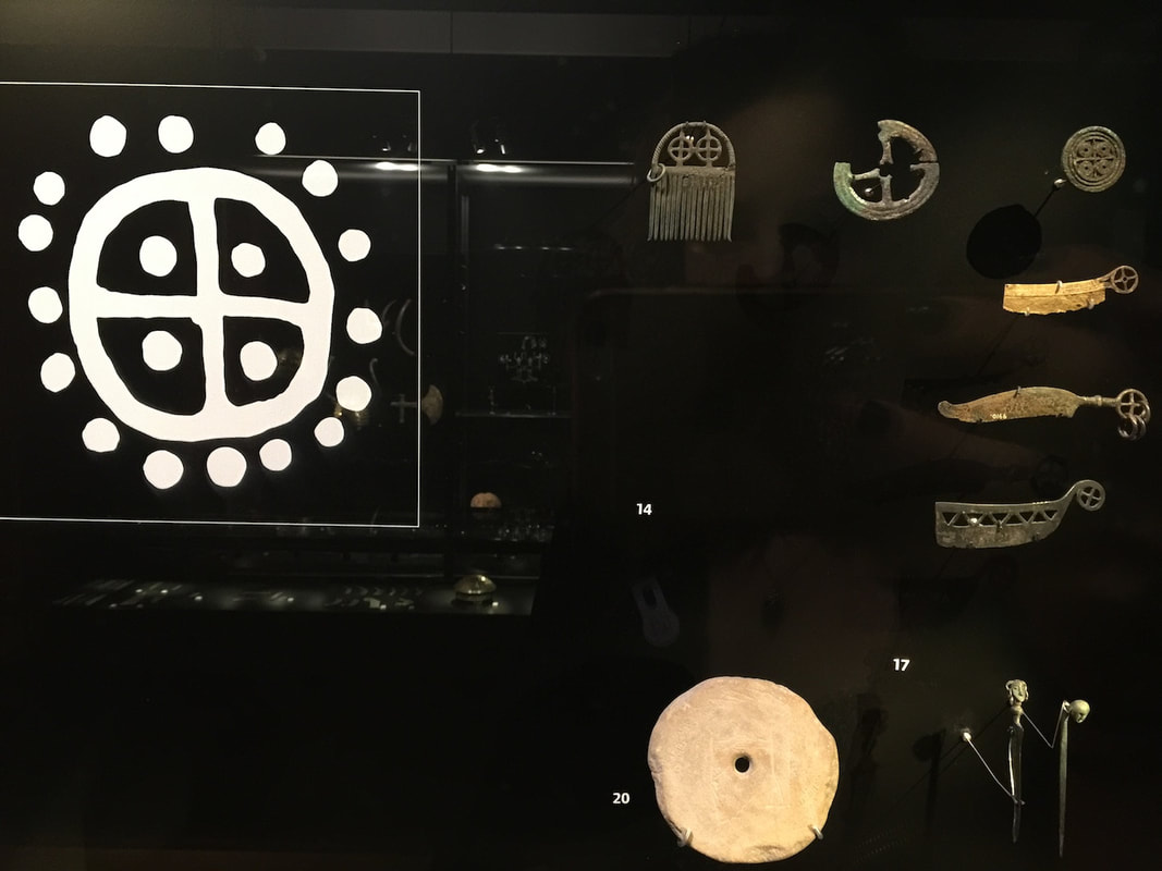
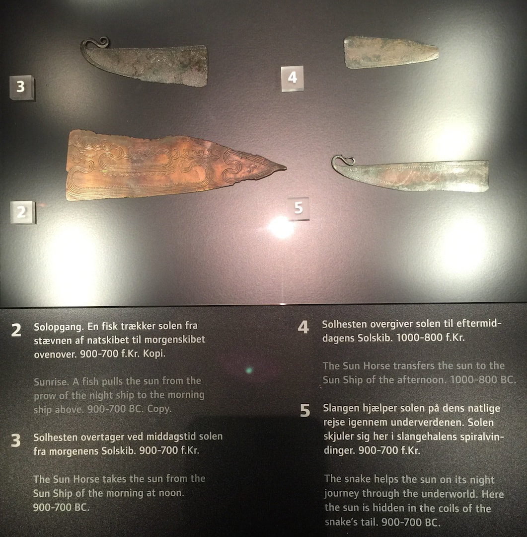
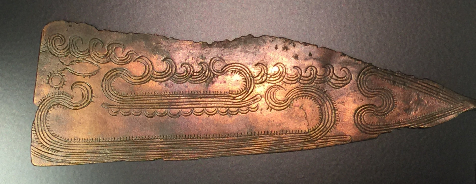
So how about visitor-directed lighting? This could be as simple as offering visitors sheets of printer paper at the entrance and encouraging them to use it as a reflecting screen (on objects in glass cases only, if you're worried about paper and people getting near unprotected objects). But personally I think it would be exciting as a central element of a show; it could even be the main topic, "Old Things in New Light." You could experiment with little lights mounted on tracks in front of the objects, so the visitor can slide the light from side to side. Heck, grab that gooseneck lamp from your desk and mount it next to an object—there, you've got interactive, user-directed lighting! There are dozens of forms this could take, and just as many epiphanies about the objects in new light. Let's go wild and see what happens. It's tiny and Indecipherable...Make an animated Video about it! National Museum, Copenhagen5/23/2018
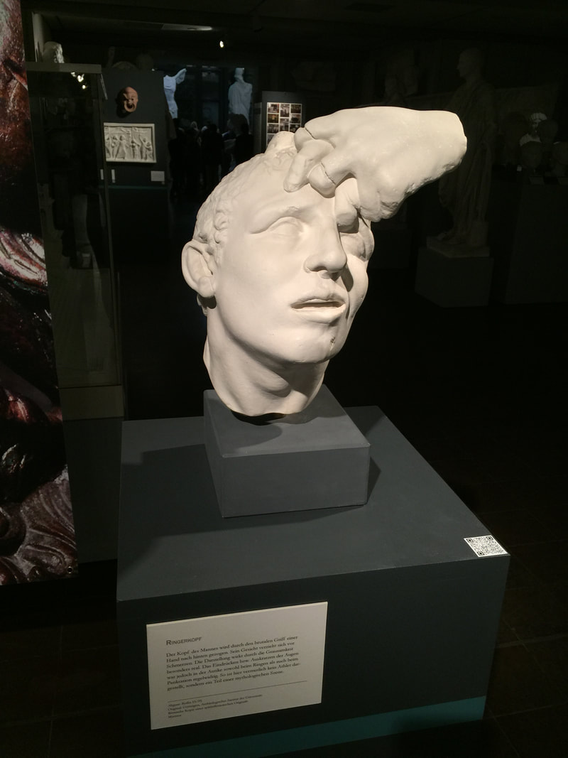
The brand new special exhibition at the Plaster Cast Collection in Berlin features this piece, a cast of an ancient sculpture depicting two wrestlers. Just the head of one wrestler and his hand intertwined with the hand of his opponent is preserved. The fragmentary preservation adds to the drama of the piece, as it leaves the modern viewer to decipher what is going on in this tiny excerpt of tumult. The display heightens this even more, with the stark white of the piece brightly lit against its dark pedestal; the effect is a further disembodying of these twisted human parts. The display fits the piece, as the Germans would say, wie die Faust aufs Auge: literally, "like a fist in your eye"— that is, like a glove.
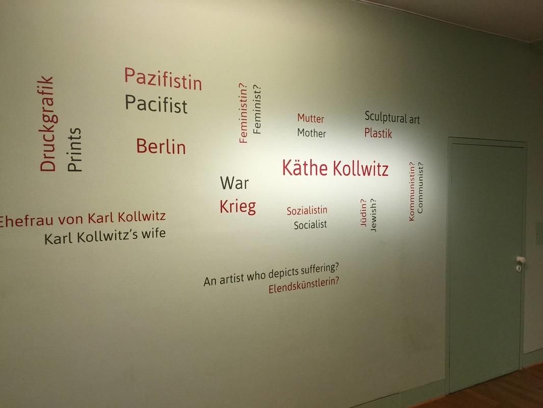
Once a month the Käthe-Kollwitz Museum in Berlin offers a lunchtime tour by the director, Dr. Iris Berndt, and yesterday's provided the extra motivation for my first visit to the museum. Standing in the first room of the ground-floor galleries, waiting for the tour to assemble, I was struck by the "word cloud" on a wall right next to the entrance. Like the automatically generated word clouds on the Internet, this collection represents thought trends in a wide set of "users" (clustered around the name of the artist, nicely emphasized with extra lighting). But unlike the digital word clouds, these words have been carefully selected to educate. As Dr. Berndt explained, they all represent concepts widely understood to apply to the great German artist Käthe Kollwitz—but several of them are problematic or even false. By marking these four terms with question marks—Feminist? Jewish? Communist? An artist who depicts suffering?—the display indicates that these preconceptions need to be reexamined and possibly discarded. This seems to me a very simple yet effective way to ease a visitor into the experience to come: several key themes are named right at the beginning, setting the tone for the subsequent galleries and helping a visitor to frame the individual objects; and just as importantly, it introduces the idea of questioning stereotypes, clichés, and pat explanations. For such a complex, richly-textured life and oeuvre as Kollwitz's, this strikes just the right first note.
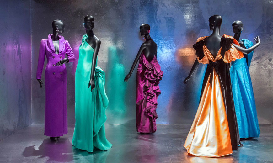
An article in the New Yorker alerted me to a current exhibition at The Metropolitan Museum, specifically in the newly-reopened Costume Institute. It takes as its focus the fashion figure Jacqueline de Ribes and presents her clothing designs in a number of displays, all lovely—but the one that particularly caught my eye is shown above (and linked through the picture; just click on it to see the original slideshow). Using reflective metal (aluminum?) as the backdrop and flooring for these dresses is a simple yet extremely effective way to emphasize the colors and reflect light upon them without distracting from them. As a display solution, in fact, it has much in common with the clothing designs themselves: it is deceptively simple, quite cunning, and above all elegant.
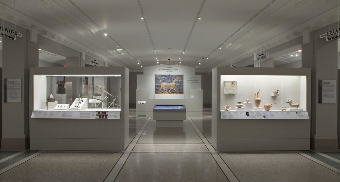
This weekend sees the opening of the new Ancient Middle East gallery at the Detroit Institute of Arts. Cause for celebration on several levels: it is an immense coup for a museum too often brought up in talk of financial crisis; it highlights the importance of this material at a time of extreme crisis in the Middle East; and, most relevant for this blog, the new gallery forefronts a nice modern display concept for some very old material. The creamy gray palette of the walls, floor, ceiling, and cases offers a clean backdrop for the variegated shapes and colors of the objects. The lighting is masterful: it is stronger on the objects than in the rest of the room, yet still diffuse rather than spotlit—hard to achieve, but worthwhile! The cases also do a nice job of hiding the light sources, while the ceiling contains a few discrete lines of track lighting. Clear plastic signboards with black lettering signpost the side galleries (apparently organized by material: metalwork to the left, ceramic to the right). The Neo-Babylonian mushussu relief provides a lovely centerpiece. To my mind, the overall effect of the gallery is very pleasing; I hope someday to see it in person.
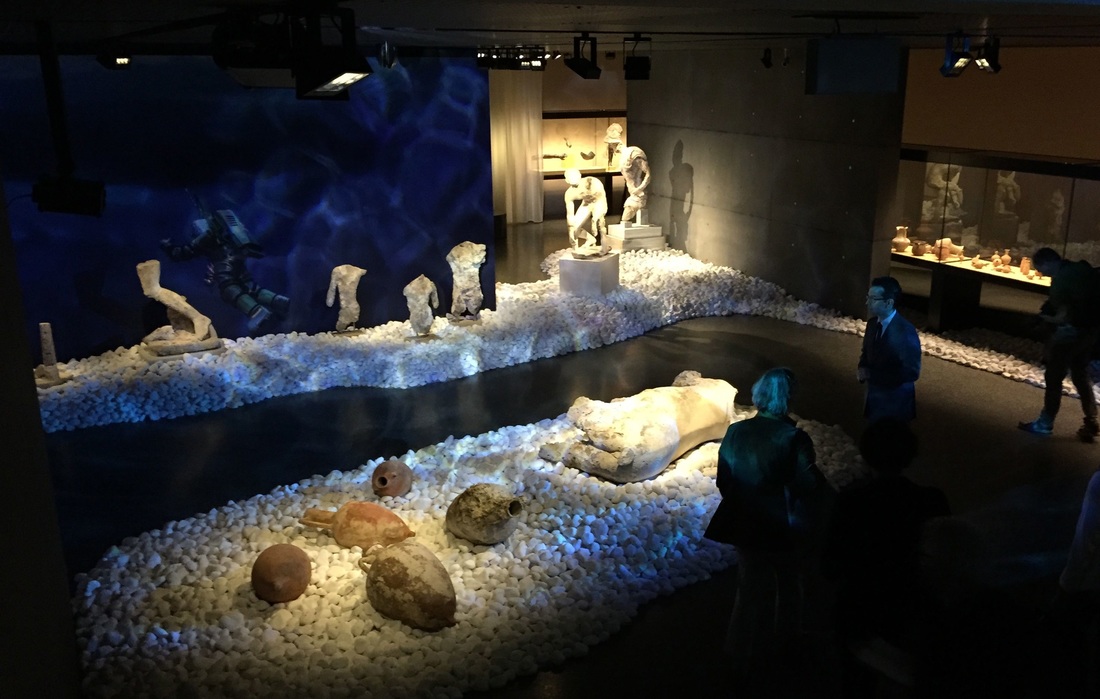
A beautiful display concept just surfaced (pun alert) in a new exhibition at the Basel Antikenmuseum, nicely photographed in this article. The exhibition focuses on a famous ancient shipwreck off the Greek island of Antikythera, and you can see how the exhibit design team incorporated the deep blue sea into the show: bluish light filtered into a watery pattern, objects set on beds of large white rocks, dim surrounds evoking the darkness of Davy Jones's locker. Although some of the most spectacular preserved evidence of ancient Greek art and science comes from this shipwreck, the display emphasizes that the focus here is not these star objects in isolation but the whole context of the wreck.
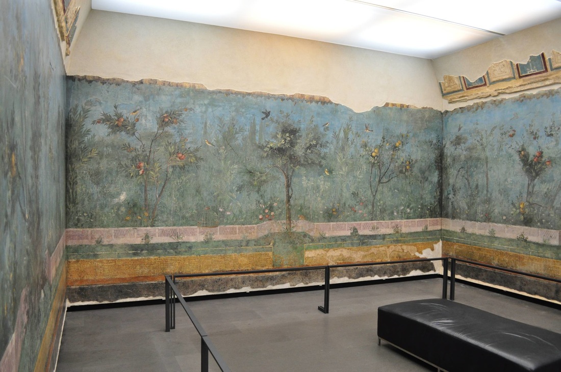
How about a display idea related to our recent switch onto daylight savings time? This room in Palazzo Massimo, Rome is one of my favorite places in the Eternal City. Not only does it house a gorgeous set of ancient Roman wall paintings (already a gold star in my book), but it is usually fairly empty and thus peaceful. Adding to this oasis of calm is the special lighting: reflected against the ceiling, it is beautifully diffuse—and what's more, it changes to replicate the time of day. It slowly, almost imperceptibly shifts from a low-light, slightly bluish tone through a warm bright midday and into a rosy sunset before repeating. The whole cycle takes around four or five minutes. It's an innovative way to bring the walls to life as well as create a meditative atmosphere.
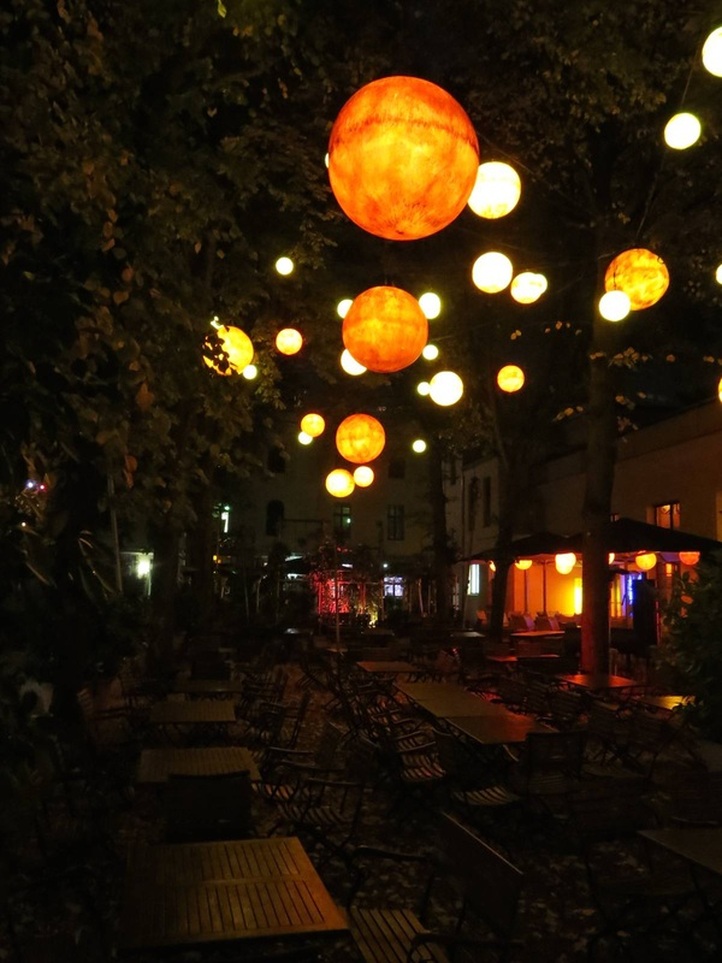
A recent exhibition idea came to me not from a museum but a beer garden. Yes! — and whyever not? As we see the boundaries break down between museums and other cultural institutions — museums are inviting in theater companies, yoga practitioners, and Michelin-star chefs for their restaurants, all in the name of innervating their public programs — ideas for exhibition design should come from non-museum institutions as well. This one struck me as I walked through the cultural hub atop the Pfefferberg in Berlin, with an outdoor tango stage to my left and this gravel-floored beer garden to my right. Above the tables were hung several dozen glowing orbs, dangling from the tree canopy. They ranged from about 50 cm to 150 cm in diameter, in varying shades of mottled yellow-orange. The effect stopped me in my tracks. Cosmic, certainly: it's like seeing the heavenly bodies descend to within touching distance (almost!). It made me think that such a mesmerizing display could just as well serve in an art museum gallery, simply as an accent to the exhibition down at ground level. Because the orbs are so eye-catching, they would have to be deployed thoughtfully in order that the art not be outshined; but carefully placed in a dimmed gallery with a few lit cases of sculpture, for instance, they would make magic. They would encourage lingering and looking, precisely what we aim for in museums. And they would use some of that tall vertical space at ceiling height that rarely gets used anyway. Pairing the orbs with beautiful visual material seems an obvious choice; pairing them with beer is optional.
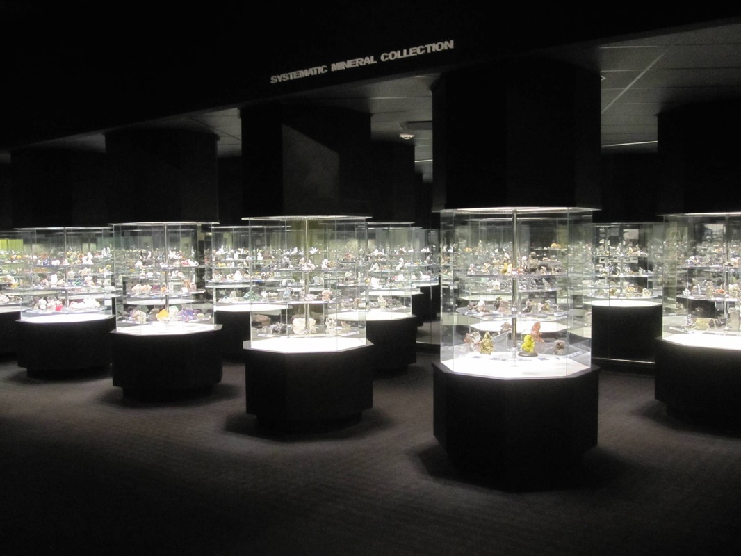
To balance the last post on diffuse lighting, in this post I want to revel in a gorgeous example of an unusually dark gallery lit with highly precise spotlights. In the Carnegie Museum of Natural History is a spectacular hall of minerals and gems. The shining glass cases, lighting, and black carpeting and walls all help make the objects appear precious, almost hallowed — they have an aura. Encased in glowing octagonal pods, they somehow even seem otherworldly. And while it's true that many of the specimens are themselves sparkly, impossibly pointy, or otherwise eye-catching, it's the display that really contributes to their inexorable pull. Talk about exhibition design amplifying the best qualities of a collection: you can hardly resist approaching the case for a better look at these, well, precious gems! Which leads to the question of keeping this glass free of nose- and fingerprints...
Inspired by a comment on the last post, I'm devoting today's post to diffuse lighting. Many scholars love the stuff, while many designers these days seem to agree that it is boring. Bring in the spotlights! While very strong, direct, single-source lighting certainly produces a dramatic effect — and can be quite successful (a blog post for another day) — diffuse lighting has its own merits. It allows the viewer to see details that might otherwise be lost in shadow. And in some cases, it better recreates the more even, natural lighting in which an object was likely originally seen.
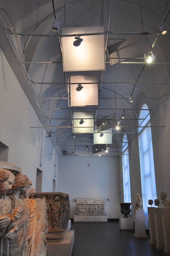
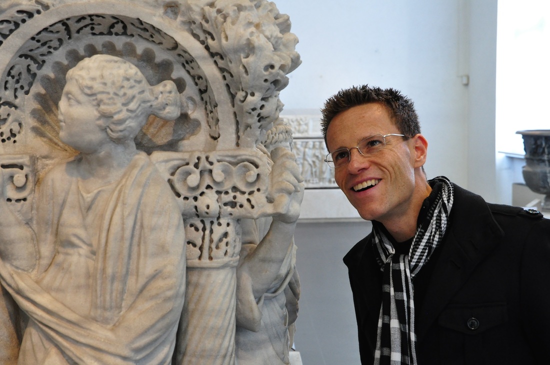
Palazzo Massimo in Rome, one of my favorite museums of all time, has installed in a few of its galleries a versatile system that produces very diffuse light. It relies on a series of screens mounted to the ceiling, positioned on pivots that allow them to be turned any which way. Bright lights are pointed at the screens rather than the objects. The result is an evenly-lit room ideal for photographing — thanks too to the filtering shades on the windows. Because the photo above hardly does justice to the actual effect, I include another one below of a visitor in this same room admiring the sarcophagi. Aren't those marbles beautiful, bathed in that light. (The potential irony being that if sarcophagi were viewed by candlelight in tombs, the original viewing conditions would be better imitated by spotlights! But to experience that sort of atmosphere, you can just walk down the hall to the room of the Portonaccio Sarcophagus.) |
Ideas on Display
A humble space to reflect on concepts of museum display as enacted across a wide range of subjects, countries, and approaches.
Archives
April 2020
Categories
All
|


 RSS Feed