Dr. Stephanie Pearson
  • Home
  • Projects
    • museums.love
    • Uncertainty and Debate
    • Mithras Model & Audio
    • Weltverbesserer Interview
  • CV
    • Employment
    • Education
    • Museum Experience
    • Professional Training
    • Publications
    • Awards & Grants
    • Teaching
    • Invited Lectures
    • Workshops & Chaired Sessions
    • Conference Papers
    • Professional Engagement
    • Excavation
  • Exhibition Reviews
    • Anna Dorothea Therbusch
    • Making Ancient Art Contemporary
    • Cleopatra
    • Pompeii and Herculaneum
  • Tours
  • Ideas on Display (blog)

Labels Now and Then - Gemäldegalerie, Berlin

9/7/2019

Comments

 
Picture
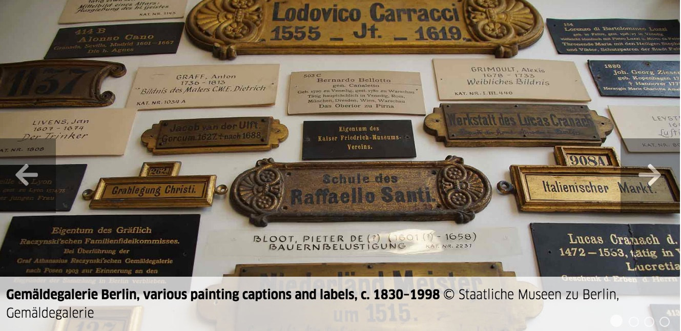
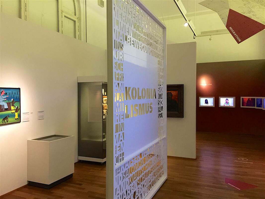
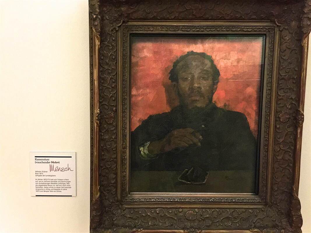
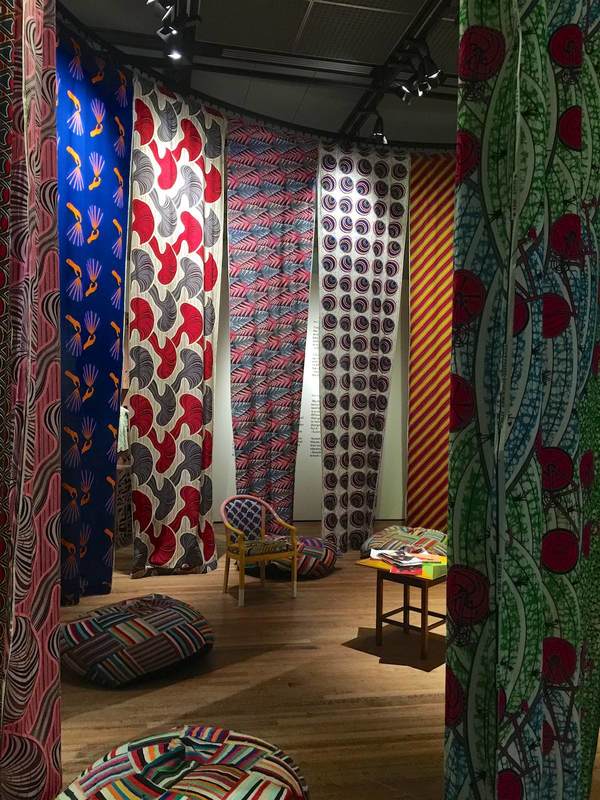
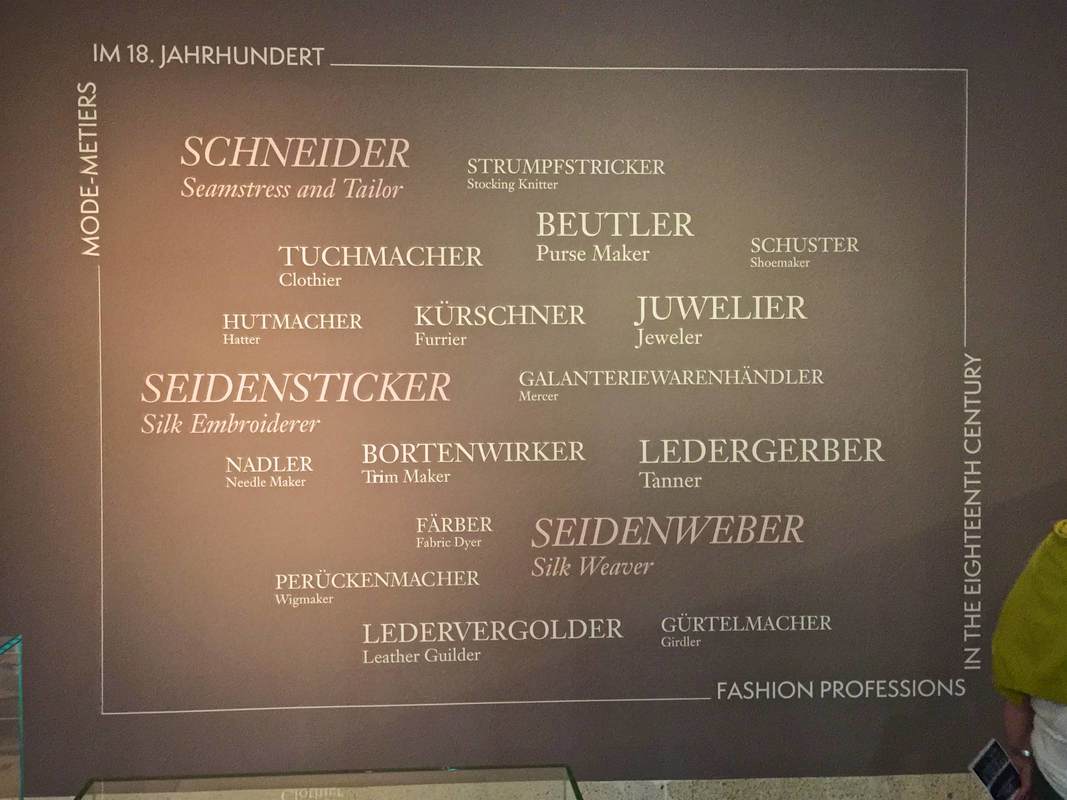
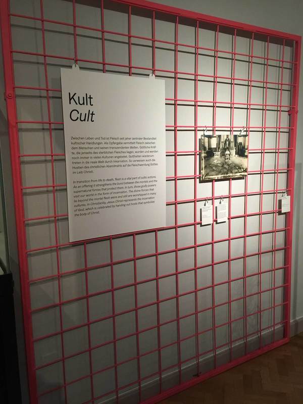
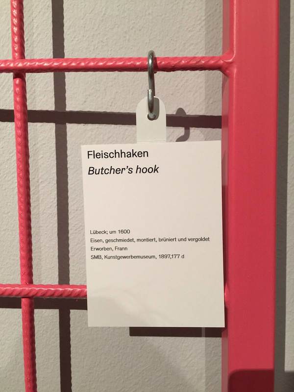
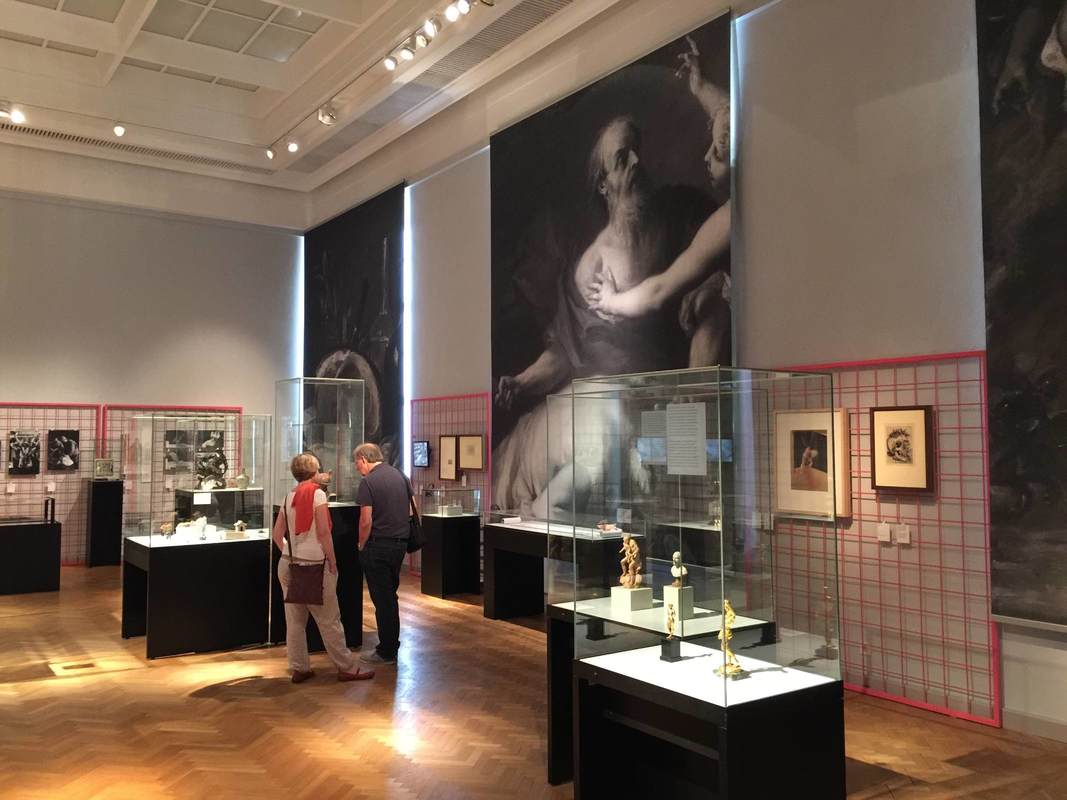
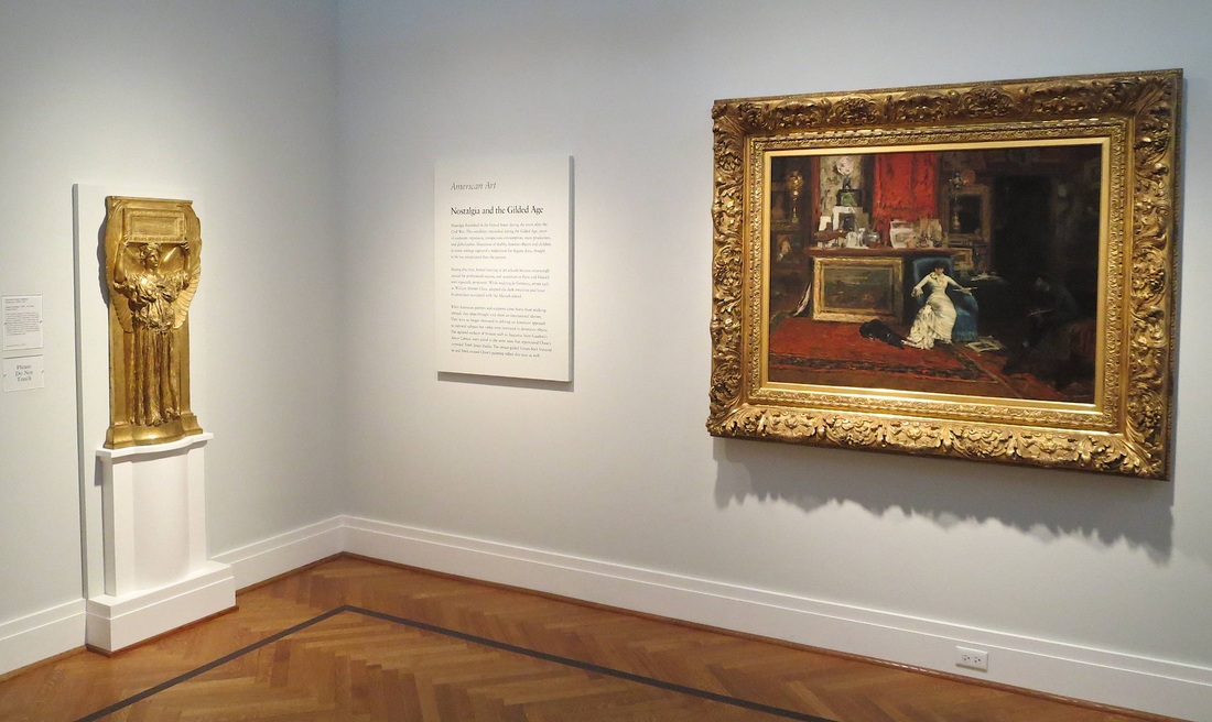
I'm a sucker for exhibitions about making exhibitions! And who doesn't love a peek behind the curtain into the inner workings? A show at the Gemäldegalerie in Berlin until the end of this month focuses on the "Labels of an Exhibition"—how they changed over time and what this tells us about changing priorities. Reminds me of other shows, about nose jobs and frame games of the past...
Comments

Photography Encouraged - Gemäldegalerie, Berlin

6/25/2019

Comments

 
Picture
Last week I was treated to a special tour of the current Mantegna + Bellini show at Berlin's Gemäldegalerie, thanks to a generous friend and colleague over at ART-THINKING. Because it was a whirlwind of intense looking and learning, I didn't take any pictures until the last second—upon leaving the gallery, seeing the sign above. The design of the sign is good, using a happy face to communicate nonverbally. The encouragement to share images using the museum's hashtag is a clever way to crowd-publicize. More than that, I was impressed that the curators managed to get permission from all of the loaning institutions to allow visitors to photograph these incredible artworks! They deserve extra cheers for that.

This beautiful show is still open for five more days, closing June 30.
Comments

Creating Knowledge Together: Pergamonmuseum. Das Panorama

6/6/2019

Comments

 
Picture
Museum display is just the last step in an ancient object's long life. This is the topic of a student workshop I'll be leading on Saturday in Berlin's Pergamonmuseum. Das Panorama. What is selected for display? What is researched, and how? What gets left out? How is the "knowledge" that the museum finally decides to communicate created? All of these are subjective processes, despite the impression that the "knowledge" presented in museums is singular, objective, and perfectly known. As Ian Hodder famously said, "Interpretation begins at the trowel's edge"—at the moment of excavation. (And, I argue, actually before that, since excavations are sited and carried out based on decisions as well.)
As part of our exploration we'll closely examine the museum labels. I was inspired by those in the interim Pergamonmuseum because they often express a certain uncertainty or scholarly debate about the objects, which I found refreshing. Not just refreshing: it brings us to think critically, one of the most important things a museum display can bring us to do! (But I repeat myself.)
All Berlin higher-ed students are welcome! The details (in German, as the event will be):


Unsicherheit und Debatte in Museumstexten: Wissen zur Antike gemeinsam bauen
Sa / 8. 6. 2019 / 15 – 17.30 Uhr
Treffpunkt: Pergamonmuseum. Das Panorama, Besucherinformation
Keine Anmeldung erforderlich. Die Teilnahme ist für Studierende kostenfrei.

Das Format TISCHGESPRÄCH findet im Rahmen von ABOUT THE MUSEUM statt, einer Initiative des Referats Bildung, Vermittlung, Besucherdienste. Weitere Informationen: studierende.smb.museum und auf Facebook: ABOUT THE MUSEUM.
Comments

Seeing through Colonialism — Landesmuseum Hannover

3/6/2019

Comments

 
Picture
Many museums are currently asking themselves how to appropriately deal with their ethnographic collections (see links in my previous posts on the subject). Some major European museums, although notably not all, are now openly acknowledging the role that colonialism played in their acquisitions. Reading the work and watching the lectures of Bénédicte Savoy on this topic would be an absorbing job for a wonderful few months. Some museums are even putting on exhibitions about their colonial past, such as Voices from the Colonies at the National Museum of Denmark. While it has been rightly pointed out that ethnographic material is not the only site of colonialism in museums—that museums themselves are colonialist structures—it is certainly one of the most obvious. And if the museums themselves do not take action, others will: the "Guerilla, Activist-Led Tour of Looted Artifacts at the British Museum" made headlines last year.

​Against this background, the Landesmuseum Hannover has taken commendable action in its own ethnographic displays. Particularly striking is the section marked off by a decorative metal dividing wall stamped with the word "Kolonialismus" in the center. This is an imposing marker of the surrounding area, and invites a curious new way of looking through the cutout letters (see photo above). On display here are objects presented in a story of colonial interaction, from depictions of visiting Europeans made by Africans whose lands were being colonized, to a 19th-century painting titled "Smoking Moor" for which the Landesmuseum has provded a modified label: "Moor" has been crossed out and "Human" (Mensch) added instead. It is a small but effective way to reframe objects we might otherwise pass over, and to make us question the metanarratives of museum exhibitions.
Picture
Picture
Comments

The Art of Association - Isabella Stewart Gardner Museum, Boston

1/2/2019

Comments

 
Picture
In laying out her art museum in Boston, which opened in 1903, Isabella Stewart Gardner sought to ellicit an emotional response in her visitors. Rather than teach them something intellectual about the works on view, she prioritized aesthetic impact. And she was able to realize this vision completely, being the sole visionary and financier of the museum—not to mention a seemingly headstrong personality.
The effect is plain throughout: there are nearly no labels, and the handful I saw named at most a culture and century. The organization of the collection in the galleries is only vaguely defined by time and place, and rather more by visual harmony: an 18th-century Russian lampstand finds its place beside a Turkish textile and a Japanese basin, while the "Spanish Cloister" is wallpapered with tiles from Mexico (right) and oriented toward its show-stopping highlight, a huge painting by John Singer Sargent. Roman sarcophagi, meanwhile, are sprinkled throughout both the Cloister and  the Courtyard (above). This is no ordinary concept of museum display! It is a treat to feel Mrs. Gardner's touch in every arrangement, and to imagine her making it all "just so" for her salon guests.
Picture
Sometimes her touch seems more enthusiastic than professional, as in the tapestries that have been bent in order to fit into a corner (below), or the row of pictures hung on the short side of a cabinet, as if to use every possible inch of vertical space.
The great achievement of this display concept is letting viewers really look at the pieces, make associations, think creatively and personally about what they are. We cannot be distracted by text or multimedia stations; we have to just look at the objects. And if the immense variety and quantity of objects can be overwhelming, this is in part a result of the ceaseless acts of imagination prompted by these pieces—just what Mrs. Gardner was going for.
Picture
Comments

Bite-Sized Nuggets (of text) - Archaeological Park, Xanten

9/11/2018

Comments

 
Picture
Walls of text are daunting. We all know it; so why is it so hard to get away from them? Well, it's hard to reduce the things we want to communicate to little bite-sized chunks. But those nibblets are infinitely more digestible! Just look at this example from the archaeological park in Xanten, Germany. Here the signage is consistently structured into a few nuggets so small that even an overheated, weary visitor like yours truly could bring herself to concentrate for just a darn minute. Despite being a museum veteran, I often have to trick myself into reading signage: "Ok, just that one sentence next to the picture. And maybe that one standing by itself right at the end." That is precisely the sort of self-deception that the Xanten signage makes the most of! Each sign beguiled me into tricking myself three or four times over—until, without realizing it, I had read the whole thing! The easy structure with lots of empty space for your eyes to rest (and your brain to think there isn't too much work involved) makes a huge difference. This is just one of the wonderful visitor-friendly aspects of this park. Three cheers for Xanten!
Picture
Comments

Fabrics in Fashion Cities Africa - Tropenmuseum, Amsterdam

8/8/2018

Comments

 
Picture
Another wonderful current exhibition at the Tropenmuseum in Amsterdam is Fashion Cities Africa. Like the Body Art show described in the last post, Fashion Cities presents a rainbow of human creativity—and of dyed fabrics! The use of cloth in the show cleverly highlights the theme and at the same time subdivides the space into cozy sections. At the entrance (above), sheets of whitewashed plywood are used as backings for introductory images and texts. Each panel introduces a local designer of African fashion, photographed on the street as if you had just run into them personally; once again it's that intimate human connection that flows throughout the museum. The boards are hung up with thick ropes at top and bottom, a very tactile nod to the cloth-and-design theme.

The second room (or second-to-last, if you entered at the other end) is encircled with hanging yards of cloth in various patterns. With pillows and chairs inside, it offers an alluring spot to tuck yourself into—the museum version of a sofa-cushion fort! Panels outside the ring of cloth explain how the colorful patterns came originally from, for instance, Indonesia (batik cloth), reached the Netherlands through colonial exchange, and from there was sent to Africa. It's a much more complex, indeed global history than one might expect. And it stays with you much more when you can touch this stuff of history, feel it, wrap yourself in it!

*stuff: 
from Old French estoffe = material, furniture. The German word for fabric is in fact Stoff. There's your cocktail-party knowledge for the day!
Picture
Comments

Fashion Professions Word Cloud - Germanisches Nationalmuseum Nürnberg

7/12/2018

Comments

 
Picture
At the show Luxury in Silk (Luxus in Seide) in the Germanisches Nationalmuseum Nürnberg, the subject of yesterday's post as well, this wall caught my eye. Clearly the arrangement of words is based on the word clouds now used on websites to visualize the most frequent search terms and clicks. But here the cloud serves to show the plethora of jobs in the 18th century that had to do with creating clothing, shoes, and jewelry ("Mode-Metiers im 18. Jahrhundert"). It's interesting to see such an aesthetic transition from an online space to a physical one.
Comments

Meathooks for "Fleisch" - Altes Museum, Berlin

6/21/2018

Comments

 
Picture
Picture
A current special exhibition at the Altes Museum in Berlin called "Fleisch" (Meat) focuses on the cultural significance of meat. Ranging from the religious rites of animal sacrifice to the lustful gaze directed at nude female bodies, the theme is perhaps overstretched; but as an interdepartmental intitiative it is exemplary, and its design is beautiful. The most striking component is industrial-grade rebar lattices painted a fleshy pink, serving as the mount for signage and pictures; these are attached with simple S-hooks reminiscent of meathooks. It's a simple, cost-effective device which here also highlights the theme of the show—very tasteful!
Picture
Comments

Using Edward Tufte's Visual Explanations in Museum Display

6/15/2018

Comments

 
Picture
Paging through Edward Tufte's book Visual Explanations (1997) is instructive not only for graphic designers, but anyone creating—or even reading!—visual displays. In a distinctly personal, engaging voice, Tufte explains what makes effective visual presentations for all sorts of information. He does not feel compelled to hide his disdain for a bad design, and he openly celebrates a good one. One example is the diagram of an ear at the top of the page above. Tufte so loathes the design at left, with its heavy lines almost indistinguishable from the ear itself and its cryptic letter labels, that he compares it to a Renaissance drawing of a man being stuck with swords (below). He juxtaposes the bad design with one he finds preferable, in which the indicator lines are finer than those delineating the ear and the nonsense letters are replaced with the names themselves. The thickness of the lines is highly significant, Tufte points out: one thickness should be used for the drawing of the ear (the object being explained), another for the indicator lines (the metalevel of our knowledge). The two grids at the bottom of the page show this again with two different thicknesses of line used in the background pattern; the diagonal lines overlying them are harder to distinguish in the lefthand example because they are nearly the same thickness as the background lines.

The facing pages shown below illustrate not only Tufte's exasperation at bad design and his acerbic wit at its expense, but also the huge range of applicability of his principles. At left is a painting by Ad Reinhardt, which Tufte uses as another illustration of how subtle differences can have great meaning (here in the shades of blue rendered in three nearly imperceptible vertical bands; Reinhardt wanted to focus the viewer's attention on these simple and subtle differences).
Picture
Tufte's book seems to me to have immense potential for designing effective museum displays—again, not just on the level of graphic design. Tufte himself designed an interactive informational screen for visitors to the National Gallery in Washington, D.C. (right); but I mean even more than this. His principles can also be applied in the placement of objects relative to each other, to the text panels, to the space, and so on. His chapter "Parallelism: Repetition and Change, Parallelism and Surprise" illuminates the ways that viewers interpret repeated images. This way of thinking could easily be applied to objects in a gallery.
Picture
Art historians, of course, are very accustomed to comparing two objects (a cornerstone of the discipline since Wölfflin), but they do it differently than people who are not trained to look for certain details or to already know certain things about the objects. This can lead to the display of a group of objects which makes art-historical sense but not intuitive, repeated-image-viewing sense. In the Neues Museum in Berlin (below), one room has a timeline written on the wall behind a row of Egyptian sculptures. The intent is to show how humans were portrayed in Egyptian art over time. But the earliest objects happen to be just heads, while the later ones represent entire bodies. The repetition of heads at first, and the subsequent break with this repetition, gives the false impression that what changed around 1600 BC is that the Egyptians started depicting people with bodies. Or perhaps in a different color of stone? Meaningful similarities and differences are hard to notice because of the many other factors at play beyond just the one meant to be highlighted.
Picture
Comments

Wastewater Construction Site = Fun Park Experience - Berlin Mauerpark

3/20/2018

Comments

 
Picture
The building of a large drainage pipe under Berlin's Mauerpark is a triumphant example of how simple display concepts can be transformative. Rather than making yet another annoying construction zone in the city, and this one right in at the entrance to the most popular park, the organizers decided to make it an attraction in itself. They achieved this by erecting a wooden wall around the main building area and decorating it with fun and informative panels. The biggest and most iconic is the cartoon cross-section of the pipe itself (above). The pipe introduces itself through a speech bubble: "I'm a drainage pipe with a 4.4-meter diameter"! More detailed panels describe the water system in depth. Around the corner, a spin wheel with exercise challenges on it ("do 5 pushups!" etc.) is a further attraction. Most surprising of all, you can see it all and learn more on a beautiful modern website devoted to the project! Way to go, Berliner Wasserbetriebe.
Comments

Red and Black, China and Egypt - Neues Museum, Berlin

10/18/2017

Comments

 
Picture
An exhibition on Chinese antiquities currently in Berlin's Neues Museum uses a couple of display tricks worth noting. One consists of long banners stretching from the first few display cases up to the two-story-high glass ceiling—a wonderful use of the cavernous space! It's simple, cheap, and very eye-catching. The black banners are printed with the name "Egypt" in several languages; the red ones with "China." In this way the banners serve as the introduction to the second display tactic that caught my eye: throughout the exhibition (no photography allowed beyond the atrium, sadly), the Chinese objects are always placed on red risers or red squares as a background. The Egyptian objects get the same treatment but in black. Because the exhibition is arranged by theme rather than culture (e.g., how each culture respectively approached currency, votive offerings to gods, and so on), the red and black color-coding is a very useful visual cue for which culture produced any given object.
Picture
Comments

Talking Objects: Roman Villa at Pully, Switzerland

4/17/2017

Comments

 
Picture
The brand-new archaeological museum at Pully (near Lausanne) is dedicated to an ancient Roman villa discovered at this site, overlooking Lake Leman. Fragments of fresco that decorated the villa's walls are exhibited in cases dedicated to certain themes—shown here is "Aux bains," "At the baths." Displayed within are pieces of fresco from the villa's bath complex, which was painted with marine scenes in keeping with the watery function of the rooms. Not only is the graphic design of the panels clean and bright, but the cases feature a cute pedagogical concept: small stickers on the glass are shaped like speech bubbles, some with tails pointing to fresco fragments as if they were talking! In the photo above, a painting of a fisherman seems to call out, "It's fresh, my fish is fresh! The fishing was good today." The bubbles at the top right introduce an authentic Roman recipe for fish sauce, quoting an ancient author, while the small bubble at left asks, "Did you know that fish farming was invented by the Romans?" It's a playful way to draw attention to individual objects, and particularly well-designed to engage young museum visitors.
Picture
Comments

Walk like an Egyptian...to the Fire Escape: Museo Egizio, Turin

3/18/2017

Comments

 
Picture
Picture
This unusual touch surely gave a smile to many visitors to the special exhibition Il Nilo a Pompei at the Museo Egizio in Turin, Italy. In keeping with the theme of this show—how Egyptian culture was taken up by Romans in Pompeii—the standard fire escape signs were replaced by these Egyptian-inspired ones! A whimsical bit of humor that gives a glimpse of the real (fun!) people behind the exhibition. Director Christian Greco cheerfully admitted to being quite amused. This balance of fun and scholarly is characteristic of the museum's seriously impressive public outreach campaigns.
Comments

Awards in Exhibition Design and Label-Writing

12/22/2015

Comments

 
Picture
Every year the American Alliance of Museums confers awards for great exhibition design and label-writing (among other categories.) The 2015 lists are out! You can see the former here as a quick list and the latter here in a more expansive format with photos and descriptions. Of the many worthy entries, my personal favorite was a label by the Minneapolis Institute of Arts for the Zulu beer pot pictured above. (You might want to check it out in the MIA's beautiful online catalog, which is not only sleekly designed but includes audio clips and free image downloads.) As reproduced on page 6 of the AAM report, this label brings out the object's visual qualities and social importance at once—certainly deserving its prize.

My second-favorite label appears on page 9: an outdoor panel at the La Brea Tar Pits. It even has something in common with the beer pot label: vivid opening lines. Who could refuse to read further after "The stinky dead mastodon was irresistible" or "How is brewing beer like growing babies?"
Comments

Word Cloud: Käthe-Kollwitz Museum

12/10/2015

Comments

 
Picture
Once a month the Käthe-Kollwitz Museum in Berlin offers a lunchtime tour by the director, Dr. Iris Berndt, and yesterday's provided the extra motivation for my first visit to the museum. Standing in the first room of the ground-floor galleries, waiting for the tour to assemble, I was struck by the "word cloud" on a wall right next to the entrance. Like the automatically generated word clouds on the Internet, this collection represents thought trends in a wide set of "users" (clustered around the name of the artist, nicely emphasized with extra lighting). But unlike the digital word clouds, these words have been carefully selected to educate. As Dr. Berndt explained, they all represent concepts widely understood to apply to the great German artist Käthe Kollwitz—but several of them are problematic or even false. By marking these four terms with question marks—Feminist? Jewish? Communist? An artist who depicts suffering?—the display indicates that these preconceptions need to be reexamined and possibly discarded. This seems to me a very simple yet effective way to ease a visitor into the experience to come: several key themes are named right at the beginning, setting the tone for the subsequent galleries and helping a visitor to frame the individual objects; and just as importantly, it introduces the idea of questioning stereotypes, clichés, and pat explanations. For such a complex, richly-textured life and oeuvre as Kollwitz's, this strikes just the right first note.
Comments

When Your Exhibit Can Walk Away: Anne Kolb Nature Center

11/22/2015

Comments

 
Picture
It's a tricky task to make nature itself into an exhibition. Nature walks (in botanical gardens and model farms, for instance) often rely not on a group of objects or other predetermined set of material, but on an unpredictable troupe of actors who may or may not be on stage that day. What a challenge to present material that the visitor might not even get to see! But certain display tactics can help smooth over the possible unevenness of this living exhibition. The Anne Kolb Nature Center in Hollywood, Florida centers on a boardwalk that winds through a section of mangrove habitat. (It also has a lovely visitor's center which, when I visited, included a display of contemporary art on spiffy movable walls.) At the start of the walk, large signs with vivid pictures of the animals (above) introduce the visitor to the point of the exhibition: to VIEW the plants and animals. Further, to help the visitor engage—and to help them see the critters tucked away in their hidey-holes—the Center offers a handout with a checklist of the plants and animals one might encounter on the walk. This is an easy, effective, low-cost way to encourage visitors (especially kids) to really look, and even to try to identify the things they see. It would be fantastic as an app for mobile devices too.
Picture
Comments

Simply Good Signage: Domäne Dahlem

11/14/2014

Comments

 
Horses and sign at Domäne Dahlem, Berlin
A successful display does not need a fancy new design idea or technology to be successful (indeed, sometimes those can really go awry!). Some of my favorite displays are very simple; their strength lies in being extremely well-conceived in terms of how they achieve their few basic goals. One great example is the signage at the Domäne Dahlem in Berlin, a charming set of fields and cottages meant to teach the visitor about old-time farming and artisanal trades. The signs scattered around the grounds are excellent in several simple but important respects:
  1. They are sturdy. Look at that metal frame! The text is protected by a thick sheet of plastic (not yellowed or scratched; is that a special kind of plastic?). And the sign stands on two very firmly embedded poles. These things are equipped to stand out in the sun and snow year-round. Moreover, they have to withstand eager kindergartners running over to them, slapping them in excitement, climbing on them, and many other things I can't even imagine but the kiddies definitely can. They are up to the task! (The signs, that is — but the kiddies too.)
  2. They clearly refer to their subject matter. Despite having to stand in the open air, and not on a wall obviously beside an object (see the previous post on botanical gardens), they are well-placed and -oriented so as to be clearly linked to their subject. The example above faces the horses and, as extra help, even shows the horses in a drawing.
  3. They start with perfect "hook" questions. You can imagine a kid and parent approaching the horse sign and the parent beginning to read the yellow box: "If it whinnies, then it's a...." "HORSE!" replies the kid. I really think this isn't just my fantasy; the sign is begging for this interaction. As for the sign below, which explains nitrogen binding among legumes, I had just wondered aloud what was growing in this big bushy field when I came across the sign that begins with a green box, "So what's growing here?" I call that perfect.
  4. The drawings are simple. Too often the graphics in signage get complicated or rely on colors that have long since faded. Not here! A basic but beautiful line drawing gets the point across in both signs. Even as a lover of color, I far prefer this style for clarity.
Legume sign at Domäne Dahlem, Berlin
Comments

The Golden Thread: Saint Louis Art Museum

10/24/2014

Comments

 
Picture
Overview panels can be underrated. In its recent renovation of the European Painting galleries, the Metropolitan Museum of Art shifted its "room labels" from the walls to plaques on knee-high metal stands. For space considerations, this makes sense. But if wall space is not at quite such a premium, a nice big wall panel does wonders for communicating the Big Idea. "What is this all about?" I can hear a visitor asking, making a sweeping gesture, stepping into a gallery for the first time. Individual object tags don't help answer this question, but an overview panel sure does. It is magical for its ability to unite a wide range of objects into a comprehensible narrative.

Everything I love about overview panels inheres in this example from the Saint Louis Art Museum. At the top is written the most general category, the designation of the collection: American Art. Below, the thematic title for the room: Nostalgia and the Gilded Age. But the best part? Look to either side and you immediately encounter something obviously gilded, perfectly illustrating the name. Moreover, both gilded pieces are quite large and lavish, as if lending some (literal) weight to the idea that an entire age could be gilded. And finally, the subjects of both pieces subtly underline the idea of nostalgia. The woman at right sinks into her chair, surrounded by precious items, speaking with a man (the artist) swallowed by shadows. At left, a golden winged figure in Classical robes embodies the glorification of a past age. Following the thread that connects the objects with each other and the text could hardly be easier.
Comments

Find out More: The British Museum

8/16/2014

Comments

 
Informational panel in Mildenhall Treasure gallery, British Museum
Photos of informational wall panels must be a minority among all photos taken in the British Museum.  (They would be dwarfed by photos of the Rosetta Stone alone!) Yet this informational panel deserves a moment of stardom.  It adorned one of the walls in the tiny gallery just to the right of the British Museum's entrance, a space for temporary exhibitions which at this partiular moment housed the Mildenhall Treasure. Urging the visitor to "Find out more," it presents various events and objects in the museum where the visitor can further engage with the themes in the gallery:

  • Gallery Talks lists upcoming presentations by the curator of the show and other museum staff
  • Lecture details a topical guest talk by a professor
  • Exhibition and related objects points to the concurrent show Life and death in Pompeii and Herculaneum, also with Roman and dining themes (see my exhibition review here)
  • Further Reading highlights two books for sale in the museum store
  • Music draws attention to the atmospheric use of Roman-themed songs piped into the gallery, also on sale in the store
  • Join in online directs the visitor to the museum's social media presence
  • Next in Room 3 offers a preview of the next show slated for this space

Although the dense text may repel some viewers, the wealth of information all in one place is an admirable way to expand the visitor experience beyond a single gallery — at the same time as highlighting and interconnecting the museum's other offerings.
Comments
    Ideas on Display
    A humble space to reflect on concepts of museum display as enacted across a wide range of subjects, countries, and approaches.

    Archives

    April 2020
    January 2020
    December 2019
    November 2019
    October 2019
    September 2019
    August 2019
    July 2019
    June 2019
    April 2019
    March 2019
    February 2019
    January 2019
    December 2018
    November 2018
    October 2018
    September 2018
    August 2018
    July 2018
    June 2018
    May 2018
    March 2018
    February 2018
    January 2018
    December 2017
    November 2017
    October 2017
    September 2017
    August 2017
    July 2017
    June 2017
    May 2017
    April 2017
    March 2017
    February 2017
    May 2016
    March 2016
    February 2016
    January 2016
    December 2015
    November 2015
    October 2015
    September 2015
    August 2015
    July 2015
    May 2015
    April 2015
    March 2015
    February 2015
    January 2015
    December 2014
    November 2014
    October 2014
    September 2014
    August 2014
    July 2014
    June 2014

    Categories

    All
    Amsterdam
    Anthropology
    Archaeology
    Architecture
    Art
    Article
    Audio
    Award
    Behind The Scenes
    Berlin
    Boston
    Bulgaria
    California
    Chicago
    China
    Color
    Conservation
    Copenhagen
    Denmark
    Diagram
    Difficult Heritage
    Digital
    Display Case
    Dresden
    Egyptian
    Exhibition Outside Museum
    External Website
    Fashion
    Florida
    Frame
    France
    Germany
    Greek
    Halle
    Hamburg
    Hands On
    Hands-on
    Hanover
    Illinois
    Interactive
    Islamic
    Italy
    Kids
    Lighting
    London
    Los Angeles
    Map
    Marketing
    Marrakech
    Minnesota
    Missouri
    Morocco
    Movement
    Munich
    Nature
    Netherlands
    New York
    North Carolina
    Nuremberg
    Outdoor
    Painting
    Paris
    Pennsylvania
    Photography
    Roman
    Rome
    Shelving
    Signage
    Space
    Spain
    Switzerland
    Texas
    Text
    Turkey
    UK
    USA
    Video
    Women
    World War 2

    RSS Feed

Contact
Stephanie Pearson
steph [at] stephpearson.com