Dr. Stephanie Pearson
  • Home
  • Projects
    • museums.love
    • Uncertainty and Debate
    • Mithras Model & Audio
    • Weltverbesserer Interview
  • CV
    • Employment
    • Education
    • Museum Experience
    • Professional Training
    • Publications
    • Awards & Grants
    • Teaching
    • Invited Lectures
    • Workshops & Chaired Sessions
    • Conference Papers
    • Professional Engagement
    • Excavation
  • Exhibition Reviews
    • Anna Dorothea Therbusch
    • Making Ancient Art Contemporary
    • Cleopatra
    • Pompeii and Herculaneum
  • Tours
  • Ideas on Display (blog)

The Art of Association - Isabella Stewart Gardner Museum, Boston

1/2/2019

Comments

 
Picture
In laying out her art museum in Boston, which opened in 1903, Isabella Stewart Gardner sought to ellicit an emotional response in her visitors. Rather than teach them something intellectual about the works on view, she prioritized aesthetic impact. And she was able to realize this vision completely, being the sole visionary and financier of the museum—not to mention a seemingly headstrong personality.
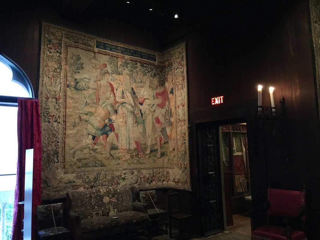
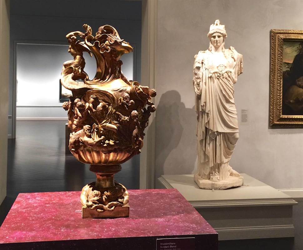
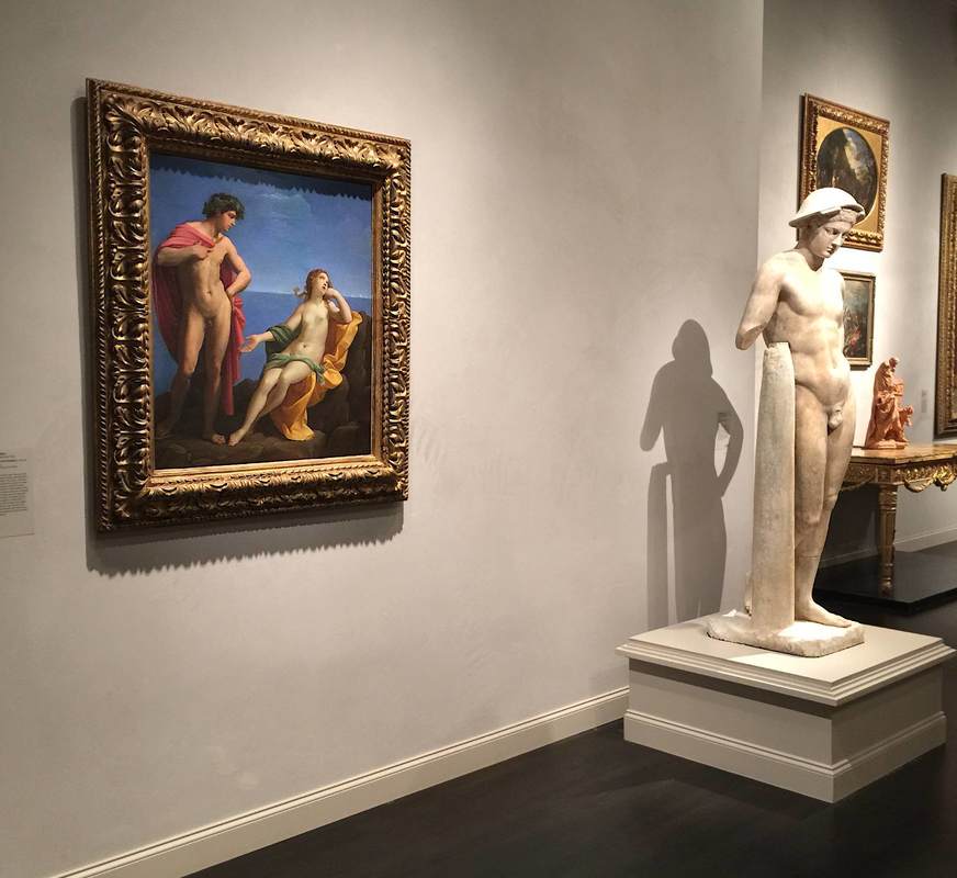
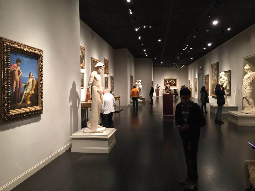
The effect is plain throughout: there are nearly no labels, and the handful I saw named at most a culture and century. The organization of the collection in the galleries is only vaguely defined by time and place, and rather more by visual harmony: an 18th-century Russian lampstand finds its place beside a Turkish textile and a Japanese basin, while the "Spanish Cloister" is wallpapered with tiles from Mexico (right) and oriented toward its show-stopping highlight, a huge painting by John Singer Sargent. Roman sarcophagi, meanwhile, are sprinkled throughout both the Cloister and  the Courtyard (above). This is no ordinary concept of museum display! It is a treat to feel Mrs. Gardner's touch in every arrangement, and to imagine her making it all "just so" for her salon guests.
Picture
Sometimes her touch seems more enthusiastic than professional, as in the tapestries that have been bent in order to fit into a corner (below), or the row of pictures hung on the short side of a cabinet, as if to use every possible inch of vertical space.
The great achievement of this display concept is letting viewers really look at the pieces, make associations, think creatively and personally about what they are. We cannot be distracted by text or multimedia stations; we have to just look at the objects. And if the immense variety and quantity of objects can be overwhelming, this is in part a result of the ceaseless acts of imagination prompted by these pieces—just what Mrs. Gardner was going for.
Picture
Comments

"Working" Podcast Features Exhibition Design at MoMA

12/12/2018

Comments

 
Picture
The three latest episodes of the podcast Working (tagline: "Slate interviews Americans about their jobs") are dedicated to the work processes in the Museum of Modern Art in New York City. One of them, "Working at MoMA: How Do Exhibition Designers Do Their Jobs?," features a conversation with Lana Hum and Mack Cole-Edelsack, the Director and Senior Design Manager respectively of MoMA's Exhibition Design & Production Department. (I was lucky enough to meet Lana Hum in 2014 as part of the Center for Curatorial Leadership/Mellon Foundation Seminar in Curatorial Practice.) It's a fun conversation to listen to: both the interviewees and interviewer (Jordan) have smart things to say and seem to be having a good time. A few novel points jumped out at me:
​
  • At one point Lana Hum calls her job a sort of translating, in that she and her team talk with curators to understand the vision and then get to work shaping that into a realizable form. This metaphor seems really useful for thinking about what exhibition design can be.
  • She also talked about exhibition design as a push-pull between, on the one hand, the "open space" that lets a visitor choose a path, and on the other a planned (often chronological) route through the show.
  • Before hearing it mentioned here, I had never thought about the need to get fire department approval for every new exhibition layout! But it makes sense that the emergency exits would need to be verified.
  • The penultimate question is brilliant for getting down to the essence of any job: What counts as an emergency in your job? For most of us, this is far from a life-or-death scenario; that certainly offers some perspecitve.

I look forward to hearing the other two episodes about MoMA's operations!
Comments

Mesh Screen makes Still space - Museum of Fine Arts, Boston

1/22/2018

Comments

 
Picture
In the contemporary art wing at the Museum of Fine Arts in Boston, the current exhibition Seeking Stillness employs an unusual type of wall construction to underscore the main theme. A sheer mesh wall separates off a small space directly at the beginning of the exhibition, creating a niche that is self-contained yet still visible from the outside. The red walls and lighting are luminous, and visually differentiate the small space from the surrounding gallery. Inside, the oil paintings of Christ seem to glow; the atmosphere borders on the religious. In exploring "spaces of contemplation," therefore, this exhibition creates exactly the sort of environment (and mental state) which inspired the exhibited objects and the theme as a whole.
Picture
Comments

Textin' Collection at SFMOMA

7/17/2017

Comments

 
SFMOMA's video about their "Send Me" program (link below).
I'm too excited about this news to omit it from this blog on the grounds of not being a display technique. Anyway, as a highly interactive medium to generate visitor interest in the collection, it is part of a synergy with actual displays—and, crucially, it works outside the museum as well as inside. So what is this all about? A recent article in the New York Times reports that the San Francisco Museum of Modern Art is reaching potential visitors via a text message program. Texting the museum at 57251 with the request "Send me ---" will retrieve an automated response of a photo of an artwork at SFMOMA captioned with its creator, title, and year. In a twist of modern hilarity, the "---" can be a word or, yes, an emoji. This has led to fascinating data on visitors' desires and interests:
  • "The top emoji requests included the robot, the heart, the rainbow, 'and, of course, poop,' Mr. Winesmith said. 'And then, because it’s the internet, it’s a lot of food and a lot of animals.'"
​Requests at night are apparently more personal, referring to family and home. Some requests are denied by the museum's autoresponse system: nudity, but also, interestingly, artists' names. The museum wants its text-visitors (they are still visitors, aren't they?) to be more creative than that; and they've found that the requests immediately following denied requests are indeed more creative. What a marvelous experiment! We can learn a lot from this about how to improve museums both within and without their walls.
Comments

Crafting a History of Science - the Huntington Library

4/28/2017

Comments

 
Picture
The first clue that the curators at The Huntington Library have thought long and hard about the presentation of their History of Science exhibition (which curator Daniel Lewis kindly showed us) is in the entryway, pictured above. The blue, curving wall on the right is a subtle mechanism for attracting people through the door—what is this surface? what is written on it?—and guiding them into the first gallery. Imagine a large flat wall panel in its place: it would produce a very different effect!
Picture
Curves define the first gallery space as well. These beautiful curving vitrines were conceived to echo the "heavenly sphere" that is the subject of this room, dedicated to astronomy. (Yes, the ceiling is vaulted too!) Dr. Lewis installed low cases so that the visitors can get up close to the books, as if they were holding them. But since this means that people bend over the cases to look inside, the lights had to be specially mounted inside the cases so that the viewer's head wouldn't interrupt a light source shining from overhead. Detailed planning that bespeaks years of experience. . . or unusual design foresight.
Picture
The next room also employs a great device for luring viewers close to the books. Dedicated to the central role of observation and illustration to the development of natural history, the walls are a vivid red that highlights the beautiful reproductions of book illustrations hung in a sort of collage style. To convey a progression through time, the earlier drawings are hung at left, followed by later lithographs, color lithographs, and prints. The ensemble is not only beautiful but inspires curiosity in the books below, which contain further illustrations and, of course, text. The presentation functions on both the level of immediate impact (beautiful wall design) and closer encounter (approaching the objects and delving into the information presented). As the curators plan to reinstall this exhibition in the coming years (it certainly doesn't show its age; it is already nine years old), I look forward to seeing what they come up with for the new incarnation.
Picture
Comments

Pairing objects Old and New: LACMA

2/26/2017

Comments

 
Picture
Visiting the Los Angeles County Museum of Art (LACMA) for the first time in many years, I was surprised (and admittedly, as a specialist in ancient art, dismayed at first) to find that the onetime gallery of ancient art has been disbanded. The Greek and Roman sculptures now stand in the galleries of European art—the ancient statues and vases joining the post-antique paintings, sculptures, and decorative arts (photo below). From my initial skepticism, however, I was completely converted to the curators' way of thinking: the pairing of old and new really works! It brings out similarities in the content, form, and even artistic style that would otherwise be lost; and the sheer visual variety of white statues with more colorful objects is beautiful and interesting (much more so than a room full of only white statues). What's more, bringing ancient art into the European art gallery underlines how fundamental it was to the artistic training of these later periods. This central art-historical concept can be grasped in a single glance because the pairings here so effectively highlight the parallels between the objects—as in the statue and painting below, both featuring classic male nudes in contrapposto. At the same time, the juxtapositions open up new ways of thinking about form—as in the second-century Hope Athena statue and ca. 1695 vase above, both with swirling drapery and twisting snake(like) edges.
Picture
Picture
Comments

Upright B&W: MOCA Los Angeles

2/3/2017

Comments

 
Picture
Placing objects into an exhibition space requires thinking about them in a new way. While a individual piece might be the focus of art-historical research, when it enters a space shared with other objects, suddenly all the pieces become part of an interaction. Each piece plays with the other objects in the space and with the visitors. And the game is no longer just art-historical but also strictly formal (form-based)—in the sense that objects inhabiting a common space can be compared and contrasted simply in terms of their appearance, which for a single object would be impossible. Parallels and harmonies emerge; so too variations and dissonance.
​
This is especially obvious in a gallery of the Museum of Contemporary Art, Los Angeles (above). The objects in this room (part of the exhibition of the permanent collection) are all monochromatic, a unifying factor across the media of painting, metal sculpture, wood sculpture, and photography. What's more, the compositions of all the larger works have a strong vertical element: the paintings send up powerful black brushstrokes, while the two sculptures point long fingers skyward. The viewer's eye bounces from one to the next, drawing her in for a closer look into the black-and-white vortex.
Comments

Inhabit a Painting - Van Gogh's Bedroom in Chicago

5/22/2016

Comments

 
Picture
Reconstruction of Van Gogh's painting _The Bedroom_ (Art Institute of Chicago)
A display that blurs the boundaries between art, life, and even display itself is a wonderful and paradoxical thing. The Art Institute of Chicago achieved this by reconstructing the room depicted in Van Gogh's painting The Bedroom—and then listing it on AirBnB for interested renters! As a promotional tool for the Institute's Van Gogh exhibition, this is a cunning tactic; but more than that, it is an exemplar of how the content of an exhibition can inspire (or even become) the display method—and how both can give rise to an unusually vital visitor experience.
Comments

Park Space: North Carolina Museum of Art

3/28/2016

Comments

 
Picture
New York Times article on the planned park space (link below).
What does it mean when an art museum plans to expand into a sweeping green park space—with no art? That is precisely what the North Carolina Museum of Art is doing, according to a recent New York Times article. The large outdoor extension is emphatically not a sculpture garden, says the museum director, Lawrence J. Wheeler, but rather "a unifying idea of what people perceive as a museum and what they perceive as a park." This is one more step in the direction of museums as sites of experience above all else. It raises the question: If parts of the world such as parks can become parts of museums, what has a museum become? If a museum's ultimate role is to serve the community, then a park space is ideal; but what then differentiates a museum from a park, a library, a parking lot—or anything else of value to the community?
Comments

Glass Shelving: Carnegie museum of natural history

1/16/2016

Comments

 
Minerals and gems, Carnegie Museum of Natural History, Pittsburgh, Pennsylvania
Let's return to the splendid gallery of minerals and gems in the Carnegie Museum of Natural History to talk about shelving technology. (In a previous post we ogled the dramatic lighting that makes the objects sparkle like, well, jewels!) These shelves are designed on a simple principle: cables stretched from the bottom to the top of the case are fitted with small steel cylinders that can slide along them as well as clamp onto a corner of a glass shelf, allowing the shelves to be adjusted to an infinite range of heights. Here they are smartly deployed in a case with a glass front and back, so that you can look right through; the minimalist shelving helps this unobstructed view.  The result is beautiful as well as clever—if not exactly transferable to earthquake country!
Minerals and gems, Carnegie Museum of Natural History, Pittsburgh, Pennsylvania
Comments

Brutalist Classicism: Kahn's Kimbell Art Museum

1/11/2016

Comments

 
Picture
Kimbell Art Museum, designed by Louis Kahn. Photo: Wikimedia Commons (Carol M. Highsmith).
Last week the six powerful arches of the Kimbell Art Museum (Forth Worth, TX) entered my life as if a Piero della Francesca background had infiltrated my TV screen. Although they make only a brief cameo in the documentary film My Architect, which centers on the architect Louis Kahn (you can see clips of it here), their design is elegant, unusual, and—especially in light of these two qualities—astonishingly simple. From the outside, their length and clean lines seem to exaggerate their recession into space, as if perspective holds unusally strong sway over this building. From the inside, meanwhile (shown in the Kimbell's photo gallery), the barrel vaults are cunningly transformed into pointed arches by unbroken banks of lights, curving outward like a pair of mile-long petals opening down the length of each vault. The slabs of cement walls stand just out of line with the bottoms of the vaults as if independent structures. All in all, the architecture manages to harness the strength of brutalism and the grace of classicism simultaneously. The space it creates for the art is remarkable: understated, unprepossessing, a perfect backdrop—and yet utterly captivating you once you start looking at it.
Comments

Golden Bead Curtain: Asian Art Museum

12/26/2015

Comments

 
Picture
A gallery in the exhibition Gorgeous, at the Asian Art Museum of San Francisco. Photo: http://aam-us.org/docs/default-source/professional-networks/2015.pdf
Another element that struck me in the American Alliance of Museum's 2015 list of prizewinners in exhibition design and label-writing—beyond the two labels highlighted in the last post—was a diaphanous golden curtain. It appears in the AAM's photo of a gallery in the exhibition Gorgeous, which showed at the Asian Art Museum of San Francisco in 2014. Although it received no special mention by the AAM (this gallery was singled out for a label, not exhibition design per se), it is a remarkable feature. Is it tinsel? No, it hangs much too orderly for that. Strings of beads? Perhaps. But this is no bead curtain from a 70's hemp shop: it is slippery and glowing, enticing the visitor to approach this warm, silky wall. It serves as a divider in the space while also allowing a view through into the next—both providing structure and luring the viewer further. Considering that bead curtain technology has been around for millennia (see this bead net dress from c. 2400 BC), it's almost surprising that this technology doesn't crop up in museums more often (although fragility must go some way toward explaining this).
Comments

Awards in Exhibition Design and Label-Writing

12/22/2015

Comments

 
Picture
Every year the American Alliance of Museums confers awards for great exhibition design and label-writing (among other categories.) The 2015 lists are out! You can see the former here as a quick list and the latter here in a more expansive format with photos and descriptions. Of the many worthy entries, my personal favorite was a label by the Minneapolis Institute of Arts for the Zulu beer pot pictured above. (You might want to check it out in the MIA's beautiful online catalog, which is not only sleekly designed but includes audio clips and free image downloads.) As reproduced on page 6 of the AAM report, this label brings out the object's visual qualities and social importance at once—certainly deserving its prize.

My second-favorite label appears on page 9: an outdoor panel at the La Brea Tar Pits. It even has something in common with the beer pot label: vivid opening lines. Who could refuse to read further after "The stinky dead mastodon was irresistible" or "How is brewing beer like growing babies?"
Comments

When Your Exhibit Can Walk Away: Anne Kolb Nature Center

11/22/2015

Comments

 
Picture
It's a tricky task to make nature itself into an exhibition. Nature walks (in botanical gardens and model farms, for instance) often rely not on a group of objects or other predetermined set of material, but on an unpredictable troupe of actors who may or may not be on stage that day. What a challenge to present material that the visitor might not even get to see! But certain display tactics can help smooth over the possible unevenness of this living exhibition. The Anne Kolb Nature Center in Hollywood, Florida centers on a boardwalk that winds through a section of mangrove habitat. (It also has a lovely visitor's center which, when I visited, included a display of contemporary art on spiffy movable walls.) At the start of the walk, large signs with vivid pictures of the animals (above) introduce the visitor to the point of the exhibition: to VIEW the plants and animals. Further, to help the visitor engage—and to help them see the critters tucked away in their hidey-holes—the Center offers a handout with a checklist of the plants and animals one might encounter on the walk. This is an easy, effective, low-cost way to encourage visitors (especially kids) to really look, and even to try to identify the things they see. It would be fantastic as an app for mobile devices too.
Picture
Comments

Art Oasis: St. Louis International Airport

11/14/2015

Comments

 
Picture
Airport exhibitions have the benefit of one thing that other exhibitions can only dream about: a captive audience! But they also have to address some challenges particular to their location. An exhibition on musical instruments titled "Wonderful Winds" at the St. Louis International Airport caught my eye because it is situated on a raised island right where arriving passengers turn the corner between the gates and the baggage claim. Its design is sleek and minimalist—I wonder if airport security regulations impose certain requirements on lines of sight?—and the wall space is small enough that a single wall panel fills the usable surface. The warm lighting and intense color of the back wall create a welcoming atmosphere and encourage you to step inside. Reduced to a few cases and a single wall panel, this exhibition contains all the necessities and is well-pitched to its audience—passengers and welcoming parties with a few minutes to spare, lured into this oasis amidst the usual airport ruckus.
Comments

Framing Frames: The Getty Center

11/1/2015

Comments

 
Picture
Installing the current show on frames. Photo source: "Framing a Frames Exhibition" on The Getty Iris (link to full slideshow is clickable in this photo and cited below).
A current exhibition at the Getty Center highlights precisely those things we usually don't look at in exhibitions: frames! It's a wonderful subject for a show, touching on questions of taste, stylistic development, craftsmanship, and even the psychology of frames as a concept—for instance, how do they achieve their goal of setting off something else without showing off themselves? Or, taking a look at these ostentatious Louis Style frames, are they in fact meant to show off? The answers to these questions are as intriguingly socially-, historically-, and culturally-dependent as any question about the art within the frames.  (You can see a behind-the-scenes slideshow of the Getty exhibition here.) One of my all-time favorite articles in the New Yorker (subject of a previous post) addresses frames in the modern museum, reflecting on the considerations in picking the right frame for a piece, who makes the aesthetic decisions and how, and of course who makes the frames.
Comments

Online Exhibition: #metkids at The Metropolitan Museum

10/30/2015

Comments

 
Picture
Screenshot of the #metkids website, an exhibition and exhibition supplement by The Metropolitan Museum.
An online (or more broadly, a digital) platform is a great solution to the layers of information embedded in any exhibition, from the large-writ headers to the digging-deeper details for specialists and the especially interested. Formatting these layers so that they are both accessible and beautiful is a challenge—one that The Metropolitan Museum met with gusto in its #metkids project. This website, although meant to introduce children to the museum's collections, is a delight for any age. The cheery red background and lively graphics are pleasing to the eye, and the simple arrangement of text with clear headers makes information easy to find. Further info can be found by clicking the terms highlighted in yellow, another easy visual cue. This site seems like a good point of reference for anyone thinking about digital presentation, be it stand-alone or supplementary to a physical (brick-and-mortar? We need a term for this) exhibition.
Comments

Foyer with (Fumigated) Flowers: Saint Louis Art Museum

10/29/2015

Comments

 
Picture
"A good test of an art museum is how far you have to go into it before you see art." These are the wise words of Elizabeth Easton, director of the Center for Curatorial Leadership and a wonderful mentor for our cohort in the CCL summer program 2014. The Saint Louis Art Museum gives you art already in the beautiful grounds outside the museum, and more as soon as you walk in the door: the grand foyer with its lofty ceiling and vaulted bays perfectly frames a rotating assortment of large (appropriate to the space) pieces from the collection. But what struck me in particular about this foyer is that it contains not only art but large (again, the space demands it) floral arrangements. They provide a necessary humanizing touch to what might otherwise be a dauntingly grandiose space. Luckily enough, during my visit the florist was still there putting on the finishing touches; and when I struck up conversation, he mentioned the extra complexity of putting flowers in an art museum: all the vegetation has to be fumigated before being installed! Beyond that extra hurdle, I imagine that thinking up a flower arrangement to work alongside the art must be a refreshing challenge.
Comments

Enhancing Trips to Museums via Interactive Photos

9/27/2015

Comments

 
Picture
Visitors like to engage on their own (often humorous) terms. Photo: The Poke via Imgur.
A recent silly post on The Poke (tagline: "time well wasted") offers an unexpectedly valuable glimpse into the heads of museum visitors. Among other things, it shows that visitors may have the most fun in a museum by using the exhibits to their own humorous ends. It's not exactly "making fun" of the objects, but using them to generate a laugh—something that the hard-working staff responsible for the exhibits might see as disrespectful, but which I would like to suggest is instead a useful jumping-off point for reconceiving how to make engaging displays. For example, a few themes reappear several times in the Poke article: people like imitating statues and paintings to comedic effect, whether by pointing out a resemblance to themselves or by creating a new context for the object (e.g., a music video by Beyonce!). It's also entertaining to add a funny attribute to the object: a hand puppet on a statue's hand, a cell phone positioned as if a portrait is taking a selfie, a modern caption to an old painting.
It seems to me that all of these interactions with objects could be turned from "pranks" (as they are presented by the very format of the Poke article) into sanctioned museum activities that leverage these visitors' energy and creativity, particularly when it comes to picture-taking. For instance:
  • Objects Taking Selfies: Go through the museum with a friend and find the object that would make the funniest pretend-selfie. Use your friend's camera to take a photo of your object taking a selfie with your camera.
  • Funny Caption Contest
  • Mix and Match: Find an object in the museum that either matches or contrasts with what you're wearing. Take a picture that best shows off the pairing.
  • Family Portrait: Do you have a lookalike in the museum collections? Find an object you identify with and take a family portrait.
  • Reaction Shot: Artistic subjects interact with the viewer, and the viewer is not just a passive recipient: find an object that expects a reaction from you, and take a photo of yourself responding in your own unique way.
There could be prizes for the winners in each category and a way to display all the entries in the museum foyer, as well as on social media. This would be a great way to generate interest and publicity! It would also be a bold statement in favor of photos as interaction, which many visitors crave but which so far has flustered many museums (although not all).
Comments

Displays outside the Museum: Oregon Museum of Science and Industry

3/23/2015

Comments

 
One of the most inspiring ideas on display that I've seen recently was produced and beautifully documented by the Oregon Museum of Science and Industry (OMSI). An innovative team at the museum wanted to put science in the path of everyone in town, and decided that small exhibits at transit centers would reach the best cross-section of community members. Through many trials, redesigns, and retrials, they came up with two stellar ideas for engaging the public with scientific material. They explain their motivations, processes, and results in a wonderfully informative booklet that is free to download (below; also available here, for example): these are people who really put their words into action!
science_on_the_move.pdf
File Size: 1889 kb
File Type: pdf
Download File

Comments

To Grasp a Gorilla: Krannert Art Museum

2/8/2015

Comments

 
It took a visionary to put a vicious over-life-size gorilla statue in the entrance foyer of the Krannert Art Museum. Far from the most welcoming face to usher you into the beautiful glass entry, the gorilla is nevertheless one of the most powerful, memorable, even beautiful works in the collection. Its display here is therefore notable for several reasons, not the least of which is the way it straddles the line between luring and possibly intimidating visitors. Art can be scary, people! Come in and find out how! Personally, I love this bold address.

​But what makes this display not only edgy but smart are the two ancillary pieces alongside. I don't mean the pendant sculpture by the same artist, which stands nearby: I mean the artist's smaller-scale practice piece and the thorough signage alongside. The tabletop version of the statue provides lovely harmony with the gargantuan final product, and shows that the artist had to carefully consider his monster — it wasn't just a nightmarish flight of fancy. Moreover, the signage explains much of the reasoning behind the artist's choice and portrayal of the subject. This is much needed, since the piece might at first look like a King Kong knock-off or, as the sign explains, an offensive piece of sexism and racism. Addressing these misconceptions right off the bat, while not making them the center of the interpretation, is a smart move. Knowing more about how this piece was painstakingly made and exhibited over many decades, as well as how it incited controversy, heightens our appreciation for the big bronze lout — as well as introducing us to the power of art. It's the perfect way to begin a museum visit.
Frémiet, Gorilla Carrying off a Stone Age Woman, in the foyer of the Krannert Art Museum
Picture
Comments

Moveable Walls: Anne Kolb Nature Center

1/27/2015

Comments

 
As a small museum trying to appeal to local families (leaving the tourists to crowd the nearby gator attractions), the Anne Kolb Nature Center in Fort Lauderdale, Florida has to serve a variety of functions. Its permanent exhibit centers on the recovered mangrove lake on which it stands, a marvel of a restoration story; but in order to stay lively for its visitors, it also has to be flexible. That's why these simple moveable walls are a stroke of genius. Three of them in a row provided the support for a temporary exhibition by a local artist. Just one bent wall set on three casters — could it get any simpler? And yet they are extraordinarily versatile and effective. It seems like a fundamental building-block that any institution interested in public engagement could keep in reserve for any time they need it. And not just for purpose-built exhibitions, either: such walls could just as well be wheeled into a foyer during a wine reception and be tacked with a few informational flyers for guests to look at while they sip.
Picture
Comments

White Cuttlefish on Black Sand: Monterey Bay Aquarium

1/6/2015

Comments

 
White cuttlefish on black sand, Monterey Bay Aquarium
Octopuses were my favorite cephalopod until I learned more about cuttlefish. Many more people now have the chance to get excited about these remarkable little undersea hovercrafts in a new special exhibition at the Monterey Bay Aquarium, Tentacles. Brand-new and quite lavish, this exhibition features rich colors on every wall, several video screens masquerading as aquaria, and of course tanks of the live wonders themselves. This vaguely hemispherical tank was striking for the contrast between pearly white cuttlefish and supernaturally sparkly black "sand." The sand has clearly been chosen to set off the bright white of the animals. They gleam against it.

The funny thing is, they also bury themselves in it: fluttering a single delicate fin, they dig into the sand and bivouac in the depression, tossing a sprinkling of sand onto their backs. Naturally, they do this to hide from predators. But no predator would be fooled by a glaringly white fleshy nugget sitting atop a black dinner plate! Although in the wild cuttlefish burrow into tropical sand as gorgeously white as they are, for the sake of the exhibit the chosen sand is black. It's an instance in which altering the actual natural context of the "object" on display helps the visitor better appreciate it aesthetically, although not conceptually (as in these examples); the intricate beauty of the camouflage that nature has wrought is subordinated to the visual WOW factor of white-on-black.
White cuttlefish on black sand, Monterey Bay Aquarium
Comments

The Golden Thread: Saint Louis Art Museum

10/24/2014

Comments

 
Picture
Overview panels can be underrated. In its recent renovation of the European Painting galleries, the Metropolitan Museum of Art shifted its "room labels" from the walls to plaques on knee-high metal stands. For space considerations, this makes sense. But if wall space is not at quite such a premium, a nice big wall panel does wonders for communicating the Big Idea. "What is this all about?" I can hear a visitor asking, making a sweeping gesture, stepping into a gallery for the first time. Individual object tags don't help answer this question, but an overview panel sure does. It is magical for its ability to unite a wide range of objects into a comprehensible narrative.

Everything I love about overview panels inheres in this example from the Saint Louis Art Museum. At the top is written the most general category, the designation of the collection: American Art. Below, the thematic title for the room: Nostalgia and the Gilded Age. But the best part? Look to either side and you immediately encounter something obviously gilded, perfectly illustrating the name. Moreover, both gilded pieces are quite large and lavish, as if lending some (literal) weight to the idea that an entire age could be gilded. And finally, the subjects of both pieces subtly underline the idea of nostalgia. The woman at right sinks into her chair, surrounded by precious items, speaking with a man (the artist) swallowed by shadows. At left, a golden winged figure in Classical robes embodies the glorification of a past age. Following the thread that connects the objects with each other and the text could hardly be easier.
Comments

Framing with Paint: Harvard Semitic Museum

9/9/2014

Comments

 
Amphoras: Transport & Storage, Harvard Semitic Museum
This beauty of a display is in the Harvard Semitic Museum. Never before had I seen such creative use of a single color of paint applied to a wall to enhance an array of objects. The objects in question are ancient amphorae, perfect for a wall-mounted display because they are large — taking up a good amount of the large vertical space — and tough, requiring no special climate control or protective glass case. Taking the extra step to paint them into an ancient ship is a truly inspired move that works on several levels:
  • First, the ship represents these vessel's lifetime as transport containers schlepped to and fro around the Mediterranean. And what's more, the painting communicates the amphorae's function to the visitor instantaneously. Jackpot!
  • Second, the painting reproduces an actual ancient painting of a boat — one that decorated a clay pot, no less. While the mis-en-abîme could make your head spin, the sheer appropriateness of the image is genius.
  • Third, the painting enlivens the gallery on a visceral level with its arcing lines, active figures, and rippling contours that preserve the hand-drawn vivacity of the original ancient painting.
And whether it fits into the third category or requires a fourth devoted to humor, the righthand figure adds a great deal of fun: he is shown relieving himself into the sea, attracting the curiostiy of a passing fish. To my mind, this note of ancient comedy is a great finishing touch for the stellar display.
Comments
<<Previous
    Ideas on Display
    A humble space to reflect on concepts of museum display as enacted across a wide range of subjects, countries, and approaches.

    Archives

    April 2020
    January 2020
    December 2019
    November 2019
    October 2019
    September 2019
    August 2019
    July 2019
    June 2019
    April 2019
    March 2019
    February 2019
    January 2019
    December 2018
    November 2018
    October 2018
    September 2018
    August 2018
    July 2018
    June 2018
    May 2018
    March 2018
    February 2018
    January 2018
    December 2017
    November 2017
    October 2017
    September 2017
    August 2017
    July 2017
    June 2017
    May 2017
    April 2017
    March 2017
    February 2017
    May 2016
    March 2016
    February 2016
    January 2016
    December 2015
    November 2015
    October 2015
    September 2015
    August 2015
    July 2015
    May 2015
    April 2015
    March 2015
    February 2015
    January 2015
    December 2014
    November 2014
    October 2014
    September 2014
    August 2014
    July 2014
    June 2014

    Categories

    All
    Amsterdam
    Anthropology
    Archaeology
    Architecture
    Art
    Article
    Audio
    Award
    Behind The Scenes
    Berlin
    Boston
    Bulgaria
    California
    Chicago
    China
    Color
    Conservation
    Copenhagen
    Denmark
    Diagram
    Difficult Heritage
    Digital
    Display Case
    Dresden
    Egyptian
    Exhibition Outside Museum
    External Website
    Fashion
    Florida
    Frame
    France
    Germany
    Greek
    Halle
    Hamburg
    Hands On
    Hands-on
    Hanover
    Illinois
    Interactive
    Islamic
    Italy
    Kids
    Lighting
    London
    Los Angeles
    Map
    Marketing
    Marrakech
    Minnesota
    Missouri
    Morocco
    Movement
    Munich
    Nature
    Netherlands
    New York
    North Carolina
    Nuremberg
    Outdoor
    Painting
    Paris
    Pennsylvania
    Photography
    Roman
    Rome
    Shelving
    Signage
    Space
    Spain
    Switzerland
    Texas
    Text
    Turkey
    UK
    USA
    Video
    Women
    World War 2

    RSS Feed

Contact
Stephanie Pearson
steph [at] stephpearson.com