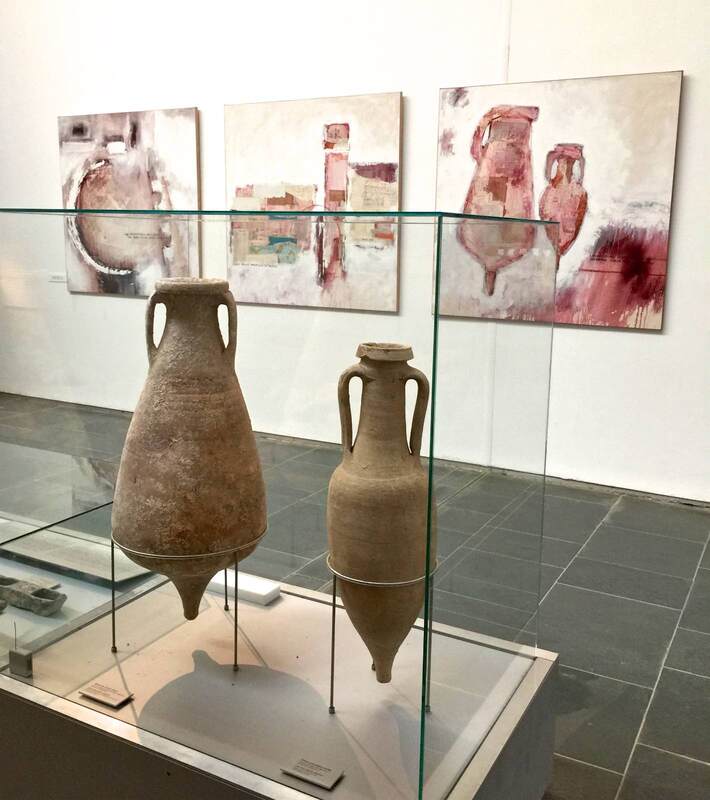
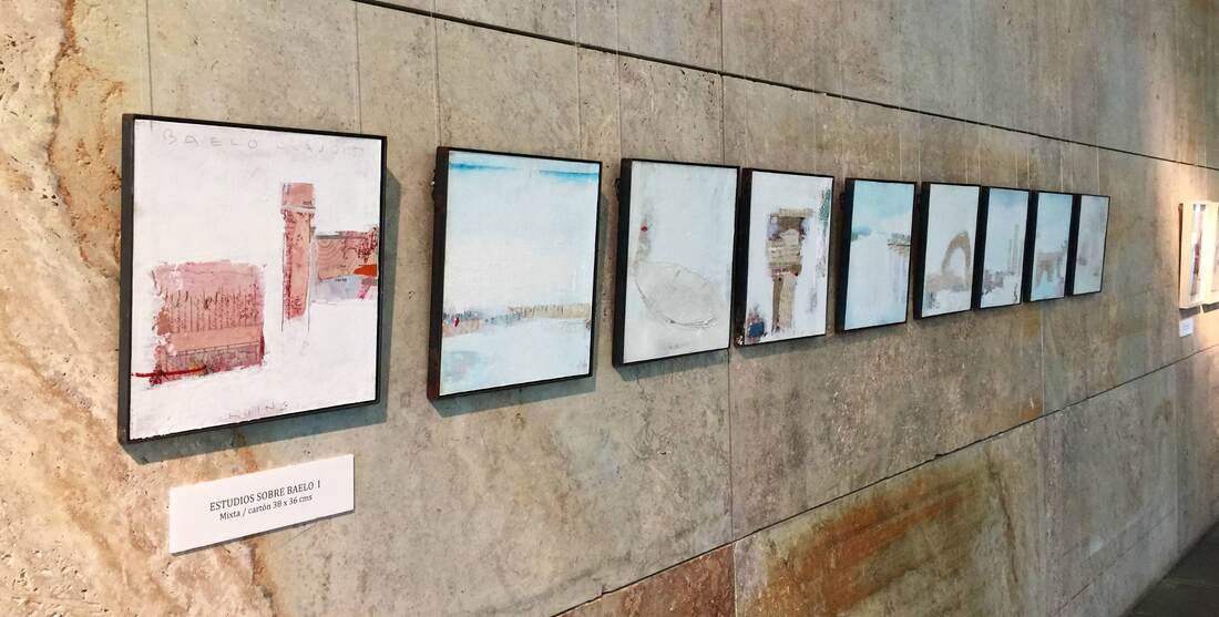
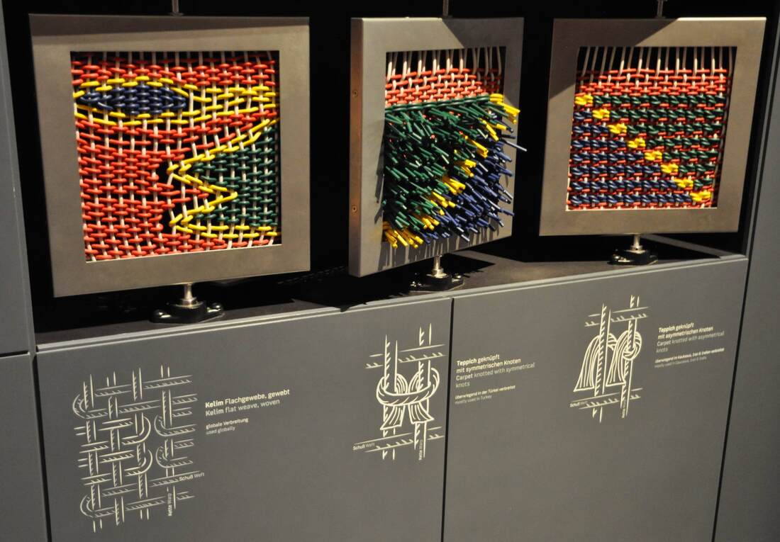
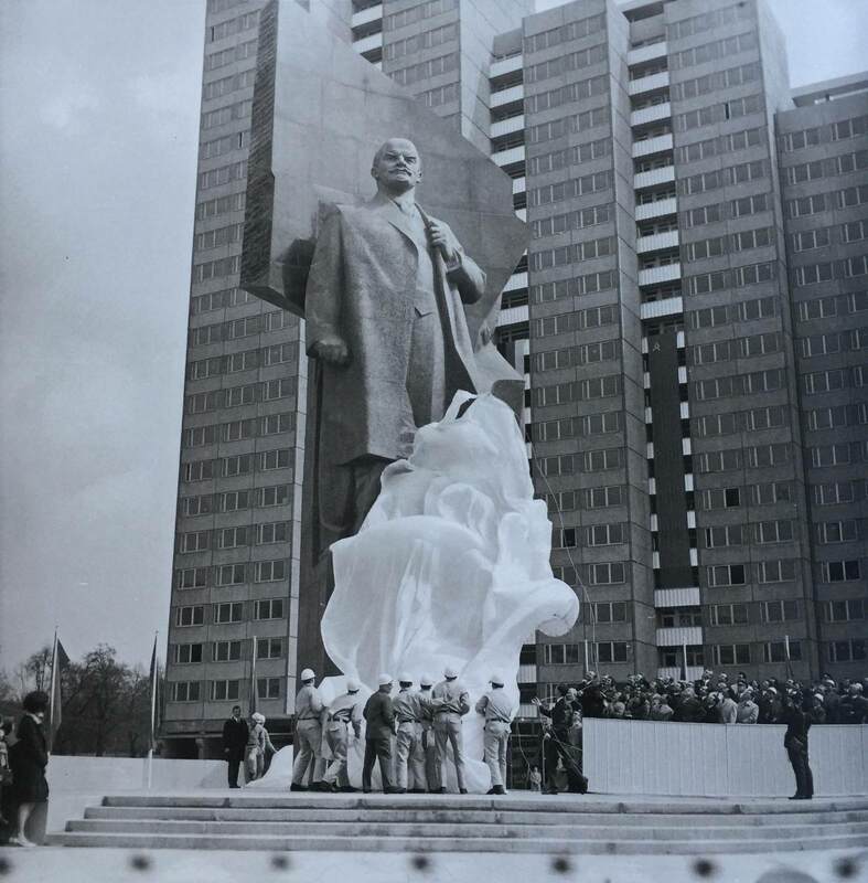
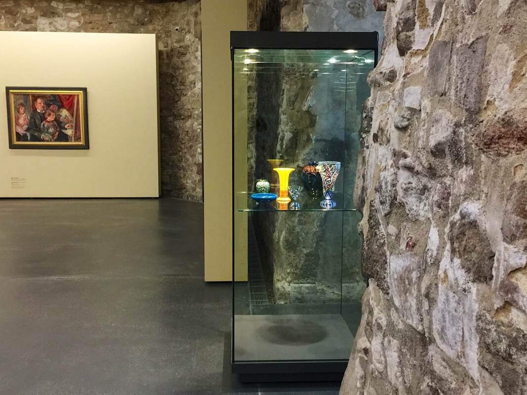
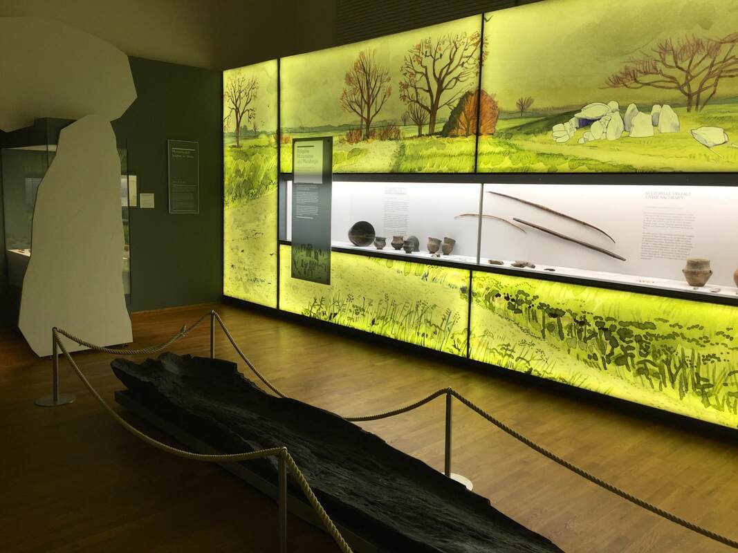
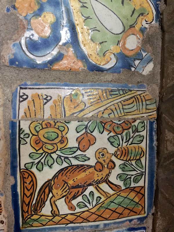
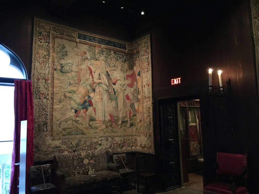
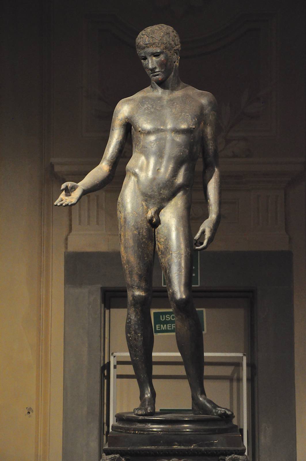
Are creative display ideas more likely to pop up in small museums than large ones? Sometimes it seems that way; perhaps they are more flexible and more closely in touch with their community, opening doors for conversations and collaborations. In any event, the small museum at the archaeological site of Baelo Claudia (modern Bolonia) in southern Spain offers a heartwarming display that seems to come from this sort of background. Contemporary two-dimensional artworks inspired by the site and the excavated objects are tastefully hung on the limestone walls. The works give a wonderfully lively impression of the site through the artist's eyes. The paintings of amphorae (above) encourage you to consider the shapes and colors in new ways, while the paintings of a famous arch at the site (below right) alert you to a now rather degraded feature that you might otherwise walk right by. As you know, I'm a big proponent of juxtaposing ancient and modern art for exactly these reasons: in complementing each other, they enrich our experience greatly!
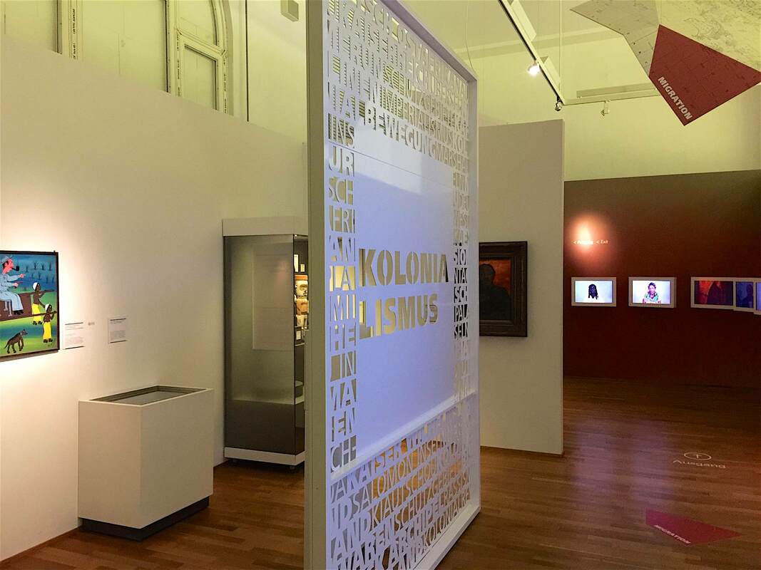
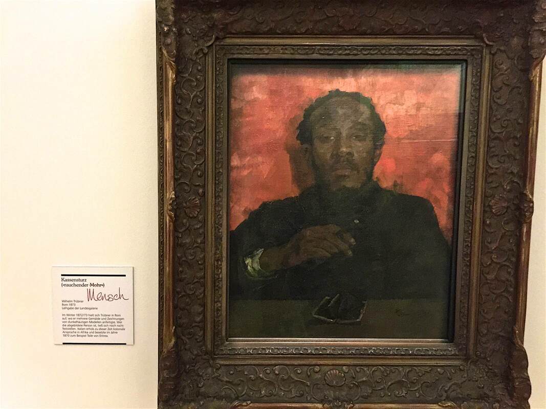
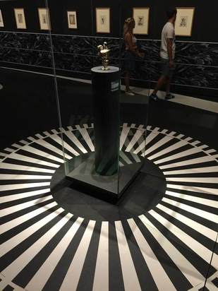
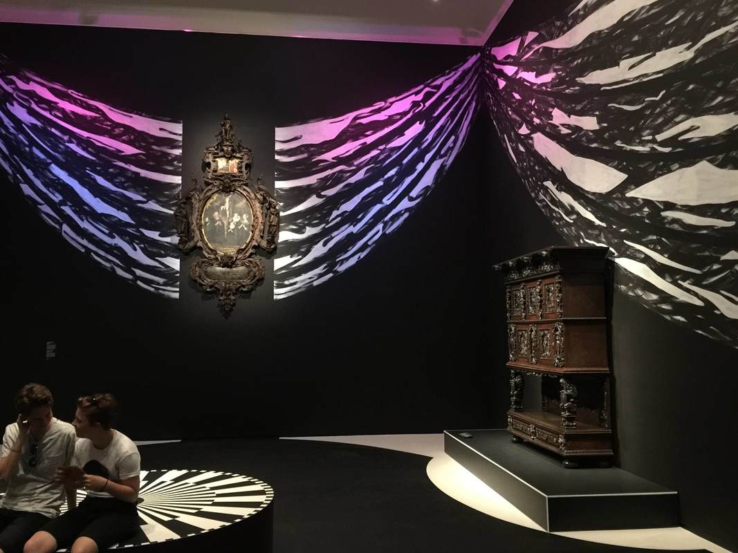
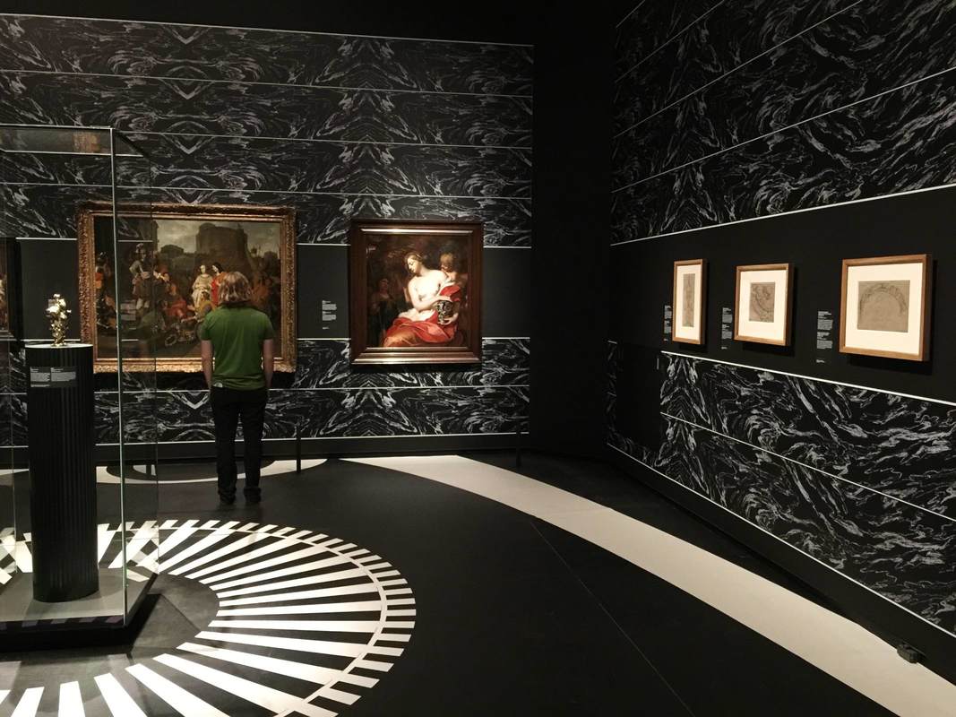
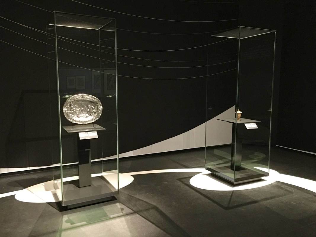
Amazingly enough, you can visit this museum on Google Arts & Culture - but this exhibition isn't on show in that version.
Amazingly enough, you can visit this museum on Google Arts & Culture - but this exhibition isn't on show in that version.

 RSS Feed