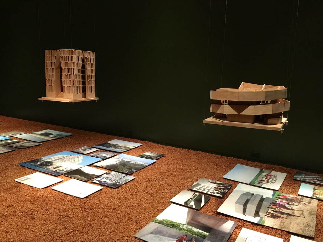
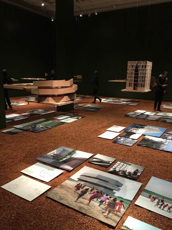
| But that's not all! The walls are able to be so dissolvingly black because all the signage and supplementary 2-D materials has been laid on the ground under the corresponding model. You could step on them if you weren't careful. But the thing is, you are careful, because the ground inserts itself constantly into your awareness—through the crushed lava stones covering it. You walk across the room with a glassy crunch-crunch underfoot. It's astonishing how strange this feels in a museum context. To my mind it evokes the natural environment of Bangladesh that is simultaneously Chowdhury's golden muse and his greatest hurdle. This Laufgefühl (sensation of walking) is a marvelous intervention, a way to heighten all the senses together. It definitely deserves more experimentation. |
|
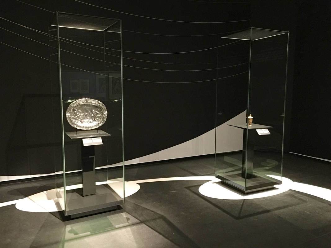
A revelatory multisensory exhibition is on view now at the Aedes Architecture Forum in Berlin. The show FARAWAY SO CLOSE. A Journey to the Architecture of Kashef Chowdhury / URBANA, Bangladesh takes wooden models of the architect Chowdhury's buildings, designed to meet the climatic challenges of Bangladesh, and hangs them from nearly invisible cables. Hovering against the black walls like UFOs highlights the otherworldly nature of the buildings' shapes; it emphasizes the literally out-of-the-box thinking behind the designs. A polygonal snailshell (above right), walls in concentric circles with aligned or offset entrances, or whole islands with central pools engineered to beat the constant floods—these are forms of elevated creativity. This experience meshed well with the symposium next door on museums in urban space, Extrovert Interior: Publicness and the Contemporary Museum. Asking how the museum mission is being relocated increasingly outside a single building (museum-in-a-box programs for schools, mobile museums on wheels and water, biennials in unexpected venues), the program was a poetic inverse to the exhibition's bringing-gravel-inside idea. All in all a very stimulating day at Aedes, and certainly not the last. I'm already looking forward to their next show, on Archi-Tectonics (Netherlands/New York).
The three latest episodes of the podcast Working (tagline: "Slate interviews Americans about their jobs") are dedicated to the work processes in the Museum of Modern Art in New York City. One of them, "Working at MoMA: How Do Exhibition Designers Do Their Jobs?," features a conversation with Lana Hum and Mack Cole-Edelsack, the Director and Senior Design Manager respectively of MoMA's Exhibition Design & Production Department. (I was lucky enough to meet Lana Hum in 2014 as part of the Center for Curatorial Leadership/Mellon Foundation Seminar in Curatorial Practice.) It's a fun conversation to listen to: both the interviewees and interviewer (Jordan) have smart things to say and seem to be having a good time. A few novel points jumped out at me:
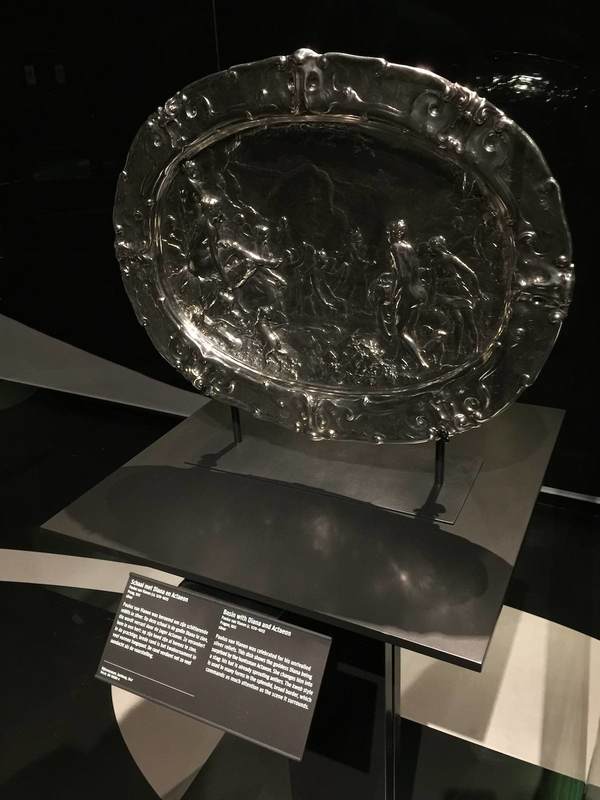
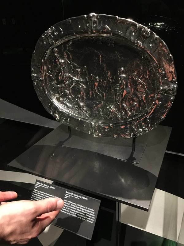
I look forward to hearing the other two episodes about MoMA's operations! This last post about the KWAB exhibition in Amsterdam's Rijksmuseum concerns lighting. This show got me and my partner-in-museology thinking about the potential for self-directed lighting in museum display. The impetus was this lovely, huge, embossed silver platter. Its fabulously fine relief is hard to see in any detail, not because the lighting is poor per se, but because it is static. Especially for objects that would have been handled, passed around, held up to the light, or simply displayed in a space where people could view it from different angles, the viewing conditions offered by a museum could hardly be more different. And it can be frustrating to try to make out what all those tiny relief people are doing on this silver thing; even I was inclined to give up and move on to something more decipherable. But adding a couple of pink hands as a reflecting screen (above right) changed everything—even more so when moved from side to side! The addition of not only light but color and movement made the relief eminently more legible. This is the reason that Reflectance Transformation Imaging works so well (here's the process): under different lighting conditions, especially ones we can adjust and move at will, we can perceive relief and texture much more easily.
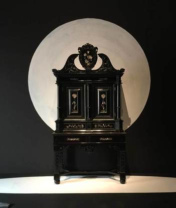
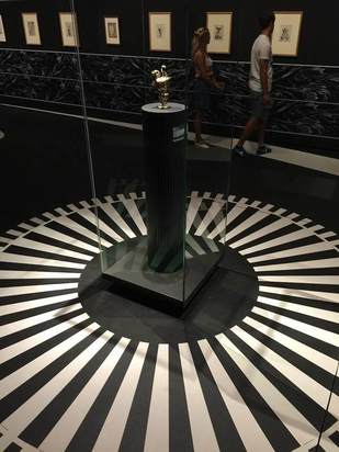
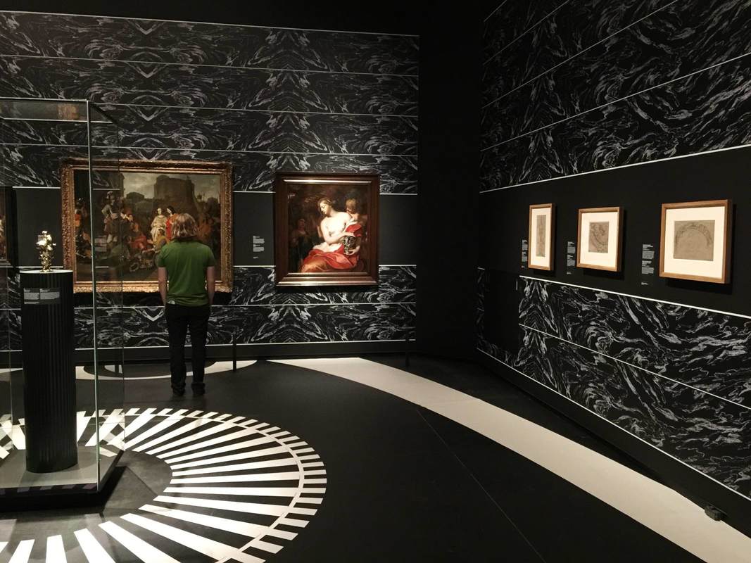
So how about visitor-directed lighting? This could be as simple as offering visitors sheets of printer paper at the entrance and encouraging them to use it as a reflecting screen (on objects in glass cases only, if you're worried about paper and people getting near unprotected objects). But personally I think it would be exciting as a central element of a show; it could even be the main topic, "Old Things in New Light." You could experiment with little lights mounted on tracks in front of the objects, so the visitor can slide the light from side to side. Heck, grab that gooseneck lamp from your desk and mount it next to an object—there, you've got interactive, user-directed lighting! There are dozens of forms this could take, and just as many epiphanies about the objects in new light. Let's go wild and see what happens. Another notable aspect of the show KWAB in the Rijksmuseum, Amsterdam is the background painting. Walls and floors alike are painted with bold black-and-white designs carefully arranged to highlight the objects. This geniusly serves several purposes: 1. Emphasis The painting can be used to make an object really pop out at you. The beautiful ebony armoir above (left) gains a whole new life from the white moon behind it. The sinuous curves at the top of the chest stand out against the light background, and the hovering circle gives the piece a lively dynamic—almost as if it were a nocturnal creature standing in a moonlit landscape. The tiny silver pitcher above (right) gets an injection of energy from the white rays radiating out across the floor. They turn the pitcher into the source of a geometric explosion, and who doesn't want to look closer at that?? 2. Context The same black-and-white painting technique on the walls is used in another way, namely to recreate a sense of the objects' original context. Keeping the monotone palette is a nice way to keep the "reconstruction" attempt from becoming distracting, while at the same time contextualizing objects rather unfamiliar to a modern viewer. In the photo below, the oval painting in an elaborate wooden frame is hard to imagine wanting to hang on your living room wall; but with the illusionistic swags of drapery emanating from it, it gains the elegance and appropriateness to the opulent display context it was originally meant for. 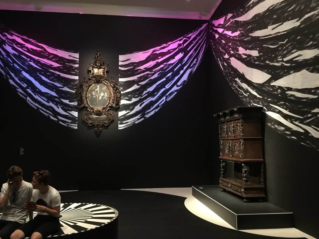 In the room below, a different pattern is used to imitate the wall decorations of the time, which in richer houses included embossed leather (!) wallpaper and wooden paneling: 3. Directing Movement In both the room above and that shown below, the wall and floor painting is used to encourage us to move through the exhibition in certain ways. Above, a long white band leads us from the bottom right (a doorway is just off the photo to the right), along the wall of drawings, and over to the paintings at left, where the half-circle of white under the center painting encourages us to linger. White stripes and circles similarly guide our movement between these two glass cases, this time reinforced by a subtle white curve on the rear wall: Such a simple and effective device as these paintings seems worth keeping in mind. Certainly, painting the floor will not often be possible in an exhibition, depending on the space (the Getty Villa's marble floors...). But for the wall paintings at least, I would be curious whether the extra cost and time for installation makes them practical or prohibitive.
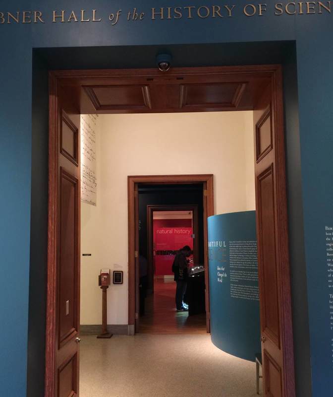
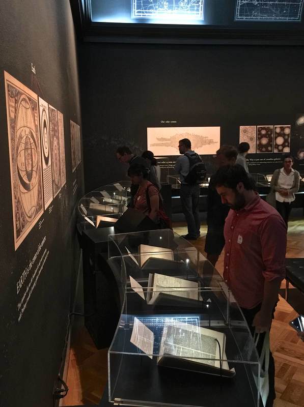
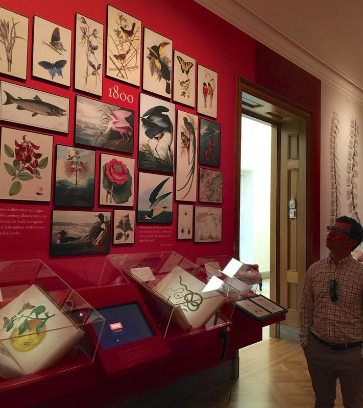
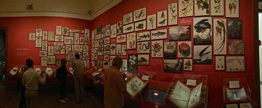
The first clue that the curators at The Huntington Library have thought long and hard about the presentation of their History of Science exhibition (which curator Daniel Lewis kindly showed us) is in the entryway, pictured above. The blue, curving wall on the right is a subtle mechanism for attracting people through the door—what is this surface? what is written on it?—and guiding them into the first gallery. Imagine a large flat wall panel in its place: it would produce a very different effect! Curves define the first gallery space as well. These beautiful curving vitrines were conceived to echo the "heavenly sphere" that is the subject of this room, dedicated to astronomy. (Yes, the ceiling is vaulted too!) Dr. Lewis installed low cases so that the visitors can get up close to the books, as if they were holding them. But since this means that people bend over the cases to look inside, the lights had to be specially mounted inside the cases so that the viewer's head wouldn't interrupt a light source shining from overhead. Detailed planning that bespeaks years of experience. . . or unusual design foresight. The next room also employs a great device for luring viewers close to the books. Dedicated to the central role of observation and illustration to the development of natural history, the walls are a vivid red that highlights the beautiful reproductions of book illustrations hung in a sort of collage style. To convey a progression through time, the earlier drawings are hung at left, followed by later lithographs, color lithographs, and prints. The ensemble is not only beautiful but inspires curiosity in the books below, which contain further illustrations and, of course, text. The presentation functions on both the level of immediate impact (beautiful wall design) and closer encounter (approaching the objects and delving into the information presented). As the curators plan to reinstall this exhibition in the coming years (it certainly doesn't show its age; it is already nine years old), I look forward to seeing what they come up with for the new incarnation.
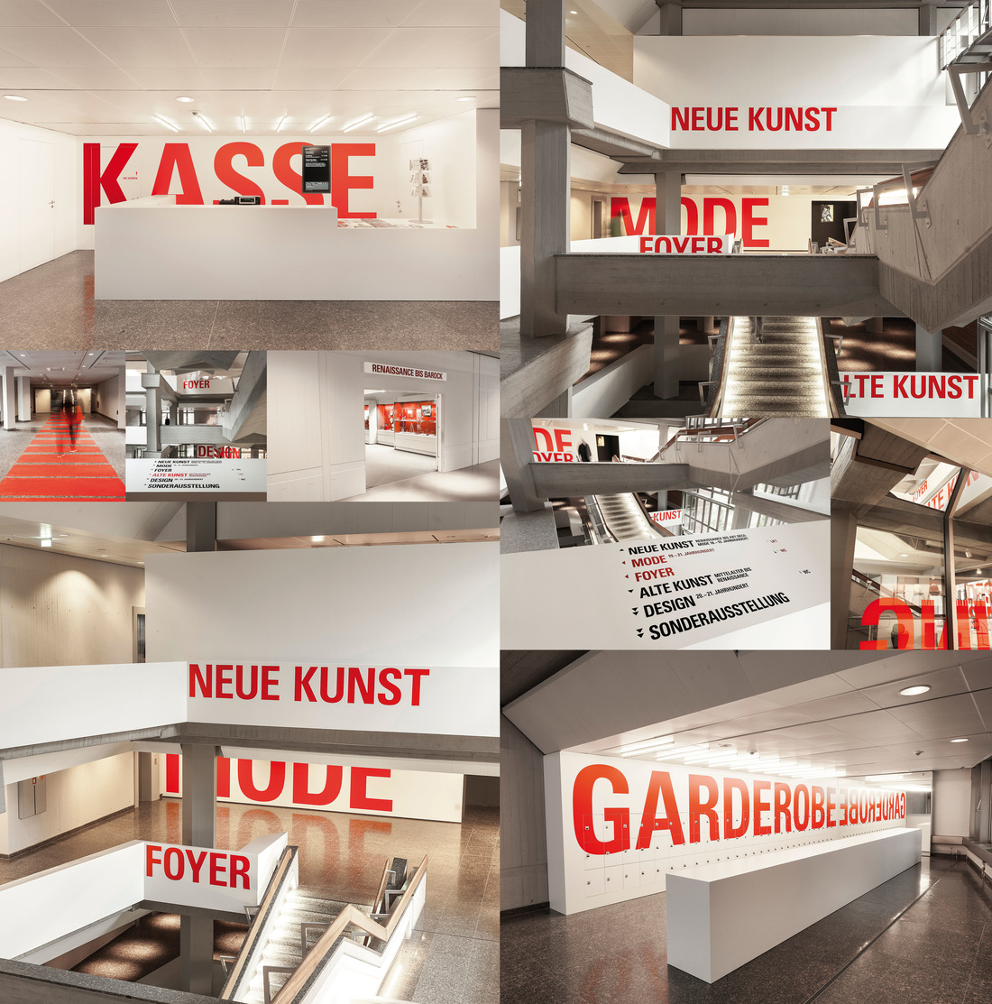
Well-designed signage is a rare and precious gem. In a museum, signage can set the tone for a visitor's entire visit: because if she starts by buying a ticket, checking her coat, using the bathroom, and then finally entering the gallery she most wants to see, she's already had to locate at least four separate areas of the museum, probably by following signs. And if that process was easy—i.e., well-signed—she'll ideally be in a fine mood; but if it was difficult, she may enter the galleries feeling grumpy or frazzled, and that will color her experience of the whole museum.
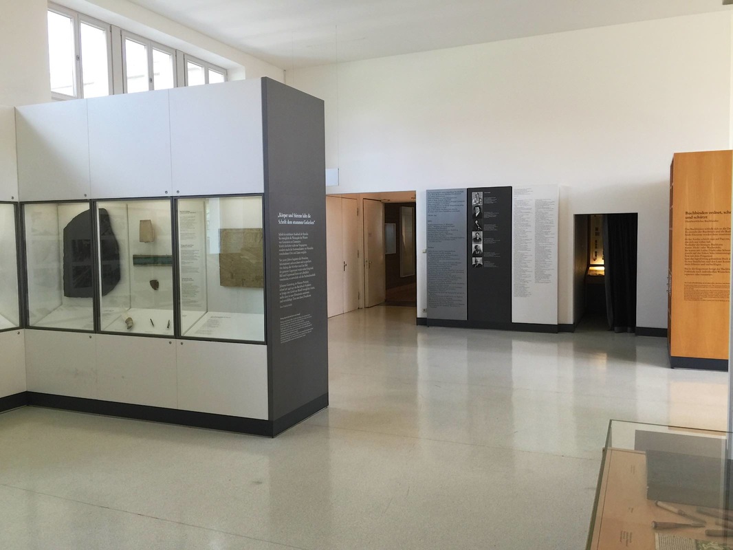
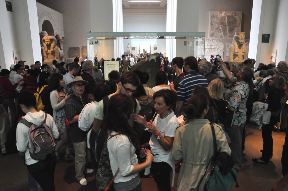
So kudos to Berlin's Kunstgewerbemuseum (the museum of decorative arts and design) for putting writing on the wall that no one can miss, and winning a design prize along the way. The eye-catching size and color of the signage creates a certain aesthetic effect that not all museums would want, but it accords well with the all-parts-visible idea behind Rolf Gutbrod's 1960s building. Even award-winning signage has two potential weak points, however. First, it has to be wriiten in a certain language—here German, which some visitors may not understand. Second, there is a compelling argument (nicely presented in an airport example in the addictive design podcast 99% Invisible) that the architecture itself, not just signage, should help guide the people in it. But since purpose-built buildings are not in the cards for most museums (and even if they are, wayfinding is only part of their mission), it's worth taking signage seriously. What do these two photos have in common? True, both were taken inside museum galleries—even if the location is obscured in the lower photo by the throngs of people, completely lacking in the top photo. The main point in common is the large dark object on display in both galleries: the Rosetta Stone. The "stone" in the top photo, taken in the Deutsches Museum in Munich, is actually a plaster cast of the original; the original stands in the British Museum, shown in the lower photo. The crowds illustrate the value we place on authenticity—but could it also be symptomatic of the different display concepts? The cast of the Rosetta Stone in Munich is certainly no crowd magnet, but it is also not set up to be one: rather, it is a supporting actor in the gallery on writing and printing technologies. In the British Museum, by contrast, the Stone is displayed right at the entrance to the ancient art wing (creating traffic problems), telling visitors (as well as expecting them to know already) that it is a highlight. Cues like this definitely affect the way visitors clump and move among the displayed objects.
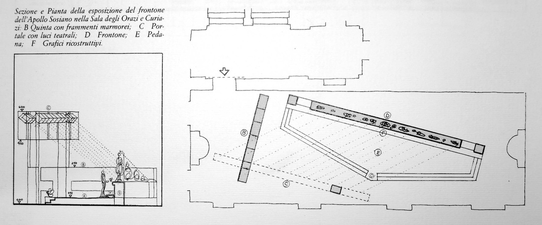
An exhibition based on a single object can be wonderfully pointed, but it can also hard to stage — especially when the single object is an enormous (albeit fragmentary) pediment from an ancient Greek temple. The Amazzonomachia exhibition that took place in the Palazzo dei Conservatori, Rome, in 1985 faced precisely this problem: how to exhibit a large set of sculptures lined up in a row, as they would have been in the original pediment, without producing a deadening effect? Marble statues standing in a row are not exactly an invigorating sight. Especially when fragmentary, they can appear painfully static and unengaging. To encourage a viewer to come closer and spend time with the objects, the Amazzonomachia design had to introduce an element of variety into the layout, lending a touch of movement to the ensemble.
The designers arrived at a very clever solution (shown in the plan above). They set the entire pediment (D) at an angle relative to the gallery, so that the sculptures do not simply line one side of the long space. This also presented the viewer with a more frontal view when she entered from the short side of the gallery, rather than an end-on view down the long sculptural lineup. Building on this idea, the pediment was set on a trapezoidal base (E) of which one long side parallels the gallery wall — thereby incorporating it seamlessly into the space, rather than allowing it to look arbitrarily, bizarrely skewed. The base itself is cunningly engineered to serve several purposes: it unifies the objects into their original grouping; it emphasizes the objects by elevating them above floor level; and the three steps leading up to the pedimental sculptures invite the viewer to approach, climb up, get closer. The cherry on top is that its trapezoidal shape echoes that of the ancient triangular pediment, as if projected here onto the ground. This final subtle touch would likely not be noticed by a visitor in the room, but may well have produced an unconscious kinesthetic impression that would reinforce the concept of the show. (The catalogue for the show is here, while several photos of the sculptures can be seen here.) An astounding number of museums sprinkle the Berlin landscape. By the city's own count, there are over 170. While some of the museums on that list are extremely well-known and heavily frequented — foremost being the Pergamon Museum, with some 1 million visitors per year — many are small, quirky, and practically undiscovered. Neighborhood museums belong to this genre. Off the radar for most tourists, these museums focus on the history and culture of the immediate locality (Kiez); they must be a dream for school groups, and offer the curious visitor too an unusual glimpse of local life.
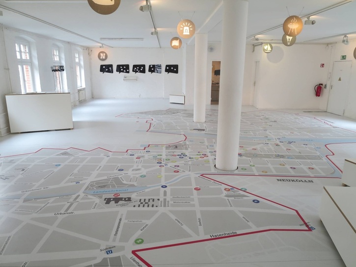
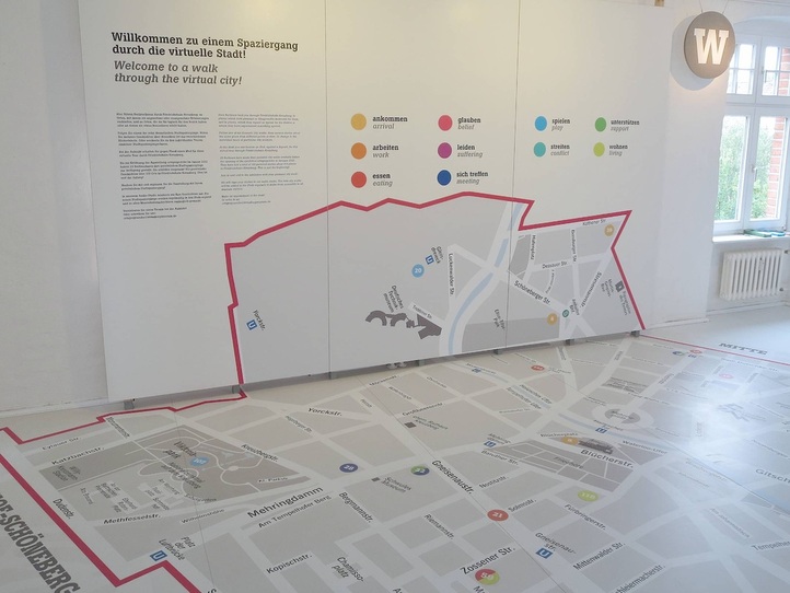
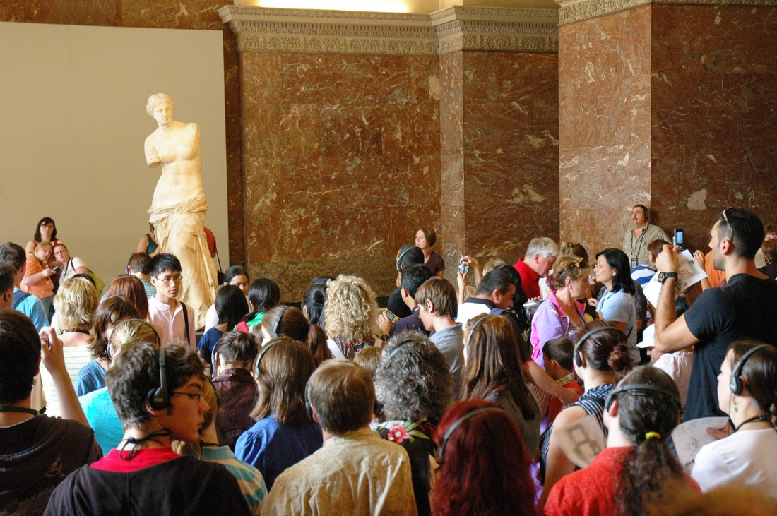
Of the 20 Kieze in Berlin, more than 11 have their own dedicated museum. One of these, the Friedrichshain-Kreuzberg Museum, occupies several refurbished stories of a building in the geographical center of the Kiez. The third floor (or fourth, in the American system) is entirely devoted to a beautiful big map of the area marked by easy-to-read landmarks and colorful numbered circles. The clean white walls, ceiling, floor, and pillars lend an airy feeling, and the room almost feels empty — until you step into it and use it for what it was intended. Borrowing a set of headphones and an iPod, the visitor is meant to walk around the map listening to local Berliners tell their stories linked to specific locales. The stories have been grouped into ten themes, each marked by a different color and labeled on the wall: from "work" and "eating" to "belief" and "suffering," the themes are both straightforward and richly textured. The visitor can opt to follow a certain color to hear stories related by theme, or select a path of stories all told by the same person, or wander the map at will choosing stories of any color or location. It is a marvelous trick of kinetic learning, made even more effective by gorgeous graphic design. That the stories are personal and told by inhabitants of the Kiez rather than actors, specialists, or museum staff makes them very compelling. In fact, the introductory panel invites visitors to make an appointment to record their own stories in the museum's audio studio! So as it turns out, this spacious white room is filled with only half of a display: the other half comes from the visitor bringing in her own exhibition content, her personal history. Local engagement couldn't get any more local and engaging. Today's post is inspired by a New York Times article about the booming number of visitors to a few national art museums and the measures the museums are taking in order to accommodate such crowds (and protect the objects). While not specifically discussed in the essay, one of the issues bundled up with this phenomenon relates directly to this blog: How can a museum effectively display its collection for a whopping 9.3 million visitors per year (Louvre), or 6.7 (British Museum), or 5.5 (Vatican)?
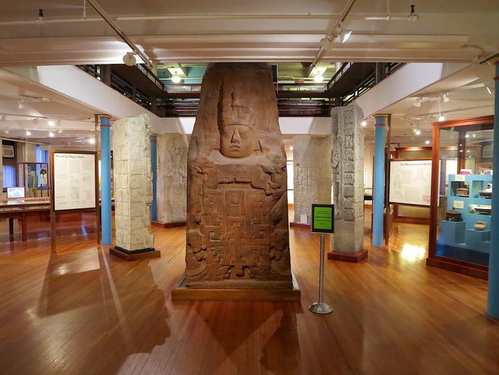
One solution is the "Venus de Milo" approach pictured above: a capacious room containing a single blockbuster object, allowing many visitors to stand and circulate throughout the large space. Extra elbow room is especially important when so many visitors are using audio guides that lead them to spend one or more minutes looking at the object. Another solution is the "Rosetta Stone" setup pictured below. Here the stone is displayed in the center of two intersecting galleries, protected by a glass case. This places the object in relation to the other materials nearby — in this case, other Egyptian works in stone — and therefore nicely contextualizes the piece. A concomitant drawback is the relative lack of space for the many visitors interested in such a famous piece. It's a difficult problem of spatial engineering which, if the predictions in the NYT article can be believed, will only become more pressing. One of my favorite museum galleries on a recent trip to Boston was the atrium-like core of the "Encounters with the Americas" galleries in the Peabody Museum of Archaeology and Ethnology at Harvard University. The diagonal arrangement of display cases is a wonderful way to slow down the visitor, to encourage her to pause and look: the lack of a straight axis through the room offering a clear line of sight to the next room hinders the common mode of jetting right through the gallery, hardly glancing to either side along the way. The effect here is of course helped by the quite sizable piece of beautifully carved stone blocking the trajectory. Erecting the smaller stone pillars on the diagonal too adds some movement to these otherwise heavy, static pieces.
Subdivisions in the gallery are achieved in part by large explanatory panels, similarly set on the diagonal, acting like half-walls to guide the visitor into differently-themed spaces. (And hooray for the copious information on those signs!) A final nice touch is the use of antique wooden display cases outfitted with new blue risers. The risers are almost a sort of minimalist artwork in themselves, and certainly freshen up the older cases without being distracting. |
Ideas on Display
A humble space to reflect on concepts of museum display as enacted across a wide range of subjects, countries, and approaches.
Archives
April 2020
Categories
All
|


 RSS Feed