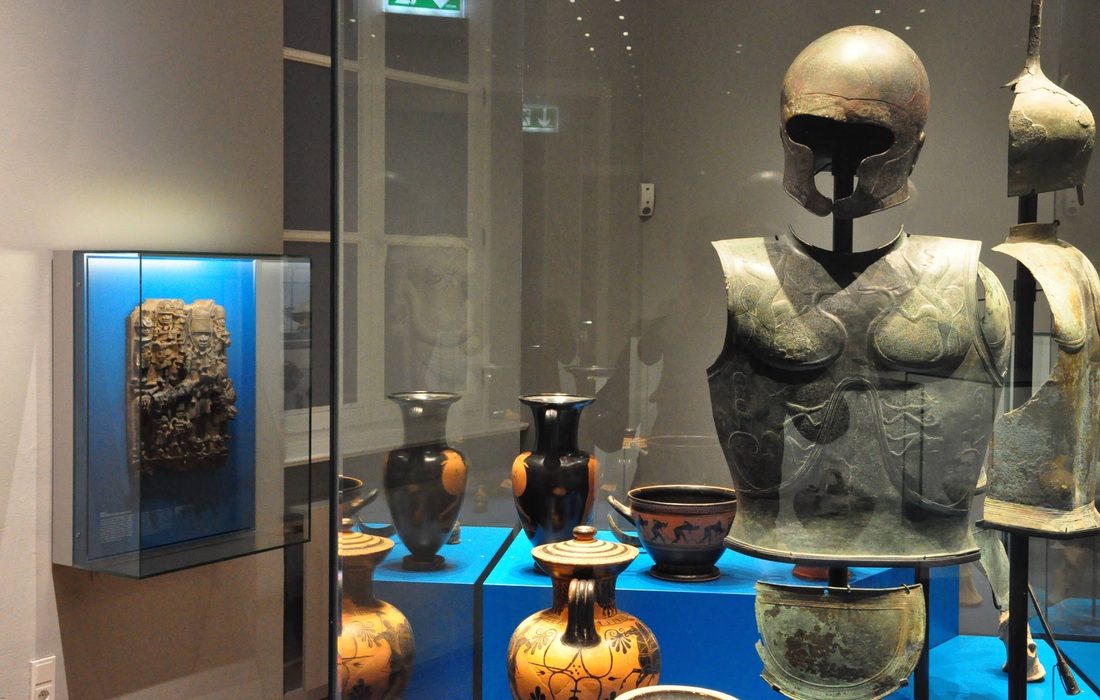
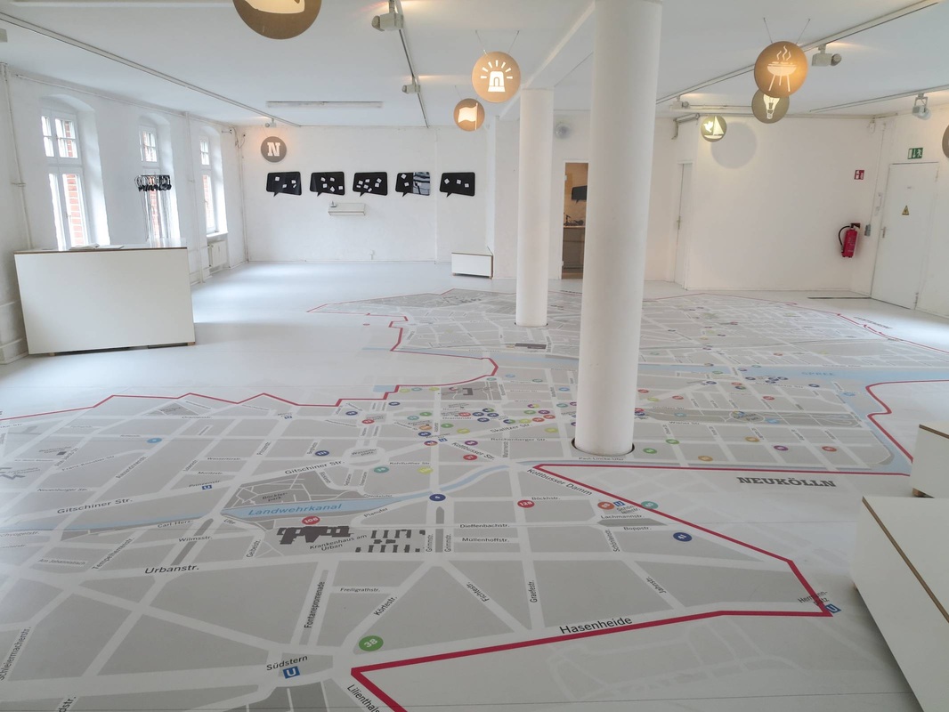
Yesterday I finally made it to Museumsdorf Düppel in Berlin, an open-air museum that has been on my to-do list for years. It centers on an absolutely charming reconstruction of the 12th-century village excavated there primarily in the 1970s. The houses with reed roofs and mud walls are impressive for their craftmanship, as well as the feeling they give you of standing really and truly in a medieval village. The lightly damp, gray, freezing weather enhanced the effect. Hats off to the capable people who made it possible to live in such conditions, constructing surprisingly cozy houses and fashioning their own clothing, tools, candles, food, and on and on. Truly impressive!
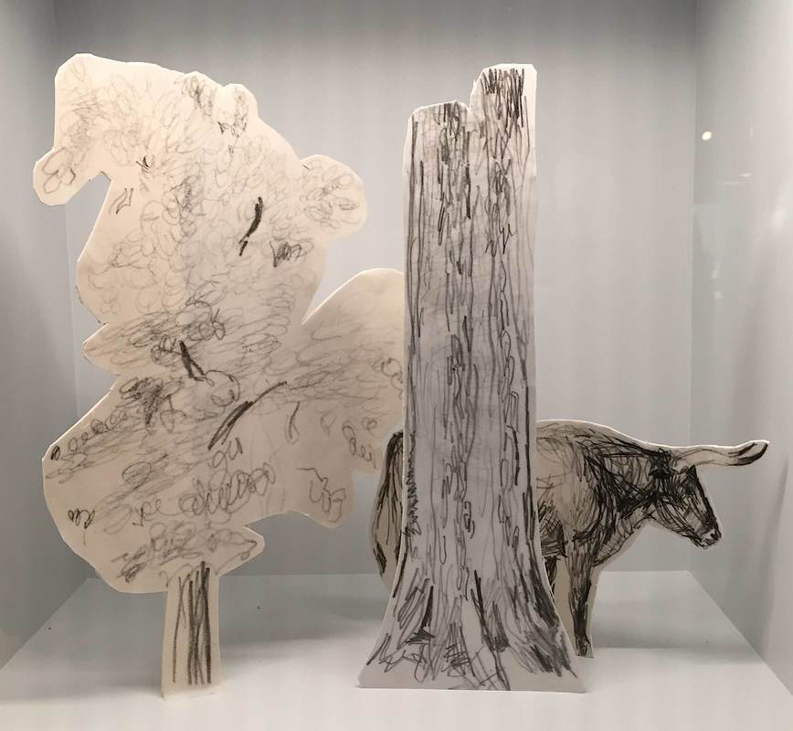
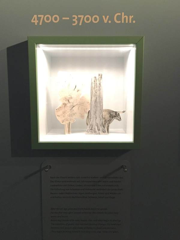
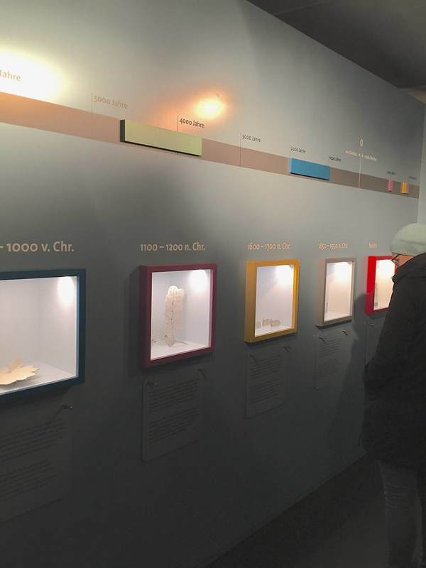
As a supplement to the village, the small interpretive center is a gem. "Klein aber fein," small but fine—the description fits perfectly. One of the displays that caught my eye for being both economic and effective is the timeline: a series of small lit vitrines sunk into the wall boasts a series of colors, each vitrine framed by a different hue. These correspond to the colored bands on the timeline above, which stretches from 10,000 BC to the present day. Each vitrine holds a miniature diorama of the landschaft around the village in the indicated time period (a title for the whole wall would help convey this: Changing Landscapes, or some such). I went gaga over the grace of the dioramas—constructed of cardstock cut-outs with simple pencil drawings, they are outrageously simple yet communicative works of art.
As a supplement to the village, the small interpretive center is a gem. "Klein aber fein," small but fine—the description fits perfectly. One of the displays that caught my eye for being both economic and effective is the timeline: a series of small lit vitrines sunk into the wall boasts a series of colors, each vitrine framed by a different hue. These correspond to the colored bands on the timeline above, which stretches from 10,000 BC to the present day. Each vitrine holds a miniature diorama of the landschaft around the village in the indicated time period (a title for the whole wall would help convey this: Changing Landscapes, or some such). I went gaga over the grace of the dioramas—constructed of cardstock cut-outs with simple pencil drawings, they are outrageously simple yet communicative works of art.
 |  |


 RSS Feed