- "The top emoji requests included the robot, the heart, the rainbow, 'and, of course, poop,' Mr. Winesmith said. 'And then, because it’s the internet, it’s a lot of food and a lot of animals.'"
|
SFMOMA's video about their "Send Me" program (link below).
I'm too excited about this news to omit it from this blog on the grounds of not being a display technique. Anyway, as a highly interactive medium to generate visitor interest in the collection, it is part of a synergy with actual displays—and, crucially, it works outside the museum as well as inside. So what is this all about? A recent article in the New York Times reports that the San Francisco Museum of Modern Art is reaching potential visitors via a text message program. Texting the museum at 57251 with the request "Send me ---" will retrieve an automated response of a photo of an artwork at SFMOMA captioned with its creator, title, and year. In a twist of modern hilarity, the "---" can be a word or, yes, an emoji. This has led to fascinating data on visitors' desires and interests:
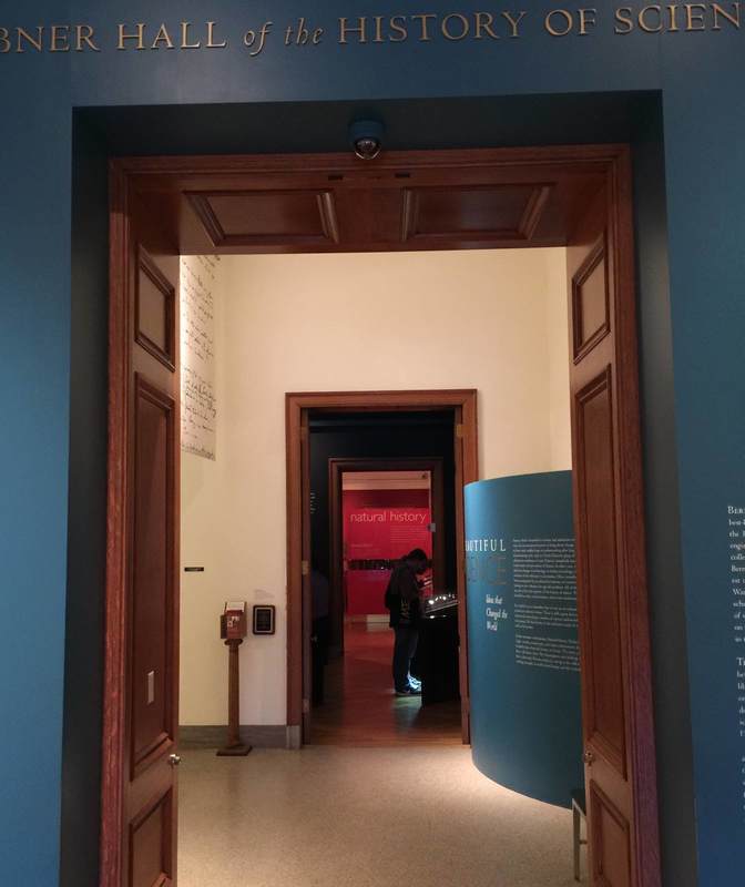
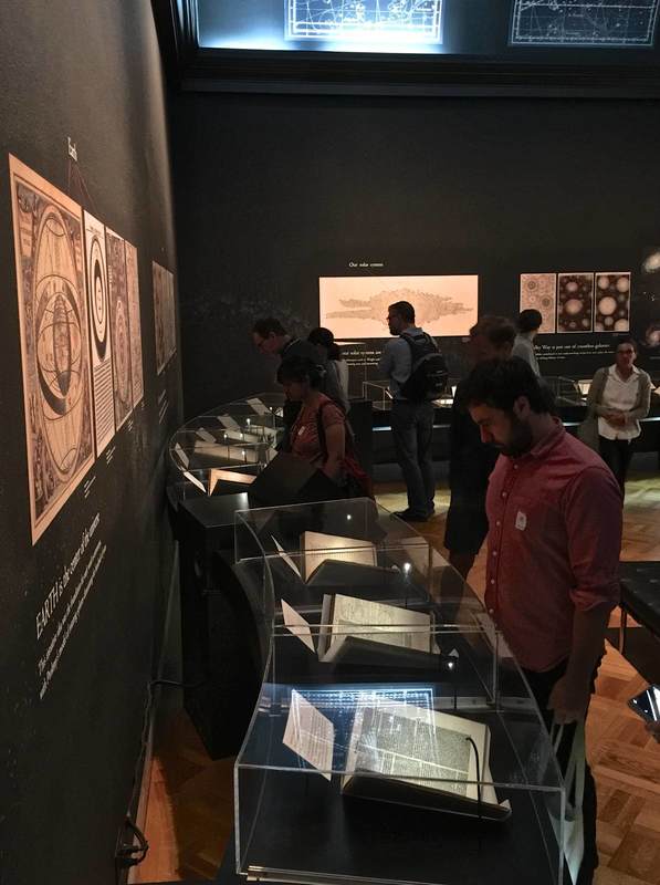
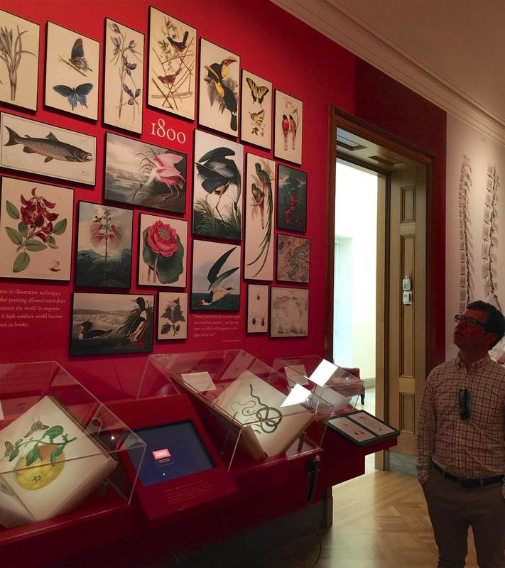
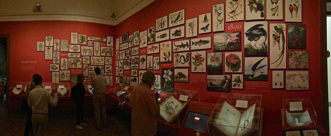
The first clue that the curators at The Huntington Library have thought long and hard about the presentation of their History of Science exhibition (which curator Daniel Lewis kindly showed us) is in the entryway, pictured above. The blue, curving wall on the right is a subtle mechanism for attracting people through the door—what is this surface? what is written on it?—and guiding them into the first gallery. Imagine a large flat wall panel in its place: it would produce a very different effect! Curves define the first gallery space as well. These beautiful curving vitrines were conceived to echo the "heavenly sphere" that is the subject of this room, dedicated to astronomy. (Yes, the ceiling is vaulted too!) Dr. Lewis installed low cases so that the visitors can get up close to the books, as if they were holding them. But since this means that people bend over the cases to look inside, the lights had to be specially mounted inside the cases so that the viewer's head wouldn't interrupt a light source shining from overhead. Detailed planning that bespeaks years of experience. . . or unusual design foresight. The next room also employs a great device for luring viewers close to the books. Dedicated to the central role of observation and illustration to the development of natural history, the walls are a vivid red that highlights the beautiful reproductions of book illustrations hung in a sort of collage style. To convey a progression through time, the earlier drawings are hung at left, followed by later lithographs, color lithographs, and prints. The ensemble is not only beautiful but inspires curiosity in the books below, which contain further illustrations and, of course, text. The presentation functions on both the level of immediate impact (beautiful wall design) and closer encounter (approaching the objects and delving into the information presented). As the curators plan to reinstall this exhibition in the coming years (it certainly doesn't show its age; it is already nine years old), I look forward to seeing what they come up with for the new incarnation.
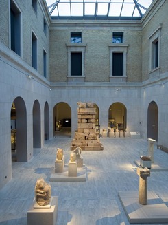
Museum Exhibition Reviews return to AJA: J. Shaya on the Museo Arqueológico Nacional, Madrid3/16/2017 Given that the mechanics of museum exhibitions can make all the difference between an effective show and an ineffective one, reviews of museum exhibitions are surprisingly hard to come by. In the scholarship on Greco-Roman civilization, at least, exhibition catalogs are much more commonly reviewed than the exhibitions themselves. This is a shame because exhibitions can communicate just as powerfully as books—and sometimes, of course, more so. They are an invaluable tool of scholarship that can propel research forward as well as public interest in it! Taking them seriously is a win for scholars, museums, visitors, everyone.
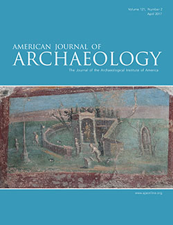
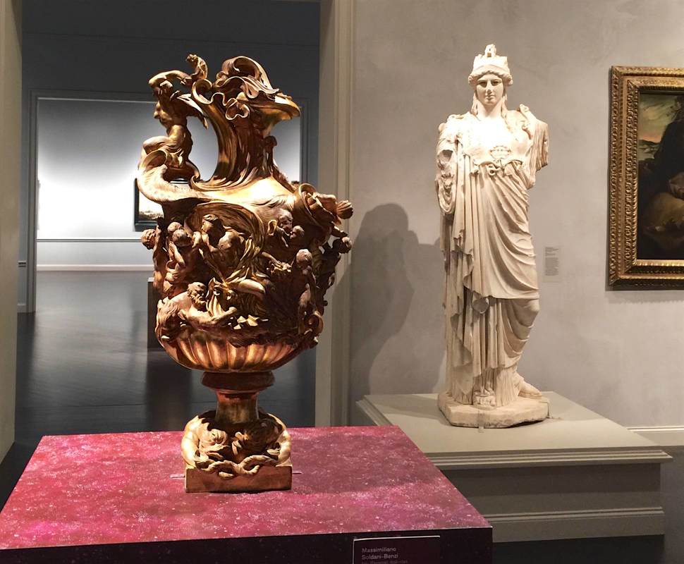
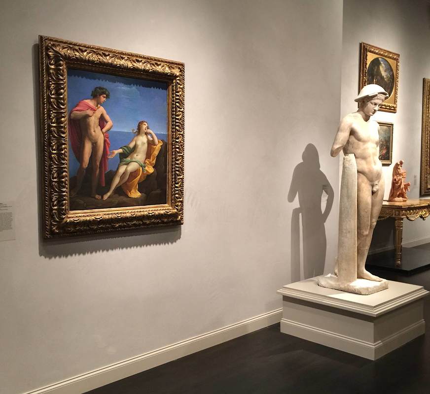
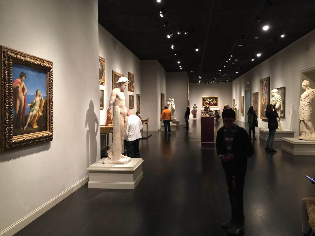
So three cheers for the resumption of museum exhibition reviews in the leading U.S. journal of Mediterranean archaeology, the American Journal of Archaeology. In the newest issue, Josephine Shaya evaluates the recent renovation of the Museo Arqueológico Nacional in Madrid, Spain. An online photo gallery accompanies her article. The same issue, in fact, includes a review of an exhibition catalog that illustrates how productive the synergy (or unity?) of brand-new scholarship and groundbreaking exhibition can be: Power and Pathos (Getty Museum, 2016) by Jens M. Daehner and Kenneth Lapatin. Visiting the Los Angeles County Museum of Art (LACMA) for the first time in many years, I was surprised (and admittedly, as a specialist in ancient art, dismayed at first) to find that the onetime gallery of ancient art has been disbanded. The Greek and Roman sculptures now stand in the galleries of European art—the ancient statues and vases joining the post-antique paintings, sculptures, and decorative arts (photo below). From my initial skepticism, however, I was completely converted to the curators' way of thinking: the pairing of old and new really works! It brings out similarities in the content, form, and even artistic style that would otherwise be lost; and the sheer visual variety of white statues with more colorful objects is beautiful and interesting (much more so than a room full of only white statues). What's more, bringing ancient art into the European art gallery underlines how fundamental it was to the artistic training of these later periods. This central art-historical concept can be grasped in a single glance because the pairings here so effectively highlight the parallels between the objects—as in the statue and painting below, both featuring classic male nudes in contrapposto. At the same time, the juxtapositions open up new ways of thinking about form—as in the second-century Hope Athena statue and ca. 1695 vase above, both with swirling drapery and twisting snake(like) edges.
Placing objects into an exhibition space requires thinking about them in a new way. While a individual piece might be the focus of art-historical research, when it enters a space shared with other objects, suddenly all the pieces become part of an interaction. Each piece plays with the other objects in the space and with the visitors. And the game is no longer just art-historical but also strictly formal (form-based)—in the sense that objects inhabiting a common space can be compared and contrasted simply in terms of their appearance, which for a single object would be impossible. Parallels and harmonies emerge; so too variations and dissonance.
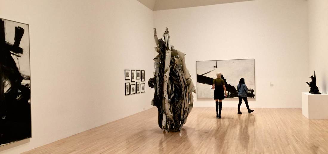
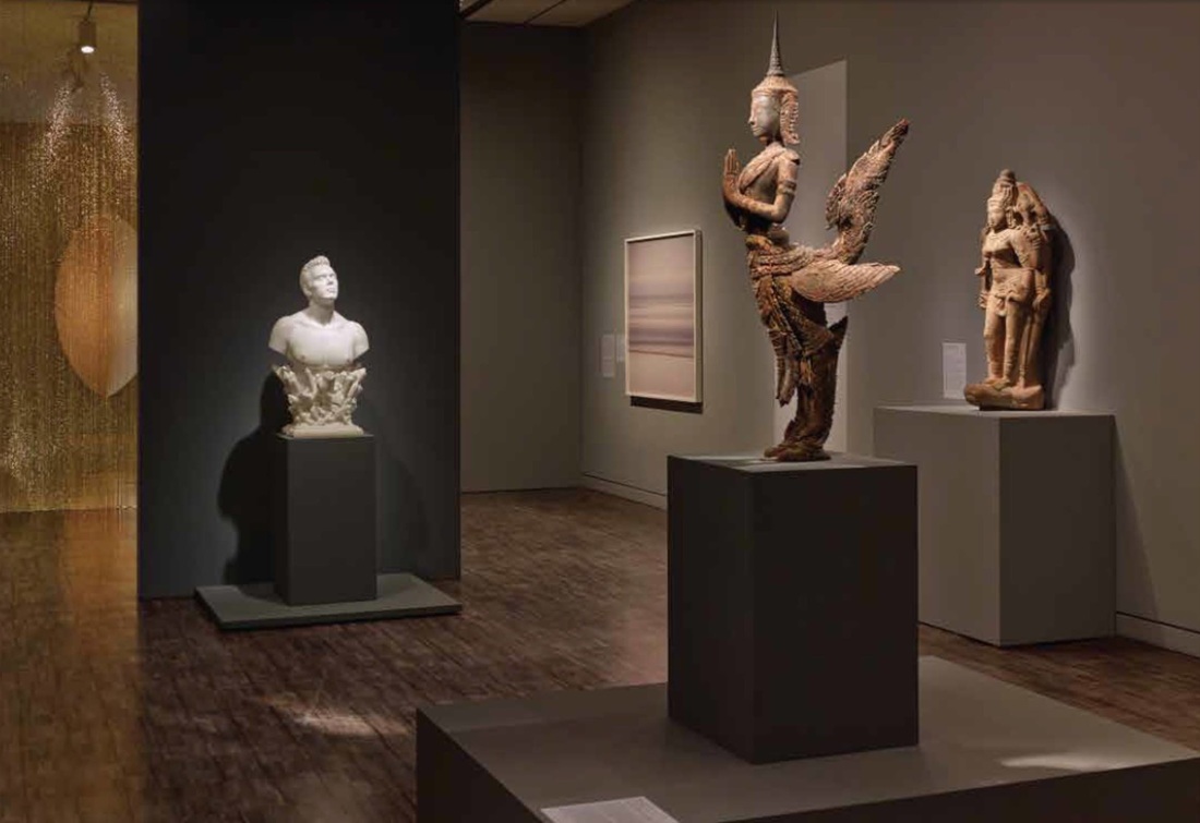
This is especially obvious in a gallery of the Museum of Contemporary Art, Los Angeles (above). The objects in this room (part of the exhibition of the permanent collection) are all monochromatic, a unifying factor across the media of painting, metal sculpture, wood sculpture, and photography. What's more, the compositions of all the larger works have a strong vertical element: the paintings send up powerful black brushstrokes, while the two sculptures point long fingers skyward. The viewer's eye bounces from one to the next, drawing her in for a closer look into the black-and-white vortex. Another element that struck me in the American Alliance of Museum's 2015 list of prizewinners in exhibition design and label-writing—beyond the two labels highlighted in the last post—was a diaphanous golden curtain. It appears in the AAM's photo of a gallery in the exhibition Gorgeous, which showed at the Asian Art Museum of San Francisco in 2014. Although it received no special mention by the AAM (this gallery was singled out for a label, not exhibition design per se), it is a remarkable feature. Is it tinsel? No, it hangs much too orderly for that. Strings of beads? Perhaps. But this is no bead curtain from a 70's hemp shop: it is slippery and glowing, enticing the visitor to approach this warm, silky wall. It serves as a divider in the space while also allowing a view through into the next—both providing structure and luring the viewer further. Considering that bead curtain technology has been around for millennia (see this bead net dress from c. 2400 BC), it's almost surprising that this technology doesn't crop up in museums more often (although fragility must go some way toward explaining this).
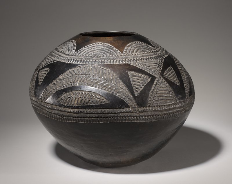
Every year the American Alliance of Museums confers awards for great exhibition design and label-writing (among other categories.) The 2015 lists are out! You can see the former here as a quick list and the latter here in a more expansive format with photos and descriptions. Of the many worthy entries, my personal favorite was a label by the Minneapolis Institute of Arts for the Zulu beer pot pictured above. (You might want to check it out in the MIA's beautiful online catalog, which is not only sleekly designed but includes audio clips and free image downloads.) As reproduced on page 6 of the AAM report, this label brings out the object's visual qualities and social importance at once—certainly deserving its prize.
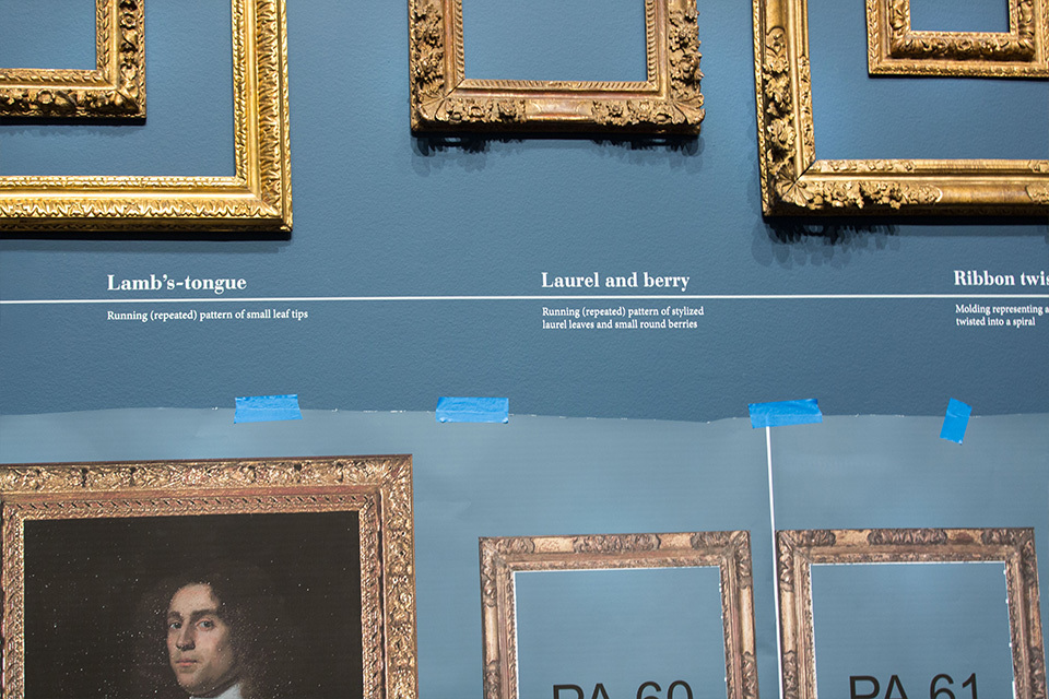
My second-favorite label appears on page 9: an outdoor panel at the La Brea Tar Pits. It even has something in common with the beer pot label: vivid opening lines. Who could refuse to read further after "The stinky dead mastodon was irresistible" or "How is brewing beer like growing babies?" A current exhibition at the Getty Center highlights precisely those things we usually don't look at in exhibitions: frames! It's a wonderful subject for a show, touching on questions of taste, stylistic development, craftsmanship, and even the psychology of frames as a concept—for instance, how do they achieve their goal of setting off something else without showing off themselves? Or, taking a look at these ostentatious Louis Style frames, are they in fact meant to show off? The answers to these questions are as intriguingly socially-, historically-, and culturally-dependent as any question about the art within the frames. (You can see a behind-the-scenes slideshow of the Getty exhibition here.) One of my all-time favorite articles in the New Yorker (subject of a previous post) addresses frames in the modern museum, reflecting on the considerations in picking the right frame for a piece, who makes the aesthetic decisions and how, and of course who makes the frames.
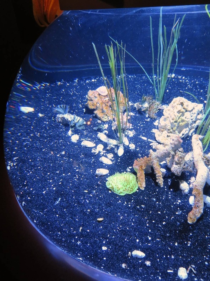
Octopuses were my favorite cephalopod until I learned more about cuttlefish. Many more people now have the chance to get excited about these remarkable little undersea hovercrafts in a new special exhibition at the Monterey Bay Aquarium, Tentacles. Brand-new and quite lavish, this exhibition features rich colors on every wall, several video screens masquerading as aquaria, and of course tanks of the live wonders themselves. This vaguely hemispherical tank was striking for the contrast between pearly white cuttlefish and supernaturally sparkly black "sand." The sand has clearly been chosen to set off the bright white of the animals. They gleam against it.
The funny thing is, they also bury themselves in it: fluttering a single delicate fin, they dig into the sand and bivouac in the depression, tossing a sprinkling of sand onto their backs. Naturally, they do this to hide from predators. But no predator would be fooled by a glaringly white fleshy nugget sitting atop a black dinner plate! Although in the wild cuttlefish burrow into tropical sand as gorgeously white as they are, for the sake of the exhibit the chosen sand is black. It's an instance in which altering the actual natural context of the "object" on display helps the visitor better appreciate it aesthetically, although not conceptually (as in these examples); the intricate beauty of the camouflage that nature has wrought is subordinated to the visual WOW factor of white-on-black. |
Ideas on Display
A humble space to reflect on concepts of museum display as enacted across a wide range of subjects, countries, and approaches.
Archives
April 2020
Categories
All
|

 RSS Feed