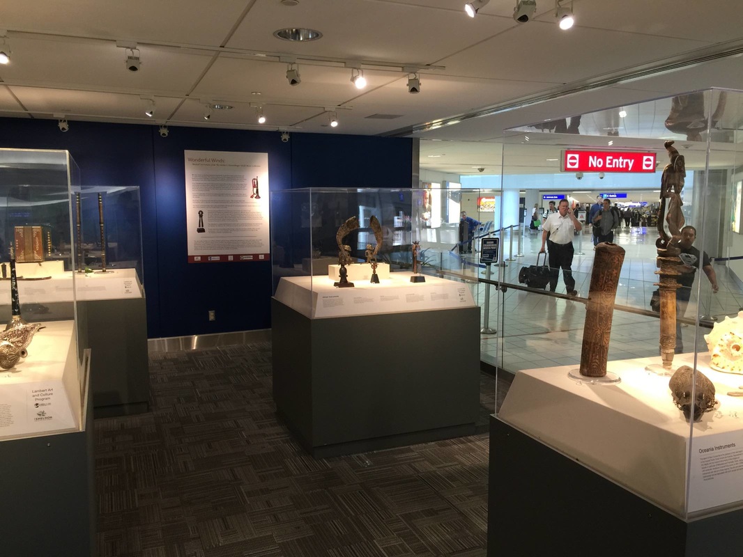
Airport exhibitions have the benefit of one thing that other exhibitions can only dream about: a captive audience! But they also have to address some challenges particular to their location. An exhibition on musical instruments titled "Wonderful Winds" at the St. Louis International Airport caught my eye because it is situated on a raised island right where arriving passengers turn the corner between the gates and the baggage claim. Its design is sleek and minimalist—I wonder if airport security regulations impose certain requirements on lines of sight?—and the wall space is small enough that a single wall panel fills the usable surface. The warm lighting and intense color of the back wall create a welcoming atmosphere and encourage you to step inside. Reduced to a few cases and a single wall panel, this exhibition contains all the necessities and is well-pitched to its audience—passengers and welcoming parties with a few minutes to spare, lured into this oasis amidst the usual airport ruckus.
"A good test of an art museum is how far you have to go into it before you see art." These are the wise words of Elizabeth Easton, director of the Center for Curatorial Leadership and a wonderful mentor for our cohort in the CCL summer program 2014. The Saint Louis Art Museum gives you art already in the beautiful grounds outside the museum, and more as soon as you walk in the door: the grand foyer with its lofty ceiling and vaulted bays perfectly frames a rotating assortment of large (appropriate to the space) pieces from the collection. But what struck me in particular about this foyer is that it contains not only art but large (again, the space demands it) floral arrangements. They provide a necessary humanizing touch to what might otherwise be a dauntingly grandiose space. Luckily enough, during my visit the florist was still there putting on the finishing touches; and when I struck up conversation, he mentioned the extra complexity of putting flowers in an art museum: all the vegetation has to be fumigated before being installed! Beyond that extra hurdle, I imagine that thinking up a flower arrangement to work alongside the art must be a refreshing challenge.
Overview panels can be underrated. In its recent renovation of the European Painting galleries, the Metropolitan Museum of Art shifted its "room labels" from the walls to plaques on knee-high metal stands. For space considerations, this makes sense. But if wall space is not at quite such a premium, a nice big wall panel does wonders for communicating the Big Idea. "What is this all about?" I can hear a visitor asking, making a sweeping gesture, stepping into a gallery for the first time. Individual object tags don't help answer this question, but an overview panel sure does. It is magical for its ability to unite a wide range of objects into a comprehensible narrative.
Everything I love about overview panels inheres in this example from the Saint Louis Art Museum. At the top is written the most general category, the designation of the collection: American Art. Below, the thematic title for the room: Nostalgia and the Gilded Age. But the best part? Look to either side and you immediately encounter something obviously gilded, perfectly illustrating the name. Moreover, both gilded pieces are quite large and lavish, as if lending some (literal) weight to the idea that an entire age could be gilded. And finally, the subjects of both pieces subtly underline the idea of nostalgia. The woman at right sinks into her chair, surrounded by precious items, speaking with a man (the artist) swallowed by shadows. At left, a golden winged figure in Classical robes embodies the glorification of a past age. Following the thread that connects the objects with each other and the text could hardly be easier. Yesterday I had the pleasure of visiting the St. Louis Art Museum for the first time. Its gorgeous setting, collection, and signage and display (hurrah!) sent me swooning. To my mind, its success is all the more impressive because of the vast diversity of its objects and galleries that could easily lead to an incohesive experience. Like so many founded in the late nineteenth century, this museum's collections cover a lot of ground: "What began as a collection of assorted plaster casts, electrotype reproductions, and other examples of 'good design' in various media rapidly gave way to a great and varied collection of original works of art spanning five millennia and six continents." (Excerpt from the handbook as quoted here.)
How to give the visitor a coherent experience of an encyclopedic collection? Some variety from gallery to gallery is of course expected and even refreshing, but too much could be jarring. One way to finesse the transitions struck me between the ancient Roman gallery and the adjacent hall of European paintings. A visitor coming from the latter toward the former would see the view in the photo above: a stunning Roman bust and warm red walls drawing her in, and two figural paintings on the blue walls to either side. The genius here is the juxtaposition of figures: two chubby babes at left (a good Roman subject, moreover!) and a dour-looking man at right flank the bust in the middle. The marble and painted men even turn towards each other, as if they would converse were at least one of them not so grouchy. Entering the reverse way, from the Roman to the European gallery, we see the view below. Marble portrait heads are set off by the red wall, and beyond them a gathering of painted women echo the figures in both subject and shape: two solemn women at right, and a group of two and three figures at left. It's a subtle and effective way to smooth the transition from one room to the next while still allowing them their own distinctive characters. |
Ideas on Display
A humble space to reflect on concepts of museum display as enacted across a wide range of subjects, countries, and approaches.
Archives
April 2020
Categories
All
|