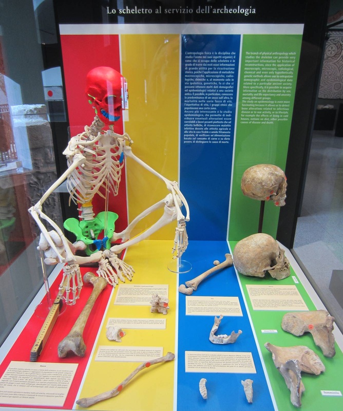
Communicating complex scientific information in a compelling way can be a challenge. This display at the Civico Museo Archeologico di Milano does a beautiful job of breaking down a wealth of fairly abstruse information into four color-coded sections. With bright colors, digestible texts, and an inviting skeleton (always a draw!), the exhibit effectively explains what information can be gathered from ancient bones. At the top is an introduction to the fields of physical anthropology and epidemiology, and to the specific themes elaborated below. Below, labels describe several physical characteristics that can be determined from bones; and in a wonderful example of show-me pedagogy, the bones that are most indicative for each characteristic sit beside the label. So at left, in the red stripe, is a paragraph about "Race" and an explanation of how the length of the femur can aid in an identification. In yellow is "Maladies," including degenerative, nutritional, and traumatic varieties, each represented by a bone marked with an orange dot at the most indicative site. "Age" is detailed in blue, again juxtaposed with the representative bones. Green discusses "Sex" with the help of two pelvic bones and two skulls, a male and a female. That the complete skeleton sitting in the corner is color-coded to match the single bones and themes is the icing on the cake: an excellent clarifying illustration. In every respect, this exhibit fulfills what its title promises: it intelligibly introduces "The skeleton in the service of archaeology." And in a lively manner at that — a true feat, given the lifeless subject!
Yesterday I had the pleasure of visiting the St. Louis Art Museum for the first time. Its gorgeous setting, collection, and signage and display (hurrah!) sent me swooning. To my mind, its success is all the more impressive because of the vast diversity of its objects and galleries that could easily lead to an incohesive experience. Like so many founded in the late nineteenth century, this museum's collections cover a lot of ground: "What began as a collection of assorted plaster casts, electrotype reproductions, and other examples of 'good design' in various media rapidly gave way to a great and varied collection of original works of art spanning five millennia and six continents." (Excerpt from the handbook as quoted here.)
How to give the visitor a coherent experience of an encyclopedic collection? Some variety from gallery to gallery is of course expected and even refreshing, but too much could be jarring. One way to finesse the transitions struck me between the ancient Roman gallery and the adjacent hall of European paintings. A visitor coming from the latter toward the former would see the view in the photo above: a stunning Roman bust and warm red walls drawing her in, and two figural paintings on the blue walls to either side. The genius here is the juxtaposition of figures: two chubby babes at left (a good Roman subject, moreover!) and a dour-looking man at right flank the bust in the middle. The marble and painted men even turn towards each other, as if they would converse were at least one of them not so grouchy. Entering the reverse way, from the Roman to the European gallery, we see the view below. Marble portrait heads are set off by the red wall, and beyond them a gathering of painted women echo the figures in both subject and shape: two solemn women at right, and a group of two and three figures at left. It's a subtle and effective way to smooth the transition from one room to the next while still allowing them their own distinctive characters. Photos of informational wall panels must be a minority among all photos taken in the British Museum. (They would be dwarfed by photos of the Rosetta Stone alone!) Yet this informational panel deserves a moment of stardom. It adorned one of the walls in the tiny gallery just to the right of the British Museum's entrance, a space for temporary exhibitions which at this partiular moment housed the Mildenhall Treasure. Urging the visitor to "Find out more," it presents various events and objects in the museum where the visitor can further engage with the themes in the gallery:
Although the dense text may repel some viewers, the wealth of information all in one place is an admirable way to expand the visitor experience beyond a single gallery — at the same time as highlighting and interconnecting the museum's other offerings. Ancient Roman funerary urns were made to long outlast their cremated contents, and indeed survive today in the thousands. Italian museum in particular house an incredible number of these urns: the Museum of the Baths of Diocletian in Rome come to mind, as well as the lower floor of the Capitoline Museums. Because the marble chests are compact and often unassuming, they might be displayed on the ground outside (as at the archaeological museum at Aquileia) or in glass cases on the side of a gallery (The Metropolitan Museum in New York). Decorated with a profusion of miscellaneous imagery and an inscription in Latin or Greek, they are not the most accesible objects in a gallery of ancient art; they require some close looking to be properly appreciated.
This all serves as background to say that the Altes Museum in Berlin has hit upon a brilliant display technique for a selection of its urns. In reconstructing the arched niches of a columbarium, the tomb in which such urns were placed for burial, the display case here not only recreates the original context of the pieces but encourages the viewer to take a closer look at these elaborate objects. Framing them like this really draws the eye in a way that a simple display case (let alone a spot on the sidewalk!) does not. What's more, this case allows the urns to be stacked three high — making them more imposing as well as saving precious gallery space. History museums have a tougher row to hoe than art museums, in some ways, because the objects they put on display do not usually fall within the category of "fine art" and therefore may not be considered worth looking at per se. Most of all, how to engage a viewer with texts — the bread and butter of historical research — is a very tricky issue that history museums have to address. How can you display a ream of letters and documents in a compelling way?
The Dokumentationszentrum Berliner Mauer found an elegant solution to this problem. A series of cables and thin steel poles stretch from floor to ceiling, standing as masts of sorts for the "flags" of text panels hung on them. Oversized panels were bound into booklets of which each "page" held two A4 sheets and an explanatory text. The visitor could page through the cluster, looking at each page in turn. Several cables and poles held not booklets but lightboxes with historic photographs. The overall effect was wonderfully open — no walls necessary! — as well as highly engaging, in my experience. Rifling through the big splayed boards is incredibly tempting. Visiting the Zentrum's website just now, I see that the whole building (and probably its surrounds, which are just as much a part of the museum) is under renovation; let's hope that some of this wonderful ingenuity appears in their new design as well. |
Ideas on Display
A humble space to reflect on concepts of museum display as enacted across a wide range of subjects, countries, and approaches.
Archives
April 2020
Categories
All
|