Dr. Stephanie Pearson
  • Home
  • Projects
    • museums.love
    • Uncertainty and Debate
    • Mithras Model & Audio
    • Weltverbesserer Interview
  • CV
    • Employment
    • Education
    • Museum Experience
    • Professional Training
    • Publications
    • Awards & Grants
    • Teaching
    • Invited Lectures
    • Workshops & Chaired Sessions
    • Conference Papers
    • Professional Engagement
    • Excavation
  • Exhibition Reviews
    • Anna Dorothea Therbusch
    • Making Ancient Art Contemporary
    • Cleopatra
    • Pompeii and Herculaneum
  • Tours
  • Ideas on Display (blog)

Essay on Museum and the City - Out of the Ground, Into Awareness

12/18/2019

Comments

 
Picture
An essay of mine about museum displays of antiquities appeared today in Museum and the City, the official blog of the Staatliche Museen zu Berlin (Berlin State Museums)! You may recall that I led a student workshop in the temporary museum called "Pergamonmuseum. Das Panorama." This essay is a writeup of the themes I presented there and then workshopped with the students in the exhibition. Archaeology, museum methodology, and teaching - just my cup of tea!

Because the essay is in German, an English summary is in order (see also this previous post):

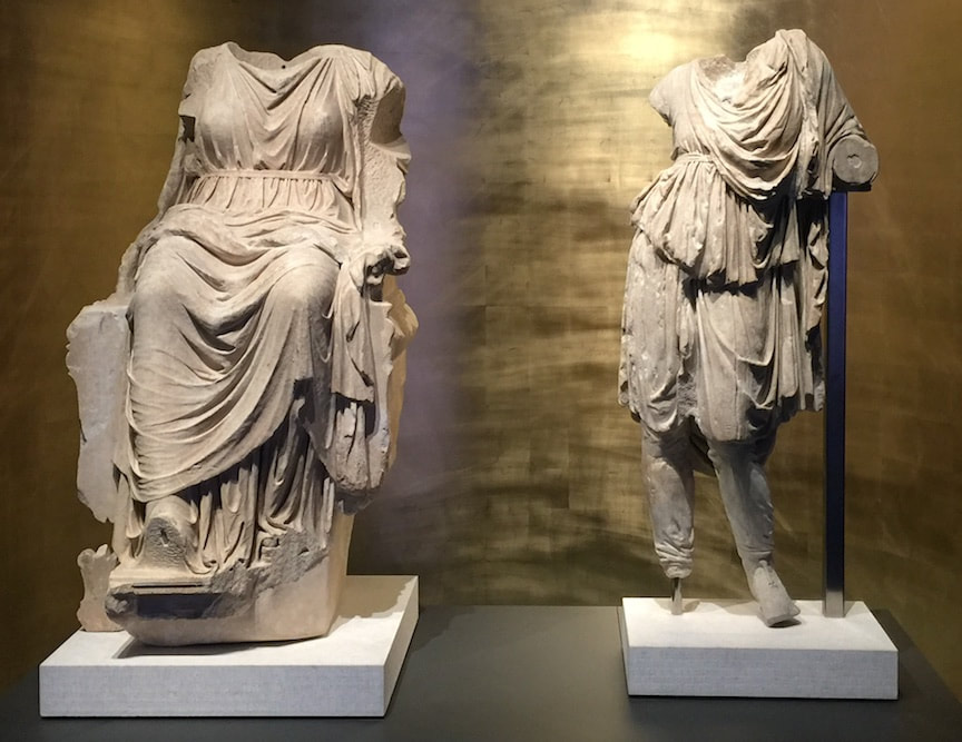
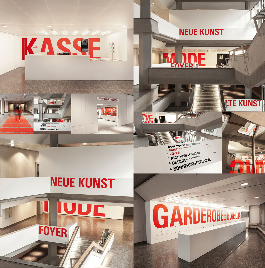
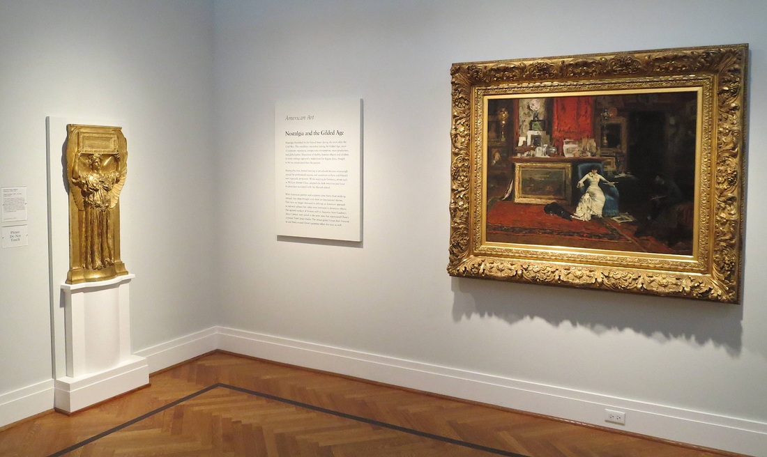
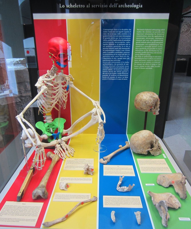
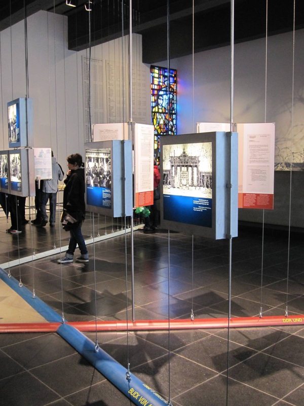
The antiquities we see on display in museums constitute only a tiny part of the objects found in excavation, and those in turn form only a tiny part of the material that actually existed back then. The selection process between being buried in the ground and being exhibited in a museum is rigorous. It includes the decision of where to excavate, what to do with the excavated material, and what material is chosen for exhibition—based on money, available space, and the personal interest of museum staff and visitors. Sometimes the decisions are carefully made, while sometimes coincidence or luck takes over (it does happen that excavations miss an important find by just a few centimeters, leaving it undiscovered). Realizing that there is a complex process behind the scenes is one step towards understanding museums as a laboratory, not a finished presentation of a topic we know everything about. The "Pergamonmuseum. Das Panorama" exhibition is great for driving this home because the explanatory texts often mention uncertainty or differing scholarly opinions. For visitors this can be exciting, or unnerving—but either way it promotes the critical thinking skills we need to deal with our modern world.
Comments

Creating Knowledge Together: Pergamonmuseum. Das Panorama

6/6/2019

Comments

 
Picture
Museum display is just the last step in an ancient object's long life. This is the topic of a student workshop I'll be leading on Saturday in Berlin's Pergamonmuseum. Das Panorama. What is selected for display? What is researched, and how? What gets left out? How is the "knowledge" that the museum finally decides to communicate created? All of these are subjective processes, despite the impression that the "knowledge" presented in museums is singular, objective, and perfectly known. As Ian Hodder famously said, "Interpretation begins at the trowel's edge"—at the moment of excavation. (And, I argue, actually before that, since excavations are sited and carried out based on decisions as well.)
As part of our exploration we'll closely examine the museum labels. I was inspired by those in the interim Pergamonmuseum because they often express a certain uncertainty or scholarly debate about the objects, which I found refreshing. Not just refreshing: it brings us to think critically, one of the most important things a museum display can bring us to do! (But I repeat myself.)
All Berlin higher-ed students are welcome! The details (in German, as the event will be):


Unsicherheit und Debatte in Museumstexten: Wissen zur Antike gemeinsam bauen
Sa / 8. 6. 2019 / 15 – 17.30 Uhr
Treffpunkt: Pergamonmuseum. Das Panorama, Besucherinformation
Keine Anmeldung erforderlich. Die Teilnahme ist für Studierende kostenfrei.

Das Format TISCHGESPRÄCH findet im Rahmen von ABOUT THE MUSEUM statt, einer Initiative des Referats Bildung, Vermittlung, Besucherdienste. Weitere Informationen: studierende.smb.museum und auf Facebook: ABOUT THE MUSEUM.
Comments

Bite-Sized Nuggets (of text) - Archaeological Park, Xanten

9/11/2018

Comments

 
Picture
Walls of text are daunting. We all know it; so why is it so hard to get away from them? Well, it's hard to reduce the things we want to communicate to little bite-sized chunks. But those nibblets are infinitely more digestible! Just look at this example from the archaeological park in Xanten, Germany. Here the signage is consistently structured into a few nuggets so small that even an overheated, weary visitor like yours truly could bring herself to concentrate for just a darn minute. Despite being a museum veteran, I often have to trick myself into reading signage: "Ok, just that one sentence next to the picture. And maybe that one standing by itself right at the end." That is precisely the sort of self-deception that the Xanten signage makes the most of! Each sign beguiled me into tricking myself three or four times over—until, without realizing it, I had read the whole thing! The easy structure with lots of empty space for your eyes to rest (and your brain to think there isn't too much work involved) makes a huge difference. This is just one of the wonderful visitor-friendly aspects of this park. Three cheers for Xanten!
Picture
Comments

See the Writing on the Wall: Kunstgewerbemuseum Berlin

2/9/2016

Comments

 
Picture
Way-finding signage in the Kunstgewerbemuseum Berlin. Photo collage: German Design Council (website linked through photo).
Well-designed signage is a rare and precious gem. In a museum, signage can set the tone for a visitor's entire visit: because if she starts by buying a ticket, checking her coat, using the bathroom, and then finally entering the gallery she most wants to see, she's already had to locate at least four separate areas of the museum, probably by following signs. And if that process was easy—i.e., well-signed—she'll ideally be in a fine mood; but if it was difficult, she may enter the galleries feeling grumpy or frazzled, and that will color her experience of the whole museum.
So kudos to Berlin's Kunstgewerbemuseum (the museum of decorative arts and design) for putting writing on the wall that no one can miss, and winning a design prize along the way. The eye-catching size and color of the signage creates a certain aesthetic effect that not all museums would want, but it accords well with the all-parts-visible idea behind Rolf Gutbrod's 1960s building.
Even award-winning signage has two potential weak points, however. First, it has to be wriiten in a certain language—here German, which some visitors may not understand. Second, there is a compelling argument (nicely presented in an airport example in the addictive design podcast 99% Invisible) that the architecture itself, not just signage, should help guide the people in it. But since purpose-built buildings are not in the cards for most museums (and even if they are, wayfinding is only part of their mission), it's worth taking signage seriously.
Comments

Awards in Exhibition Design and Label-Writing

12/22/2015

Comments

 
Picture
Every year the American Alliance of Museums confers awards for great exhibition design and label-writing (among other categories.) The 2015 lists are out! You can see the former here as a quick list and the latter here in a more expansive format with photos and descriptions. Of the many worthy entries, my personal favorite was a label by the Minneapolis Institute of Arts for the Zulu beer pot pictured above. (You might want to check it out in the MIA's beautiful online catalog, which is not only sleekly designed but includes audio clips and free image downloads.) As reproduced on page 6 of the AAM report, this label brings out the object's visual qualities and social importance at once—certainly deserving its prize.

My second-favorite label appears on page 9: an outdoor panel at the La Brea Tar Pits. It even has something in common with the beer pot label: vivid opening lines. Who could refuse to read further after "The stinky dead mastodon was irresistible" or "How is brewing beer like growing babies?"
Comments

Word Cloud: Käthe-Kollwitz Museum

12/10/2015

Comments

 
Picture
Once a month the Käthe-Kollwitz Museum in Berlin offers a lunchtime tour by the director, Dr. Iris Berndt, and yesterday's provided the extra motivation for my first visit to the museum. Standing in the first room of the ground-floor galleries, waiting for the tour to assemble, I was struck by the "word cloud" on a wall right next to the entrance. Like the automatically generated word clouds on the Internet, this collection represents thought trends in a wide set of "users" (clustered around the name of the artist, nicely emphasized with extra lighting). But unlike the digital word clouds, these words have been carefully selected to educate. As Dr. Berndt explained, they all represent concepts widely understood to apply to the great German artist Käthe Kollwitz—but several of them are problematic or even false. By marking these four terms with question marks—Feminist? Jewish? Communist? An artist who depicts suffering?—the display indicates that these preconceptions need to be reexamined and possibly discarded. This seems to me a very simple yet effective way to ease a visitor into the experience to come: several key themes are named right at the beginning, setting the tone for the subsequent galleries and helping a visitor to frame the individual objects; and just as importantly, it introduces the idea of questioning stereotypes, clichés, and pat explanations. For such a complex, richly-textured life and oeuvre as Kollwitz's, this strikes just the right first note.
Comments

Textual Bouquet: Airborne Museum Hartenstein, Arnhem

1/2/2015

Comments

 
Bouquet of letters, Airborne Museum Hartenstein, Arnhem
This post has been a long time in coming, insofar as this particular display idea was one of the motivations to create this blog in the first place: that's how beautiful, simple, and effective I think it is. With it, the wonderful Airborne Museum Hartenstein in Arnhem (the Netherlands) has tackled the difficult problem of making primary-source documents approachable — in this case, eye-witness accounts of life in Arnhem during World War 2. The Dokumentationszentrum Berliner Mauer addressed this problem in a different but also very effective way. Still, for simplicity, this arrangement takes the prize. Aesthetically it's quite nice too, as if presenting the visitor with a bouquet of flowers that happen to be written on; it does attract a person's attention, far more than texts set flat on a wall. Although the metal stems are permanently fixed to the metal "blossoms" of text, I can imagine a variation on this idea that would allow the texts to be switched out periodically — perhaps even replaced with the occasional object, a hands-on addition to the textual bouquet.
Comments

Simply Good Signage: Domäne Dahlem

11/14/2014

Comments

 
Horses and sign at Domäne Dahlem, Berlin
A successful display does not need a fancy new design idea or technology to be successful (indeed, sometimes those can really go awry!). Some of my favorite displays are very simple; their strength lies in being extremely well-conceived in terms of how they achieve their few basic goals. One great example is the signage at the Domäne Dahlem in Berlin, a charming set of fields and cottages meant to teach the visitor about old-time farming and artisanal trades. The signs scattered around the grounds are excellent in several simple but important respects:
  1. They are sturdy. Look at that metal frame! The text is protected by a thick sheet of plastic (not yellowed or scratched; is that a special kind of plastic?). And the sign stands on two very firmly embedded poles. These things are equipped to stand out in the sun and snow year-round. Moreover, they have to withstand eager kindergartners running over to them, slapping them in excitement, climbing on them, and many other things I can't even imagine but the kiddies definitely can. They are up to the task! (The signs, that is — but the kiddies too.)
  2. They clearly refer to their subject matter. Despite having to stand in the open air, and not on a wall obviously beside an object (see the previous post on botanical gardens), they are well-placed and -oriented so as to be clearly linked to their subject. The example above faces the horses and, as extra help, even shows the horses in a drawing.
  3. They start with perfect "hook" questions. You can imagine a kid and parent approaching the horse sign and the parent beginning to read the yellow box: "If it whinnies, then it's a...." "HORSE!" replies the kid. I really think this isn't just my fantasy; the sign is begging for this interaction. As for the sign below, which explains nitrogen binding among legumes, I had just wondered aloud what was growing in this big bushy field when I came across the sign that begins with a green box, "So what's growing here?" I call that perfect.
  4. The drawings are simple. Too often the graphics in signage get complicated or rely on colors that have long since faded. Not here! A basic but beautiful line drawing gets the point across in both signs. Even as a lover of color, I far prefer this style for clarity.
Legume sign at Domäne Dahlem, Berlin
Comments

Labels without Walls: Ökowerk Berlin

10/31/2014

 
Botanical gardens are a special kind of museum. By their very nature they have certain restrictions and opportunities that are foreign to a "brick and mortar" museum — for instance, walls. Walls are both a restriction and an opportunity, really, and one that is rather lacking in at least the outdoor portion of any botanical garden. With walls come wall texts, as well as the ability to encourage certain directions of movement. Lacking walls, botanical gardens (again, speaking of the outside area; the greenhouses and possible visitor center or attached museum are a different story) miss these opportunities even as they gain others.

What potential repercussions a lack of walls might have on a plant display struck me at the Ökowerk Berlin, which includes several garden spaces on its extensive grounds. Labeling the display is tricky when there isn't a wall to support the labels; the solution here is to print small paper labels and slip them into metal and plastic holders staked into the ground. The stakes are well-conceived insofar as they can be placed anywhere, and presumably even moved as the plants grow, unfurl leaves that then cover the signage, or drop their leaves and retreat to a mere husk, requiring the signage to be set nearer in order to look relevant. Unlike larger signs too, they can be stuck right in the middle of a bed of plants, making very clear what they refer to. Conversely, the portable size restricts the amount of information that can be given: so in this case, QR codes have to do almost all of the legwork.
Plants with QR-code labels, Ökowerk Berlin

The Golden Thread: Saint Louis Art Museum

10/24/2014

Comments

 
Picture
Overview panels can be underrated. In its recent renovation of the European Painting galleries, the Metropolitan Museum of Art shifted its "room labels" from the walls to plaques on knee-high metal stands. For space considerations, this makes sense. But if wall space is not at quite such a premium, a nice big wall panel does wonders for communicating the Big Idea. "What is this all about?" I can hear a visitor asking, making a sweeping gesture, stepping into a gallery for the first time. Individual object tags don't help answer this question, but an overview panel sure does. It is magical for its ability to unite a wide range of objects into a comprehensible narrative.

Everything I love about overview panels inheres in this example from the Saint Louis Art Museum. At the top is written the most general category, the designation of the collection: American Art. Below, the thematic title for the room: Nostalgia and the Gilded Age. But the best part? Look to either side and you immediately encounter something obviously gilded, perfectly illustrating the name. Moreover, both gilded pieces are quite large and lavish, as if lending some (literal) weight to the idea that an entire age could be gilded. And finally, the subjects of both pieces subtly underline the idea of nostalgia. The woman at right sinks into her chair, surrounded by precious items, speaking with a man (the artist) swallowed by shadows. At left, a golden winged figure in Classical robes embodies the glorification of a past age. Following the thread that connects the objects with each other and the text could hardly be easier.
Comments

In Vivid Color: Civico Museo Archeologico di Milano

8/28/2014

Comments

 
"Skeleton in the service of archaeology," Civico Museo Archeologico di Milano
Communicating complex scientific information in a compelling way can be a challenge. This display at the Civico Museo Archeologico di Milano does a beautiful job of breaking down a wealth of fairly abstruse information into four color-coded sections. With bright colors, digestible texts, and an inviting skeleton (always a draw!), the exhibit effectively explains what information can be gathered from ancient bones. At the top is an introduction to the fields of physical anthropology and epidemiology, and to the specific themes elaborated below. Below, labels describe several physical characteristics that can be determined from bones; and in a wonderful example of show-me pedagogy, the bones that are most indicative for each characteristic sit beside the label. So at left, in the red stripe, is a paragraph about "Race" and an explanation of how the length of the femur can aid in an identification. In yellow is "Maladies," including degenerative, nutritional, and traumatic varieties, each represented by a bone marked with an orange dot at the most indicative site. "Age" is detailed in blue, again juxtaposed with the representative bones. Green discusses "Sex" with the help of two pelvic bones and two skulls, a male and a female. That the complete skeleton sitting in the corner is color-coded to match the single bones and themes is the icing on the cake: an excellent clarifying illustration. In every respect, this exhibit fulfills what its title promises: it intelligibly introduces "The skeleton in the service of archaeology." And in a lively manner at that — a true feat, given the lifeless subject!
Comments

Find out More: The British Museum

8/16/2014

Comments

 
Informational panel in Mildenhall Treasure gallery, British Museum
Photos of informational wall panels must be a minority among all photos taken in the British Museum.  (They would be dwarfed by photos of the Rosetta Stone alone!) Yet this informational panel deserves a moment of stardom.  It adorned one of the walls in the tiny gallery just to the right of the British Museum's entrance, a space for temporary exhibitions which at this partiular moment housed the Mildenhall Treasure. Urging the visitor to "Find out more," it presents various events and objects in the museum where the visitor can further engage with the themes in the gallery:

  • Gallery Talks lists upcoming presentations by the curator of the show and other museum staff
  • Lecture details a topical guest talk by a professor
  • Exhibition and related objects points to the concurrent show Life and death in Pompeii and Herculaneum, also with Roman and dining themes (see my exhibition review here)
  • Further Reading highlights two books for sale in the museum store
  • Music draws attention to the atmospheric use of Roman-themed songs piped into the gallery, also on sale in the store
  • Join in online directs the visitor to the museum's social media presence
  • Next in Room 3 offers a preview of the next show slated for this space

Although the dense text may repel some viewers, the wealth of information all in one place is an admirable way to expand the visitor experience beyond a single gallery — at the same time as highlighting and interconnecting the museum's other offerings.
Comments

Engaging with Texts: Dokumentationszentrum Berliner Mauer

8/2/2014

Comments

 
Dokumentationszentrum Berliner Mauer
History museums have a tougher row to hoe than art museums, in some ways, because the objects they put on display do not usually fall within the category of "fine art" and therefore may not be considered worth looking at per se. Most of all, how to engage a viewer with texts — the bread and butter of historical research — is a very tricky issue that history museums have to address. How can you display a ream of letters and documents in a compelling way?

The Dokumentationszentrum Berliner Mauer found an elegant solution to this problem. A series of cables and thin steel poles stretch from floor to ceiling, standing as masts of sorts for the "flags" of text panels hung on them. Oversized panels were bound into booklets of which each "page" held two A4 sheets and an explanatory text. The visitor could page through the cluster, looking at each page in turn. Several cables and poles held not booklets but lightboxes with historic photographs.

The overall effect was wonderfully open — no walls necessary! — as well as highly engaging, in my experience. Rifling through the big splayed boards is incredibly tempting. Visiting the Zentrum's website just now, I see that the whole building (and probably its surrounds, which are just as much a part of the museum) is under renovation; let's hope that some of this wonderful ingenuity appears in their new design as well.
Dokumentationszentrum Berliner Mauer
Comments
    Ideas on Display
    A humble space to reflect on concepts of museum display as enacted across a wide range of subjects, countries, and approaches.

    Archives

    April 2020
    January 2020
    December 2019
    November 2019
    October 2019
    September 2019
    August 2019
    July 2019
    June 2019
    April 2019
    March 2019
    February 2019
    January 2019
    December 2018
    November 2018
    October 2018
    September 2018
    August 2018
    July 2018
    June 2018
    May 2018
    March 2018
    February 2018
    January 2018
    December 2017
    November 2017
    October 2017
    September 2017
    August 2017
    July 2017
    June 2017
    May 2017
    April 2017
    March 2017
    February 2017
    May 2016
    March 2016
    February 2016
    January 2016
    December 2015
    November 2015
    October 2015
    September 2015
    August 2015
    July 2015
    May 2015
    April 2015
    March 2015
    February 2015
    January 2015
    December 2014
    November 2014
    October 2014
    September 2014
    August 2014
    July 2014
    June 2014

    Categories

    All
    Amsterdam
    Anthropology
    Archaeology
    Architecture
    Art
    Article
    Audio
    Award
    Behind The Scenes
    Berlin
    Boston
    Bulgaria
    California
    Chicago
    China
    Color
    Conservation
    Copenhagen
    Denmark
    Diagram
    Difficult Heritage
    Digital
    Display Case
    Dresden
    Egyptian
    Exhibition Outside Museum
    External Website
    Fashion
    Florida
    Frame
    France
    Germany
    Greek
    Halle
    Hamburg
    Hands On
    Hands-on
    Hanover
    Illinois
    Interactive
    Islamic
    Italy
    Kids
    Lighting
    London
    Los Angeles
    Map
    Marketing
    Marrakech
    Minnesota
    Missouri
    Morocco
    Movement
    Munich
    Nature
    Netherlands
    New York
    North Carolina
    Nuremberg
    Outdoor
    Painting
    Paris
    Pennsylvania
    Photography
    Roman
    Rome
    Shelving
    Signage
    Space
    Spain
    Switzerland
    Texas
    Text
    Turkey
    UK
    USA
    Video
    Women
    World War 2

    RSS Feed

Contact
Stephanie Pearson
steph [at] stephpearson.com