Botanical gardens are a special kind of museum. By their very nature they have certain restrictions and opportunities that are foreign to a "brick and mortar" museum — for instance, walls. Walls are both a restriction and an opportunity, really, and one that is rather lacking in at least the outdoor portion of any botanical garden. With walls come wall texts, as well as the ability to encourage certain directions of movement. Lacking walls, botanical gardens (again, speaking of the outside area; the greenhouses and possible visitor center or attached museum are a different story) miss these opportunities even as they gain others.
What potential repercussions a lack of walls might have on a plant display struck me at the Ökowerk Berlin, which includes several garden spaces on its extensive grounds. Labeling the display is tricky when there isn't a wall to support the labels; the solution here is to print small paper labels and slip them into metal and plastic holders staked into the ground. The stakes are well-conceived insofar as they can be placed anywhere, and presumably even moved as the plants grow, unfurl leaves that then cover the signage, or drop their leaves and retreat to a mere husk, requiring the signage to be set nearer in order to look relevant. Unlike larger signs too, they can be stuck right in the middle of a bed of plants, making very clear what they refer to. Conversely, the portable size restricts the amount of information that can be given: so in this case, QR codes have to do almost all of the legwork.
What potential repercussions a lack of walls might have on a plant display struck me at the Ökowerk Berlin, which includes several garden spaces on its extensive grounds. Labeling the display is tricky when there isn't a wall to support the labels; the solution here is to print small paper labels and slip them into metal and plastic holders staked into the ground. The stakes are well-conceived insofar as they can be placed anywhere, and presumably even moved as the plants grow, unfurl leaves that then cover the signage, or drop their leaves and retreat to a mere husk, requiring the signage to be set nearer in order to look relevant. Unlike larger signs too, they can be stuck right in the middle of a bed of plants, making very clear what they refer to. Conversely, the portable size restricts the amount of information that can be given: so in this case, QR codes have to do almost all of the legwork.
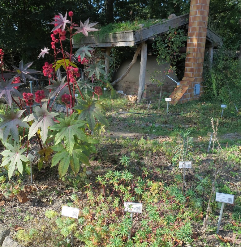
Plants with QR-code labels, Ökowerk Berlin

 RSS Feed