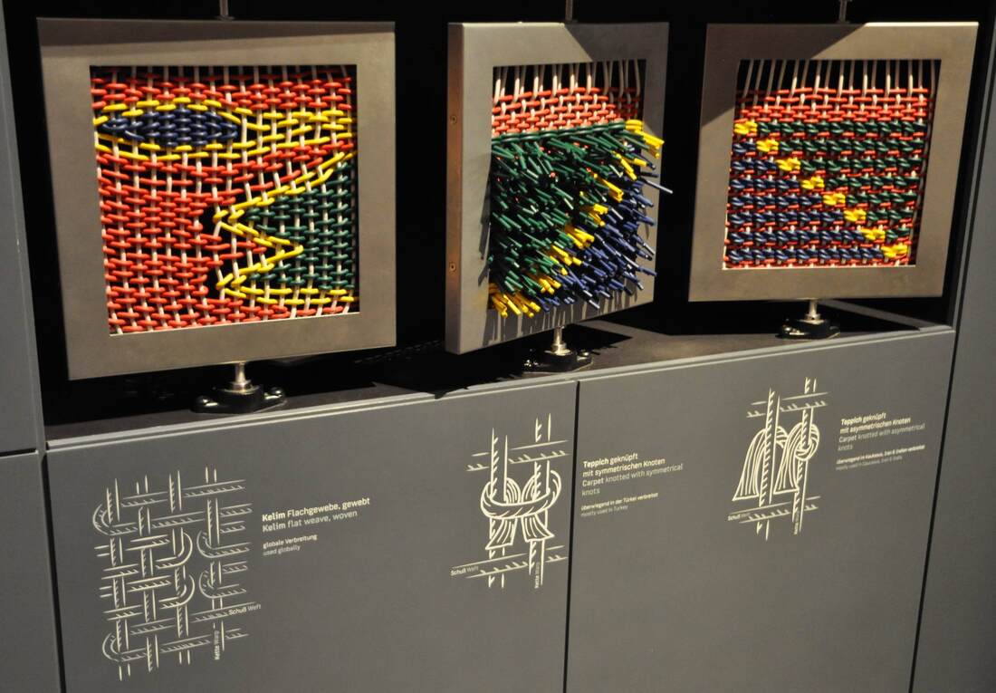
The Museum of Islamic Art in Berlin is proud of its carpet collection. Rightly so: not only are the carpets special in themselves, but they have a tumultuous history. The permanent display that opened last year (well, permanent until it shuffles around again for the reopening of the Pergamon Museum) conveys some of how the objects came to the museum—many through private collectors involved in the "oriental" research popular in late 19th- and early 20th-century Germany—and how they fared in World War II. While the carpet exhibition is fairly traditional in its display, a couple features stood out to me. One is pictured above: large panels demonstrating three different weaving techniques. Thick colorful plastic cord is used instead of the usual fine threads to make the technique more visible. Visitors can turn each panel to see both sides and thus discover the difference between kilim and pile rugs. Namely, kilim (left) are woven such that both sides are flat, while pile rugs (with symmetrical or asymmetrical knots, center and right) result in one side being bristled with the ends of the knots poking out. It's one of the few hands-on displays in the museum, and certainly fun to play with! It's vaguely reminiscent of the weave-it-yourself activity in the Museum of European Cultures in Berlin, but better suited to the far greater number of visitors passing through the Pergamon Museum.
Paging through Edward Tufte's book Visual Explanations (1997) is instructive not only for graphic designers, but anyone creating—or even reading!—visual displays. In a distinctly personal, engaging voice, Tufte explains what makes effective visual presentations for all sorts of information. He does not feel compelled to hide his disdain for a bad design, and he openly celebrates a good one. One example is the diagram of an ear at the top of the page above. Tufte so loathes the design at left, with its heavy lines almost indistinguishable from the ear itself and its cryptic letter labels, that he compares it to a Renaissance drawing of a man being stuck with swords (below). He juxtaposes the bad design with one he finds preferable, in which the indicator lines are finer than those delineating the ear and the nonsense letters are replaced with the names themselves. The thickness of the lines is highly significant, Tufte points out: one thickness should be used for the drawing of the ear (the object being explained), another for the indicator lines (the metalevel of our knowledge). The two grids at the bottom of the page show this again with two different thicknesses of line used in the background pattern; the diagonal lines overlying them are harder to distinguish in the lefthand example because they are nearly the same thickness as the background lines. The facing pages shown below illustrate not only Tufte's exasperation at bad design and his acerbic wit at its expense, but also the huge range of applicability of his principles. At left is a painting by Ad Reinhardt, which Tufte uses as another illustration of how subtle differences can have great meaning (here in the shades of blue rendered in three nearly imperceptible vertical bands; Reinhardt wanted to focus the viewer's attention on these simple and subtle differences).
Art historians, of course, are very accustomed to comparing two objects (a cornerstone of the discipline since Wölfflin), but they do it differently than people who are not trained to look for certain details or to already know certain things about the objects. This can lead to the display of a group of objects which makes art-historical sense but not intuitive, repeated-image-viewing sense. In the Neues Museum in Berlin (below), one room has a timeline written on the wall behind a row of Egyptian sculptures. The intent is to show how humans were portrayed in Egyptian art over time. But the earliest objects happen to be just heads, while the later ones represent entire bodies. The repetition of heads at first, and the subsequent break with this repetition, gives the false impression that what changed around 1600 BC is that the Egyptians started depicting people with bodies. Or perhaps in a different color of stone? Meaningful similarities and differences are hard to notice because of the many other factors at play beyond just the one meant to be highlighted.
The building of a large drainage pipe under Berlin's Mauerpark is a triumphant example of how simple display concepts can be transformative. Rather than making yet another annoying construction zone in the city, and this one right in at the entrance to the most popular park, the organizers decided to make it an attraction in itself. They achieved this by erecting a wooden wall around the main building area and decorating it with fun and informative panels. The biggest and most iconic is the cartoon cross-section of the pipe itself (above). The pipe introduces itself through a speech bubble: "I'm a drainage pipe with a 4.4-meter diameter"! More detailed panels describe the water system in depth. Around the corner, a spin wheel with exercise challenges on it ("do 5 pushups!" etc.) is a further attraction. Most surprising of all, you can see it all and learn more on a beautiful modern website devoted to the project! Way to go, Berliner Wasserbetriebe.
It's a tricky task to make nature itself into an exhibition. Nature walks (in botanical gardens and model farms, for instance) often rely not on a group of objects or other predetermined set of material, but on an unpredictable troupe of actors who may or may not be on stage that day. What a challenge to present material that the visitor might not even get to see! But certain display tactics can help smooth over the possible unevenness of this living exhibition. The Anne Kolb Nature Center in Hollywood, Florida centers on a boardwalk that winds through a section of mangrove habitat. (It also has a lovely visitor's center which, when I visited, included a display of contemporary art on spiffy movable walls.) At the start of the walk, large signs with vivid pictures of the animals (above) introduce the visitor to the point of the exhibition: to VIEW the plants and animals. Further, to help the visitor engage—and to help them see the critters tucked away in their hidey-holes—the Center offers a handout with a checklist of the plants and animals one might encounter on the walk. This is an easy, effective, low-cost way to encourage visitors (especially kids) to really look, and even to try to identify the things they see. It would be fantastic as an app for mobile devices too.
A successful display does not need a fancy new design idea or technology to be successful (indeed, sometimes those can really go awry!). Some of my favorite displays are very simple; their strength lies in being extremely well-conceived in terms of how they achieve their few basic goals. One great example is the signage at the Domäne Dahlem in Berlin, a charming set of fields and cottages meant to teach the visitor about old-time farming and artisanal trades. The signs scattered around the grounds are excellent in several simple but important respects:
An exhibition based on a single object can be wonderfully pointed, but it can also hard to stage — especially when the single object is an enormous (albeit fragmentary) pediment from an ancient Greek temple. The Amazzonomachia exhibition that took place in the Palazzo dei Conservatori, Rome, in 1985 faced precisely this problem: how to exhibit a large set of sculptures lined up in a row, as they would have been in the original pediment, without producing a deadening effect? Marble statues standing in a row are not exactly an invigorating sight. Especially when fragmentary, they can appear painfully static and unengaging. To encourage a viewer to come closer and spend time with the objects, the Amazzonomachia design had to introduce an element of variety into the layout, lending a touch of movement to the ensemble.
The designers arrived at a very clever solution (shown in the plan above). They set the entire pediment (D) at an angle relative to the gallery, so that the sculptures do not simply line one side of the long space. This also presented the viewer with a more frontal view when she entered from the short side of the gallery, rather than an end-on view down the long sculptural lineup. Building on this idea, the pediment was set on a trapezoidal base (E) of which one long side parallels the gallery wall — thereby incorporating it seamlessly into the space, rather than allowing it to look arbitrarily, bizarrely skewed. The base itself is cunningly engineered to serve several purposes: it unifies the objects into their original grouping; it emphasizes the objects by elevating them above floor level; and the three steps leading up to the pedimental sculptures invite the viewer to approach, climb up, get closer. The cherry on top is that its trapezoidal shape echoes that of the ancient triangular pediment, as if projected here onto the ground. This final subtle touch would likely not be noticed by a visitor in the room, but may well have produced an unconscious kinesthetic impression that would reinforce the concept of the show. (The catalogue for the show is here, while several photos of the sculptures can be seen here.) |
Ideas on Display
A humble space to reflect on concepts of museum display as enacted across a wide range of subjects, countries, and approaches.
Archives
April 2020
Categories
All
|