Dr. Stephanie Pearson
  • Home
  • Projects
    • museums.love
    • Uncertainty and Debate
    • Mithras Model & Audio
    • Weltverbesserer Interview
  • CV
    • Employment
    • Education
    • Museum Experience
    • Professional Training
    • Publications
    • Awards & Grants
    • Teaching
    • Invited Lectures
    • Workshops & Chaired Sessions
    • Conference Papers
    • Professional Engagement
    • Excavation
  • Exhibition Reviews
    • Anna Dorothea Therbusch
    • Making Ancient Art Contemporary
    • Cleopatra
    • Pompeii and Herculaneum
  • Tours
  • Ideas on Display (blog)

First Impressions - Haus Bastian, Berlin

9/5/2019

Comments

 
Picture
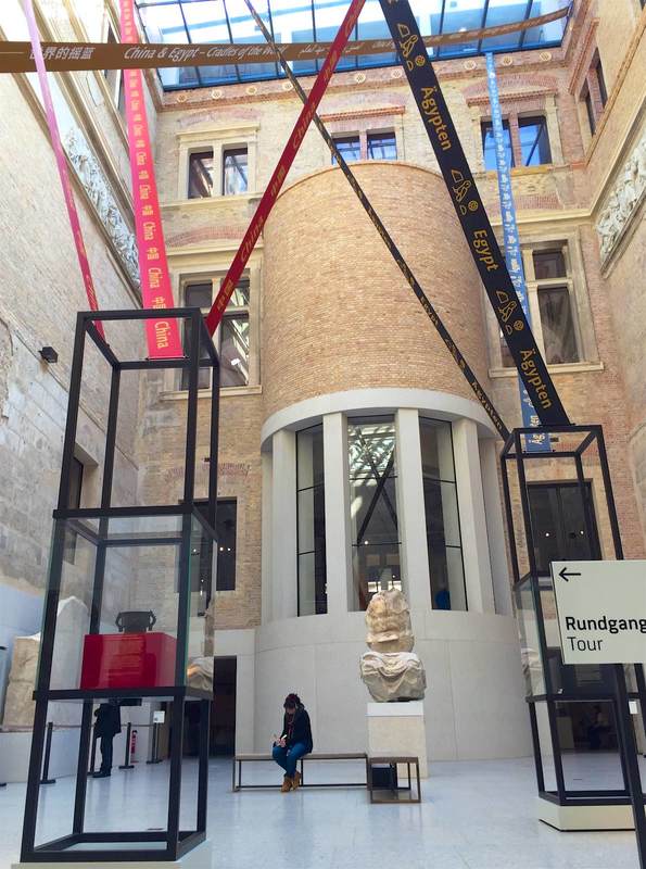
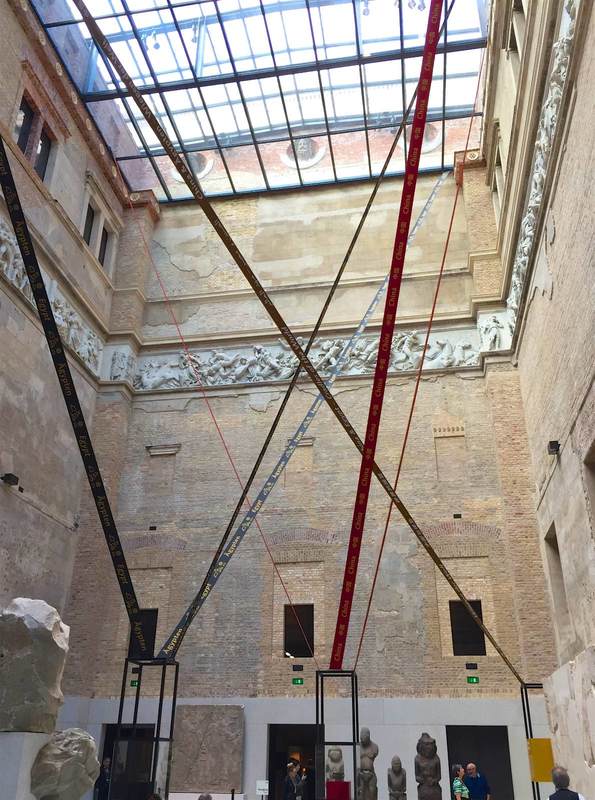
Just across the canal from Berlin’s Museum Island is a stately building that has just joined the museum family. The Haus Bastian was designed by architect David Chipperfield, like the Neues Museum and the brand new James-Simon-Galerie that it faces across the water. The Bastian family long used this lofty building as a gallery of modern and contemporary art—last year I got to see its last show, which included Wim Wenders’ photographs and Dan Flavin’s lights. Now, however, the family has donated the building to Berlin’s state museums for use as an educational center. It celebrated its opening two nights ago with a first glimpse at the spaces and materials available for experience-hungry kids, families, adults, and teachers.

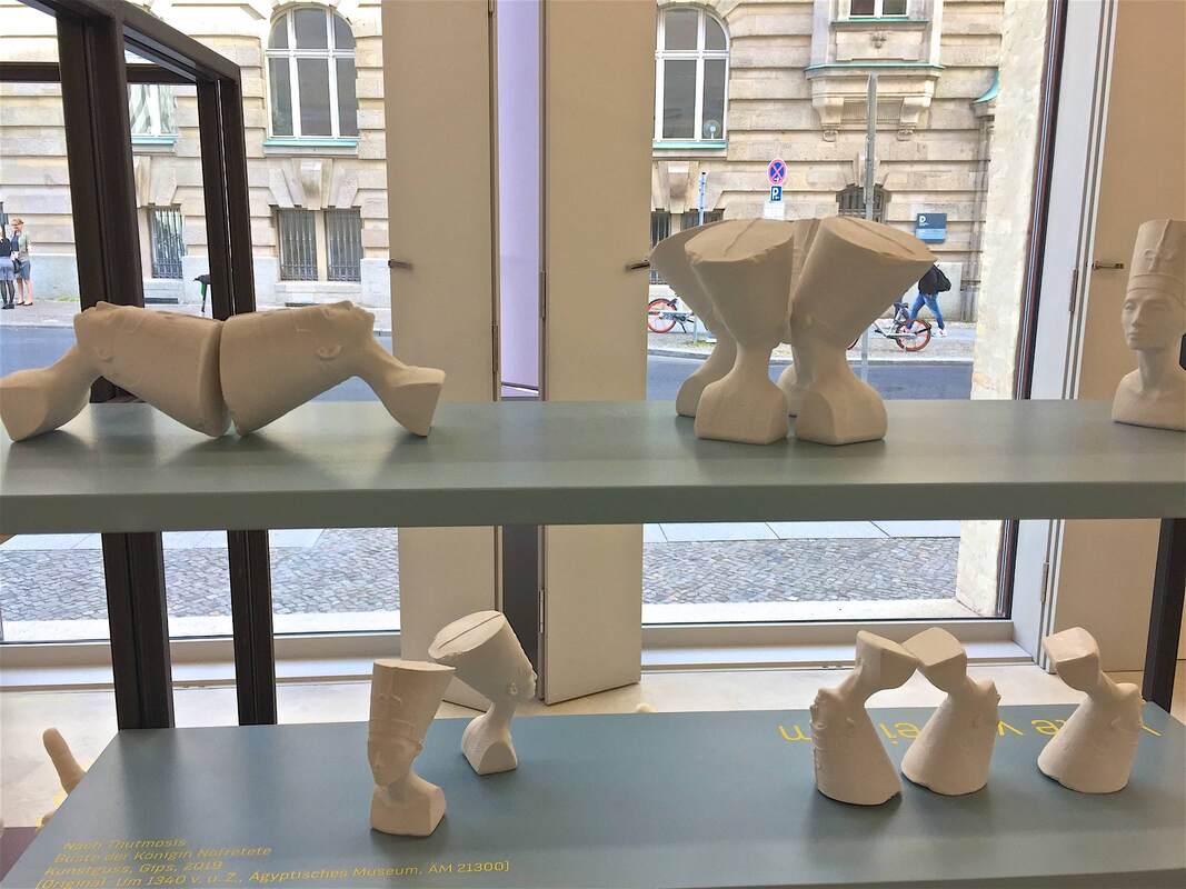
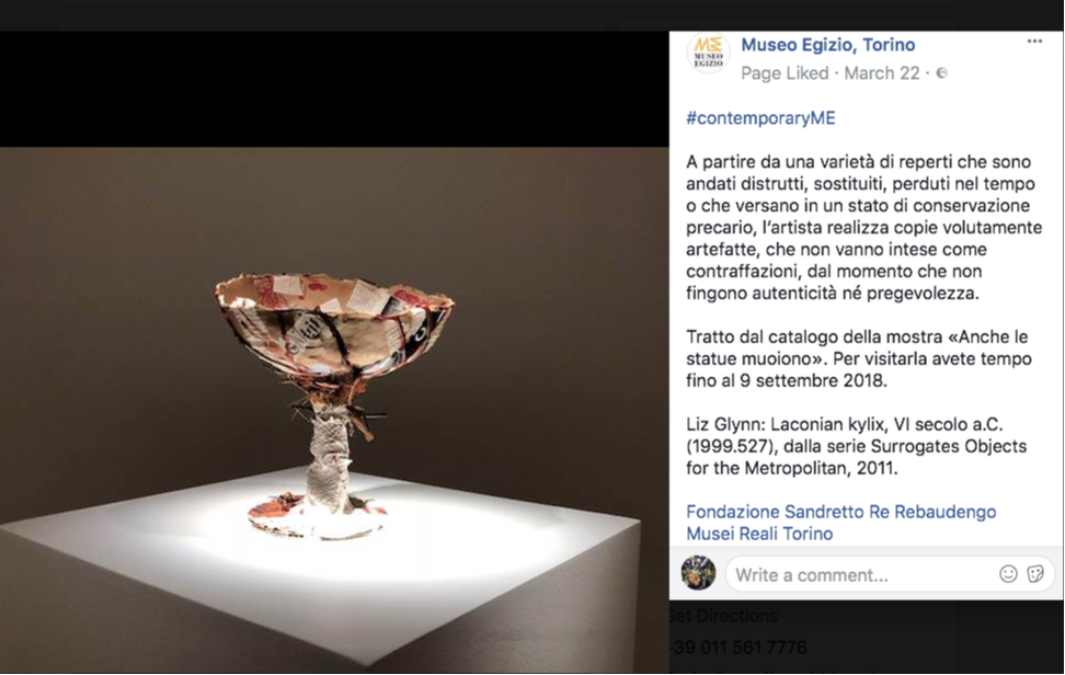
One of the current programs is titled "One to one? Pictures and Copies" (Eins zu eins? Von Bildern und Abbildern). Kids are invited to partake in "Project Days" exploring form through clay and plaster impressions, sometimes of their own bodies. 
The project materials include little busts of Nefertiti (above), miniatures based on the Neues Museum’s blockbuster portrait of the ancient Egyptian queen. Exhibiting multiple tiny white copies of the portrait is a playful way to draw attention to its physical characteristics: these Nefertitis are not like the original, not the face to launch a thousand posters and coffee mugs—but physical things with certain lines, curves, and volumes. (Replicas were also used in stimulating ways in this show.) The arrangement of the busts in various positions emphasizes this even more. In groups of four, they form a pattern that obscures the uniqueness and importance of The One Irreplaceable Treasure. Upside-down, the busts turn into weird forms like Wall-E or a large rubber stamp with an offset handle. Playing with museum objects like this builds visual skills and creativity—just what this center hopes to do in many other ways as well. I’m eager to see how this endeavor proceeds.
Comments

What we can achieve! The ideas behind Ancient Objects, Modern Projections

11/28/2018

Comments

 
My presentation on Friday led to a vibrant discussion—the most gratifying possible outcome of a talk! We discussed how displays of ancient art can achieve certain effects together with its visiting audience. Particularly in view of the warm reception it received, I hope that this presentation might spark further ideas in the online community; so here are the slides and talking points to look through as you like. I hope that the conversations will continue to grow and multiply, invigorating our museums and our communities.

(Please enable Javascript in order to view the two PDFs below!)
Comments

Ancient Images, Modern Projections. Displaying Complex Narratives in the Museum - this Friday!

11/21/2018

Comments

 
Picture
Title slide with reflection of the artist
This Friday is a very special day: I'll be giving a talk about museum displays of ancient art! In particular, how they can benefit from an injection of multivocality, uncertainty, complexity, non-traditional narratives, and other conversation starters. Please come and join the discussion! Complete information about the event is here.

Ancient Images, Modern Projections. Displaying Complex Narratives in the Museum
by Dr. Stephanie Pearson, Humboldt-Universität zu Berlin and New York University Berlin
on 23 November 2018
at the conference Image studies and museum practice: the image as the focal point of research versus the image as exhibited object. A conference run by the Ancient Objects and Visual Studies programme at the Berlin Graduate School of Ancient Studies
in the Abguss-Sammlung Antiker Plastik der Freien Universität Berlin
Schloßstraße 69b, 14059 Berlin

Comments

Ancient Statues, Modern Shoes - Egypt in the British Museum

6/26/2018

Comments

 
Guardian article
News article by Mark Brown for The Guardian. Click image or link below for full article.
Displaying a pair of soccer star Mo Salah's shoes in the middle of a gallery of ancient Egyptian sculpture—as reported in this article in The Guardian, screenshot above—is a display tactic all of its own. Capitalizing on World Cup fever is just one element. What's more, the incursion of such a colorful, everyday, clearly modern material into a room full of old, imposing, monochromatic statues is eye-catching. In this case it's also a powerful statement about cultural heritage: keeper Neal Spencer says that "The boots tell a story of a modern Egyptian icon, performing in the UK, with a truly global impact." The same could be said of the ancient colossi surrounding the shoes. As museums are increasingly confronted with dissatisfaction about cultural colonialism and claims of presenting a "global heritage," such displays trying to engage the debates are on the rise. Successful or not, the fact that they engage at all is a first step toward improving how we teach and learn about culture through objects.
Comments

Using Edward Tufte's Visual Explanations in Museum Display

6/15/2018

Comments

 
Picture
Paging through Edward Tufte's book Visual Explanations (1997) is instructive not only for graphic designers, but anyone creating—or even reading!—visual displays. In a distinctly personal, engaging voice, Tufte explains what makes effective visual presentations for all sorts of information. He does not feel compelled to hide his disdain for a bad design, and he openly celebrates a good one. One example is the diagram of an ear at the top of the page above. Tufte so loathes the design at left, with its heavy lines almost indistinguishable from the ear itself and its cryptic letter labels, that he compares it to a Renaissance drawing of a man being stuck with swords (below). He juxtaposes the bad design with one he finds preferable, in which the indicator lines are finer than those delineating the ear and the nonsense letters are replaced with the names themselves. The thickness of the lines is highly significant, Tufte points out: one thickness should be used for the drawing of the ear (the object being explained), another for the indicator lines (the metalevel of our knowledge). The two grids at the bottom of the page show this again with two different thicknesses of line used in the background pattern; the diagonal lines overlying them are harder to distinguish in the lefthand example because they are nearly the same thickness as the background lines.

The facing pages shown below illustrate not only Tufte's exasperation at bad design and his acerbic wit at its expense, but also the huge range of applicability of his principles. At left is a painting by Ad Reinhardt, which Tufte uses as another illustration of how subtle differences can have great meaning (here in the shades of blue rendered in three nearly imperceptible vertical bands; Reinhardt wanted to focus the viewer's attention on these simple and subtle differences).
Picture
Tufte's book seems to me to have immense potential for designing effective museum displays—again, not just on the level of graphic design. Tufte himself designed an interactive informational screen for visitors to the National Gallery in Washington, D.C. (right); but I mean even more than this. His principles can also be applied in the placement of objects relative to each other, to the text panels, to the space, and so on. His chapter "Parallelism: Repetition and Change, Parallelism and Surprise" illuminates the ways that viewers interpret repeated images. This way of thinking could easily be applied to objects in a gallery.
Picture
Art historians, of course, are very accustomed to comparing two objects (a cornerstone of the discipline since Wölfflin), but they do it differently than people who are not trained to look for certain details or to already know certain things about the objects. This can lead to the display of a group of objects which makes art-historical sense but not intuitive, repeated-image-viewing sense. In the Neues Museum in Berlin (below), one room has a timeline written on the wall behind a row of Egyptian sculptures. The intent is to show how humans were portrayed in Egyptian art over time. But the earliest objects happen to be just heads, while the later ones represent entire bodies. The repetition of heads at first, and the subsequent break with this repetition, gives the false impression that what changed around 1600 BC is that the Egyptians started depicting people with bodies. Or perhaps in a different color of stone? Meaningful similarities and differences are hard to notice because of the many other factors at play beyond just the one meant to be highlighted.
Picture
Comments

A Candid Look at Other Cultures - Interview in the Berliner Zeitung

6/4/2018

Comments

 
Picture
Recently the Berliner Zeitung published an interview with me in their series of "Berliner Weltverbesserer" ("Berliners Bettering the World")—a title I can only hope to aspire to! I'm especially proud to be one of the first humanities scholars interviewed for the series. Archaeology can stand up to nanotechnology in bettering the world! That is my view, anyway, as I try to show in this short text about what I find important about my research. The understanding of other cultures is something I try to underscore in my work, since I think it helps us to better understand and respect our modern multicultural world. Greek, Roman, and Egyptian interactions 2000 years ago can tell us a surprising amount about our intercultural  interactions today!
Comments

A Brighter Future through, yes, Self-Criticism - Museo Egizio in Turin

3/27/2018

Comments

 
Picture
Of course, two decisions have to be made before the question of display tactics even arises.

  • To display or not? Should (any)thing(s) be displayed? Are we in a position to do so?
  • What should be displayed?

Then, and only then:
​
  • How should it be displayed?

This last question raises further questions about intended audience, etc.—the subject of immeasurable spilled ink already, and still flowing (good thing; we need the flood). The first question, about whether to display at all, is equally complex and has been addressed in a small way even on this blog. Let's turn to the second question.

What is displayed has as much impact on the message of the exhibit as how it's diplayed. (Yes, all exhibits have a message, whether conscious or not. My students seem to grasp this better than many professionals.) The Museo Egizio in Turin is currently co-hosting an exhibition that makes this clear in the most laudable self-critical move I have ever seen a museum make. Please send other examples if you know of some; in my experience, this is unique. This archaeology museum has decided to highlight the problems of where its objects come from, under what circumstances of colonialism or other duress they were acquired, and what role or right a museum even has to create knowledge around them.

How does it achieve this very tall order? By exhibiting works of contemporary art that raise these issues. Above (screenshot from the museums' Facebook site), a piece by Liz Glynn in her series "Surrogate Objects for the Metropolitan" imitates some of the look of a Greek vase while also announcing its collage-like materials as if for a humble craft project. It thus questions the value of Greek vases—after all, many were simply the red plastic cups of their day—as well as the way the museum literally puts them on a pedestal, and the effect this has on what we think of them, how we value them.

​A piece by Ali Cherri in the Turin exhibition positions a taxidermied hawk triumphantly spreading its wings over a table full of archaeological objects. This is a powerful image to highlight the potential predatory nature of dealing in antiquities. For an archaeological museum to champion awareness of these issues is as surprising and new as it is exemplary. It is a typically inspiring move by museum messiah oops I mean director Christian Greco. Hopefully he will inspire many, many other museums to follow suit.
Comments

Red and Black, China and Egypt - Neues Museum, Berlin

10/18/2017

Comments

 
Picture
An exhibition on Chinese antiquities currently in Berlin's Neues Museum uses a couple of display tricks worth noting. One consists of long banners stretching from the first few display cases up to the two-story-high glass ceiling—a wonderful use of the cavernous space! It's simple, cheap, and very eye-catching. The black banners are printed with the name "Egypt" in several languages; the red ones with "China." In this way the banners serve as the introduction to the second display tactic that caught my eye: throughout the exhibition (no photography allowed beyond the atrium, sadly), the Chinese objects are always placed on red risers or red squares as a background. The Egyptian objects get the same treatment but in black. Because the exhibition is arranged by theme rather than culture (e.g., how each culture respectively approached currency, votive offerings to gods, and so on), the red and black color-coding is a very useful visual cue for which culture produced any given object.
Picture
Comments

Walk like an Egyptian...to the Fire Escape: Museo Egizio, Turin

3/18/2017

Comments

 
Picture
Picture
This unusual touch surely gave a smile to many visitors to the special exhibition Il Nilo a Pompei at the Museo Egizio in Turin, Italy. In keeping with the theme of this show—how Egyptian culture was taken up by Romans in Pompeii—the standard fire escape signs were replaced by these Egyptian-inspired ones! A whimsical bit of humor that gives a glimpse of the real (fun!) people behind the exhibition. Director Christian Greco cheerfully admitted to being quite amused. This balance of fun and scholarly is characteristic of the museum's seriously impressive public outreach campaigns.
Comments

Bubbles and Circles: Museum of Arts and Crafts, Hamburg (3)

11/27/2014

Comments

 
Picture
Some of the oldest material in the Museum of Arts and Crafts in Hamburg is displayed in one of the freshest ways. Stepping into the first gallery of Egyptian art feels a bit like entering an underwater world: the walls are a deep turquoise-blue, the lights are dim, and there are luminous bubbles floating before your eyes. Or so it seems! The bubbles are actually circular windows in the wall that look onto one huge recessed case. The back wall of the case is painted light yellow, which in the dark room practically glows. Like the bright purple cases in the Cabinet of Curiosities, these spots of color attract the eye and draw the visitor in for a closer look.
What's more, this display made me realize that circles are not a shape we often see in museums. I suppose this is partly dictated by the fact that glass display cases almost have to be rectilinear (and although advanced plastics can be molded into all sorts of shapes, I don't know if they are being used in display case technology). It seems to me that using circles to give the eye a break from linear geometry and to highlight certain objects could be implemented with normal cases, too: how about a big vinyl sticker with a circular cut-out in it, stuck onto a glass display case? As a kid I loved playing with the thin, translucent plastic shapes that stuck to windows and easily peeled off again; could we translate that technology?
Picture
Comments

Designing for Crowds: Louvre and British Museum

7/29/2014

Comments

 
Venus de Milo, Louvre Museum, Paris
Today's post is inspired by a New York Times article about the booming number of visitors to a few national art museums and the measures the museums are taking in order to accommodate such crowds (and protect the objects). While not specifically discussed in the essay, one of the issues bundled up with this phenomenon relates directly to this blog: How can a museum effectively display its collection for a whopping 9.3 million visitors per year (Louvre), or 6.7 (British Museum), or 5.5 (Vatican)?

One solution is the "Venus de Milo" approach pictured above: a capacious room containing a single blockbuster object, allowing many visitors to stand and circulate throughout the large space. Extra elbow room is especially important when so many visitors are using audio guides that lead them to spend one or more minutes looking at the object.

Another solution is the "Rosetta Stone" setup pictured below. Here the stone is displayed in the center of two intersecting galleries, protected by a glass case. This places the object in relation to the other materials nearby — in this case, other Egyptian works in stone — and therefore nicely contextualizes the piece. A concomitant drawback is the relative lack of space for the many visitors interested in such a famous piece. It's a difficult problem of spatial engineering which, if the predictions in the NYT article can be believed, will only become more pressing.
Rosetta Stone, British Museum, London
Comments
    Ideas on Display
    A humble space to reflect on concepts of museum display as enacted across a wide range of subjects, countries, and approaches.

    Archives

    April 2020
    January 2020
    December 2019
    November 2019
    October 2019
    September 2019
    August 2019
    July 2019
    June 2019
    April 2019
    March 2019
    February 2019
    January 2019
    December 2018
    November 2018
    October 2018
    September 2018
    August 2018
    July 2018
    June 2018
    May 2018
    March 2018
    February 2018
    January 2018
    December 2017
    November 2017
    October 2017
    September 2017
    August 2017
    July 2017
    June 2017
    May 2017
    April 2017
    March 2017
    February 2017
    May 2016
    March 2016
    February 2016
    January 2016
    December 2015
    November 2015
    October 2015
    September 2015
    August 2015
    July 2015
    May 2015
    April 2015
    March 2015
    February 2015
    January 2015
    December 2014
    November 2014
    October 2014
    September 2014
    August 2014
    July 2014
    June 2014

    Categories

    All
    Amsterdam
    Anthropology
    Archaeology
    Architecture
    Art
    Article
    Audio
    Award
    Behind The Scenes
    Berlin
    Boston
    Bulgaria
    California
    Chicago
    China
    Color
    Conservation
    Copenhagen
    Denmark
    Diagram
    Difficult Heritage
    Digital
    Display Case
    Dresden
    Egyptian
    Exhibition Outside Museum
    External Website
    Fashion
    Florida
    Frame
    France
    Germany
    Greek
    Halle
    Hamburg
    Hands On
    Hands-on
    Hanover
    Illinois
    Interactive
    Islamic
    Italy
    Kids
    Lighting
    London
    Los Angeles
    Map
    Marketing
    Marrakech
    Minnesota
    Missouri
    Morocco
    Movement
    Munich
    Nature
    Netherlands
    New York
    North Carolina
    Nuremberg
    Outdoor
    Painting
    Paris
    Pennsylvania
    Photography
    Roman
    Rome
    Shelving
    Signage
    Space
    Spain
    Switzerland
    Texas
    Text
    Turkey
    UK
    USA
    Video
    Women
    World War 2

    RSS Feed

Contact
Stephanie Pearson
steph [at] stephpearson.com