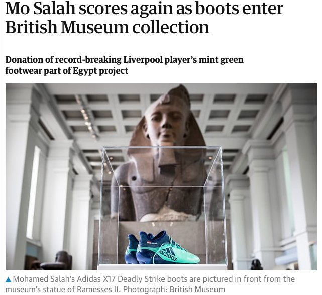
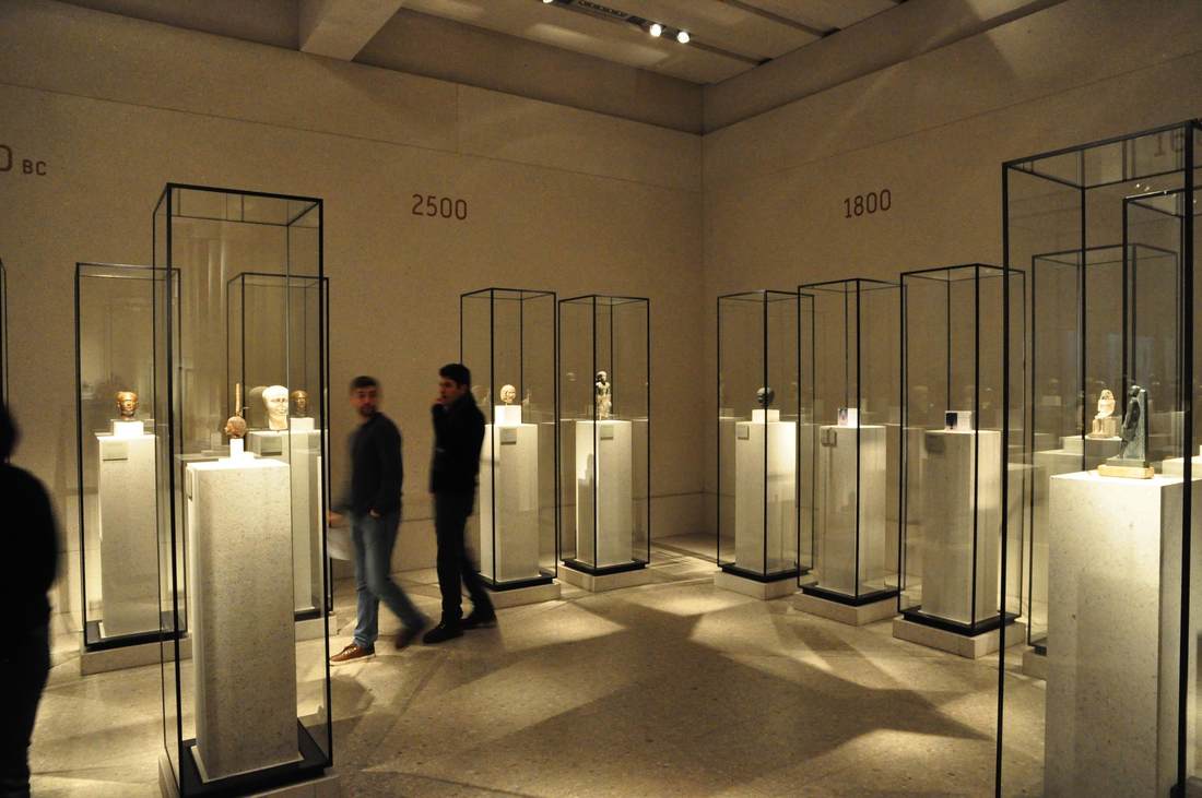
Displaying a pair of soccer star Mo Salah's shoes in the middle of a gallery of ancient Egyptian sculpture—as reported in this article in The Guardian, screenshot above—is a display tactic all of its own. Capitalizing on World Cup fever is just one element. What's more, the incursion of such a colorful, everyday, clearly modern material into a room full of old, imposing, monochromatic statues is eye-catching. In this case it's also a powerful statement about cultural heritage: keeper Neal Spencer says that "The boots tell a story of a modern Egyptian icon, performing in the UK, with a truly global impact." The same could be said of the ancient colossi surrounding the shoes. As museums are increasingly confronted with dissatisfaction about cultural colonialism and claims of presenting a "global heritage," such displays trying to engage the debates are on the rise. Successful or not, the fact that they engage at all is a first step toward improving how we teach and learn about culture through objects.
A current special exhibition at the Altes Museum in Berlin called "Fleisch" (Meat) focuses on the cultural significance of meat. Ranging from the religious rites of animal sacrifice to the lustful gaze directed at nude female bodies, the theme is perhaps overstretched; but as an interdepartmental intitiative it is exemplary, and its design is beautiful. The most striking component is industrial-grade rebar lattices painted a fleshy pink, serving as the mount for signage and pictures; these are attached with simple S-hooks reminiscent of meathooks. It's a simple, cost-effective device which here also highlights the theme of the show—very tasteful!
Paging through Edward Tufte's book Visual Explanations (1997) is instructive not only for graphic designers, but anyone creating—or even reading!—visual displays. In a distinctly personal, engaging voice, Tufte explains what makes effective visual presentations for all sorts of information. He does not feel compelled to hide his disdain for a bad design, and he openly celebrates a good one. One example is the diagram of an ear at the top of the page above. Tufte so loathes the design at left, with its heavy lines almost indistinguishable from the ear itself and its cryptic letter labels, that he compares it to a Renaissance drawing of a man being stuck with swords (below). He juxtaposes the bad design with one he finds preferable, in which the indicator lines are finer than those delineating the ear and the nonsense letters are replaced with the names themselves. The thickness of the lines is highly significant, Tufte points out: one thickness should be used for the drawing of the ear (the object being explained), another for the indicator lines (the metalevel of our knowledge). The two grids at the bottom of the page show this again with two different thicknesses of line used in the background pattern; the diagonal lines overlying them are harder to distinguish in the lefthand example because they are nearly the same thickness as the background lines. The facing pages shown below illustrate not only Tufte's exasperation at bad design and his acerbic wit at its expense, but also the huge range of applicability of his principles. At left is a painting by Ad Reinhardt, which Tufte uses as another illustration of how subtle differences can have great meaning (here in the shades of blue rendered in three nearly imperceptible vertical bands; Reinhardt wanted to focus the viewer's attention on these simple and subtle differences).
Art historians, of course, are very accustomed to comparing two objects (a cornerstone of the discipline since Wölfflin), but they do it differently than people who are not trained to look for certain details or to already know certain things about the objects. This can lead to the display of a group of objects which makes art-historical sense but not intuitive, repeated-image-viewing sense. In the Neues Museum in Berlin (below), one room has a timeline written on the wall behind a row of Egyptian sculptures. The intent is to show how humans were portrayed in Egyptian art over time. But the earliest objects happen to be just heads, while the later ones represent entire bodies. The repetition of heads at first, and the subsequent break with this repetition, gives the false impression that what changed around 1600 BC is that the Egyptians started depicting people with bodies. Or perhaps in a different color of stone? Meaningful similarities and differences are hard to notice because of the many other factors at play beyond just the one meant to be highlighted.
Recently the Berliner Zeitung published an interview with me in their series of "Berliner Weltverbesserer" ("Berliners Bettering the World")—a title I can only hope to aspire to! I'm especially proud to be one of the first humanities scholars interviewed for the series. Archaeology can stand up to nanotechnology in bettering the world! That is my view, anyway, as I try to show in this short text about what I find important about my research. The understanding of other cultures is something I try to underscore in my work, since I think it helps us to better understand and respect our modern multicultural world. Greek, Roman, and Egyptian interactions 2000 years ago can tell us a surprising amount about our intercultural interactions today!
|
Ideas on Display
A humble space to reflect on concepts of museum display as enacted across a wide range of subjects, countries, and approaches.
Archives
April 2020
Categories
All
|