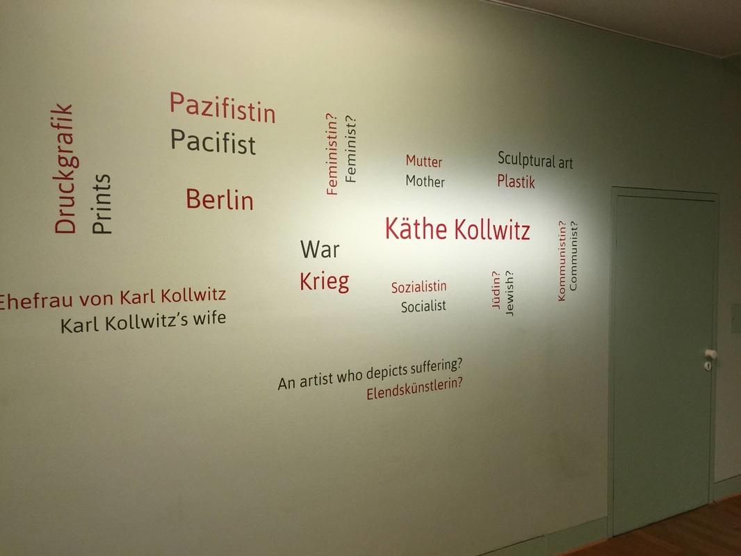
Once a month the Käthe-Kollwitz Museum in Berlin offers a lunchtime tour by the director, Dr. Iris Berndt, and yesterday's provided the extra motivation for my first visit to the museum. Standing in the first room of the ground-floor galleries, waiting for the tour to assemble, I was struck by the "word cloud" on a wall right next to the entrance. Like the automatically generated word clouds on the Internet, this collection represents thought trends in a wide set of "users" (clustered around the name of the artist, nicely emphasized with extra lighting). But unlike the digital word clouds, these words have been carefully selected to educate. As Dr. Berndt explained, they all represent concepts widely understood to apply to the great German artist Käthe Kollwitz—but several of them are problematic or even false. By marking these four terms with question marks—Feminist? Jewish? Communist? An artist who depicts suffering?—the display indicates that these preconceptions need to be reexamined and possibly discarded. This seems to me a very simple yet effective way to ease a visitor into the experience to come: several key themes are named right at the beginning, setting the tone for the subsequent galleries and helping a visitor to frame the individual objects; and just as importantly, it introduces the idea of questioning stereotypes, clichés, and pat explanations. For such a complex, richly-textured life and oeuvre as Kollwitz's, this strikes just the right first note.
Yesterday saw the finale of an ambitious multi-year project in the National Museums of Berlin meant to probe the issues in displaying ethnographic collections today. This "Humboldt Lab" took place in Berlin's Ethnological Museum and raised some fantastically interesting questions—like the problem of displaying sacred objects not meant to be seen, the subject of an earlier post on this blog. The publication accompanying the seven "trial" exhibits constructed as part of the Lab is lovely too; I look forward to reading it. (For anyone interested in ordering a copy but undecided on which language, go for the original German—the text is much more readable than the English translation.) Although I'll be sad to see the old museum close (below is a view of the sleek South Pacific galleries, reopened in 2004), it will be exciting to see how the museum moves ahead with the results of this unique petri-dish opportunity!
Running across the article "Geheime Dinge" (page 46) this week was serendipitous because it aligns perfectly with the last post on how to display something too small to see. A similar display problem is facing the team behind the Humboldt Forum, a huge new cultural space being built in the center of Berlin. Among other things, the Ethnological Museum will move into this space—and has made this an opportunity to experiment with new, sometimes radical display ideas. Exhibiting objects from "non-European cultures" (the term used in all HuFo materials) is difficult to do tactfully, to say the least; and one of the most intriguing problems that has come up in this respect was addressed in an article from a promotional magazine put out by the Forum. The title and tag line say it all: "Secret Objects. How can you display objects that are so sacred, so secret, that the uninitiated are not even allowed to see them?" The sign in the case reads "Object removed for spiritual reasons."
One of the examples in the article, small inscribed stones from Australia that are considered sacred and "unshowable" in this way, was proposed for a display that included not the stones themselves but 3-D prints of them, along with authentic materials associated with how the stones were used (such as incense). This indeed follows the letter of the law by not showing the stones themselves—but is showing a perfect replica of them a respectful solution? Another proposal has the (real) objects in a case that is somehow clouded or shrouded, from which the veil is lifted for a few seconds every so many minutes to offer visitors a peek inside while still preserving the objects "unseen" for most of the time. This seems to me a dangerously titillating solution, encouraging a peeping-Tom voyeurism that would defeat any modicum of respect for the objects and their culture. It is an extremely difficult problem that the HuFo team is facing; I look forward, not without anxiety, to seeing their answer. Once upon a time in Berlin, there was a colossal statue of Lenin. His head alone weighed 3.5 metric tons. The statue was dedicated in 1970 (Lenin's 100th birthday), dismantled under the new regime in 1991, and condemned to be buried in a nearby forest, where it still lies to this very day. Now it is meant to go into a permanent exhibition; that is, it was meant to, until the Senate suddenly and mysteriously decided to forbid it just two weeks ago. (All of this is reported in an excellent Berliner Zeitung article.) Once the Senate ends its summer recess and comes back to the issue on September 23, I will be following this story, hoping that it ends the way it should: with this amazing piece of art on show, teaching visitors about the vicissitudes of power and the concomitant struggles over putting objects on display!
What do these two photos have in common? True, both were taken inside museum galleries—even if the location is obscured in the lower photo by the throngs of people, completely lacking in the top photo. The main point in common is the large dark object on display in both galleries: the Rosetta Stone. The "stone" in the top photo, taken in the Deutsches Museum in Munich, is actually a plaster cast of the original; the original stands in the British Museum, shown in the lower photo. The crowds illustrate the value we place on authenticity—but could it also be symptomatic of the different display concepts? The cast of the Rosetta Stone in Munich is certainly no crowd magnet, but it is also not set up to be one: rather, it is a supporting actor in the gallery on writing and printing technologies. In the British Museum, by contrast, the Stone is displayed right at the entrance to the ancient art wing (creating traffic problems), telling visitors (as well as expecting them to know already) that it is a highlight. Cues like this definitely affect the way visitors clump and move among the displayed objects.
Within the city-sized complex that is the Deutsches Museum in Munich, one gallery is devoted to ceramic technology. This room houses a model of an ancient Roman pottery production center, an enormous vat for transporting acids, and many smaller wonders of ceramic that we encounter (mostly unknowingly) in our everyday lives. The ceramic knife and roller skate wheels are mounted with small pieces of clear plastic onto a clear plastic sheet standing vertically in the back of the display case—a good way to make the display more legible and interesting than simply laying out the objects on a tabletop. They seem to "float" in front of the very colorful orange backdrop.
Impeccable timing! This news story came out in Deutsche Welle just after I wrote the last post, and highlights precisely the same idea of viewer engagement as discussed there. In this case it's not a victory podium but a chair to stand on, and it invites you to stand on it by virtue of the three chairs next to it with people (statues) standing on them. These people all "stood up" for what they believe in, and spoke out—so here's your soapbox: what will you speak out about?
How can museums effectively engage their visitors? It's a huge question with myriad answers—and sometimes it seems that each answer only raises more questions. Over the past six weeks or so I've gotten to participate in some rousing discussions about public engagement in museums (one was this scintillating symposium in Cambridge) and was deeply affected by the ideas presented there. Many of them involved staging events in the museum, making the museum a hub of activity and an agent in the lives of the community. One of the most moving ideas came from our colleagues in the National Archaeological Museum in Athens, who have worked with a correctional center to create opportunities for young offenders to connect and grow with art.
Yet public engagement can work on much smaller levels. Three levels made of white plastic, for instance. I saw these steps on the sidewalk outside a restaurant, simply standing there beside the tables and stools, and thought it was a very clever way to invite a passerby to stop and engage. Nothing says "we need a person here, and it should be you!" like an empty victor's podium! Can't you imagine a group of friends vying to be #1? In that moment, they have stopped to engage and have fun as we can only hope they would at a museum display. In this case the restaurant must be hoping for a bit more face time with potential customers—but a museum could surely use this tactic for another purpose. These steps act almost like a large wooden cut-out with a hole for the face: it is practically magnetic. So purpose-made, missing only the human ingredient. And someone to take a photo of that human, of course. Ideally, exhibitions don't exist only within the confines of a gallery: they can stay with the visitor for long afterward, perhaps with the aid of a souvenir. The booming development of gift shops in museums (or museums appended to gift shops, as it might seem at times) is a polarizing issue, but personally I always like browsing the selection of books in a museum shop. Often the supply include books you can't find anywhere else, and they tend to include superb pictures. So I was happy to see this table of books in the exhibition galleries of the Neues Museum in Berlin. In a long gallery that mostly serves as a passageway, this table wasn't competing for attention against any objects but presented the visitor with an array of books relevant to the adjoining galleries. I like the idea of being able to browse the books while you're still thinking about the objects on show, rather than having to wait until the end of your visit when other thoughts are pressing in (bathroom, next museum, lunch, etc.). The subjects ranged from the famous "golden hat" in the neighboring gallery to well-chosen books on astronomy (a theme integral to the hat) and early humans.
To conclude this brief series of posts on the Museum of Arts and Crafts in Hamburg, let's return to the Aegean blue galleries of ancient art. This room struck me for two reasons. First of all, such a cluster of display cases (at right in the photo) rising up to a pinnacle is not very common. It seems to me a nice way to provide some height to what could otherwise be a row of cases stultifyingly alike in size, shape, and disposition. The way it incorporates a strong vertical element reminds me of the upright burial in the Neues Museum in Berlin: an economic use of space as well as an interesting break from the usual case distribution.
The other aspect I liked about this room is the high ledge along the lefthand wall. Supporting a set of Greek funerary monuments, it acts like the original base that would have elevated these objects far above the ancient viewer's eye level (as in the example of the Dexileos stele, a replica of which can be seen here in the original context). Like the columbarium in the Altes Museum in Berlin, this gives the museumgoer a better idea of the original display context of these objects than if they were set at ground level or in a case. The trade-off is that their details are not easy to see from this distance and angle; but this seems a fair trade, in that it makes excellent use of large marble objects that don't need the climate control or protection that a case provides. Don't fret, your eyes are not going half-fuzzy: this is the next innovative display idea from the Museum of Arts and Crafts in Hamburg. In a special exhibition on provenance (itself very nicely done, with all the right questions and answers about provenance written into the wall and object texts), this case stood out for several reasons. First of all, the construction-worker orange color under the silver objects. Like the bright purple in the Cabinet of Curiosities display or the cerulean blue in the Greek galleries, I'm not convinced that the color enhances the objects; but it does a fabulous job of acting like a tractor beam to reel in the viewer. Bright! Shiny! Must get closer!
The second feature that struck me is the use of stickers on the glass walls of the case. As in the bubble effect in the Egyptian gallery, here too it seems that vinyl stickers were smoothed onto the panes in order to direct the eye in certain ways. Here the stickers are more subtle than the circular cut-outs: they are clear and just barely textured so as to give the glass a frosted appearance. Cut into large triangles and laid at irregular angles, they create an almost hallucinatory effect as you look into the case. The photo below shows how the stickers echo the geometric gray printed background on the back and base of the case, while the upper photo illustrates the sometimes dizzying effect of looking at an object half-obscured by fog. Yet I loved it, despite feeling vaguely disoriented. As an optical illusion of sorts, it asks the viewer to look closely to figure out just what she's seeing; and in so doing, it gets her to stay put, scrutinize, change viewpoint, look again. That is a great achievement. And in my experience, even if my attention was first focused on the case, it certainly shifted to the objects. Some of the oldest material in the Museum of Arts and Crafts in Hamburg is displayed in one of the freshest ways. Stepping into the first gallery of Egyptian art feels a bit like entering an underwater world: the walls are a deep turquoise-blue, the lights are dim, and there are luminous bubbles floating before your eyes. Or so it seems! The bubbles are actually circular windows in the wall that look onto one huge recessed case. The back wall of the case is painted light yellow, which in the dark room practically glows. Like the bright purple cases in the Cabinet of Curiosities, these spots of color attract the eye and draw the visitor in for a closer look.
What's more, this display made me realize that circles are not a shape we often see in museums. I suppose this is partly dictated by the fact that glass display cases almost have to be rectilinear (and although advanced plastics can be molded into all sorts of shapes, I don't know if they are being used in display case technology). It seems to me that using circles to give the eye a break from linear geometry and to highlight certain objects could be implemented with normal cases, too: how about a big vinyl sticker with a circular cut-out in it, stuck onto a glass display case? As a kid I loved playing with the thin, translucent plastic shapes that stuck to windows and easily peeled off again; could we translate that technology? Continuing the thread from last time, this post takes us again to the Museum of Arts and Crafts in Hamburg for a look at another of its colorful displays. This bold black-and-purple gallery presents a "cabinet of curiosities" in which the objects are grouped according to aesthetic criteria rather than geographic or cultural origin or the like. Part of the aesthetic effect in this Kunstkammer is achieved not just by the objects but the display: the strongly contrasting colors and recessed cases are very eye-catching. The radiant cases drew me toward them, a moth to the flame. (A similar concept of colorful cubes sunken into a black wall appears in the Neues Museum in Berlin.) What I find so smart about the flashy display concept in this instance is that it actually advances the theme of the room: like the original Kunstkammer, it elevates aesthetic effect to the highest priority. This space demands to be experienced on an aesthetic level first and foremost. Indeed, you can hardly do otherwise — because in keeping with the original Kunstkammer concept, the only text in the entire room is the name of the room printed on the wall!
Last week I had the pleasure of going goggle-eyed at the Museum für Kunst und Gewerbe (Museum of Arts and Crafts) in Hamburg. Room after room in this museum offered new, bright, lively ideas for displays that had me alternating smiles with scooping my jaw off the floor. Needless to say, I was very excited and merrily snapped photos of a few of my favorites. Today we see the first of five (yes!) highlights.
The large display case at right in the photo above houses ancient Greek objects that represent aspects of Classical Greek warfare. I liked the use of this theme to unify a set of varied objects differing in size, material, and shape, from small clay vases to imposing bronze armor. And although I'm not sure that the radiant blue augments the objects per se, I love that it adds a splash of vibrancy to a set of objects that is otherwise largely bichromatic (red and black/gray). More striking, however, is the juxtaposition of the large case at right with the smaller one at left. It holds a relief from Benin, Africa. (Although the relief looks minuscule, this is just an effect of the photograph: the relief is several meters farther from the camera. In reality it is a bit bigger than the bronze breastplate at right.) The Benin relief was made approximately a millennium later than the Greek pots, yet it too depicts warefare — in a remarkably different way. Together, the two cases in this room draw connections across time and space to show how very different cultures can share a common social convention (if we can call war a social convention) as well as a desire to express it visually. How they each express it, and why their means of doing so should differ in some ways and align in others, is the basis of precisely the sort of cultural comparison that I think enriches our human experience. It sparks insight, demonstrates connectedness — a profound result from a simple but insightful display concept. A successful display does not need a fancy new design idea or technology to be successful (indeed, sometimes those can really go awry!). Some of my favorite displays are very simple; their strength lies in being extremely well-conceived in terms of how they achieve their few basic goals. One great example is the signage at the Domäne Dahlem in Berlin, a charming set of fields and cottages meant to teach the visitor about old-time farming and artisanal trades. The signs scattered around the grounds are excellent in several simple but important respects:
Botanical gardens are a special kind of museum. By their very nature they have certain restrictions and opportunities that are foreign to a "brick and mortar" museum — for instance, walls. Walls are both a restriction and an opportunity, really, and one that is rather lacking in at least the outdoor portion of any botanical garden. With walls come wall texts, as well as the ability to encourage certain directions of movement. Lacking walls, botanical gardens (again, speaking of the outside area; the greenhouses and possible visitor center or attached museum are a different story) miss these opportunities even as they gain others.
What potential repercussions a lack of walls might have on a plant display struck me at the Ökowerk Berlin, which includes several garden spaces on its extensive grounds. Labeling the display is tricky when there isn't a wall to support the labels; the solution here is to print small paper labels and slip them into metal and plastic holders staked into the ground. The stakes are well-conceived insofar as they can be placed anywhere, and presumably even moved as the plants grow, unfurl leaves that then cover the signage, or drop their leaves and retreat to a mere husk, requiring the signage to be set nearer in order to look relevant. Unlike larger signs too, they can be stuck right in the middle of a bed of plants, making very clear what they refer to. Conversely, the portable size restricts the amount of information that can be given: so in this case, QR codes have to do almost all of the legwork. A recent exhibition idea came to me not from a museum but a beer garden. Yes! — and whyever not? As we see the boundaries break down between museums and other cultural institutions — museums are inviting in theater companies, yoga practitioners, and Michelin-star chefs for their restaurants, all in the name of innervating their public programs — ideas for exhibition design should come from non-museum institutions as well. This one struck me as I walked through the cultural hub atop the Pfefferberg in Berlin, with an outdoor tango stage to my left and this gravel-floored beer garden to my right. Above the tables were hung several dozen glowing orbs, dangling from the tree canopy. They ranged from about 50 cm to 150 cm in diameter, in varying shades of mottled yellow-orange. The effect stopped me in my tracks. Cosmic, certainly: it's like seeing the heavenly bodies descend to within touching distance (almost!). It made me think that such a mesmerizing display could just as well serve in an art museum gallery, simply as an accent to the exhibition down at ground level. Because the orbs are so eye-catching, they would have to be deployed thoughtfully in order that the art not be outshined; but carefully placed in a dimmed gallery with a few lit cases of sculpture, for instance, they would make magic. They would encourage lingering and looking, precisely what we aim for in museums. And they would use some of that tall vertical space at ceiling height that rarely gets used anyway. Pairing the orbs with beautiful visual material seems an obvious choice; pairing them with beer is optional.
The Trier Landesmuseum came onto my radar recently, and in browsing their website I grew excited about the photos of their permanent collection display. The exhibition presents "a circular walking tour through the entire history of Trier and the Trier region – from the Stone Age to the Roman city, from the Franks to the last Trier Electoral Prince." Apparently it won an award for its design, and I can see why! From the band of purple backdrop for precious miniatures to the half-recessed cases (artworks in themselves), the design is truly beautiful. I hope for the chance to experience it in person to see how it works for the collection.
Note on the award (from the museum's website): “red dot: best of the best” Award 2011 The permanent exhibition of the Trier Landesmuseum was awarded one of the most prestigious international prizes for design, the “red dot: best of the best”, in the autumn of 2011. The exhibition received the prize in the category “communication design” for an especially bold, innovative, modern design. Verticality is a leitmotif of the Neues Museum's new exhibition of its collection of Prehistory and Early History. As discussed in the last two posts, the simple yet unusual tilting of the usual axis of display invigorates the objects: not only are they easier to see than if they stretched back into the recesses of a large horizontal case, but this visibility acts like a visitor magnet. The photo above is indicative: I couldn't manage to take a photo of this case without people in front of it! Of course, the morbid subject boosts the interest of this particular case (none of the other cases in this gallery enjoyed such a constant stream of viewers) — but in any case, I bet that it wouldn't see nearly the same traffic if it were laid out flat. I would love to see a study in which the same set of bones was displayed horizontally for one test group and vertically for another, with the aim of comparing the number and duration of visits to each.
Standing an archaeological quadrant on its head as above is more than a spectacular feat of conservation. It also makes plain a big question about displaying archaeological material: specifically, whether the display should represent artifacts in a context reminiscent of their original one, or rather in a highly aestheticized one. Neither possibility is right or wrong; they are simply two points on the spectrum of approaches. The Neues Museum has opted for the latter to stunning effect. The case below is one of the best examples: axe heads arrayed in a 14 x 11 grid make no claim to conveying use or find context but rather make an arresting visual package. Yet the pedagogical potential is in no way diminished. Quite to the contrary — the display perfectly underscores the thesis of the case. The text describes the value of metals in the Bronze Age, which is succinctly expressed by the sheer wealth of axe heads (and jewelry) placed on show. Disembodied as they are, with an emphasis on their number and physical form, the axe heads actually better represent the abstract idea of wealth than if they were displayed in a semblance of their archaeological context. Continuing the train of thought from the last post, today I want to share another method by which the Neues Museum in Berlin has chosen to exhibit its objects vertically. The concept seems simple, yet the effect is striking. In the case pictured above, shards of glass have been clipped into special wire holders that stick up from the plinth like flowers — although given the geometry of the pieces, they almost resemble cosmic debris shooting into space! With large, heavy lumps of glass providing visual weight at floor level, the projecting fragments provide a gorgeous contrast in weightlessness. As a way to use the full space of a case, from bottom to top, this is very clever. Moreover, it brings these rather humble pieces of history to life: by contrast, can you imagine the effect if they were simply strewn across the floor of the case? It would probably be stultifying. Instead, here we have a carefully choreographed play of shapes, colors, and space. The stunning effect is worth far more than the simplicity of the idea would let on; and what's more, the concept can be executed on the cheap: although this version is highly refined, a similar idea could practically substitute wire coat hangers. (Alright, just check with the conservators first!) For context, you can see this case in its ensemble of ultra-modern cubic peepholes in the photo below. (Subject for another post, this black box-with-hidey-holes approach.)
While the traditional mode of displaying an object in a museum has been to put it in a glass case, bringing an object out of the case — and therefore into the visitor's physical space — can make it much more powerful. Removing even a transparent barrier like a glass box makes the object instantly more immediate: it now inhabits our world, rather than some removed one whose distance in both time and space seems to be symbolized by the vitrine.
Making objects more accessible in this way has its own complications, of course — not least in that they become quite literally tangible! Not all objects can stand up to a curious visitor's stroking finger or spontaneous sneeze. Precisely this problem was debated between the curators (who wanted the case gone) and conservators (who were concerned about protecting the object) at The Metropolitan Museum, when Navina Haidar hoped to remove the vitrine from around a fabulous incense burner in the shape of a lion. In both that instance and the one pictured above, in the Neues Museum in Berlin, a large base below the object resolved some of the difficulty. The oversized base keeps people from approaching too closely while still allowing them to experience the object "up close and personal." In addition to the caselessness, two more factors add enormously to the Neues Museum's display of two Bronze-Age trumpets. One is that the base serves doubly as an audio station: by pressing a button on the front, the visitor is treated to a haunting chorus of blaring trumpets. Hearing the tones they would have emitted feels like a substitute for holding them and playing them yourself; it is a wonderful sensory experience. The second notable factor is that the trumpets are suspended rather than mounted to the base. Their twisting shapes lend themselves perfectly to such an ethereal effect, as if they were being propelled into the air by their bronze flagella. Many of the displays in the Neues Museum's newly-renovated galleries were conceived with a vertical rather than horizontal format in mind, which is not only space-saving but visually arresting. A future post will explore some of the other creative designs. An astounding number of museums sprinkle the Berlin landscape. By the city's own count, there are over 170. While some of the museums on that list are extremely well-known and heavily frequented — foremost being the Pergamon Museum, with some 1 million visitors per year — many are small, quirky, and practically undiscovered. Neighborhood museums belong to this genre. Off the radar for most tourists, these museums focus on the history and culture of the immediate locality (Kiez); they must be a dream for school groups, and offer the curious visitor too an unusual glimpse of local life.
Of the 20 Kieze in Berlin, more than 11 have their own dedicated museum. One of these, the Friedrichshain-Kreuzberg Museum, occupies several refurbished stories of a building in the geographical center of the Kiez. The third floor (or fourth, in the American system) is entirely devoted to a beautiful big map of the area marked by easy-to-read landmarks and colorful numbered circles. The clean white walls, ceiling, floor, and pillars lend an airy feeling, and the room almost feels empty — until you step into it and use it for what it was intended. Borrowing a set of headphones and an iPod, the visitor is meant to walk around the map listening to local Berliners tell their stories linked to specific locales. The stories have been grouped into ten themes, each marked by a different color and labeled on the wall: from "work" and "eating" to "belief" and "suffering," the themes are both straightforward and richly textured. The visitor can opt to follow a certain color to hear stories related by theme, or select a path of stories all told by the same person, or wander the map at will choosing stories of any color or location. It is a marvelous trick of kinetic learning, made even more effective by gorgeous graphic design. That the stories are personal and told by inhabitants of the Kiez rather than actors, specialists, or museum staff makes them very compelling. In fact, the introductory panel invites visitors to make an appointment to record their own stories in the museum's audio studio! So as it turns out, this spacious white room is filled with only half of a display: the other half comes from the visitor bringing in her own exhibition content, her personal history. Local engagement couldn't get any more local and engaging. Ancient Roman funerary urns were made to long outlast their cremated contents, and indeed survive today in the thousands. Italian museum in particular house an incredible number of these urns: the Museum of the Baths of Diocletian in Rome come to mind, as well as the lower floor of the Capitoline Museums. Because the marble chests are compact and often unassuming, they might be displayed on the ground outside (as at the archaeological museum at Aquileia) or in glass cases on the side of a gallery (The Metropolitan Museum in New York). Decorated with a profusion of miscellaneous imagery and an inscription in Latin or Greek, they are not the most accesible objects in a gallery of ancient art; they require some close looking to be properly appreciated.
This all serves as background to say that the Altes Museum in Berlin has hit upon a brilliant display technique for a selection of its urns. In reconstructing the arched niches of a columbarium, the tomb in which such urns were placed for burial, the display case here not only recreates the original context of the pieces but encourages the viewer to take a closer look at these elaborate objects. Framing them like this really draws the eye in a way that a simple display case (let alone a spot on the sidewalk!) does not. What's more, this case allows the urns to be stacked three high — making them more imposing as well as saving precious gallery space. History museums have a tougher row to hoe than art museums, in some ways, because the objects they put on display do not usually fall within the category of "fine art" and therefore may not be considered worth looking at per se. Most of all, how to engage a viewer with texts — the bread and butter of historical research — is a very tricky issue that history museums have to address. How can you display a ream of letters and documents in a compelling way?
The Dokumentationszentrum Berliner Mauer found an elegant solution to this problem. A series of cables and thin steel poles stretch from floor to ceiling, standing as masts of sorts for the "flags" of text panels hung on them. Oversized panels were bound into booklets of which each "page" held two A4 sheets and an explanatory text. The visitor could page through the cluster, looking at each page in turn. Several cables and poles held not booklets but lightboxes with historic photographs. The overall effect was wonderfully open — no walls necessary! — as well as highly engaging, in my experience. Rifling through the big splayed boards is incredibly tempting. Visiting the Zentrum's website just now, I see that the whole building (and probably its surrounds, which are just as much a part of the museum) is under renovation; let's hope that some of this wonderful ingenuity appears in their new design as well. |
Ideas on Display
A humble space to reflect on concepts of museum display as enacted across a wide range of subjects, countries, and approaches.
Archives
April 2020
Categories
All
|