Dr. Stephanie Pearson
  • Home
  • Projects
    • museums.love
    • Uncertainty and Debate
    • Mithras Model & Audio
    • Weltverbesserer Interview
  • CV
    • Employment
    • Education
    • Museum Experience
    • Professional Training
    • Publications
    • Awards & Grants
    • Teaching
    • Invited Lectures
    • Workshops & Chaired Sessions
    • Conference Papers
    • Professional Engagement
    • Excavation
  • Exhibition Reviews
    • Anna Dorothea Therbusch
    • Making Ancient Art Contemporary
    • Cleopatra
    • Pompeii and Herculaneum
  • Tours
  • Ideas on Display (blog)

Interactive, User-Directed Lighting? KWAB in the Rijksmuseum, Amsterdam

9/1/2018

Comments

 
Picture
Picture
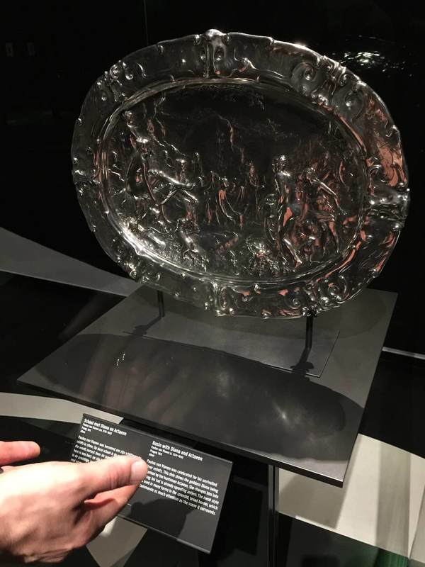
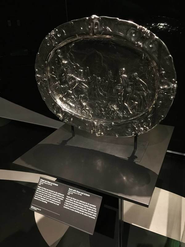
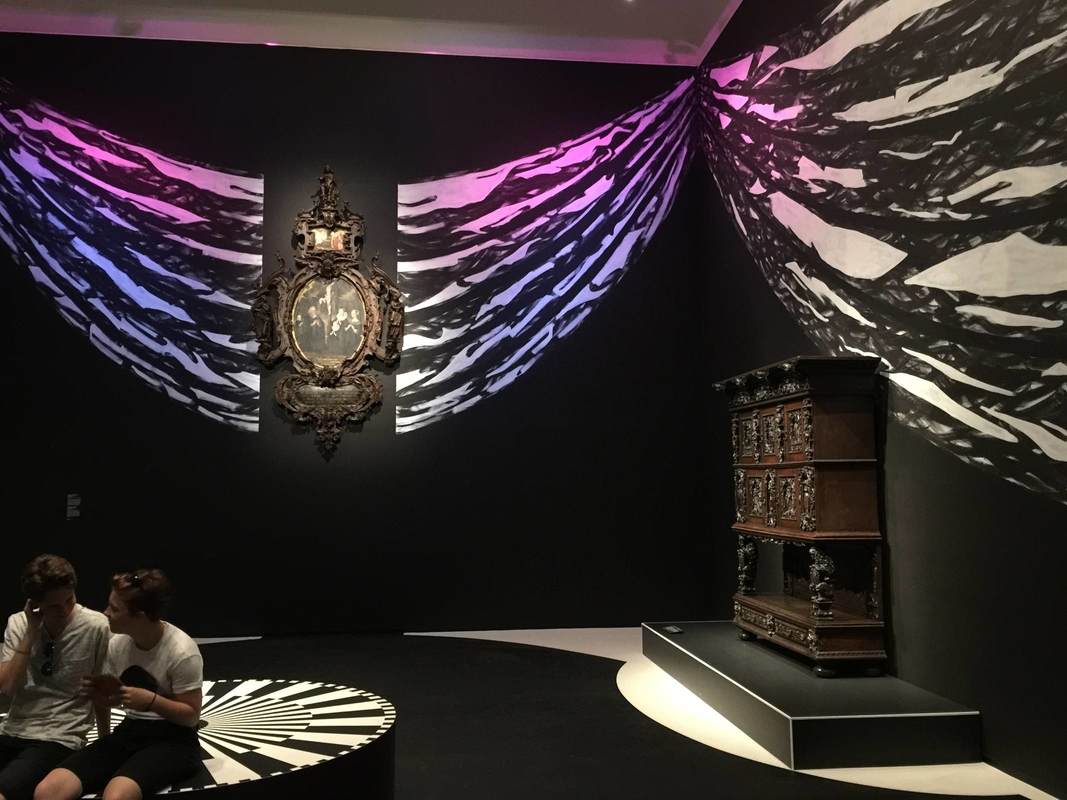
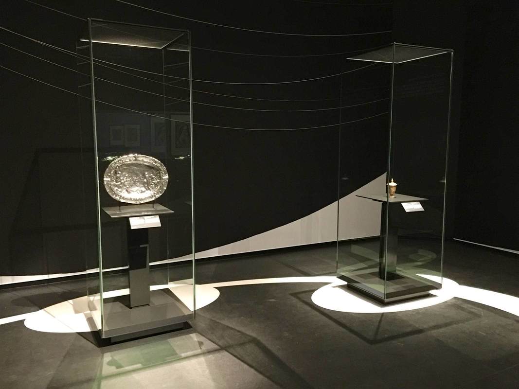
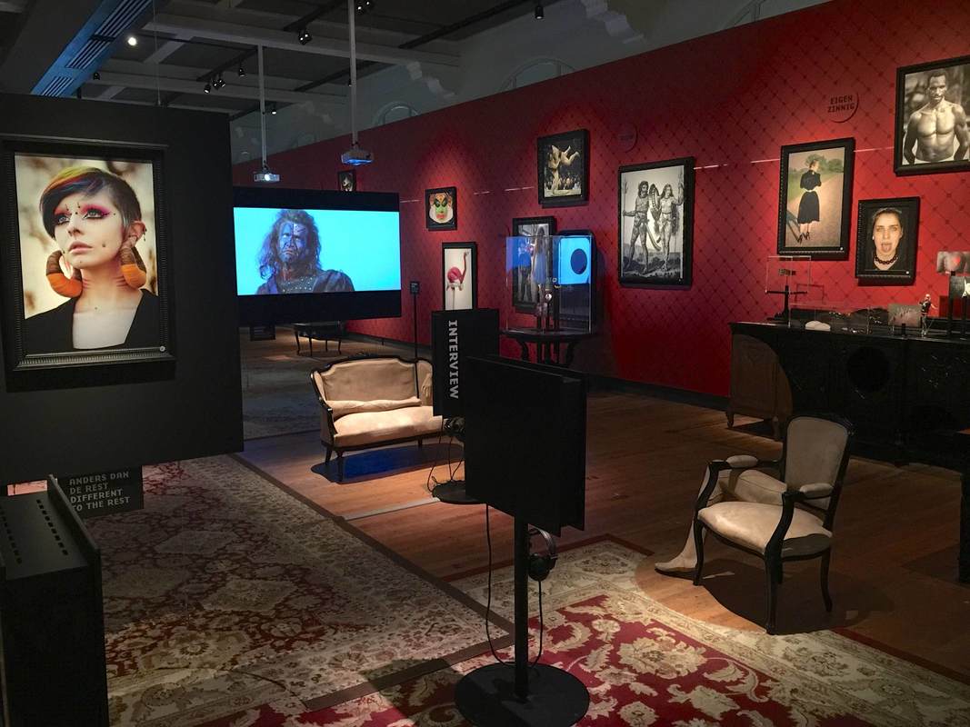
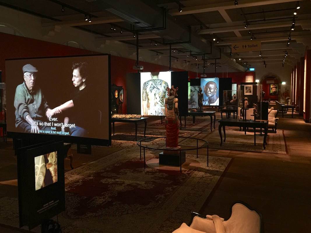
This last post about the KWAB exhibition in Amsterdam's Rijksmuseum concerns lighting. This show got me and my partner-in-museology thinking about the potential for self-directed lighting in museum display. The impetus was this lovely, huge, embossed silver platter. Its fabulously fine relief is hard to see in any detail, not because the lighting is poor per se, but because it is static. Especially for objects that would have been handled, passed around, held up to the light, or simply displayed in a space where people could view it from different angles, the viewing conditions offered by a museum could hardly be more different. And it can be frustrating to try to make out what all those tiny relief people are doing on this silver thing; even I was inclined to give up and move on to something more decipherable. But adding a couple of pink hands as a reflecting screen (above right) changed everything—even more so when moved from side to side! The addition of not only light but color and movement made the relief eminently more legible. This is the reason that Reflectance Transformation Imaging works so well (here's the process): under different lighting conditions, especially ones we can adjust and move at will, we can perceive relief and texture much more easily.

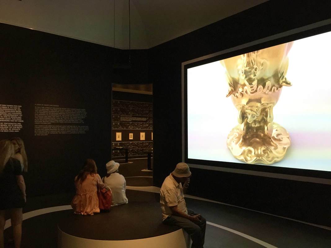
So how about visitor-directed lighting? This could be as simple as offering visitors sheets of printer paper at the entrance and encouraging them to use it as a reflecting screen (on objects in glass cases only, if you're worried about paper and people getting near unprotected objects). But personally I think it would be exciting as a central element of a show; it could even be the main topic, "Old Things in New Light." You could experiment with little lights mounted on tracks in front of the objects, so the visitor can slide the light from side to side. Heck, grab that gooseneck lamp from your desk and mount it next to an object—there, you've got interactive, user-directed lighting! There are dozens of forms this could take, and just as many epiphanies about the objects in new light. Let's go wild and see what happens.
Comments

Painting walls and floors - KWAB in the Rijksmuseum, Amsterdam

8/31/2018

Comments

 
Picture
Picture
Another notable aspect of the show KWAB in the Rijksmuseum, Amsterdam is the background painting. Walls and floors alike are painted with bold black-and-white designs carefully arranged to highlight the objects. This geniusly serves several purposes:

1. Emphasis

​The painting can be used to make an object really pop out at you. The beautiful ebony armoir above (left) gains a whole new life from the white moon behind it. The sinuous curves at the top of the chest stand out against the light background, and the hovering circle gives the piece a lively dynamic—almost as if it were a nocturnal creature standing in a moonlit landscape.

The tiny silver pitcher above (right) gets an injection of energy from the white rays radiating out across the floor. They turn the pitcher into the source of a geometric explosion, and who doesn't want to look closer at that??
2. Context

​The same black-and-white painting technique on the walls is used in another way, namely to recreate a sense of the objects' original context. Keeping the monotone palette is a nice way to keep the "reconstruction" attempt from becoming distracting, while at the same time contextualizing objects rather unfamiliar to a modern viewer. In the photo below, the oval painting in an elaborate wooden frame is hard to imagine wanting to hang on your living room wall; but with the illusionistic swags of drapery emanating from it, it gains the elegance and appropriateness to the opulent display context it was originally meant for.
Picture

In the room below, a different pattern is used to imitate the wall decorations of the time, which in richer houses included embossed leather (!) wallpaper and wooden paneling:
Picture
3. Directing Movement

In both the room above and that shown below, the wall and floor painting is used to encourage us to move through the exhibition in certain ways. Above, a long white band leads us from the bottom right (a doorway is just off the photo to the right), along the wall of drawings, and over to the paintings at left, where the half-circle of white under the center painting encourages us to linger.

White stripes and circles similarly guide our movement between these two glass cases, this time reinforced by a subtle white curve on the rear wall:
Picture
Such a simple and effective device as these paintings seems worth keeping in mind. Certainly, painting the floor will not often be possible in an exhibition, depending on the space (the Getty Villa's marble floors...). But for the wall paintings at least, I would be curious whether the extra cost and time for installation makes them practical or prohibitive.
Comments

A closer, bigger, Splashier Look - KWAB in the Rijksmuseum, Amsterdam

8/30/2018

Comments

 
Picture
Until September 16, the Rijksmuseum in Amsterdam is showing an exhibition called KWAB. Kwab is the name given to fantastical furnishing designs featuring plant-animal fusions in the Dutch Golden Age. Refreshingly, the exhibition left the confinements of standard exhibition design and tried out some very eye-catching new things—paralleling the inventiveness of kwab design itself. The next few posts will highlight some of these elements.

Entering the exhibition brings you face-to-face with the first dramatic device: a huge video sceen showing one of the exhibited objects, filmed in a constantly-moving, close-up pan in various directions. We swirl around, up, into, over, and down the golden vase. Although I'm wary of giving viewers a screen to focus on instead of the object itself, this was a good way to highlight some of the hard-to-see details of the intricate piece. It makes you want to go into the show and find it. Also, most objects in the show are fairly small or, because they are furnishings, not particularly arresting to a visitor expecting "art" in terms of huge Rembrandt paintings—so the massive screen and close-up perspective help draw attention to objects that need it. In the Rijksmuseum, any object that isn't The Night Watch needs all the help it can get!
Comments

Metal basketweaving - Tropenmuseum, Amsterdam

8/14/2018

Comments

 
Picture
A final post about the glorious Tropenmuseum in Amsterdam! This time a technical apect of its permanent exhibition Afterlives of Slavery. Here the display technology resembles a bit the industrical metal grid in the Flesh exhibition currently on in Berlin. The difference is, here the grid is used as a platform for attaching all sorts of materials, not just hanging labels and pictures. Most creatively, the structure is used to best advantage by being paired with a flexible plastic sheet on which the texts are printed; the plastic is cut into strips that can be woven directly into the grid! At right you can see two varieties of this technique, an overall-basket-weave at the top and a just-the-corners tactic below. Allowing infinite combinations and configurations is a huge advantage for such a material. I can imagine it being trotted out time and again for all sorts of different exhibitions, a handy device in the museum's tool box.
Picture
Comments

Fabrics in Fashion Cities Africa - Tropenmuseum, Amsterdam

8/8/2018

Comments

 
Picture
Another wonderful current exhibition at the Tropenmuseum in Amsterdam is Fashion Cities Africa. Like the Body Art show described in the last post, Fashion Cities presents a rainbow of human creativity—and of dyed fabrics! The use of cloth in the show cleverly highlights the theme and at the same time subdivides the space into cozy sections. At the entrance (above), sheets of whitewashed plywood are used as backings for introductory images and texts. Each panel introduces a local designer of African fashion, photographed on the street as if you had just run into them personally; once again it's that intimate human connection that flows throughout the museum. The boards are hung up with thick ropes at top and bottom, a very tactile nod to the cloth-and-design theme.

The second room (or second-to-last, if you entered at the other end) is encircled with hanging yards of cloth in various patterns. With pillows and chairs inside, it offers an alluring spot to tuck yourself into—the museum version of a sofa-cushion fort! Panels outside the ring of cloth explain how the colorful patterns came originally from, for instance, Indonesia (batik cloth), reached the Netherlands through colonial exchange, and from there was sent to Africa. It's a much more complex, indeed global history than one might expect. And it stays with you much more when you can touch this stuff of history, feel it, wrap yourself in it!

*stuff: 
from Old French estoffe = material, furniture. The German word for fabric is in fact Stoff. There's your cocktail-party knowledge for the day!
Picture
Comments

Home Body Art - Tropenmuseum, Amsterdam

8/7/2018

Comments

 
Picture
Last week a new museum topped my list of favorites: the Tropenmuseum in Amsterdam. All too rarely does a museum visit energize you—but, for me, this one did! Instead of museum fatigue and an aching back, I felt revived. The energy and freshness of this museum come from a beautiful openness of worldview, reflected in both the chosen themes and the carefully-written texts (not to mention the program of events). Even the permanent exhibition about slavery manages to sound considered and non-judgmental while at the same time exposing the horrific facts.

This openness is the ideal, indeed necessary complement to the museum's main focus: people. Period. To such an extent that both the website and the museum itself refuse to limit this focus further by mentioning the "tropical" cultures which originally gave the museum its name, or any other restrictive vocabulary. The mission statement is staunchly about people, for people. It obviously intends to take a stand against the colonialist agenda that informed the museum's foundation. Still, at first I found it almost too vague—until stepping inside. People really are the focus of the exhibitions, and it's fantastically invigorating. Encountering so many vibrant cultures feels like standing in the sun streaming through a stained-glass window, all the blues and reds and greens painting and warming your skin, touched by the cosmic light.


But maybe I just came up with that metophor through the inspiration of one of the beautiful human-based current exhibitions, Body Art. Typical of the Tropenmuseum is the human focus and breadth of people included here. Bodily modifications and clothing are examined not by culture or time but according to the desired effect, from making a person feel "different to the others" (above left, extreme piercings and makeup), expressing a group identity (below center, mafia tattoos), or displaying wealth. This grouping allows for striking juxtapositions: under the title "Eigenzinnig" = "Self-Determined" or "Quirky" (above right) are, on one side, a shockingly tiny belt from the days of corsets; and on the other, a contemporary photograph of a woman with a split tongue. Just so can unexpected differences be drawn, as for instance with tattoos. Facial tattoos were carried out on the beautiful girls in a southeast Asian village so that they would appear too strange or ugly for the local ruler to claim as a wife, and could thus remain safely in their communities. A grandson of a Holocaust survivor had his grandfather's concentration camp tattoo reproduced on his own forearm as a permanent reminder (below left).

For all these reasons, I was deeply affected by this exhibition. Even more so because of the intimacy of the setting, arranged like a living room from last century. The homey feeling gives our bodies a safe, comfortable space to inhabit while we reflect on how we use them to express ourselves.
Picture
Comments

Showcasing the "invisible": Micropia, Amsterdam

9/5/2015

Comments

 
New Yorker article
Glowing display of microbes in Micropia (photo: Ed Yong; source: NewYorker.com)
A recent New Yorker article raises an interesting question of display: How can you fill a whole museum with exhibits exclusively about something microscopic? This is the task of Amsterdam's Micropia, a museum devoted to "invisible life"—that is, microbes. Among Micropia's solutions to this challenge are (as reported by the New Yorker, although the author does not focus on the display challenge in particular):
  • an exhibit of the materials used by the first scientist to discover microbes
  • a video that zooms in on visitors and seamlessly continues into animations of microbes that would be found on their bodies
  • a row of microscopes (perhaps the most obvious solution to this display challenge!)
  • a "heart-shaped red platform, the Kiss-o-Meter, which told [a kissing couple] how many bacteria they had just exchanged" (its clever tag line: "Kissing is never just between the two of you")
  • and, perhaps my favorite of all, "a wall of backlit agar plates, some of them with mold or bacteria colonies that traced the contours of the places where they had first begun to grow: keys, phones, computer mice, remote controls, toothbrushes, doorknobs, a euro bill. There were orange dots of Klebsiella, blue mats of Enterococcus, and gray pencil shadings of Staphylococcus—contamination made beautiful."
This is a creative series of exhibits to solve the "scale problem" of showcasing microbes. I hope to see it in person some day!
Comments

Textual Bouquet: Airborne Museum Hartenstein, Arnhem

1/2/2015

Comments

 
Bouquet of letters, Airborne Museum Hartenstein, Arnhem
This post has been a long time in coming, insofar as this particular display idea was one of the motivations to create this blog in the first place: that's how beautiful, simple, and effective I think it is. With it, the wonderful Airborne Museum Hartenstein in Arnhem (the Netherlands) has tackled the difficult problem of making primary-source documents approachable — in this case, eye-witness accounts of life in Arnhem during World War 2. The Dokumentationszentrum Berliner Mauer addressed this problem in a different but also very effective way. Still, for simplicity, this arrangement takes the prize. Aesthetically it's quite nice too, as if presenting the visitor with a bouquet of flowers that happen to be written on; it does attract a person's attention, far more than texts set flat on a wall. Although the metal stems are permanently fixed to the metal "blossoms" of text, I can imagine a variation on this idea that would allow the texts to be switched out periodically — perhaps even replaced with the occasional object, a hands-on addition to the textual bouquet.
Comments
    Ideas on Display
    A humble space to reflect on concepts of museum display as enacted across a wide range of subjects, countries, and approaches.

    Archives

    April 2020
    January 2020
    December 2019
    November 2019
    October 2019
    September 2019
    August 2019
    July 2019
    June 2019
    April 2019
    March 2019
    February 2019
    January 2019
    December 2018
    November 2018
    October 2018
    September 2018
    August 2018
    July 2018
    June 2018
    May 2018
    March 2018
    February 2018
    January 2018
    December 2017
    November 2017
    October 2017
    September 2017
    August 2017
    July 2017
    June 2017
    May 2017
    April 2017
    March 2017
    February 2017
    May 2016
    March 2016
    February 2016
    January 2016
    December 2015
    November 2015
    October 2015
    September 2015
    August 2015
    July 2015
    May 2015
    April 2015
    March 2015
    February 2015
    January 2015
    December 2014
    November 2014
    October 2014
    September 2014
    August 2014
    July 2014
    June 2014

    Categories

    All
    Amsterdam
    Anthropology
    Archaeology
    Architecture
    Art
    Article
    Audio
    Award
    Behind The Scenes
    Berlin
    Boston
    Bulgaria
    California
    Chicago
    China
    Color
    Conservation
    Copenhagen
    Denmark
    Diagram
    Difficult Heritage
    Digital
    Display Case
    Dresden
    Egyptian
    Exhibition Outside Museum
    External Website
    Fashion
    Florida
    Frame
    France
    Germany
    Greek
    Halle
    Hamburg
    Hands On
    Hands-on
    Hanover
    Illinois
    Interactive
    Islamic
    Italy
    Kids
    Lighting
    London
    Los Angeles
    Map
    Marketing
    Marrakech
    Minnesota
    Missouri
    Morocco
    Movement
    Munich
    Nature
    Netherlands
    New York
    North Carolina
    Nuremberg
    Outdoor
    Painting
    Paris
    Pennsylvania
    Photography
    Roman
    Rome
    Shelving
    Signage
    Space
    Spain
    Switzerland
    Texas
    Text
    Turkey
    UK
    USA
    Video
    Women
    World War 2

    RSS Feed

Contact
Stephanie Pearson
steph [at] stephpearson.com