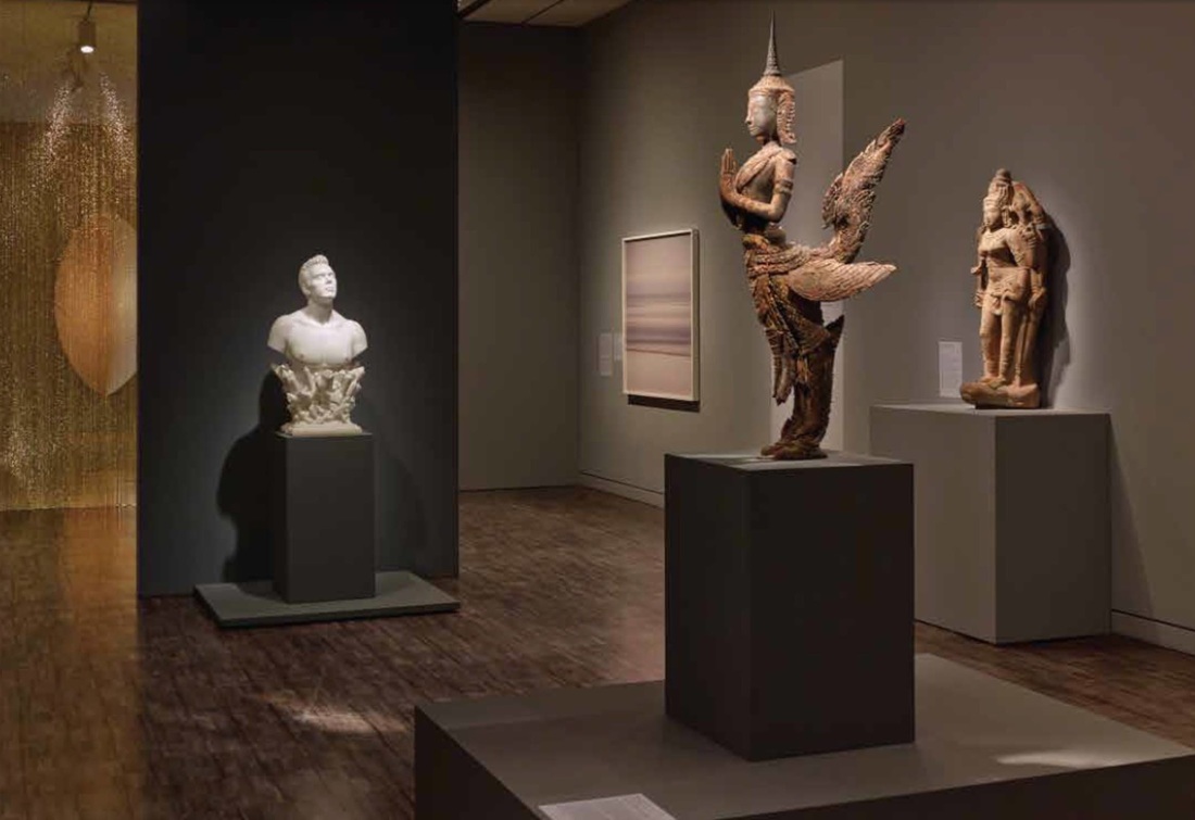
Another element that struck me in the American Alliance of Museum's 2015 list of prizewinners in exhibition design and label-writing—beyond the two labels highlighted in the last post—was a diaphanous golden curtain. It appears in the AAM's photo of a gallery in the exhibition Gorgeous, which showed at the Asian Art Museum of San Francisco in 2014. Although it received no special mention by the AAM (this gallery was singled out for a label, not exhibition design per se), it is a remarkable feature. Is it tinsel? No, it hangs much too orderly for that. Strings of beads? Perhaps. But this is no bead curtain from a 70's hemp shop: it is slippery and glowing, enticing the visitor to approach this warm, silky wall. It serves as a divider in the space while also allowing a view through into the next—both providing structure and luring the viewer further. Considering that bead curtain technology has been around for millennia (see this bead net dress from c. 2400 BC), it's almost surprising that this technology doesn't crop up in museums more often (although fragility must go some way toward explaining this).
Every year the American Alliance of Museums confers awards for great exhibition design and label-writing (among other categories.) The 2015 lists are out! You can see the former here as a quick list and the latter here in a more expansive format with photos and descriptions. Of the many worthy entries, my personal favorite was a label by the Minneapolis Institute of Arts for the Zulu beer pot pictured above. (You might want to check it out in the MIA's beautiful online catalog, which is not only sleekly designed but includes audio clips and free image downloads.) As reproduced on page 6 of the AAM report, this label brings out the object's visual qualities and social importance at once—certainly deserving its prize.
My second-favorite label appears on page 9: an outdoor panel at the La Brea Tar Pits. It even has something in common with the beer pot label: vivid opening lines. Who could refuse to read further after "The stinky dead mastodon was irresistible" or "How is brewing beer like growing babies?" The Trier Landesmuseum came onto my radar recently, and in browsing their website I grew excited about the photos of their permanent collection display. The exhibition presents "a circular walking tour through the entire history of Trier and the Trier region – from the Stone Age to the Roman city, from the Franks to the last Trier Electoral Prince." Apparently it won an award for its design, and I can see why! From the band of purple backdrop for precious miniatures to the half-recessed cases (artworks in themselves), the design is truly beautiful. I hope for the chance to experience it in person to see how it works for the collection.
Note on the award (from the museum's website): “red dot: best of the best” Award 2011 The permanent exhibition of the Trier Landesmuseum was awarded one of the most prestigious international prizes for design, the “red dot: best of the best”, in the autumn of 2011. The exhibition received the prize in the category “communication design” for an especially bold, innovative, modern design. |
Ideas on Display
A humble space to reflect on concepts of museum display as enacted across a wide range of subjects, countries, and approaches.
Archives
April 2020
Categories
All
|