Dr. Stephanie Pearson
  • Home
  • Projects
    • museums.love
    • Uncertainty and Debate
    • Mithras Model & Audio
    • Weltverbesserer Interview
  • CV
    • Employment
    • Education
    • Museum Experience
    • Professional Training
    • Publications
    • Awards & Grants
    • Teaching
    • Invited Lectures
    • Workshops & Chaired Sessions
    • Conference Papers
    • Professional Engagement
    • Excavation
  • Exhibition Reviews
    • Anna Dorothea Therbusch
    • Making Ancient Art Contemporary
    • Cleopatra
    • Pompeii and Herculaneum
  • Tours
  • Ideas on Display (blog)

Reaching a New Audience: Bode Museum in Ads and Instagram

12/30/2015

Comments

 
Picture
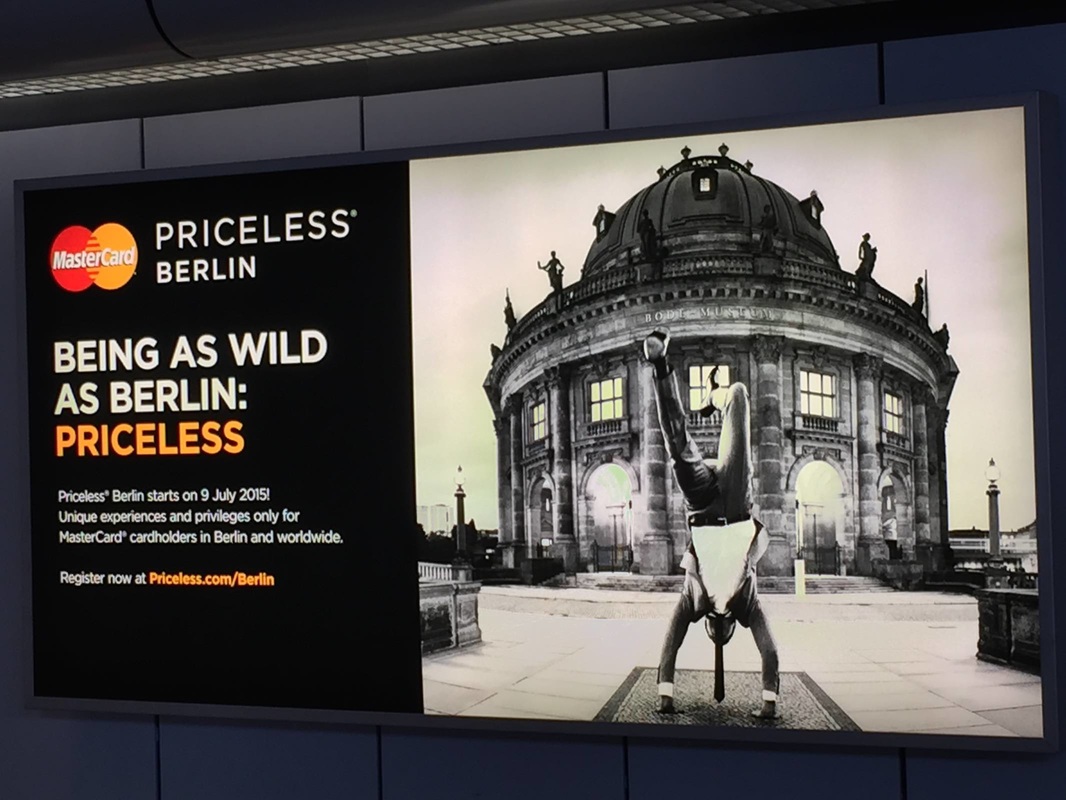
What a stroke of good luck when a major credit card company uses your museum as the backdrop for its billboards! This advertisement appears right at the entry to the security check in Berlin's Tegel Airport, so it also has a captive audience. I wonder if the Bode Museum worked with MasterCard in order to get this exposure. Certainly the museum is working hard to expand its reach—particularly to a younger crowd, as shown by its new Instagram project.
Comments

Golden Bead Curtain: Asian Art Museum

12/26/2015

Comments

 
Picture
A gallery in the exhibition Gorgeous, at the Asian Art Museum of San Francisco. Photo: http://aam-us.org/docs/default-source/professional-networks/2015.pdf
Another element that struck me in the American Alliance of Museum's 2015 list of prizewinners in exhibition design and label-writing—beyond the two labels highlighted in the last post—was a diaphanous golden curtain. It appears in the AAM's photo of a gallery in the exhibition Gorgeous, which showed at the Asian Art Museum of San Francisco in 2014. Although it received no special mention by the AAM (this gallery was singled out for a label, not exhibition design per se), it is a remarkable feature. Is it tinsel? No, it hangs much too orderly for that. Strings of beads? Perhaps. But this is no bead curtain from a 70's hemp shop: it is slippery and glowing, enticing the visitor to approach this warm, silky wall. It serves as a divider in the space while also allowing a view through into the next—both providing structure and luring the viewer further. Considering that bead curtain technology has been around for millennia (see this bead net dress from c. 2400 BC), it's almost surprising that this technology doesn't crop up in museums more often (although fragility must go some way toward explaining this).
Comments

Awards in Exhibition Design and Label-Writing

12/22/2015

Comments

 
Picture
Every year the American Alliance of Museums confers awards for great exhibition design and label-writing (among other categories.) The 2015 lists are out! You can see the former here as a quick list and the latter here in a more expansive format with photos and descriptions. Of the many worthy entries, my personal favorite was a label by the Minneapolis Institute of Arts for the Zulu beer pot pictured above. (You might want to check it out in the MIA's beautiful online catalog, which is not only sleekly designed but includes audio clips and free image downloads.) As reproduced on page 6 of the AAM report, this label brings out the object's visual qualities and social importance at once—certainly deserving its prize.

My second-favorite label appears on page 9: an outdoor panel at the La Brea Tar Pits. It even has something in common with the beer pot label: vivid opening lines. Who could refuse to read further after "The stinky dead mastodon was irresistible" or "How is brewing beer like growing babies?"
Comments

Architecture as Display: Wukro Archaeological Museum

12/12/2015

Comments

 
Picture
A display in the new museum in Wuqro, Ethiopia. Photo: P. Wolf; copyright DAI Orient-Abteilung.
The German Archaeological Institute recently announced a new museum opening in Wukro (Wuqro), Ethiopia. This museum houses archaeological finds from the area, with one highlight being the 8th- to 6th-century BC sanctuary of a moon god. The altar and channel for libations is reconstructed in the museum (above). Just as striking as this reconstruction is the architecture of the museum building itself: it dosn't just recede into the background, but acts as part of the display. Its massive stone walls accentuate the objects more powerfully than the usual flat painted wall surface; they are a beautiful extension of the display.

​To find out more: this document (in German) explains the museum project, including diagrams of the building, and this website presents nice pictures of the galleries, signage, and festive opening ceremony.
Comments

Word Cloud: Käthe-Kollwitz Museum

12/10/2015

Comments

 
Picture
Once a month the Käthe-Kollwitz Museum in Berlin offers a lunchtime tour by the director, Dr. Iris Berndt, and yesterday's provided the extra motivation for my first visit to the museum. Standing in the first room of the ground-floor galleries, waiting for the tour to assemble, I was struck by the "word cloud" on a wall right next to the entrance. Like the automatically generated word clouds on the Internet, this collection represents thought trends in a wide set of "users" (clustered around the name of the artist, nicely emphasized with extra lighting). But unlike the digital word clouds, these words have been carefully selected to educate. As Dr. Berndt explained, they all represent concepts widely understood to apply to the great German artist Käthe Kollwitz—but several of them are problematic or even false. By marking these four terms with question marks—Feminist? Jewish? Communist? An artist who depicts suffering?—the display indicates that these preconceptions need to be reexamined and possibly discarded. This seems to me a very simple yet effective way to ease a visitor into the experience to come: several key themes are named right at the beginning, setting the tone for the subsequent galleries and helping a visitor to frame the individual objects; and just as importantly, it introduces the idea of questioning stereotypes, clichés, and pat explanations. For such a complex, richly-textured life and oeuvre as Kollwitz's, this strikes just the right first note.
Comments

Reflecting Color: Jacqueline de Ribes at The Metropolitan Museum

12/3/2015

Comments

 
Picture
A view of the exhibition "Jacqueline de Ribes" at The Metropolitan Museum of Art. Photo: http://www.metmuseum.org/exhibitions/listings/2015/jacqueline-de-ribes/gallery-views
An article in the New Yorker alerted me to a current exhibition at The Metropolitan Museum, specifically in the newly-reopened Costume Institute. It takes as its focus the fashion figure Jacqueline de Ribes and presents her clothing designs in a number of displays, all lovely—but the one that particularly caught my eye is shown above (and linked through the picture; just click on it to see the original slideshow). Using reflective metal (aluminum?) as the backdrop and flooring for these dresses is a simple yet extremely effective way to emphasize the colors and reflect light upon them without distracting from them. As a display solution, in fact, it has much in common with the clothing designs themselves: it is deceptively simple, quite cunning, and above all elegant.
Comments
    Ideas on Display
    A humble space to reflect on concepts of museum display as enacted across a wide range of subjects, countries, and approaches.

    Archives

    April 2020
    January 2020
    December 2019
    November 2019
    October 2019
    September 2019
    August 2019
    July 2019
    June 2019
    April 2019
    March 2019
    February 2019
    January 2019
    December 2018
    November 2018
    October 2018
    September 2018
    August 2018
    July 2018
    June 2018
    May 2018
    March 2018
    February 2018
    January 2018
    December 2017
    November 2017
    October 2017
    September 2017
    August 2017
    July 2017
    June 2017
    May 2017
    April 2017
    March 2017
    February 2017
    May 2016
    March 2016
    February 2016
    January 2016
    December 2015
    November 2015
    October 2015
    September 2015
    August 2015
    July 2015
    May 2015
    April 2015
    March 2015
    February 2015
    January 2015
    December 2014
    November 2014
    October 2014
    September 2014
    August 2014
    July 2014
    June 2014

    Categories

    All
    Amsterdam
    Anthropology
    Archaeology
    Architecture
    Art
    Article
    Audio
    Award
    Behind The Scenes
    Berlin
    Boston
    Bulgaria
    California
    Chicago
    China
    Color
    Conservation
    Copenhagen
    Denmark
    Diagram
    Difficult Heritage
    Digital
    Display Case
    Dresden
    Egyptian
    Exhibition Outside Museum
    External Website
    Fashion
    Florida
    Frame
    France
    Germany
    Greek
    Halle
    Hamburg
    Hands On
    Hands-on
    Hanover
    Illinois
    Interactive
    Islamic
    Italy
    Kids
    Lighting
    London
    Los Angeles
    Map
    Marketing
    Marrakech
    Minnesota
    Missouri
    Morocco
    Movement
    Munich
    Nature
    Netherlands
    New York
    North Carolina
    Nuremberg
    Outdoor
    Painting
    Paris
    Pennsylvania
    Photography
    Roman
    Rome
    Shelving
    Signage
    Space
    Spain
    Switzerland
    Texas
    Text
    Turkey
    UK
    USA
    Video
    Women
    World War 2

    RSS Feed

Contact
Stephanie Pearson
steph [at] stephpearson.com