Dr. Stephanie Pearson
  • Home
  • Projects
    • museums.love
    • Uncertainty and Debate
    • Mithras Model & Audio
    • Weltverbesserer Interview
  • CV
    • Employment
    • Education
    • Museum Experience
    • Professional Training
    • Publications
    • Awards & Grants
    • Teaching
    • Invited Lectures
    • Workshops & Chaired Sessions
    • Conference Papers
    • Professional Engagement
    • Excavation
  • Exhibition Reviews
    • Anna Dorothea Therbusch
    • Making Ancient Art Contemporary
    • Cleopatra
    • Pompeii and Herculaneum
  • Tours
  • Ideas on Display (blog)

Lure of Gold and Light - Museo Histórico Municipal de Écija

10/17/2019

Comments

 
Picture
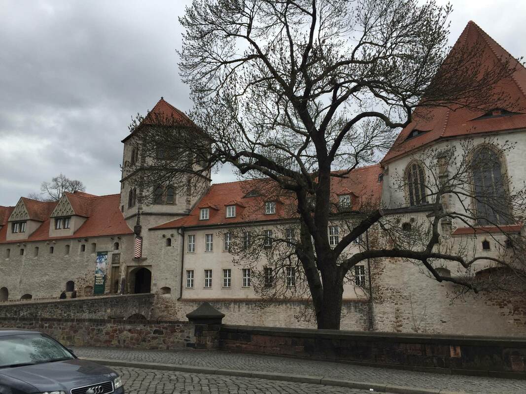
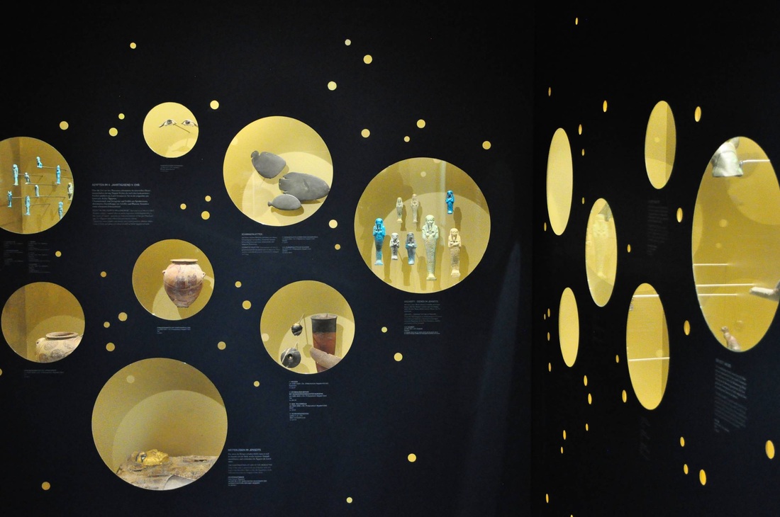
On a study trip with students recently, I got to visit the wonderful historical museum in Écija, Spain - the Museo Histórico Municipal housed in the beautiful Palacio de Benamejí. Both the town and the museum are less well-known than they should be; they are not only beautiful, but full of treasures waiting to be discovered! As archaeologists we were thrilled by the artifact collections and the exciting excavations that took place under the main plaza, once the Roman forum. In addition, the museologically oriented among us delighted in the presentation in the museum. Thanks to a tour by museum director Antonio Ugalde, we got an in-depth look at the history of the area from the prehistoric to the late Roman periods. The school groups that come through here can hardly know how lucky they are!
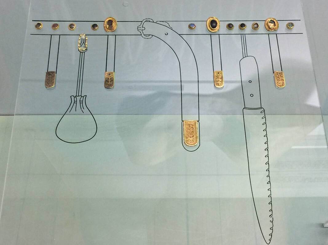
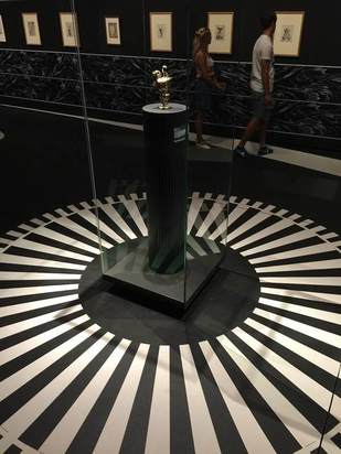
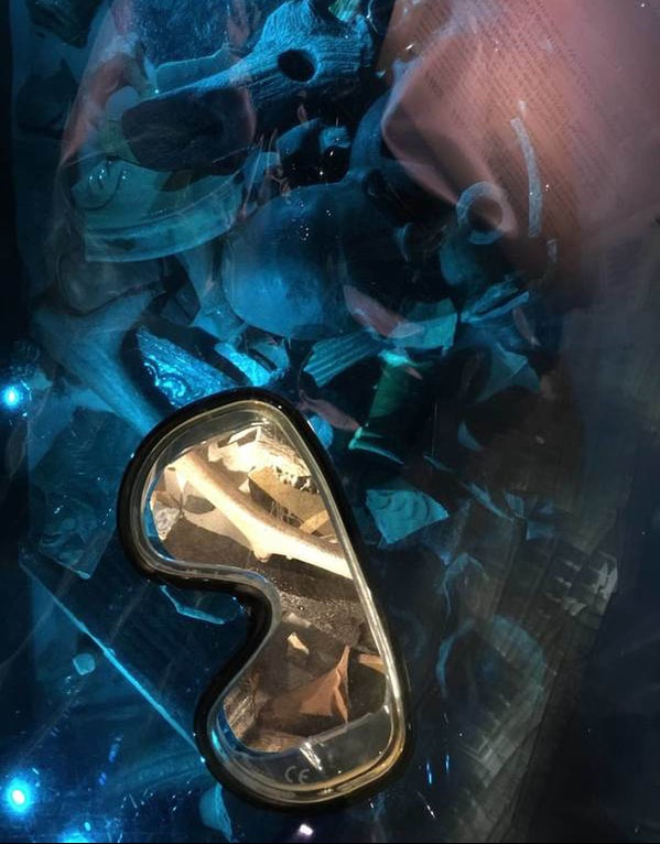
One of the displays that I especially liked houses a piece of gold jewelry. While the exact function of the piece is unknown, it was probably the central element on a longer chain, whether a belt, necklace, or other adornment. Its workmanship is superb: the granulation of tiny gold spheres soldered onto the piece is on par with the best work from Etruria, the masters of this technique. (Here is a nice short video about gold granulation by the Met Museum.)
Picture
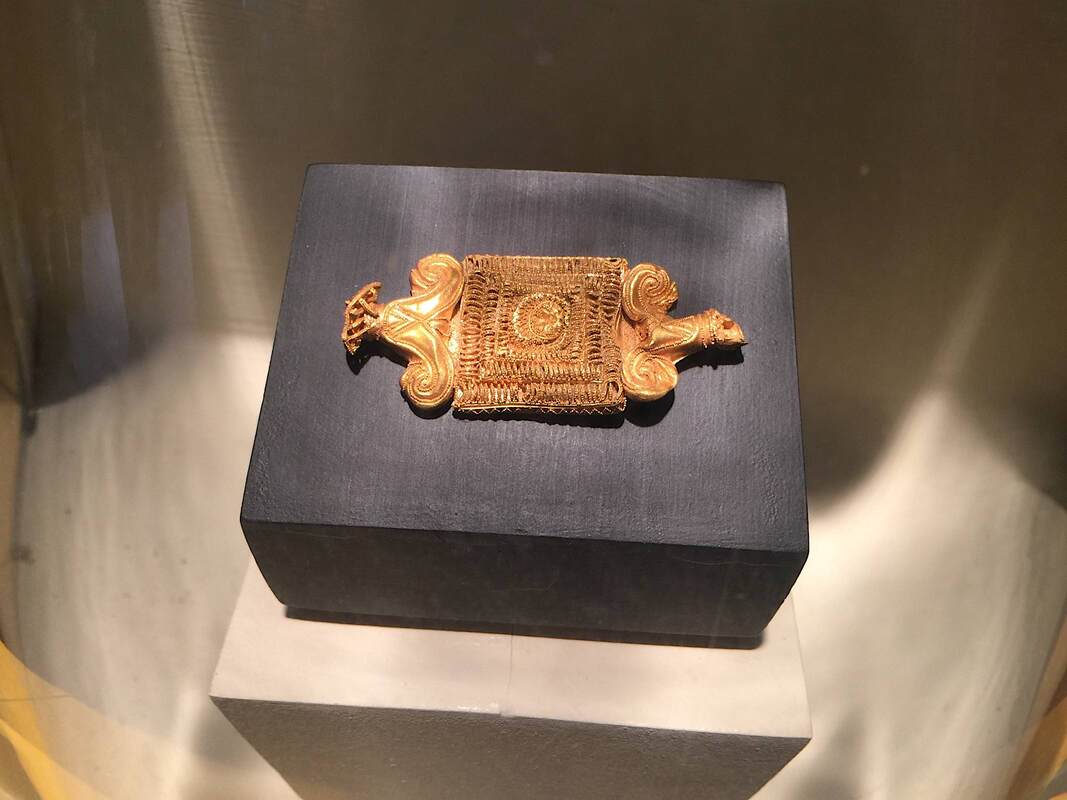
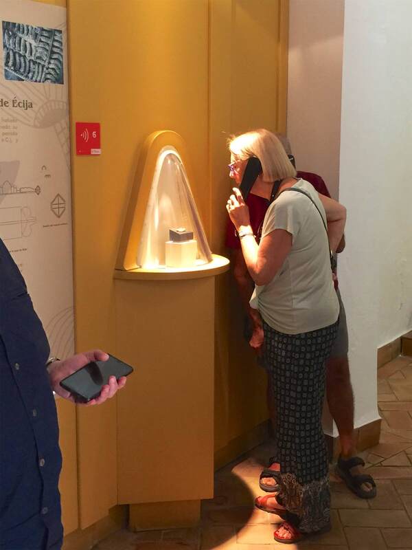
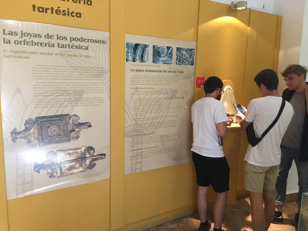
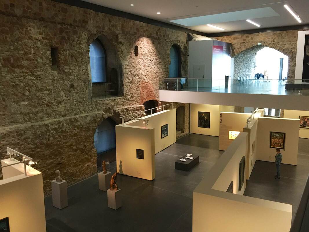
Including a hugely enlarged photo of the piece (see below) is a good way to help viewers appreciate the detail. At the same time, it's important to lure them to look at the piece itself rather than stopping at the picture alone. This is done by the special case and lighting on the gold piece: the case is a cone shape projecting from the wall, highlighting the tiny treasure in a way that lures you irresistibly to take a closer peek. The conical bubble draws you in like a magnet! It is helped by the single light from overhead, lighting it in a golden glow. We were pulled toward it like a moth to the flame.
Picture
Comments

Clothes Racks without Hangups - Schwules Museum, Berlin

8/22/2019

Comments

 
Picture
Picture
Through Monday you can still catch the wonderful show My Dearest Sweet Love: Christopher Isherwood & Don Bachardy at the Schwules Museum in Berlin. What a wonderful compliment to the experience of reading Isherwood's books. What's more, Bachardy's paintings are truly stunning; the male nude series (here are some examples from 2002) took my breath away. He paints with such economy, capturing complex muscles in scant brushstrokes. His use of color also blew my mind—and he must paint very quickly, since the many colors that bleed into one another could only do so if all wet at once. I wanted desperately to buy a catalog of the show, but sadly there isn't one.

What I was able to take home with me, however, was an idea on display! In the exhibition LOVE AT FIRST FIGHT! Queer Movements in Germany since Stonewall (through fall 2020), the display is based entirely on simple clothes racks. They were spray-painted in red, a nod to the protests and homemade signs of the movements in the title. The racks were used in three ways:
  1. hung with clothes hangers reduced to just the hook and a clip which held paper materials (photo above left: exhibition guides in different languages)
  2. strung with protest signs evoking those from past movements (photo above right; slogan T-shirt hung beside). It was wonderful to be able to take these into your hand. For me, it sparked the realization of how difficult it could be to physically partake in protests in which your body is the subject of debate.
  3. ringed with zipties which fastened to the corners of laminated sheets. The sheets consisted of regular paper printed with various texts and pictures, each one attached at all four corners to the nearby sheets or to the clothes rack—almost like a patchwork quilt. (No photo; I didn't want to bother the visitors using those displays!)
​
This is an incredibly simple and effective means of display, not to mention cost-effective; IKEA sells clothes racks like this for under $10! Three cheers for the Schwules Museum and these two wonderful exhibitions. I'll definitely be coming back for future shows.
Comments

Drawing in context - National Archaeological Museum, Sofia

7/19/2019

Comments

 
Picture
Sometimes even the simplest hint of context can make an object come alive. In the National Archaeological Museum in Sofia, Bulgaria, the collection of gold is fantastic—yet if the objects stand in isolation, the way they were used in the past (and the very fact that they were used at all!) can get lost. One solution to this problem is seen above. The medieval gold objects are put into context immediately with a simple line drawing: they were attached to a belt, serving as ornament among the useful everyday objects like a pouch and a knife. It is richly informative in one glance, and far better than a more complicated reconstruction like, say, a full-body dummy!
Comments

Stony Looks — Kunstmuseum Moritzburg

3/15/2019

Comments

 
Last weekend I had the chance to visit Halle for the first time. Among the museal delights is the Kunstmuseum Moritzburg, housing a collection of 20th-century painting inside a genuine castle (right). Built in the 15th century and modified numerous times thereafter, the castle is an architectural palimpsest. And, as you can imagine, the thick stone walls hardly lend themselves to rotating exhibitions of painting; just try driving a nail into those things, let alone more than one, let alone the wrath of the heritage bureau!
Picture
This is where cunning display tactics come in handy. The museum erected a series of freestanding interior walls to serve the needs of art display within the architectural shell (and constraints) of the castle. Many of the walls even have lighting rigged along the top, providing closer and more dirigible light than anything hung from the mile-high ceiling could:
Picture
Of course, the castle offers far more than just limitations. Its passages allow you to peer in ways you usually can't in a museum building (right). And its rugged masonry forms a sensory contrast to the finely milled, sleek, shiny objects in gold frames and glass cases (below). A display of Bauhaus-era glass vessels stands out with gleaming, brilliant colors that look even more luminous against the stony backdrop. A diamond in the rough!
Picture
Picture
Comments

Watercolor Walls for Archaeology — Landesmuseum Hannover

3/13/2019

Comments

 
Picture
One last post will conclude this series on the Landesmuseum Hannover. These expansive walls of watercolor landscapes, lit from behind with an even glow, run throughout the exhibition of Saxon archaeology. As an artist, art historian and admiring niece of a wonderful mural artist, I fell in love with these immediately. But they operate beyond the realm of personal preference, I swear! Not only do they add color to the display without complicating the view of the objects themselves—which remain on a white ground—but they flesh out the objects' use contexts. Each mural is crafted to show the phase of prehistory that the objects belong to. The type of housing shown is accurate to the time; so is the state of nature or agriculture. But to be honest, it is so bewitching to see a gorgeous watercolor at this scale that I could care less about the content... Oh wait, not really! Bad art historian!

The keen-eyed will have seen that the white cutouts of boulders at left are represented in the painting at right—and that this sort of construction to contextualize the objects was discussed in the last post.
Comments

Framing in golden circles, houses, graves — Landesmuseum Hannover

3/12/2019

Comments

 
Picture
Another pleasing aspect of the Landesmuseum Hannover's galleries are the framing devices for the objects. Archaeological objects in particular can be small, withered, corroded, or otherwise unimpressive; sometimes they need a little help to get their due. These gold partitions affixed to the cases of gold jewelry and precious objects from Bronze-Age Germany (Lower Saxony, to be precise—of which Hannover is the capital) serve this end. With their color and concentric-circle design, they draw attention right away—and perfectly echo the objects in the cases! Both the spiraling gold wire of the jewelry (below right) and the circles on the astrological discs (below left) become more obvious with this big visual hint. What is more, the cutouts in the gold screens offer a peekaboo with the objects that makes looking more fun (just like the dividing wall from this post!).
Picture
Picture
A similar but distict tactic can be seen in the architectural frames erected around other artifacts. These serve not just to highlight but also to contextualize the objects. A house-like construction (below left) emphasizes that these objects came from a domestic context. For the grave goods, a wonderfully sculptural and minimalist tumulus points to the original context. They are restrained indicators, but so large and physical that they might even work subconsciously...
Picture
Picture
Comments

Current Showcase = Immediate Eyecatcher - Museum of European Cultures, Berlin

2/15/2019

Comments

 
Picture
Such a simple yet effective idea: an object-of-the-month display at the museum entrance. Here it's the Museum of European Cultures in Berlin, and the object in "Das aktuelle Schaufenster" (the current showcase) is a contemporary Swedish dress used in the celebrations of Saint Lucy. You can see the doors of the main entrance just to the right. What a great way to bring out of storage some objects that may not fit into the other exhibitions, and draw in the visitors as soon as they step over the threshold!
Comments

Pencil-Paper Dioramas - Museumsdorf Düppel, Berlin

12/17/2018

Comments

 
Picture
Yesterday I finally made it to Museumsdorf Düppel in Berlin, an open-air museum that has been on my to-do list for years. It centers on an absolutely charming reconstruction of the 12th-century village excavated there primarily in the 1970s. The houses with reed roofs and mud walls are impressive for their craftmanship, as well as the feeling they give you of standing really and truly in a medieval village. The lightly damp, gray, freezing weather enhanced the effect. Hats off to the capable people who made it possible to live in such conditions, constructing surprisingly cozy houses and fashioning their own clothing, tools, candles, food, and on and on. Truly impressive!

As a supplement to the village, the small interpretive center is a gem. "Klein aber fein," small but fine—the description fits perfectly. One of the displays that caught my eye for being both economic and effective is the timeline: a series of small lit vitrines sunk into the wall boasts a series of colors, each vitrine framed by a different hue. These correspond to the colored bands on the timeline above, which stretches from 10,000 BC to the present day. Each vitrine holds a miniature diorama of the landschaft around the village in the indicated time period (a title for the whole wall would help convey this: Changing Landscapes, or some such). I went gaga over the grace of the dioramas—constructed of cardstock cut-outs with simple pencil drawings, they are outrageously simple yet communicative works of art.
Picture
Picture
Comments

Interactive, User-Directed Lighting? KWAB in the Rijksmuseum, Amsterdam

9/1/2018

Comments

 
Picture
Picture
This last post about the KWAB exhibition in Amsterdam's Rijksmuseum concerns lighting. This show got me and my partner-in-museology thinking about the potential for self-directed lighting in museum display. The impetus was this lovely, huge, embossed silver platter. Its fabulously fine relief is hard to see in any detail, not because the lighting is poor per se, but because it is static. Especially for objects that would have been handled, passed around, held up to the light, or simply displayed in a space where people could view it from different angles, the viewing conditions offered by a museum could hardly be more different. And it can be frustrating to try to make out what all those tiny relief people are doing on this silver thing; even I was inclined to give up and move on to something more decipherable. But adding a couple of pink hands as a reflecting screen (above right) changed everything—even more so when moved from side to side! The addition of not only light but color and movement made the relief eminently more legible. This is the reason that Reflectance Transformation Imaging works so well (here's the process): under different lighting conditions, especially ones we can adjust and move at will, we can perceive relief and texture much more easily.

So how about visitor-directed lighting? This could be as simple as offering visitors sheets of printer paper at the entrance and encouraging them to use it as a reflecting screen (on objects in glass cases only, if you're worried about paper and people getting near unprotected objects). But personally I think it would be exciting as a central element of a show; it could even be the main topic, "Old Things in New Light." You could experiment with little lights mounted on tracks in front of the objects, so the visitor can slide the light from side to side. Heck, grab that gooseneck lamp from your desk and mount it next to an object—there, you've got interactive, user-directed lighting! There are dozens of forms this could take, and just as many epiphanies about the objects in new light. Let's go wild and see what happens.
Comments

Painting walls and floors - KWAB in the Rijksmuseum, Amsterdam

8/31/2018

Comments

 
Picture
Picture
Another notable aspect of the show KWAB in the Rijksmuseum, Amsterdam is the background painting. Walls and floors alike are painted with bold black-and-white designs carefully arranged to highlight the objects. This geniusly serves several purposes:

1. Emphasis

​The painting can be used to make an object really pop out at you. The beautiful ebony armoir above (left) gains a whole new life from the white moon behind it. The sinuous curves at the top of the chest stand out against the light background, and the hovering circle gives the piece a lively dynamic—almost as if it were a nocturnal creature standing in a moonlit landscape.

The tiny silver pitcher above (right) gets an injection of energy from the white rays radiating out across the floor. They turn the pitcher into the source of a geometric explosion, and who doesn't want to look closer at that??
2. Context

​The same black-and-white painting technique on the walls is used in another way, namely to recreate a sense of the objects' original context. Keeping the monotone palette is a nice way to keep the "reconstruction" attempt from becoming distracting, while at the same time contextualizing objects rather unfamiliar to a modern viewer. In the photo below, the oval painting in an elaborate wooden frame is hard to imagine wanting to hang on your living room wall; but with the illusionistic swags of drapery emanating from it, it gains the elegance and appropriateness to the opulent display context it was originally meant for.
Picture

In the room below, a different pattern is used to imitate the wall decorations of the time, which in richer houses included embossed leather (!) wallpaper and wooden paneling:
Picture
3. Directing Movement

In both the room above and that shown below, the wall and floor painting is used to encourage us to move through the exhibition in certain ways. Above, a long white band leads us from the bottom right (a doorway is just off the photo to the right), along the wall of drawings, and over to the paintings at left, where the half-circle of white under the center painting encourages us to linger.

White stripes and circles similarly guide our movement between these two glass cases, this time reinforced by a subtle white curve on the rear wall:
Picture
Such a simple and effective device as these paintings seems worth keeping in mind. Certainly, painting the floor will not often be possible in an exhibition, depending on the space (the Getty Villa's marble floors...). But for the wall paintings at least, I would be curious whether the extra cost and time for installation makes them practical or prohibitive.
Comments

Metal basketweaving - Tropenmuseum, Amsterdam

8/14/2018

Comments

 
Picture
A final post about the glorious Tropenmuseum in Amsterdam! This time a technical apect of its permanent exhibition Afterlives of Slavery. Here the display technology resembles a bit the industrical metal grid in the Flesh exhibition currently on in Berlin. The difference is, here the grid is used as a platform for attaching all sorts of materials, not just hanging labels and pictures. Most creatively, the structure is used to best advantage by being paired with a flexible plastic sheet on which the texts are printed; the plastic is cut into strips that can be woven directly into the grid! At right you can see two varieties of this technique, an overall-basket-weave at the top and a just-the-corners tactic below. Allowing infinite combinations and configurations is a huge advantage for such a material. I can imagine it being trotted out time and again for all sorts of different exhibitions, a handy device in the museum's tool box.
Picture
Comments

Copies and Plaster Pools - Replica Knowledge in Berlin

12/2/2017

Comments

 
Picture
Picture
In the exhibition Repliken Wissen = Replica Knowledge, currently in Berlin's Tieranatomisches Theater, all of the objects are original—and none of them are. The exhibition displays modern replicas of Minoan and Mycenaean art in order to point out that replicas, far from being simply reproductions of some much more interesting "originals," have their own stories to tell. Their lifetimes may not be as old as that of the archaeological objects they copy, but they are complex, thrilling, and illuminating in their own way. Displaying multiple replicas made from the same model (such as the drinking cups above) highlights this theme of copying.

​One of the display techniques that cleverly underscored this message consisted of pools of plaster under the objects on the glass shelves. These slightly irregular blobs form a much-needed opaque backdrop and injection of color to frame the pieces, which, many in shiny metal, would otherwise melt into a sea of reflections in the glinting vitrines. Moreover, the plaster pools (as curator Felix Sattler explained on a tour) recall the process of molding and pouring plaster replicas of the ancient objects. Thus the theme of the show is reinforced by its display. Definitely worth a visit, as is the Theater building itself; it's up through the end of March.
Comments

Prehistoric Playland - Hamburg Archaeological Museum

9/8/2017

Comments

 
Picture
Hamburg's Archaeological Museum in Harburg is a gem. The first-floor gallery, pictured above, is relatively small but packed with wildly creative displays. An artificial dirt-and-rock floor (all glued down, safe to walk and scramble on) strikes the right tone for the prehistoric collections. Just so the dark ceiling, recalling a cave or perhaps the night sky. It's atmospheric, certainly; but more than that, the playfulness helps to emphasize the content rather than distracting from it. Who could expect otherwise from the creative team, Ravensberger Freizeit und Promotion, famous for their educational board games! Here are just a few examples:
The entrance is flanked by massive, glowing, blue-green pillars to either side. Upon closer inspection, they turn out to be towers of ice cube trays! Why? The text alongside explains how the landscape around Hamburg was carved by glacial action. Aha!

Built into the floor beside this pillar (detail below; another can be seen in the room view above) is a glass plate. It has a blue cast to all but two spots, where goggles are placed on the glass with a clear view onto the antlers, pot sherds, and other artifacts from this area. This is a strong invitation to get close and peer inside.
Picture
Picture
Another eye-catching display is a huge sardine tin, nearly two meters long, its lid peeled back to reveal the delicacies inside. Not sardines per se, but a variety of artifacts related to prehistoric fishing techniques. A pile of fish bones (bottom center) attests to their success.
Picture
A pile of TVs alight with flickering flames (right) draws attention to the section about fire: its invention, how it was first made, and how it changed eating habits for early man. But the TVs aren't just a flashy gimmick: the text points out that just as our ancestors sat around the fire at night for community and entertainment, so today we sit around the TV for similar reasons!

One of the most rewarding parts of my visit was seeing a group of four-year-olds put these displays to the test, climbing the rocks, lifting the lids, pulling and peeking and, well, engaging! (Which makes a person appreciate how kid-proof it all is, to still look new after 8 years of such rigorous testing.) My next post will turn to the second-floor gallery, quite different in atmosphere but equally creative.
Picture
Comments

Crafting a History of Science - the Huntington Library

4/28/2017

Comments

 
Picture
The first clue that the curators at The Huntington Library have thought long and hard about the presentation of their History of Science exhibition (which curator Daniel Lewis kindly showed us) is in the entryway, pictured above. The blue, curving wall on the right is a subtle mechanism for attracting people through the door—what is this surface? what is written on it?—and guiding them into the first gallery. Imagine a large flat wall panel in its place: it would produce a very different effect!
Picture
Curves define the first gallery space as well. These beautiful curving vitrines were conceived to echo the "heavenly sphere" that is the subject of this room, dedicated to astronomy. (Yes, the ceiling is vaulted too!) Dr. Lewis installed low cases so that the visitors can get up close to the books, as if they were holding them. But since this means that people bend over the cases to look inside, the lights had to be specially mounted inside the cases so that the viewer's head wouldn't interrupt a light source shining from overhead. Detailed planning that bespeaks years of experience. . . or unusual design foresight.
Picture
The next room also employs a great device for luring viewers close to the books. Dedicated to the central role of observation and illustration to the development of natural history, the walls are a vivid red that highlights the beautiful reproductions of book illustrations hung in a sort of collage style. To convey a progression through time, the earlier drawings are hung at left, followed by later lithographs, color lithographs, and prints. The ensemble is not only beautiful but inspires curiosity in the books below, which contain further illustrations and, of course, text. The presentation functions on both the level of immediate impact (beautiful wall design) and closer encounter (approaching the objects and delving into the information presented). As the curators plan to reinstall this exhibition in the coming years (it certainly doesn't show its age; it is already nine years old), I look forward to seeing what they come up with for the new incarnation.
Picture
Comments

Talking Objects: Roman Villa at Pully, Switzerland

4/17/2017

Comments

 
Picture
The brand-new archaeological museum at Pully (near Lausanne) is dedicated to an ancient Roman villa discovered at this site, overlooking Lake Leman. Fragments of fresco that decorated the villa's walls are exhibited in cases dedicated to certain themes—shown here is "Aux bains," "At the baths." Displayed within are pieces of fresco from the villa's bath complex, which was painted with marine scenes in keeping with the watery function of the rooms. Not only is the graphic design of the panels clean and bright, but the cases feature a cute pedagogical concept: small stickers on the glass are shaped like speech bubbles, some with tails pointing to fresco fragments as if they were talking! In the photo above, a painting of a fisherman seems to call out, "It's fresh, my fish is fresh! The fishing was good today." The bubbles at the top right introduce an authentic Roman recipe for fish sauce, quoting an ancient author, while the small bubble at left asks, "Did you know that fish farming was invented by the Romans?" It's a playful way to draw attention to individual objects, and particularly well-designed to engage young museum visitors.
Picture
Comments

Glass Shelving: Carnegie museum of natural history

1/16/2016

Comments

 
Minerals and gems, Carnegie Museum of Natural History, Pittsburgh, Pennsylvania
Let's return to the splendid gallery of minerals and gems in the Carnegie Museum of Natural History to talk about shelving technology. (In a previous post we ogled the dramatic lighting that makes the objects sparkle like, well, jewels!) These shelves are designed on a simple principle: cables stretched from the bottom to the top of the case are fitted with small steel cylinders that can slide along them as well as clamp onto a corner of a glass shelf, allowing the shelves to be adjusted to an infinite range of heights. Here they are smartly deployed in a case with a glass front and back, so that you can look right through; the minimalist shelving helps this unobstructed view.  The result is beautiful as well as clever—if not exactly transferable to earthquake country!
Minerals and gems, Carnegie Museum of Natural History, Pittsburgh, Pennsylvania
Comments

Floating Clear: Deutsches Museum, Munich

7/24/2015

Comments

 
Picture
Within the city-sized complex that is the Deutsches Museum in Munich, one gallery is devoted to ceramic technology. This room houses a model of an ancient Roman pottery production center, an enormous vat for transporting acids, and many smaller wonders of ceramic that we encounter (mostly unknowingly) in our everyday lives. The ceramic knife and roller skate wheels are mounted with small pieces of clear plastic onto a clear plastic sheet standing vertically in the back of the display case—a good way to make the display more legible and interesting than simply laying out the objects on a tabletop. They seem to "float" in front of the very colorful orange backdrop.
Comments

Through a Glass Foggily: Museum of Arts and Crafts, Hamburg (4)

12/9/2014

Comments

 
Don't fret, your eyes are not going half-fuzzy: this is the next innovative display idea from the Museum of Arts and Crafts in Hamburg. In a special exhibition on provenance (itself very nicely done, with all the right questions and answers about provenance written into the wall and object texts), this case stood out for several reasons. First of all, the construction-worker orange color under the silver objects. Like the bright purple in the Cabinet of Curiosities display or the cerulean blue in the Greek galleries, I'm not convinced that the color enhances the objects; but it does a fabulous job of acting like a tractor beam to reel in the viewer. Bright! Shiny! Must get closer!

The second feature that struck me is the use of stickers on the glass walls of the case. As in the bubble effect in the Egyptian gallery, here too it seems that vinyl stickers were smoothed onto the panes in order to direct the eye in certain ways. Here the stickers are more subtle than the circular cut-outs: they are clear and just barely textured so as to give the glass a frosted appearance. Cut into large triangles and laid at irregular angles, they create an almost hallucinatory effect as you look into the case. The photo below shows how the stickers echo the geometric gray printed background on the back and base of the case, while the upper photo illustrates the sometimes dizzying effect of looking at an object half-obscured by fog. Yet I loved it, despite feeling vaguely disoriented. As an optical illusion of sorts, it asks the viewer to look closely to figure out just what she's seeing; and in so doing, it gets her to stay put, scrutinize, change viewpoint, look again. That is a great achievement. And in my experience, even if my attention was first focused on the case, it certainly shifted to the objects.
Partially fogged glass, Museum of Arts and Crafts, Hamburg
Comments

Bubbles and Circles: Museum of Arts and Crafts, Hamburg (3)

11/27/2014

Comments

 
Picture
Some of the oldest material in the Museum of Arts and Crafts in Hamburg is displayed in one of the freshest ways. Stepping into the first gallery of Egyptian art feels a bit like entering an underwater world: the walls are a deep turquoise-blue, the lights are dim, and there are luminous bubbles floating before your eyes. Or so it seems! The bubbles are actually circular windows in the wall that look onto one huge recessed case. The back wall of the case is painted light yellow, which in the dark room practically glows. Like the bright purple cases in the Cabinet of Curiosities, these spots of color attract the eye and draw the visitor in for a closer look.
What's more, this display made me realize that circles are not a shape we often see in museums. I suppose this is partly dictated by the fact that glass display cases almost have to be rectilinear (and although advanced plastics can be molded into all sorts of shapes, I don't know if they are being used in display case technology). It seems to me that using circles to give the eye a break from linear geometry and to highlight certain objects could be implemented with normal cases, too: how about a big vinyl sticker with a circular cut-out in it, stuck onto a glass display case? As a kid I loved playing with the thin, translucent plastic shapes that stuck to windows and easily peeled off again; could we translate that technology?
Picture
Comments

Flashy Design as a Theme: Museum of Arts and Crafts, Hamburg (2)

11/23/2014

Comments

 
Picture
Continuing the thread from last time, this post takes us again to the Museum of Arts and Crafts in Hamburg for a look at another of its colorful displays. This bold black-and-purple gallery presents a "cabinet of curiosities" in which the objects are grouped according to aesthetic criteria rather than geographic or cultural origin or the like. Part of the aesthetic effect in this Kunstkammer is achieved not just by the objects but the display: the strongly contrasting colors and recessed cases are very eye-catching. The radiant cases drew me toward them, a moth to the flame. (A similar concept of colorful cubes sunken into a black wall appears in the Neues Museum in Berlin.) What I find so smart about the flashy display concept in this instance is that it actually advances the theme of the room: like the original Kunstkammer, it elevates aesthetic effect to the highest priority. This space demands to be experienced on an aesthetic level first and foremost. Indeed, you can hardly do otherwise — because  in keeping with the original Kunstkammer concept, the only text in the entire room is the name of the room printed on the wall!
Comments

Crossing Cultures: Museum of Arts and Crafts, Hamburg (1)

11/20/2014

Comments

 
Relief from Benin (L), vases and armor from ancient Greece (R). Museum Of Arts And Crafts, Hamburg
Last week I had the pleasure of going goggle-eyed at the Museum für Kunst und Gewerbe (Museum of Arts and Crafts) in Hamburg. Room after room in this museum offered new, bright, lively ideas for displays that had me alternating smiles with scooping my jaw off the floor. Needless to say, I was very excited and merrily snapped photos of a few of my favorites. Today we see the first of five (yes!) highlights.

The large display case at right in the photo above houses ancient Greek objects that represent aspects of Classical Greek warfare. I liked the use of this theme to unify a set of varied objects differing in size, material, and shape, from small clay vases to imposing bronze armor. And although I'm not sure that the radiant blue augments the objects per se, I love that it adds a splash of vibrancy to a set of objects that is otherwise largely bichromatic (red and black/gray).

More striking, however, is the juxtaposition of the large case at right with the smaller one at left. It holds a relief from Benin, Africa. (Although the relief looks minuscule, this is just an effect of the photograph: the relief is several meters farther from the camera. In reality it is a bit bigger than the bronze breastplate at right.) The Benin relief was made approximately a millennium later than the Greek pots, yet it too depicts warefare — in a remarkably different way. Together, the two cases in this room draw connections across time and space to show how very different cultures can share a common social convention (if we can call war a social convention) as well as a desire to express it visually. How they each express it, and why their means of doing so should differ in some ways and align in others, is the basis of precisely the sort of cultural comparison that I think enriches our human experience. It sparks insight, demonstrates connectedness — a profound result from a simple but insightful display concept.
Comments

Planning a Pediment: Amazzonomachia, Palazzo dei Conservatori

10/12/2014

Comments

 
Plan of Amazzonomachia exhibition
Plan of Amazzonomachia exhibition, Palazzo dei Conservatori, 1985
An exhibition based on a single object can be wonderfully pointed, but it can also hard to stage — especially when the single object is an enormous (albeit fragmentary) pediment from an ancient Greek temple. The Amazzonomachia exhibition that took place in the Palazzo dei Conservatori, Rome, in 1985 faced precisely this problem: how to exhibit a large set of sculptures lined up in a row, as they would have been in the original pediment, without producing a deadening effect? Marble statues standing in a row are not exactly an invigorating sight. Especially when fragmentary, they can appear painfully static and unengaging. To encourage a viewer to come closer and spend time with the objects, the Amazzonomachia design had to introduce an element of variety into the layout, lending a touch of movement to the ensemble.

The designers arrived at a very clever solution (shown in the plan above). They set the entire pediment (D) at an angle relative to the gallery, so that the sculptures do not simply line one side of the long space. This also presented the viewer with a more frontal view when she entered from the short side of the gallery, rather than an end-on view down the long sculptural lineup. Building on this idea, the pediment was set on a trapezoidal base (E) of which one long side parallels the gallery wall — thereby incorporating it seamlessly into the space, rather than allowing it to look arbitrarily, bizarrely skewed. The base itself is cunningly engineered to serve several purposes: it unifies the objects into their original grouping; it emphasizes the objects by elevating them above floor level; and the three steps leading up to the pedimental sculptures invite the viewer to approach, climb up, get closer. The cherry on top is that its trapezoidal shape echoes that of the ancient triangular pediment, as if projected here onto the ground. This final subtle touch would likely not be noticed by a visitor in the room, but may well have produced an unconscious kinesthetic impression that would reinforce the concept of the show.

(The catalogue for the show is here, while several photos of the sculptures can be seen here.)
Comments

Award-Winning Design: Trier Landesmuseum

10/10/2014

Comments

 
Trier Landesmuseum
Colorful half-recessed cases in the Trier Landesmuseum (photo by museum; see website below)
The Trier Landesmuseum came onto my radar recently, and in browsing their website I grew excited about the photos of their permanent collection display. The exhibition presents "a circular walking tour through the entire history of Trier and the Trier region – from the Stone Age to the Roman city, from the Franks to the last Trier Electoral Prince." Apparently it won an award for its design, and I can see why! From the band of purple backdrop for precious miniatures to the half-recessed cases (artworks in themselves), the design is truly beautiful. I hope for the chance to experience it in person to see how it works for the collection.

Note on the award (from the museum's website):

“red dot: best of the best” Award 2011 

The permanent exhibition of the Trier Landesmuseum was awarded one of the most prestigious international prizes for design, the “red dot: best of the best”, in the autumn of 2011. The exhibition received the prize in the category “communication design” for an especially bold, innovative, modern design.


Comments

Extreme Verticals: Neues Museum 3

10/9/2014

Comments

 
Vertical presentation of burial, Neues Museum, Berlin
Verticality is a leitmotif of the Neues Museum's new exhibition of its collection of Prehistory and Early History. As discussed in the last two posts, the simple yet unusual tilting of the usual axis of display invigorates the objects: not only are they easier to see than if they stretched back into the recesses of a large horizontal case, but this visibility acts like a visitor magnet. The photo above is indicative: I couldn't manage to take a photo of this case without people in front of it! Of course, the morbid subject boosts the interest of this particular case (none of the other cases in this gallery enjoyed such a constant stream of viewers) — but in any case, I bet that it wouldn't see nearly the same traffic if it were laid out flat. I would love to see a study in which the same set of bones was displayed horizontally for one test group and vertically for another, with the aim of comparing the number and duration of visits to each.

Standing an archaeological quadrant on its head as above is more than a spectacular feat of conservation. It also makes plain a big question about displaying archaeological material: specifically, whether the display should represent artifacts in a context reminiscent of their original one, or rather in a highly aestheticized one. Neither possibility is right or wrong; they are simply two points on the spectrum of approaches. The Neues Museum has opted for the latter to stunning effect. The case below is one of the best examples: axe heads arrayed in a 14 x 11 grid make no claim to conveying use or find context but rather make an arresting visual package. Yet the pedagogical potential is in no way diminished. Quite to the contrary — the display perfectly underscores the thesis of the case. The text describes the value of metals in the Bronze Age, which is succinctly expressed by the sheer wealth of axe heads (and jewelry) placed on show. Disembodied as they are, with an emphasis on their number and physical form, the axe heads actually better represent the abstract idea of wealth than if they were displayed in a semblance of their archaeological context.
Vertical presentation of axe heads, Neues Museum, Berlin
Comments

Elevated Elements: Neues Museum 2

9/30/2014

Comments

 
Elevated elements in the Neues Museum, Berlin
Continuing the train of thought from the last post, today I want to share another method by which the Neues Museum in Berlin has chosen to exhibit its objects vertically. The concept seems simple, yet the effect is striking. In the case pictured above, shards of glass have been clipped into special wire holders that stick up from the plinth like flowers — although given the geometry of the pieces, they almost resemble cosmic debris shooting into space! With large, heavy lumps of glass providing visual weight at floor level, the projecting fragments provide a gorgeous contrast in weightlessness. As a way to use the full space of a case, from bottom to top, this is very clever. Moreover, it brings these rather humble pieces of history to life: by contrast, can you imagine the effect if they were simply strewn across the floor of the case? It would probably be stultifying. Instead, here we have a carefully choreographed play of shapes, colors, and space. The stunning effect is worth far more than the simplicity of the idea would let on; and what's more, the concept can be executed on the cheap: although this version is highly refined, a similar idea could practically substitute wire coat hangers. (Alright, just check with the conservators first!) For context, you can see this case in its ensemble of ultra-modern cubic peepholes in the photo below. (Subject for another post, this black box-with-hidey-holes approach.)
Elevated elements in the Neues Museum, Berlin
Comments
<<Previous
    Ideas on Display
    A humble space to reflect on concepts of museum display as enacted across a wide range of subjects, countries, and approaches.

    Archives

    April 2020
    January 2020
    December 2019
    November 2019
    October 2019
    September 2019
    August 2019
    July 2019
    June 2019
    April 2019
    March 2019
    February 2019
    January 2019
    December 2018
    November 2018
    October 2018
    September 2018
    August 2018
    July 2018
    June 2018
    May 2018
    March 2018
    February 2018
    January 2018
    December 2017
    November 2017
    October 2017
    September 2017
    August 2017
    July 2017
    June 2017
    May 2017
    April 2017
    March 2017
    February 2017
    May 2016
    March 2016
    February 2016
    January 2016
    December 2015
    November 2015
    October 2015
    September 2015
    August 2015
    July 2015
    May 2015
    April 2015
    March 2015
    February 2015
    January 2015
    December 2014
    November 2014
    October 2014
    September 2014
    August 2014
    July 2014
    June 2014

    Categories

    All
    Amsterdam
    Anthropology
    Archaeology
    Architecture
    Art
    Article
    Audio
    Award
    Behind The Scenes
    Berlin
    Boston
    Bulgaria
    California
    Chicago
    China
    Color
    Conservation
    Copenhagen
    Denmark
    Diagram
    Difficult Heritage
    Digital
    Display Case
    Dresden
    Egyptian
    Exhibition Outside Museum
    External Website
    Fashion
    Florida
    Frame
    France
    Germany
    Greek
    Halle
    Hamburg
    Hands On
    Hands-on
    Hanover
    Illinois
    Interactive
    Islamic
    Italy
    Kids
    Lighting
    London
    Los Angeles
    Map
    Marketing
    Marrakech
    Minnesota
    Missouri
    Morocco
    Movement
    Munich
    Nature
    Netherlands
    New York
    North Carolina
    Nuremberg
    Outdoor
    Painting
    Paris
    Pennsylvania
    Photography
    Roman
    Rome
    Shelving
    Signage
    Space
    Spain
    Switzerland
    Texas
    Text
    Turkey
    UK
    USA
    Video
    Women
    World War 2

    RSS Feed

Contact
Stephanie Pearson
steph [at] stephpearson.com