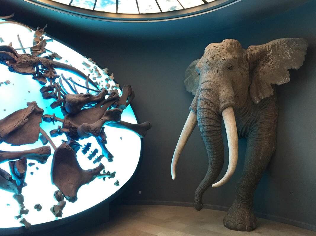
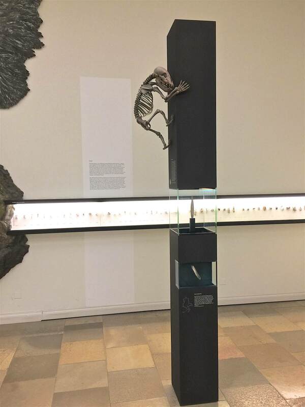
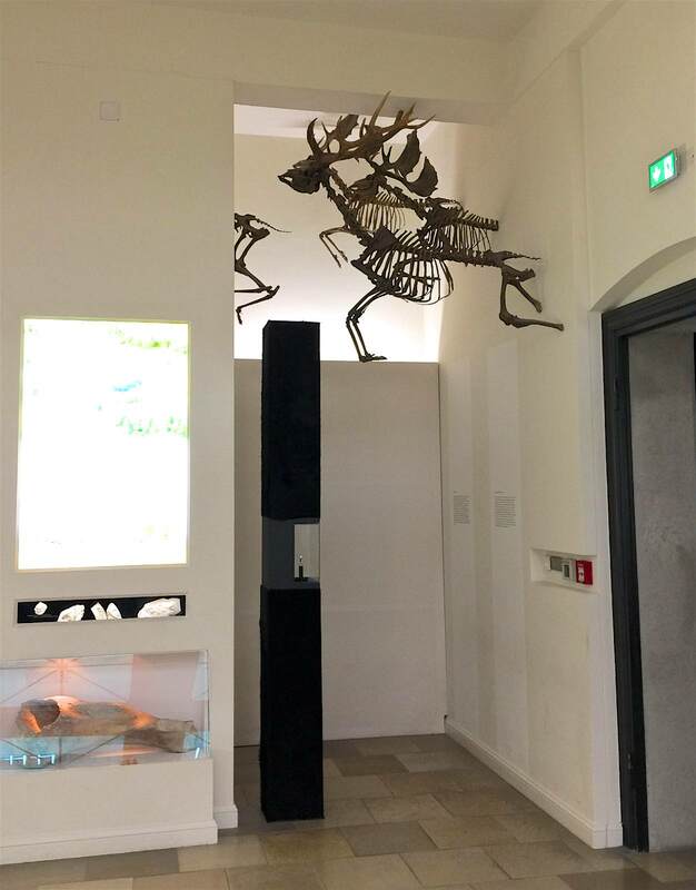
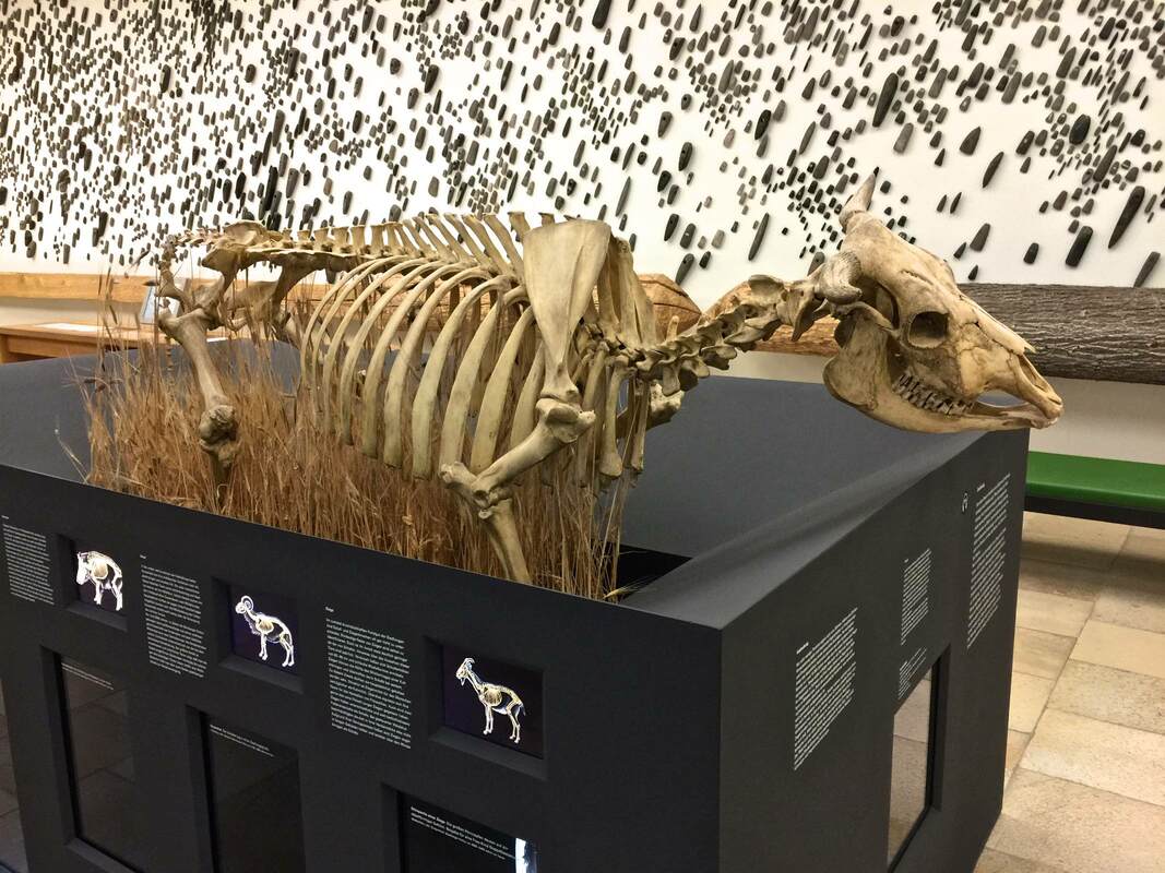
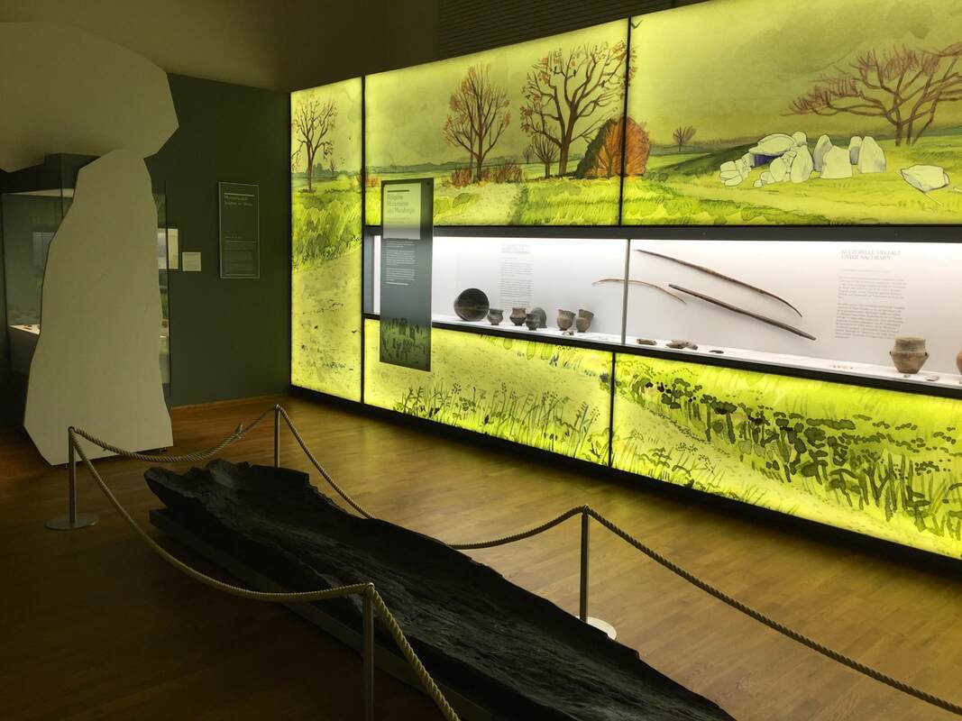
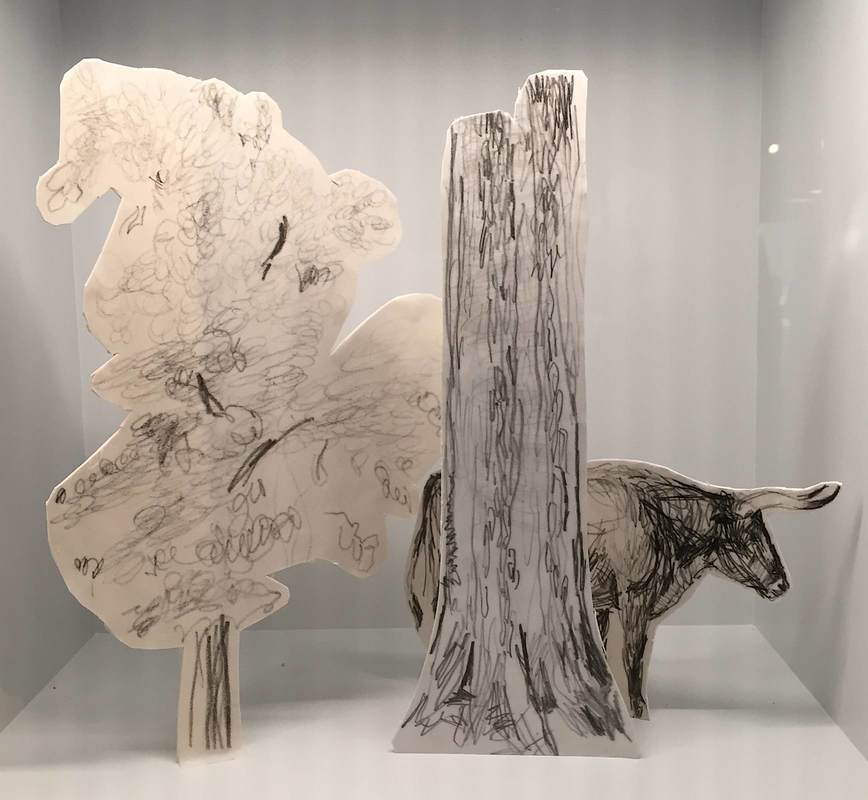
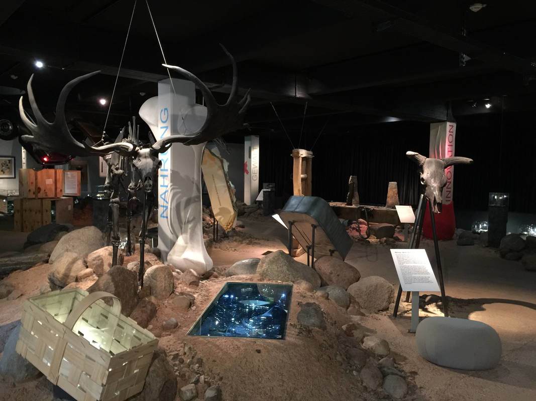
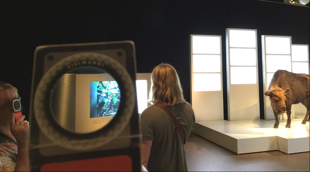
Another wonderful trick of display at Halle's State Museum of Prehistory (Landesmuseum für Vorgeschichte) are the fossilized skeletons displays in poses and places as if they were alive. A mammoth (above) crashes through the wall into the room housing his bones on a light table. A prehistoric mammal climbs a display case (below left) like a monkey up a tree, while some early elk (below right) soar through the air into the light well. A large grazing animal (bottom) stands chest-deep in dry savannah grass. (The striking display of axe heads in the background featured in the last post.) It is not only much more fun to look at these "living" animals, but educational—for the movement is part of the animal! When reindeer fly...
One last post will conclude this series on the Landesmuseum Hannover. These expansive walls of watercolor landscapes, lit from behind with an even glow, run throughout the exhibition of Saxon archaeology. As an artist, art historian and admiring niece of a wonderful mural artist, I fell in love with these immediately. But they operate beyond the realm of personal preference, I swear! Not only do they add color to the display without complicating the view of the objects themselves—which remain on a white ground—but they flesh out the objects' use contexts. Each mural is crafted to show the phase of prehistory that the objects belong to. The type of housing shown is accurate to the time; so is the state of nature or agriculture. But to be honest, it is so bewitching to see a gorgeous watercolor at this scale that I could care less about the content... Oh wait, not really! Bad art historian!
The keen-eyed will have seen that the white cutouts of boulders at left are represented in the painting at right—and that this sort of construction to contextualize the objects was discussed in the last post. A revelatory multisensory exhibition is on view now at the Aedes Architecture Forum in Berlin. The show FARAWAY SO CLOSE. A Journey to the Architecture of Kashef Chowdhury / URBANA, Bangladesh takes wooden models of the architect Chowdhury's buildings, designed to meet the climatic challenges of Bangladesh, and hangs them from nearly invisible cables. Hovering against the black walls like UFOs highlights the otherworldly nature of the buildings' shapes; it emphasizes the literally out-of-the-box thinking behind the designs. A polygonal snailshell (above right), walls in concentric circles with aligned or offset entrances, or whole islands with central pools engineered to beat the constant floods—these are forms of elevated creativity.
This experience meshed well with the symposium next door on museums in urban space, Extrovert Interior: Publicness and the Contemporary Museum. Asking how the museum mission is being relocated increasingly outside a single building (museum-in-a-box programs for schools, mobile museums on wheels and water, biennials in unexpected venues), the program was a poetic inverse to the exhibition's bringing-gravel-inside idea. All in all a very stimulating day at Aedes, and certainly not the last. I'm already looking forward to their next show, on Archi-Tectonics (Netherlands/New York).
Yesterday I finally made it to Museumsdorf Düppel in Berlin, an open-air museum that has been on my to-do list for years. It centers on an absolutely charming reconstruction of the 12th-century village excavated there primarily in the 1970s. The houses with reed roofs and mud walls are impressive for their craftmanship, as well as the feeling they give you of standing really and truly in a medieval village. The lightly damp, gray, freezing weather enhanced the effect. Hats off to the capable people who made it possible to live in such conditions, constructing surprisingly cozy houses and fashioning their own clothing, tools, candles, food, and on and on. Truly impressive!
As a supplement to the village, the small interpretive center is a gem. "Klein aber fein," small but fine—the description fits perfectly. One of the displays that caught my eye for being both economic and effective is the timeline: a series of small lit vitrines sunk into the wall boasts a series of colors, each vitrine framed by a different hue. These correspond to the colored bands on the timeline above, which stretches from 10,000 BC to the present day. Each vitrine holds a miniature diorama of the landschaft around the village in the indicated time period (a title for the whole wall would help convey this: Changing Landscapes, or some such). I went gaga over the grace of the dioramas—constructed of cardstock cut-outs with simple pencil drawings, they are outrageously simple yet communicative works of art. Hamburg's Archaeological Museum in Harburg is a gem. The first-floor gallery, pictured above, is relatively small but packed with wildly creative displays. An artificial dirt-and-rock floor (all glued down, safe to walk and scramble on) strikes the right tone for the prehistoric collections. Just so the dark ceiling, recalling a cave or perhaps the night sky. It's atmospheric, certainly; but more than that, the playfulness helps to emphasize the content rather than distracting from it. Who could expect otherwise from the creative team, Ravensberger Freizeit und Promotion, famous for their educational board games! Here are just a few examples:
In one gallery of Berlin's Natural History Museum, all the video installations are plain white. They illuminate the taxidermied bison like the lights for a fashion shoot, but otherwise betray no special function. But if you grab a playing card from the big bin at the entrance, and you look through the little circle of polarizing filter that occupies half of the card, suddenly the white screens spring to life! Each one plays a captioned video about animals, some of which are also shown in taxidermied form nearby. Through the filter you can watch the video as usual—or watch the people around you as they realize, squint, look, and learn! It's a cute trick to get people to stop and engage in a concentrated way with video material. I certainly would have breezed past a lot of these screens if not for the polarizing gimmick to draw me in (on a visit last weekend during the 20th iteration of the Long Night of the Museums).
The first clue that the curators at The Huntington Library have thought long and hard about the presentation of their History of Science exhibition (which curator Daniel Lewis kindly showed us) is in the entryway, pictured above. The blue, curving wall on the right is a subtle mechanism for attracting people through the door—what is this surface? what is written on it?—and guiding them into the first gallery. Imagine a large flat wall panel in its place: it would produce a very different effect! Curves define the first gallery space as well. These beautiful curving vitrines were conceived to echo the "heavenly sphere" that is the subject of this room, dedicated to astronomy. (Yes, the ceiling is vaulted too!) Dr. Lewis installed low cases so that the visitors can get up close to the books, as if they were holding them. But since this means that people bend over the cases to look inside, the lights had to be specially mounted inside the cases so that the viewer's head wouldn't interrupt a light source shining from overhead. Detailed planning that bespeaks years of experience. . . or unusual design foresight. The next room also employs a great device for luring viewers close to the books. Dedicated to the central role of observation and illustration to the development of natural history, the walls are a vivid red that highlights the beautiful reproductions of book illustrations hung in a sort of collage style. To convey a progression through time, the earlier drawings are hung at left, followed by later lithographs, color lithographs, and prints. The ensemble is not only beautiful but inspires curiosity in the books below, which contain further illustrations and, of course, text. The presentation functions on both the level of immediate impact (beautiful wall design) and closer encounter (approaching the objects and delving into the information presented). As the curators plan to reinstall this exhibition in the coming years (it certainly doesn't show its age; it is already nine years old), I look forward to seeing what they come up with for the new incarnation.
What does it mean when an art museum plans to expand into a sweeping green park space—with no art? That is precisely what the North Carolina Museum of Art is doing, according to a recent New York Times article. The large outdoor extension is emphatically not a sculpture garden, says the museum director, Lawrence J. Wheeler, but rather "a unifying idea of what people perceive as a museum and what they perceive as a park." This is one more step in the direction of museums as sites of experience above all else. It raises the question: If parts of the world such as parks can become parts of museums, what has a museum become? If a museum's ultimate role is to serve the community, then a park space is ideal; but what then differentiates a museum from a park, a library, a parking lot—or anything else of value to the community?
Let's return to the splendid gallery of minerals and gems in the Carnegie Museum of Natural History to talk about shelving technology. (In a previous post we ogled the dramatic lighting that makes the objects sparkle like, well, jewels!) These shelves are designed on a simple principle: cables stretched from the bottom to the top of the case are fitted with small steel cylinders that can slide along them as well as clamp onto a corner of a glass shelf, allowing the shelves to be adjusted to an infinite range of heights. Here they are smartly deployed in a case with a glass front and back, so that you can look right through; the minimalist shelving helps this unobstructed view. The result is beautiful as well as clever—if not exactly transferable to earthquake country!
It's a tricky task to make nature itself into an exhibition. Nature walks (in botanical gardens and model farms, for instance) often rely not on a group of objects or other predetermined set of material, but on an unpredictable troupe of actors who may or may not be on stage that day. What a challenge to present material that the visitor might not even get to see! But certain display tactics can help smooth over the possible unevenness of this living exhibition. The Anne Kolb Nature Center in Hollywood, Florida centers on a boardwalk that winds through a section of mangrove habitat. (It also has a lovely visitor's center which, when I visited, included a display of contemporary art on spiffy movable walls.) At the start of the walk, large signs with vivid pictures of the animals (above) introduce the visitor to the point of the exhibition: to VIEW the plants and animals. Further, to help the visitor engage—and to help them see the critters tucked away in their hidey-holes—the Center offers a handout with a checklist of the plants and animals one might encounter on the walk. This is an easy, effective, low-cost way to encourage visitors (especially kids) to really look, and even to try to identify the things they see. It would be fantastic as an app for mobile devices too.
"A good test of an art museum is how far you have to go into it before you see art." These are the wise words of Elizabeth Easton, director of the Center for Curatorial Leadership and a wonderful mentor for our cohort in the CCL summer program 2014. The Saint Louis Art Museum gives you art already in the beautiful grounds outside the museum, and more as soon as you walk in the door: the grand foyer with its lofty ceiling and vaulted bays perfectly frames a rotating assortment of large (appropriate to the space) pieces from the collection. But what struck me in particular about this foyer is that it contains not only art but large (again, the space demands it) floral arrangements. They provide a necessary humanizing touch to what might otherwise be a dauntingly grandiose space. Luckily enough, during my visit the florist was still there putting on the finishing touches; and when I struck up conversation, he mentioned the extra complexity of putting flowers in an art museum: all the vegetation has to be fumigated before being installed! Beyond that extra hurdle, I imagine that thinking up a flower arrangement to work alongside the art must be a refreshing challenge.
A recent New Yorker article raises an interesting question of display: How can you fill a whole museum with exhibits exclusively about something microscopic? This is the task of Amsterdam's Micropia, a museum devoted to "invisible life"—that is, microbes. Among Micropia's solutions to this challenge are (as reported by the New Yorker, although the author does not focus on the display challenge in particular):
As a small museum trying to appeal to local families (leaving the tourists to crowd the nearby gator attractions), the Anne Kolb Nature Center in Fort Lauderdale, Florida has to serve a variety of functions. Its permanent exhibit centers on the recovered mangrove lake on which it stands, a marvel of a restoration story; but in order to stay lively for its visitors, it also has to be flexible. That's why these simple moveable walls are a stroke of genius. Three of them in a row provided the support for a temporary exhibition by a local artist. Just one bent wall set on three casters — could it get any simpler? And yet they are extraordinarily versatile and effective. It seems like a fundamental building-block that any institution interested in public engagement could keep in reserve for any time they need it. And not just for purpose-built exhibitions, either: such walls could just as well be wheeled into a foyer during a wine reception and be tacked with a few informational flyers for guests to look at while they sip.
Octopuses were my favorite cephalopod until I learned more about cuttlefish. Many more people now have the chance to get excited about these remarkable little undersea hovercrafts in a new special exhibition at the Monterey Bay Aquarium, Tentacles. Brand-new and quite lavish, this exhibition features rich colors on every wall, several video screens masquerading as aquaria, and of course tanks of the live wonders themselves. This vaguely hemispherical tank was striking for the contrast between pearly white cuttlefish and supernaturally sparkly black "sand." The sand has clearly been chosen to set off the bright white of the animals. They gleam against it.
The funny thing is, they also bury themselves in it: fluttering a single delicate fin, they dig into the sand and bivouac in the depression, tossing a sprinkling of sand onto their backs. Naturally, they do this to hide from predators. But no predator would be fooled by a glaringly white fleshy nugget sitting atop a black dinner plate! Although in the wild cuttlefish burrow into tropical sand as gorgeously white as they are, for the sake of the exhibit the chosen sand is black. It's an instance in which altering the actual natural context of the "object" on display helps the visitor better appreciate it aesthetically, although not conceptually (as in these examples); the intricate beauty of the camouflage that nature has wrought is subordinated to the visual WOW factor of white-on-black. A successful display does not need a fancy new design idea or technology to be successful (indeed, sometimes those can really go awry!). Some of my favorite displays are very simple; their strength lies in being extremely well-conceived in terms of how they achieve their few basic goals. One great example is the signage at the Domäne Dahlem in Berlin, a charming set of fields and cottages meant to teach the visitor about old-time farming and artisanal trades. The signs scattered around the grounds are excellent in several simple but important respects:
Botanical gardens are a special kind of museum. By their very nature they have certain restrictions and opportunities that are foreign to a "brick and mortar" museum — for instance, walls. Walls are both a restriction and an opportunity, really, and one that is rather lacking in at least the outdoor portion of any botanical garden. With walls come wall texts, as well as the ability to encourage certain directions of movement. Lacking walls, botanical gardens (again, speaking of the outside area; the greenhouses and possible visitor center or attached museum are a different story) miss these opportunities even as they gain others.
What potential repercussions a lack of walls might have on a plant display struck me at the Ökowerk Berlin, which includes several garden spaces on its extensive grounds. Labeling the display is tricky when there isn't a wall to support the labels; the solution here is to print small paper labels and slip them into metal and plastic holders staked into the ground. The stakes are well-conceived insofar as they can be placed anywhere, and presumably even moved as the plants grow, unfurl leaves that then cover the signage, or drop their leaves and retreat to a mere husk, requiring the signage to be set nearer in order to look relevant. Unlike larger signs too, they can be stuck right in the middle of a bed of plants, making very clear what they refer to. Conversely, the portable size restricts the amount of information that can be given: so in this case, QR codes have to do almost all of the legwork. To balance the last post on diffuse lighting, in this post I want to revel in a gorgeous example of an unusually dark gallery lit with highly precise spotlights. In the Carnegie Museum of Natural History is a spectacular hall of minerals and gems. The shining glass cases, lighting, and black carpeting and walls all help make the objects appear precious, almost hallowed — they have an aura. Encased in glowing octagonal pods, they somehow even seem otherworldly. And while it's true that many of the specimens are themselves sparkly, impossibly pointy, or otherwise eye-catching, it's the display that really contributes to their inexorable pull. Talk about exhibition design amplifying the best qualities of a collection: you can hardly resist approaching the case for a better look at these, well, precious gems! Which leads to the question of keeping this glass free of nose- and fingerprints...
|
Ideas on Display
A humble space to reflect on concepts of museum display as enacted across a wide range of subjects, countries, and approaches.
Archives
April 2020
Categories
All
|