Amazingly enough, you can visit this museum on Google Arts & Culture - but this exhibition isn't on show in that version.
|
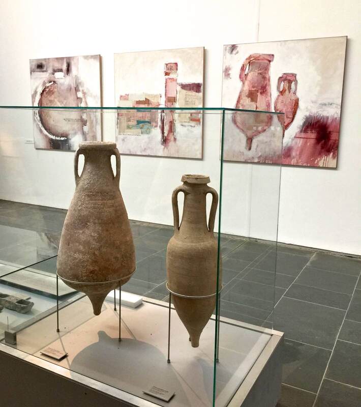
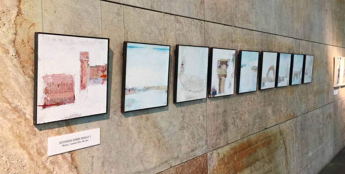
Are creative display ideas more likely to pop up in small museums than large ones? Sometimes it seems that way; perhaps they are more flexible and more closely in touch with their community, opening doors for conversations and collaborations. In any event, the small museum at the archaeological site of Baelo Claudia (modern Bolonia) in southern Spain offers a heartwarming display that seems to come from this sort of background. Contemporary two-dimensional artworks inspired by the site and the excavated objects are tastefully hung on the limestone walls. The works give a wonderfully lively impression of the site through the artist's eyes. The paintings of amphorae (above) encourage you to consider the shapes and colors in new ways, while the paintings of a famous arch at the site (below right) alert you to a now rather degraded feature that you might otherwise walk right by. As you know, I'm a big proponent of juxtaposing ancient and modern art for exactly these reasons: in complementing each other, they enrich our experience greatly!
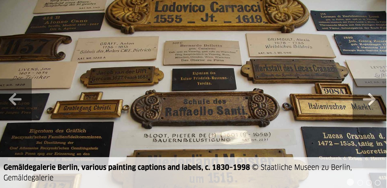
Amazingly enough, you can visit this museum on Google Arts & Culture - but this exhibition isn't on show in that version. I'm a sucker for exhibitions about making exhibitions! And who doesn't love a peek behind the curtain into the inner workings? A show at the Gemäldegalerie in Berlin until the end of this month focuses on the "Labels of an Exhibition"—how they changed over time and what this tells us about changing priorities. Reminds me of other shows, about nose jobs and frame games of the past...
Through Monday you can still catch the wonderful show My Dearest Sweet Love: Christopher Isherwood & Don Bachardy at the Schwules Museum in Berlin. What a wonderful compliment to the experience of reading Isherwood's books. What's more, Bachardy's paintings are truly stunning; the male nude series (here are some examples from 2002) took my breath away. He paints with such economy, capturing complex muscles in scant brushstrokes. His use of color also blew my mind—and he must paint very quickly, since the many colors that bleed into one another could only do so if all wet at once. I wanted desperately to buy a catalog of the show, but sadly there isn't one.
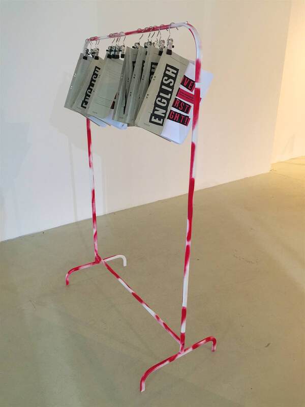
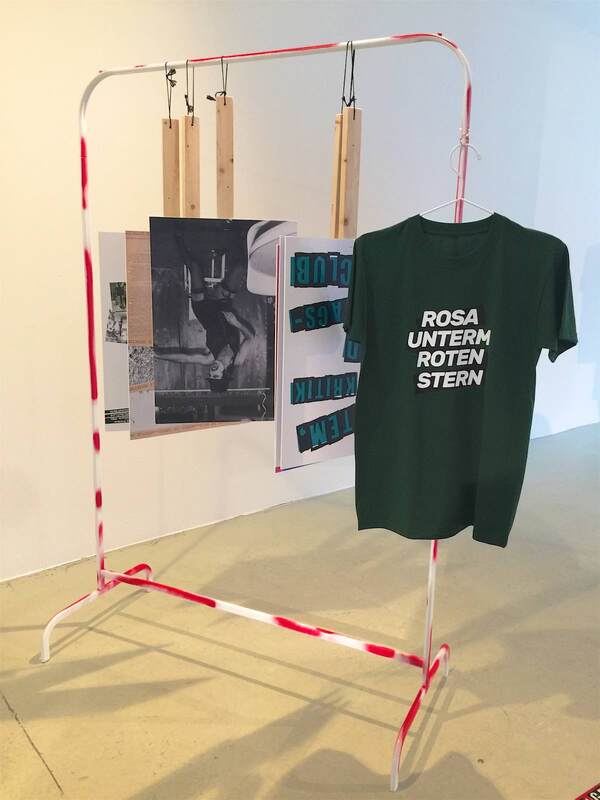
What I was able to take home with me, however, was an idea on display! In the exhibition LOVE AT FIRST FIGHT! Queer Movements in Germany since Stonewall (through fall 2020), the display is based entirely on simple clothes racks. They were spray-painted in red, a nod to the protests and homemade signs of the movements in the title. The racks were used in three ways:
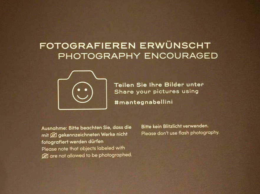
This is an incredibly simple and effective means of display, not to mention cost-effective; IKEA sells clothes racks like this for under $10! Three cheers for the Schwules Museum and these two wonderful exhibitions. I'll definitely be coming back for future shows. Last week I was treated to a special tour of the current Mantegna + Bellini show at Berlin's Gemäldegalerie, thanks to a generous friend and colleague over at ART-THINKING. Because it was a whirlwind of intense looking and learning, I didn't take any pictures until the last second—upon leaving the gallery, seeing the sign above. The design of the sign is good, using a happy face to communicate nonverbally. The encouragement to share images using the museum's hashtag is a clever way to crowd-publicize. More than that, I was impressed that the curators managed to get permission from all of the loaning institutions to allow visitors to photograph these incredible artworks! They deserve extra cheers for that.
This beautiful show is still open for five more days, closing June 30.
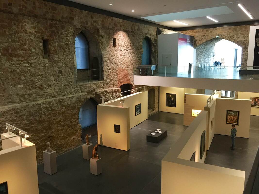
This is where cunning display tactics come in handy. The museum erected a series of freestanding interior walls to serve the needs of art display within the architectural shell (and constraints) of the castle. Many of the walls even have lighting rigged along the top, providing closer and more dirigible light than anything hung from the mile-high ceiling could:
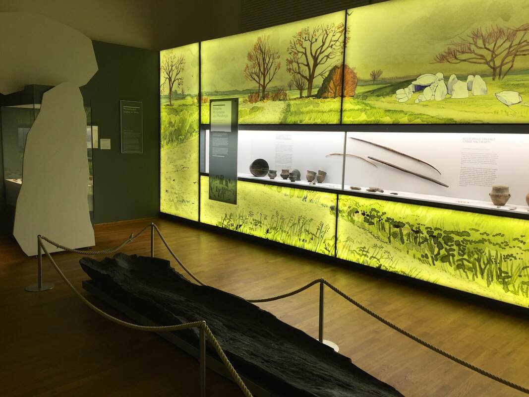
One last post will conclude this series on the Landesmuseum Hannover. These expansive walls of watercolor landscapes, lit from behind with an even glow, run throughout the exhibition of Saxon archaeology. As an artist, art historian and admiring niece of a wonderful mural artist, I fell in love with these immediately. But they operate beyond the realm of personal preference, I swear! Not only do they add color to the display without complicating the view of the objects themselves—which remain on a white ground—but they flesh out the objects' use contexts. Each mural is crafted to show the phase of prehistory that the objects belong to. The type of housing shown is accurate to the time; so is the state of nature or agriculture. But to be honest, it is so bewitching to see a gorgeous watercolor at this scale that I could care less about the content... Oh wait, not really! Bad art historian!
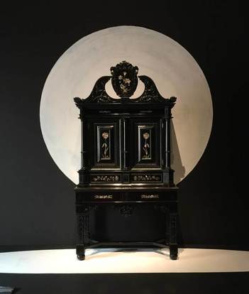
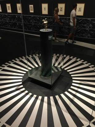
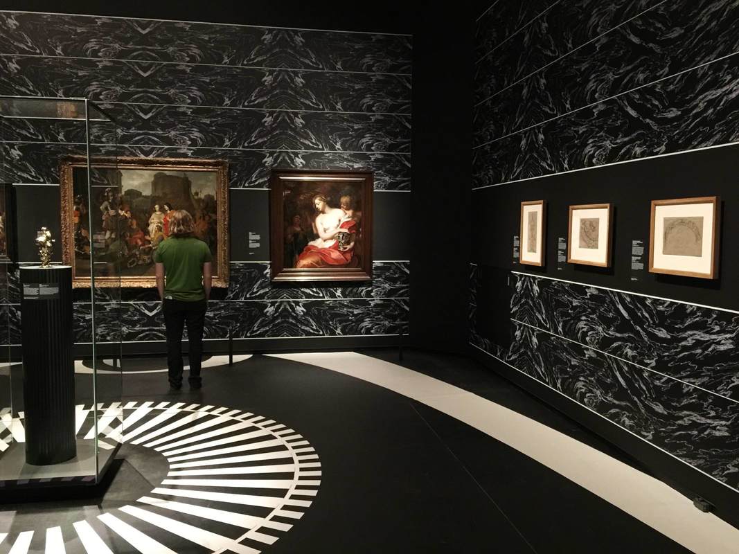
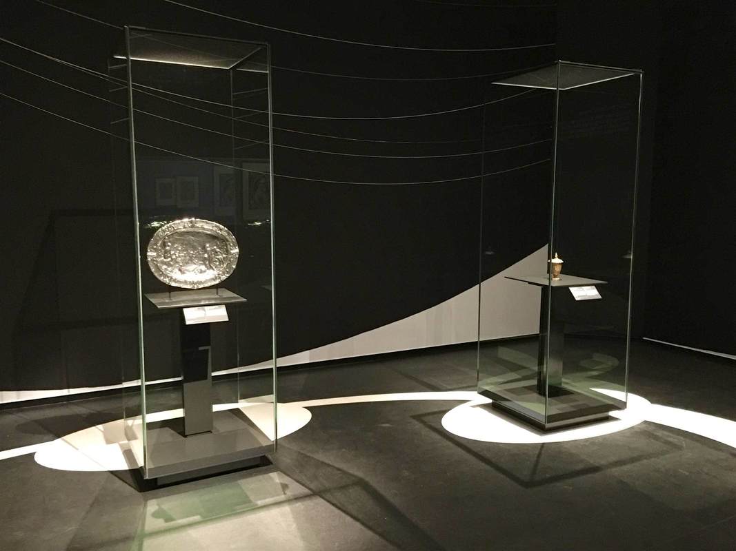
The keen-eyed will have seen that the white cutouts of boulders at left are represented in the painting at right—and that this sort of construction to contextualize the objects was discussed in the last post. Another notable aspect of the show KWAB in the Rijksmuseum, Amsterdam is the background painting. Walls and floors alike are painted with bold black-and-white designs carefully arranged to highlight the objects. This geniusly serves several purposes: 1. Emphasis The painting can be used to make an object really pop out at you. The beautiful ebony armoir above (left) gains a whole new life from the white moon behind it. The sinuous curves at the top of the chest stand out against the light background, and the hovering circle gives the piece a lively dynamic—almost as if it were a nocturnal creature standing in a moonlit landscape. The tiny silver pitcher above (right) gets an injection of energy from the white rays radiating out across the floor. They turn the pitcher into the source of a geometric explosion, and who doesn't want to look closer at that?? 2. Context The same black-and-white painting technique on the walls is used in another way, namely to recreate a sense of the objects' original context. Keeping the monotone palette is a nice way to keep the "reconstruction" attempt from becoming distracting, while at the same time contextualizing objects rather unfamiliar to a modern viewer. In the photo below, the oval painting in an elaborate wooden frame is hard to imagine wanting to hang on your living room wall; but with the illusionistic swags of drapery emanating from it, it gains the elegance and appropriateness to the opulent display context it was originally meant for. 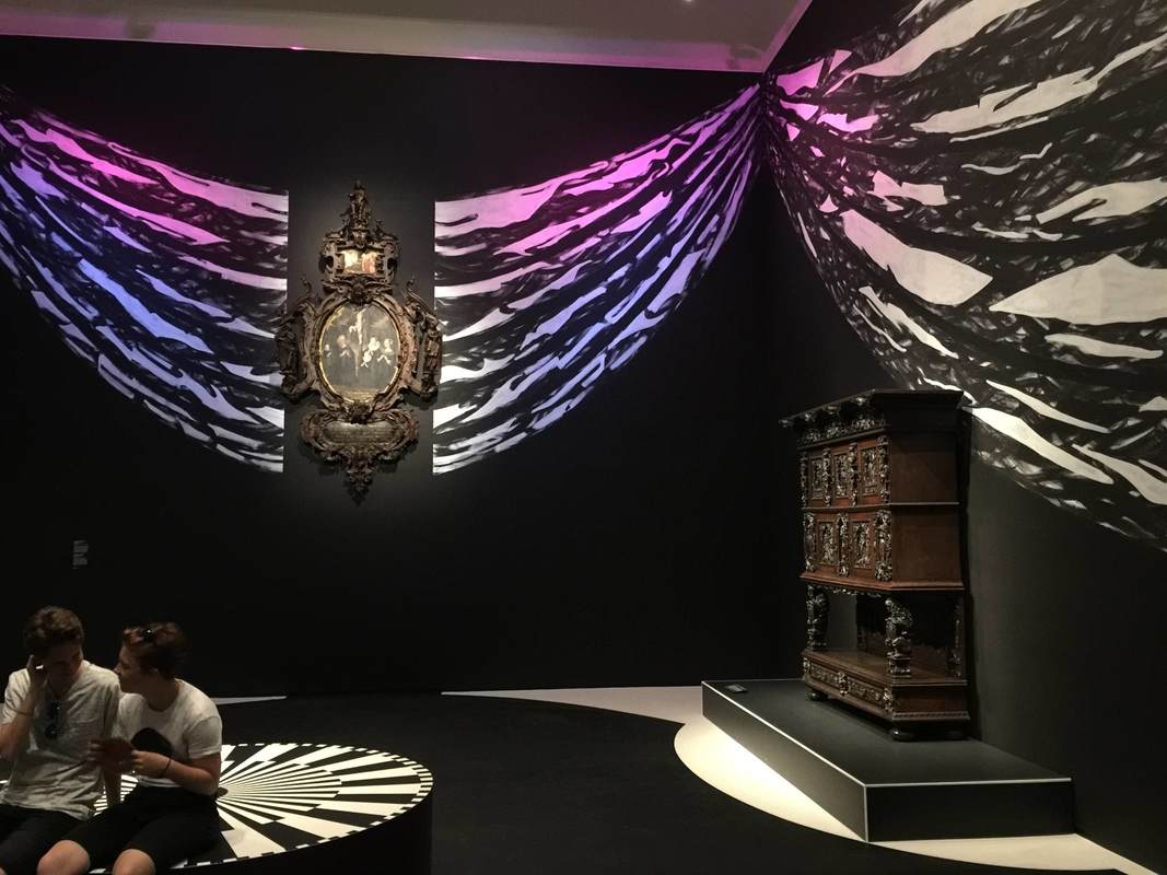 In the room below, a different pattern is used to imitate the wall decorations of the time, which in richer houses included embossed leather (!) wallpaper and wooden paneling: 3. Directing Movement In both the room above and that shown below, the wall and floor painting is used to encourage us to move through the exhibition in certain ways. Above, a long white band leads us from the bottom right (a doorway is just off the photo to the right), along the wall of drawings, and over to the paintings at left, where the half-circle of white under the center painting encourages us to linger. White stripes and circles similarly guide our movement between these two glass cases, this time reinforced by a subtle white curve on the rear wall: Such a simple and effective device as these paintings seems worth keeping in mind. Certainly, painting the floor will not often be possible in an exhibition, depending on the space (the Getty Villa's marble floors...). But for the wall paintings at least, I would be curious whether the extra cost and time for installation makes them practical or prohibitive.
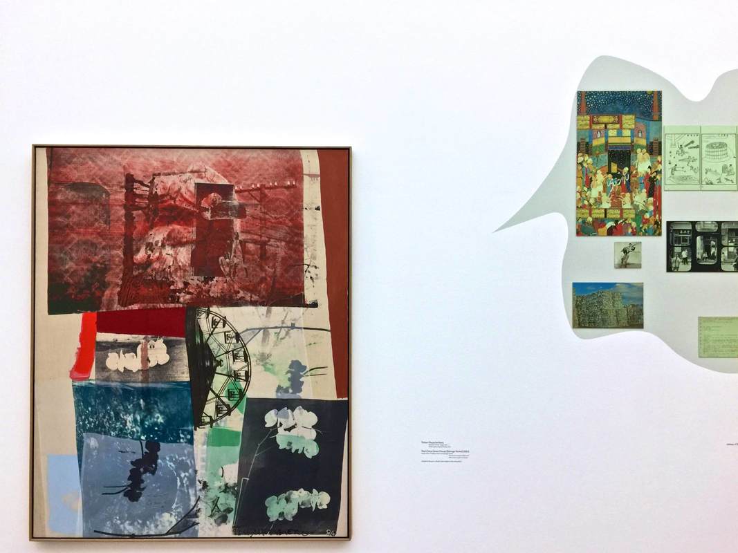
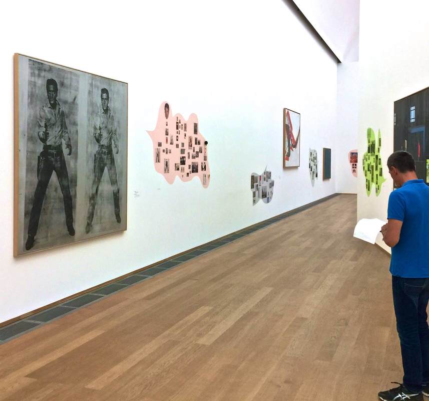
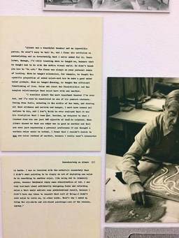
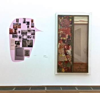
For two more days, the Hamburger Bahnhof in Berlin is showing its critical exhibition Hello World. Divided into "chapters" which all have their own titles and are housed in different arms of the building, the exhibition as a whole addresses one question: What would a collection of contemporary art like the HB's look like if it weren't so Western-focused? Needless to say, particularly with the Humboldt Forum being built not far from here, this topic is urgent. Because I want this blog to continue focusing on design elements (for now, anyway), here I'll just point out a few sources for reading more about the immense debates that this show takes on. The "chapter" formed around a part of the permanent collection (the Erich Marx Collection, above), titled The Human Rights of the Eye, features the works of Rauschenberg, Warhol, Twombly, and others that don't fit into the exhibition's diversity- and global-oriented themes. To frame them in the terms of Hello World, the curators invited the graphic arts duo cyan to intervene. The artists created collages beside the Marx Collection paintings, each collage reflecting visual aspects as well as content from the painting nearby in order to "trace the multilayered cultural interweavings" in the paintings. I did not feel that this was successful to the point of recasting the collection as "global;" nonetheless, I liked very much the dialogue between modern masterpieces and contemporary collages offering a cloud of associations. I can imagine this format—particularly the large shapes like speech bubbles emerging from the artworks—for all sorts of material relevant to the object, including the usual label information, relevant archival material, or even calendar listings for related events in the museum. Here of course the focus was rather on the collages as art themselves. Still, one collage included archival material in the form of a letter by Rauschenberg about his teacher Albers, which I found philosophically inspiring; see below.
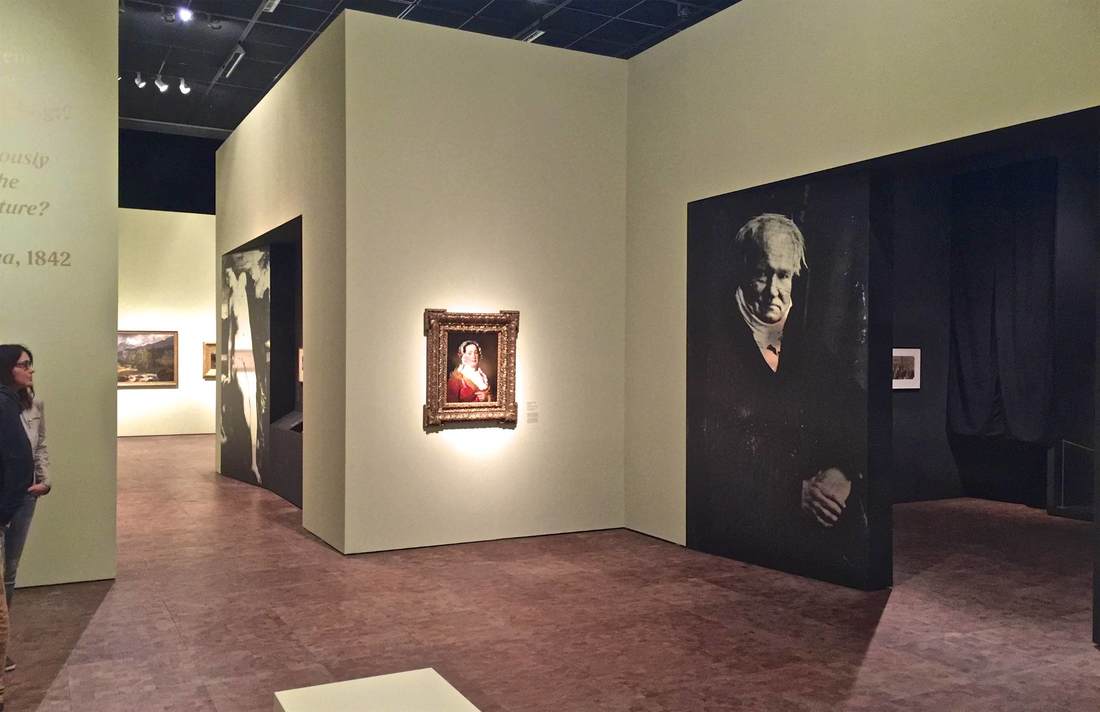
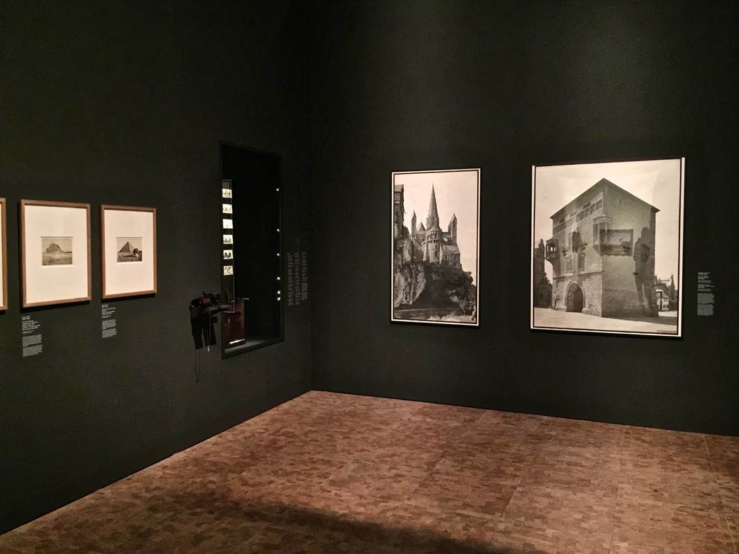
Salon and Black Box - Painting and Photography at the Germanisches Nationalmuseum Nürnberg7/11/2018 The second stunning exhibition I got to see recently at the Germanisches Nationalmuseum Nürnberg concerns painting and the birth of photography. Light and Canvas. Photography and Painting in the 19th Century does a wonderful job of presenting a complex subject: how did the invention of photography change painting, and how did the long tradition of painting influence early photography? The display underscores the dual protagonists of the story: the paintings are hung on vaguely kohlrabi-green walls, while the photographs inhabit black-walled chambers separated off from the main gallery space. The walls framing the entrance to the chambers are reflective silver overlain with black images, recalling early silver prints (visible above left). This is a genius conception for several reasons:
Overall I was hugely impressed by the effective presentation of such a complex subject and such a challenge in terms of display. You're in for a treat if you get a chance to go; it's open through September 9, 2018.
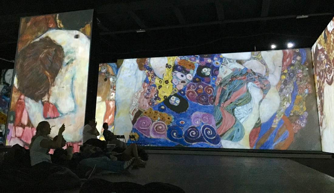
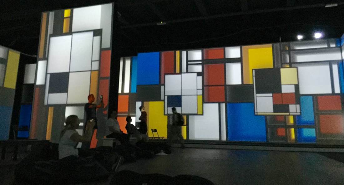
A new sort of art exhibition opened in Berlin about a month ago (running until January 28). From Monet to Kandinsky - Visions Alive is a similar presentation to last year's Van Gogh Alive exhibition in the same space (mentioned in this post on art as sensory experience). Using a combination of multiple projectors, sophisticated animation, and music in surround sound, the developers offer a way to experience art quite different from a gallery visit. The focus here is on sensory impact, not traditional pedagogy; all information about the artists whose work is shown is limited to a room on either side of the display space, each hung with a daunting set of text-dense posters. Really the viewer is meant to linger in the main exhibition space, a single large room with many folding chairs and bean bags—an invitation to relax and enjoy the sights and sounds.
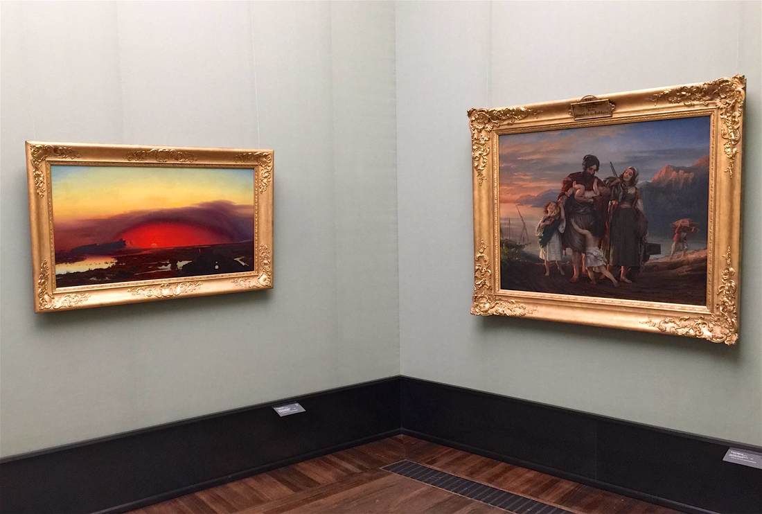
The exhibition consists of moving images of paintings projected onto all four walls (and onto a freestanding, screen-clad A/V tower, at left in the photos here). Music plays. Various paintings by a single artist are shown on the multiple walls, at varying degrees of "zoom." The real variety, though, comes with the animation: every painting has been reworked into a psychedelic moving image. Lillies from Monet's waterlily series have been cut from their paintings and now tumble lightly from ceiling to floor over a background of other Monet gardenscapes. Mondrian's squares gain shadow and thus depth, first flickering on like so many lit windows in an apartment building at night, then becoming hundreds of wooden blocks tumbling through outer space like celestial child's toys. Klimt's spirals and gilded squares break free of their canvases and swirl like confetti. After 60 minutes the film starts over again; and to my own surprise, I found that I could have gladly stayed for another round, so complex and beautiful is the imagery. Not only nice for the eyes, but food for the brain. For although text in this room is limited to a short phrase from the artist projected over the door, the animation shows a firm knowledge of the artworks and artists. The animators were not just strutting their technical stuff; they implemented effects to enhance the art according to its content or even the artist's biography. Thus Van Gogh's painting Wheatfield with Crows is the last of his works to be shown (to the sound of cawing as the birds float over the horizon), just as it was the last work he ever painted. Toulouse-Lautrec's segment opens with silhouettes of the heads of various spectators he painted, as if seated in a theater, a spotlight playing across them as their voices titter—underscoring the importance of spectatorship and nightlife to the artist's repertoire. The many Van Gogh self portraits that morph into one after the other after the other emphasize the artist's obsessive nature, perhaps visible in the repeated attempts to capture his own likeness. By the end, I was enraptured. Quite a shift from my initial skepticism; I'm embarrassed to admit that at first, I was horrified by what seemed like an overly showy spectacle at the expense of an apparent substance (ahem, text?). How lucky that my companion convinced me to stay and relax into the colors and sounds—which indeed turned out to be wonderful, but also by far not the only merits of this exhibition. Arranging objects in a gallery so that they communicate with each other (and with the visitor caught in their crosstalk) can take many forms. A unified color scheme among the individual vitrines can do it, as can a monochrome or gold color to the objects themselves, or a similarity in shape. The above pairing of paintings in Berlin's Alte Nationalgalerie highlights the similarly rosy tone of both pieces, but in an especially cunning way. The lefthand painting, August Kopisch's Pontine Marshes at Sunset, depicts a red sun sinking over the crimson wetlands like an ember. It smolders in the dome of clouds above it, a furnace between the eerie lunar landscape and the jaundiced sky. Lengthening toward the right, the red oval seems to cast its light upon the next wall—where it falls upon the straggling family painted by Eduard Magnus in his Return of the Palikares. The low sun cloaking this scene in pink lies just off the canvas to the left, allowing us to imagine that it might be the very same sun that sets over the Pontine marshes. Not only the warm color, then, connects the paintings, but the very light source itself; it calls for the two pieces to be looked at together, dynamically.
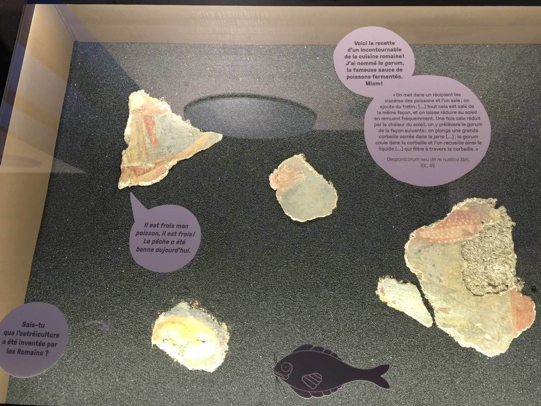
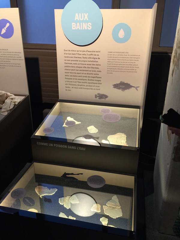
The brand-new archaeological museum at Pully (near Lausanne) is dedicated to an ancient Roman villa discovered at this site, overlooking Lake Leman. Fragments of fresco that decorated the villa's walls are exhibited in cases dedicated to certain themes—shown here is "Aux bains," "At the baths." Displayed within are pieces of fresco from the villa's bath complex, which was painted with marine scenes in keeping with the watery function of the rooms. Not only is the graphic design of the panels clean and bright, but the cases feature a cute pedagogical concept: small stickers on the glass are shaped like speech bubbles, some with tails pointing to fresco fragments as if they were talking! In the photo above, a painting of a fisherman seems to call out, "It's fresh, my fish is fresh! The fishing was good today." The bubbles at the top right introduce an authentic Roman recipe for fish sauce, quoting an ancient author, while the small bubble at left asks, "Did you know that fish farming was invented by the Romans?" It's a playful way to draw attention to individual objects, and particularly well-designed to engage young museum visitors.
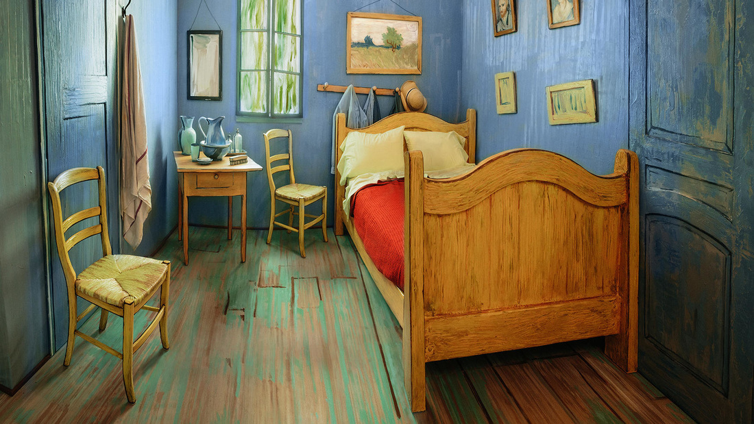
A display that blurs the boundaries between art, life, and even display itself is a wonderful and paradoxical thing. The Art Institute of Chicago achieved this by reconstructing the room depicted in Van Gogh's painting The Bedroom—and then listing it on AirBnB for interested renters! As a promotional tool for the Institute's Van Gogh exhibition, this is a cunning tactic; but more than that, it is an exemplar of how the content of an exhibition can inspire (or even become) the display method—and how both can give rise to an unusually vital visitor experience.
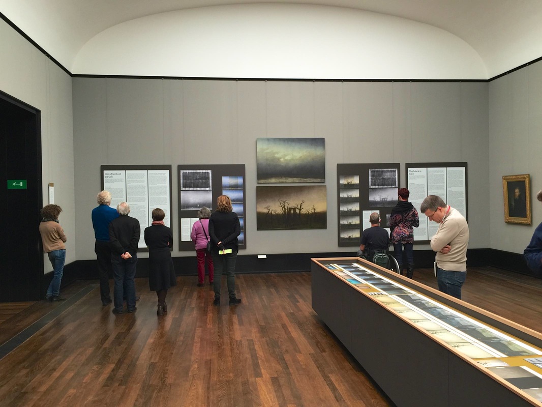
Who doesn't love a peek behind the curtains? At least when the venue is a museum, a look behind the scenes (or curtains, in the German idiom) is always thrilling. Making visible all the work that goes into readying objects for display is not only a highlight for visitors but a well-deserved kudos to the conservation teams whose hard work is rarely recognized by the public—because ideally, their work is invisible! The conservators at Berlin's Alte Nationalgalerie are now earning appreciation in a special exhibition about their three years of work restoring Caspar David Friedrich's two most famous paintings, Monk by the Sea and The Abbey in the Oakwood. Numerous series of photographs in the exhibition show the progression from yellowed, cracked, poorly-restored pieces to the radiant paintings now finally back on show. A few of the photographs even showed the conservators' coded markings and notes for planning the restoration, as well as the X-ray images they used to better understand the underdrawings and primer layers. Two full-size photographs of the unrestored paintings (seen above) allow viewers to compare the earlier with the present state (much clearer and less jaundiced!). It is an exciting story to see laid out like this—and today, at least, many people were there to enjoy it.
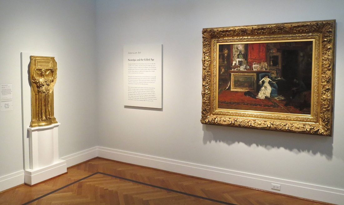
Overview panels can be underrated. In its recent renovation of the European Painting galleries, the Metropolitan Museum of Art shifted its "room labels" from the walls to plaques on knee-high metal stands. For space considerations, this makes sense. But if wall space is not at quite such a premium, a nice big wall panel does wonders for communicating the Big Idea. "What is this all about?" I can hear a visitor asking, making a sweeping gesture, stepping into a gallery for the first time. Individual object tags don't help answer this question, but an overview panel sure does. It is magical for its ability to unite a wide range of objects into a comprehensible narrative.
Everything I love about overview panels inheres in this example from the Saint Louis Art Museum. At the top is written the most general category, the designation of the collection: American Art. Below, the thematic title for the room: Nostalgia and the Gilded Age. But the best part? Look to either side and you immediately encounter something obviously gilded, perfectly illustrating the name. Moreover, both gilded pieces are quite large and lavish, as if lending some (literal) weight to the idea that an entire age could be gilded. And finally, the subjects of both pieces subtly underline the idea of nostalgia. The woman at right sinks into her chair, surrounded by precious items, speaking with a man (the artist) swallowed by shadows. At left, a golden winged figure in Classical robes embodies the glorification of a past age. Following the thread that connects the objects with each other and the text could hardly be easier. This beauty of a display is in the Harvard Semitic Museum. Never before had I seen such creative use of a single color of paint applied to a wall to enhance an array of objects. The objects in question are ancient amphorae, perfect for a wall-mounted display because they are large — taking up a good amount of the large vertical space — and tough, requiring no special climate control or protective glass case. Taking the extra step to paint them into an ancient ship is a truly inspired move that works on several levels:
|
Ideas on Display
A humble space to reflect on concepts of museum display as enacted across a wide range of subjects, countries, and approaches.
Archives
April 2020
Categories
All
|

 RSS Feed