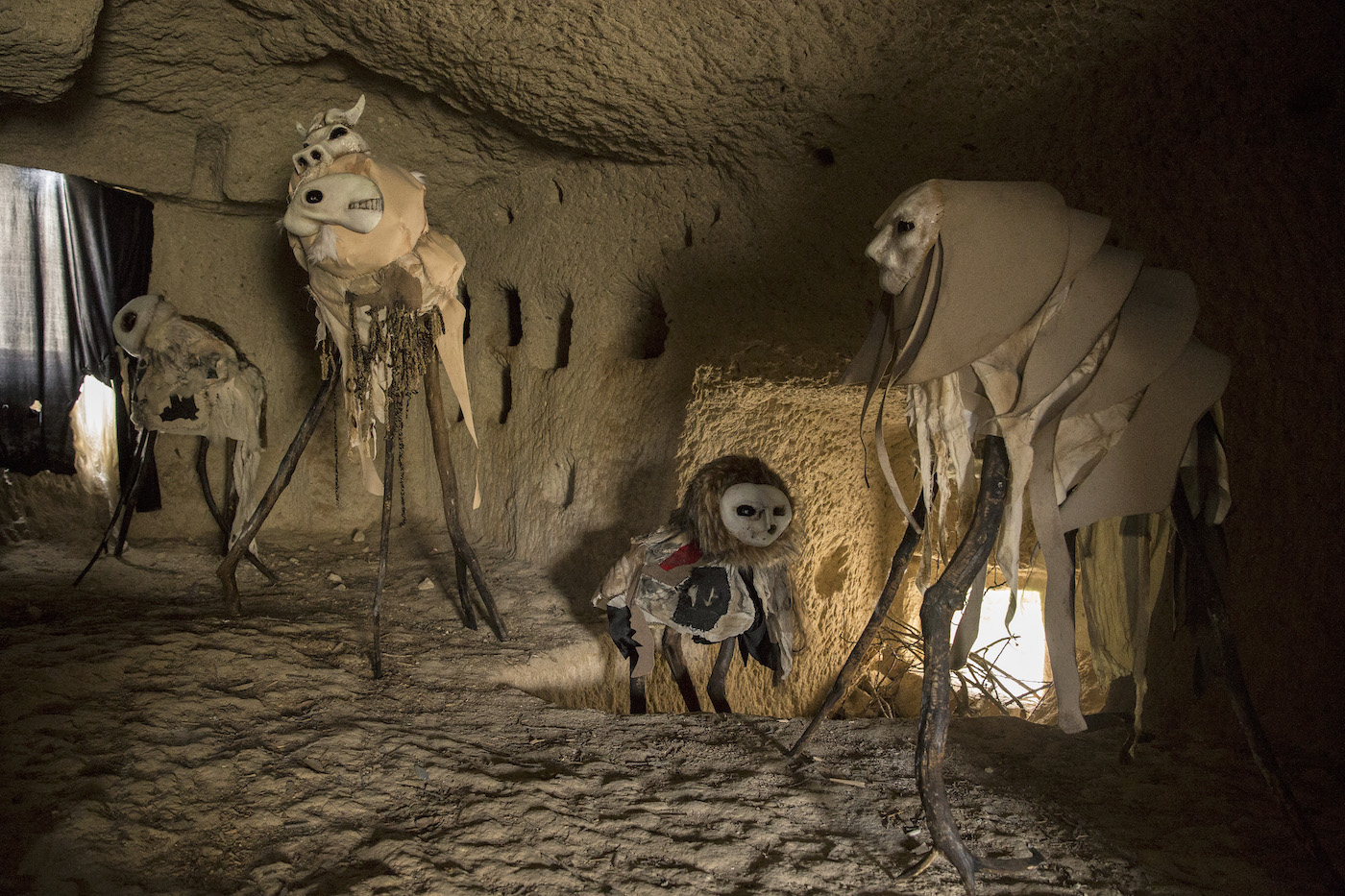
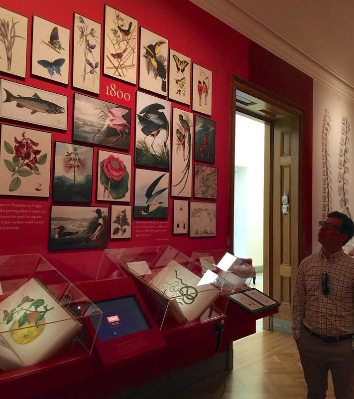
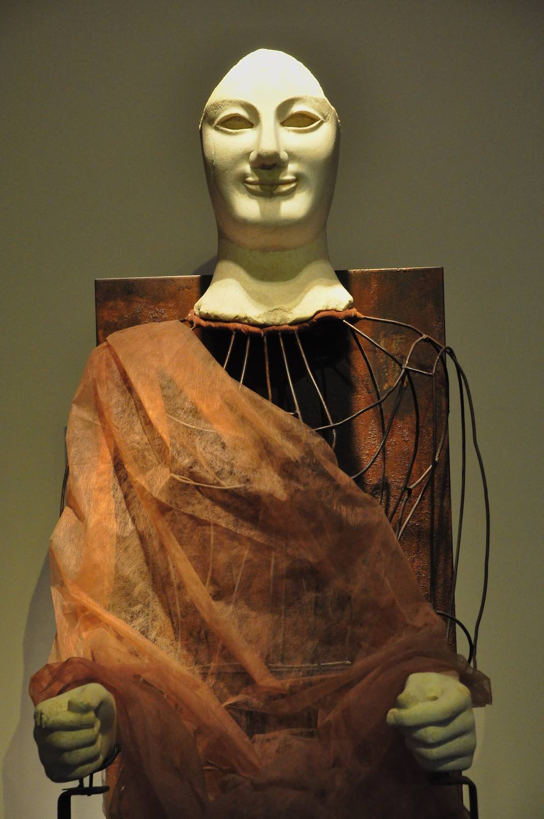
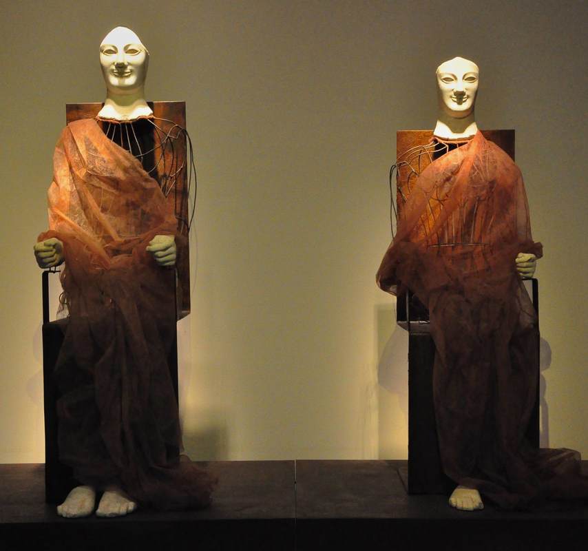
As if a cave-turned-gallery weren't cool enough, what if the cave is in a fantastical Cappadocian fairy chimney? It sounds (and looks!) straight out of Dr. Seuss, but it's real: the Cappadox art festival comprises dozens of art installations in and around these otherworldly stone towers. As Emma Stone in Hyperallergic reports, the installations range from single sculptures to multimedia ensembles. The piece pictured above fits particularly well into the rock-hewn environment; a space once used for graves and chapels now houses these vaguely steampunky arachnocreatures. It's a superb way to spotlight both the living, breathing contemporary art and the (UNESCO-listed) historic cultural site.
Arranging objects in a gallery so that they communicate with each other (and with the visitor caught in their crosstalk) can take many forms. A unified color scheme among the individual vitrines can do it, as can a monochrome or gold color to the objects themselves, or a similarity in shape. The above pairing of paintings in Berlin's Alte Nationalgalerie highlights the similarly rosy tone of both pieces, but in an especially cunning way. The lefthand painting, August Kopisch's Pontine Marshes at Sunset, depicts a red sun sinking over the crimson wetlands like an ember. It smolders in the dome of clouds above it, a furnace between the eerie lunar landscape and the jaundiced sky. Lengthening toward the right, the red oval seems to cast its light upon the next wall—where it falls upon the straggling family painted by Eduard Magnus in his Return of the Palikares. The low sun cloaking this scene in pink lies just off the canvas to the left, allowing us to imagine that it might be the very same sun that sets over the Pontine marshes. Not only the warm color, then, connects the paintings, but the very light source itself; it calls for the two pieces to be looked at together, dynamically.
The first clue that the curators at The Huntington Library have thought long and hard about the presentation of their History of Science exhibition (which curator Daniel Lewis kindly showed us) is in the entryway, pictured above. The blue, curving wall on the right is a subtle mechanism for attracting people through the door—what is this surface? what is written on it?—and guiding them into the first gallery. Imagine a large flat wall panel in its place: it would produce a very different effect! Curves define the first gallery space as well. These beautiful curving vitrines were conceived to echo the "heavenly sphere" that is the subject of this room, dedicated to astronomy. (Yes, the ceiling is vaulted too!) Dr. Lewis installed low cases so that the visitors can get up close to the books, as if they were holding them. But since this means that people bend over the cases to look inside, the lights had to be specially mounted inside the cases so that the viewer's head wouldn't interrupt a light source shining from overhead. Detailed planning that bespeaks years of experience. . . or unusual design foresight. The next room also employs a great device for luring viewers close to the books. Dedicated to the central role of observation and illustration to the development of natural history, the walls are a vivid red that highlights the beautiful reproductions of book illustrations hung in a sort of collage style. To convey a progression through time, the earlier drawings are hung at left, followed by later lithographs, color lithographs, and prints. The ensemble is not only beautiful but inspires curiosity in the books below, which contain further illustrations and, of course, text. The presentation functions on both the level of immediate impact (beautiful wall design) and closer encounter (approaching the objects and delving into the information presented). As the curators plan to reinstall this exhibition in the coming years (it certainly doesn't show its age; it is already nine years old), I look forward to seeing what they come up with for the new incarnation.
The archaeological museum at Aidone, Sicily presents a juxtaposition of very old (6th century BC) and very new (2009) that is at once provocative and instructive. The decision to display the remains of two remarkable ancient Greek statues in a reconstruction by contemporary Sicilian fashion desigenr Marella Ferrera is symbolic, underscoring the equal value of (and even a unity of) Sicily's ancient and modern heritage. In Ferrera's concept, the marble heads, hands, and feet of the statues of goddesses Demeter and Kore/Persephone are affixed to metal wire armatures swathed in transparent rust-red cloth. (Some tweaking has been done over the years; an earlier version used a pale off-white cloth and included a stalk of grain in Kore's left hand. At the time of the first installation, Ferrera's human models were similarly swathed in her Winter 2009 collection.) The result is much more striking than the exhibit for the statues in Virginia, where they were housed until a repatriation claim in 2007 lead to the return of the statues in December 2009. What is more, Ferrera's "in-corporation" of the heads and extremities creatively recreates the original context of the statues: as acroliths, these statues had stone heads, hands, and feet, but their bodies were carved in in wood which no longer survives. Setting the remaining stone pieces back into bodies gives the viewer a proper sense of the powerful physical presence of the original statues—an important factor in their function as figures of worship.
This unusual touch surely gave a smile to many visitors to the special exhibition Il Nilo a Pompei at the Museo Egizio in Turin, Italy. In keeping with the theme of this show—how Egyptian culture was taken up by Romans in Pompeii—the standard fire escape signs were replaced by these Egyptian-inspired ones! A whimsical bit of humor that gives a glimpse of the real (fun!) people behind the exhibition. Director Christian Greco cheerfully admitted to being quite amused. This balance of fun and scholarly is characteristic of the museum's seriously impressive public outreach campaigns.
Museum Exhibition Reviews return to AJA: J. Shaya on the Museo Arqueológico Nacional, Madrid3/16/2017 Given that the mechanics of museum exhibitions can make all the difference between an effective show and an ineffective one, reviews of museum exhibitions are surprisingly hard to come by. In the scholarship on Greco-Roman civilization, at least, exhibition catalogs are much more commonly reviewed than the exhibitions themselves. This is a shame because exhibitions can communicate just as powerfully as books—and sometimes, of course, more so. They are an invaluable tool of scholarship that can propel research forward as well as public interest in it! Taking them seriously is a win for scholars, museums, visitors, everyone.
So three cheers for the resumption of museum exhibition reviews in the leading U.S. journal of Mediterranean archaeology, the American Journal of Archaeology. In the newest issue, Josephine Shaya evaluates the recent renovation of the Museo Arqueológico Nacional in Madrid, Spain. An online photo gallery accompanies her article. The same issue, in fact, includes a review of an exhibition catalog that illustrates how productive the synergy (or unity?) of brand-new scholarship and groundbreaking exhibition can be: Power and Pathos (Getty Museum, 2016) by Jens M. Daehner and Kenneth Lapatin. Visiting the Los Angeles County Museum of Art (LACMA) for the first time in many years, I was surprised (and admittedly, as a specialist in ancient art, dismayed at first) to find that the onetime gallery of ancient art has been disbanded. The Greek and Roman sculptures now stand in the galleries of European art—the ancient statues and vases joining the post-antique paintings, sculptures, and decorative arts (photo below). From my initial skepticism, however, I was completely converted to the curators' way of thinking: the pairing of old and new really works! It brings out similarities in the content, form, and even artistic style that would otherwise be lost; and the sheer visual variety of white statues with more colorful objects is beautiful and interesting (much more so than a room full of only white statues). What's more, bringing ancient art into the European art gallery underlines how fundamental it was to the artistic training of these later periods. This central art-historical concept can be grasped in a single glance because the pairings here so effectively highlight the parallels between the objects—as in the statue and painting below, both featuring classic male nudes in contrapposto. At the same time, the juxtapositions open up new ways of thinking about form—as in the second-century Hope Athena statue and ca. 1695 vase above, both with swirling drapery and twisting snake(like) edges.
Placing objects into an exhibition space requires thinking about them in a new way. While a individual piece might be the focus of art-historical research, when it enters a space shared with other objects, suddenly all the pieces become part of an interaction. Each piece plays with the other objects in the space and with the visitors. And the game is no longer just art-historical but also strictly formal (form-based)—in the sense that objects inhabiting a common space can be compared and contrasted simply in terms of their appearance, which for a single object would be impossible. Parallels and harmonies emerge; so too variations and dissonance.
This is especially obvious in a gallery of the Museum of Contemporary Art, Los Angeles (above). The objects in this room (part of the exhibition of the permanent collection) are all monochromatic, a unifying factor across the media of painting, metal sculpture, wood sculpture, and photography. What's more, the compositions of all the larger works have a strong vertical element: the paintings send up powerful black brushstrokes, while the two sculptures point long fingers skyward. The viewer's eye bounces from one to the next, drawing her in for a closer look into the black-and-white vortex. A display that blurs the boundaries between art, life, and even display itself is a wonderful and paradoxical thing. The Art Institute of Chicago achieved this by reconstructing the room depicted in Van Gogh's painting The Bedroom—and then listing it on AirBnB for interested renters! As a promotional tool for the Institute's Van Gogh exhibition, this is a cunning tactic; but more than that, it is an exemplar of how the content of an exhibition can inspire (or even become) the display method—and how both can give rise to an unusually vital visitor experience.
What does it mean when an art museum plans to expand into a sweeping green park space—with no art? That is precisely what the North Carolina Museum of Art is doing, according to a recent New York Times article. The large outdoor extension is emphatically not a sculpture garden, says the museum director, Lawrence J. Wheeler, but rather "a unifying idea of what people perceive as a museum and what they perceive as a park." This is one more step in the direction of museums as sites of experience above all else. It raises the question: If parts of the world such as parks can become parts of museums, what has a museum become? If a museum's ultimate role is to serve the community, then a park space is ideal; but what then differentiates a museum from a park, a library, a parking lot—or anything else of value to the community?
Remember the "talking statues" in London? Now the same folks (Sing London) have extended their project to Berlin. As they did in London, they are equipping numerous commemorative statues around town with audio clips that a visitor can access through small signs in front of the statue; snap the QR code and you're ready to listen. Two colleagues and I tried out the Lise Meitner statue and found it worked flawlessly. The voice actor brought a vibrant personal touch to the statue—a great way to bring it to life. One useful aspect of this concept is that such audio accompaniment can be overlain on any preexisting object; it does not have to be developed at the same time as the object installation. All that has to be added to the physical display space is a QR code (or a link to another technology—like Blinkster, used in Berlin's Ethnological Museum).
The recent release of a film about paintings by Goya highlights the increasing trend of using cinema as a complement to—not to say substitute for?—actually visiting museum galleries. For this film is not about Goya, nor about his paintings per se, but about an exhibition of his paintings in the National Gallery in London. This, as far as I know, is a new genre of filmmaking (although pointers to the contrary would be greatly appreciated!). It emphasizes the experiential aspect of an exhibition, somewhat like the Van Gogh Alive show that immerses its viewers in floor-to-ceiling projections of excerpted details from Van Gogh paintings—creating a surreal landscape in which experience, not the stuff of traditional exhibitions, takes center stage. The Goya film, like the others by Exhibition on Screen, does not go so far as this, but still does focus on a luscious experience of the exhibited material and its historical context (see the period reconstructions in the trailer) more than, say, Frederick Wiseman's film National Gallery, which centered on life in the museum itself. It seems a wonderful way to inspire audiences to visit museums (I'm in the camp that believes that people will mostly use resources like this as an impetus, not a substitute, for going to museums themselves). I wonder what the partnership looks like between the museums and the filmmakers, and what the audience numbers are for these films.
Well-designed signage is a rare and precious gem. In a museum, signage can set the tone for a visitor's entire visit: because if she starts by buying a ticket, checking her coat, using the bathroom, and then finally entering the gallery she most wants to see, she's already had to locate at least four separate areas of the museum, probably by following signs. And if that process was easy—i.e., well-signed—she'll ideally be in a fine mood; but if it was difficult, she may enter the galleries feeling grumpy or frazzled, and that will color her experience of the whole museum.
So kudos to Berlin's Kunstgewerbemuseum (the museum of decorative arts and design) for putting writing on the wall that no one can miss, and winning a design prize along the way. The eye-catching size and color of the signage creates a certain aesthetic effect that not all museums would want, but it accords well with the all-parts-visible idea behind Rolf Gutbrod's 1960s building. Even award-winning signage has two potential weak points, however. First, it has to be wriiten in a certain language—here German, which some visitors may not understand. Second, there is a compelling argument (nicely presented in an airport example in the addictive design podcast 99% Invisible) that the architecture itself, not just signage, should help guide the people in it. But since purpose-built buildings are not in the cards for most museums (and even if they are, wayfinding is only part of their mission), it's worth taking signage seriously. Who doesn't love a peek behind the curtains? At least when the venue is a museum, a look behind the scenes (or curtains, in the German idiom) is always thrilling. Making visible all the work that goes into readying objects for display is not only a highlight for visitors but a well-deserved kudos to the conservation teams whose hard work is rarely recognized by the public—because ideally, their work is invisible! The conservators at Berlin's Alte Nationalgalerie are now earning appreciation in a special exhibition about their three years of work restoring Caspar David Friedrich's two most famous paintings, Monk by the Sea and The Abbey in the Oakwood. Numerous series of photographs in the exhibition show the progression from yellowed, cracked, poorly-restored pieces to the radiant paintings now finally back on show. A few of the photographs even showed the conservators' coded markings and notes for planning the restoration, as well as the X-ray images they used to better understand the underdrawings and primer layers. Two full-size photographs of the unrestored paintings (seen above) allow viewers to compare the earlier with the present state (much clearer and less jaundiced!). It is an exciting story to see laid out like this—and today, at least, many people were there to enjoy it.
A catalog published by the Louvre, L'Orient romain et byzantin au Louvre, underscores the power of perhaps the most fundamental matter of display: which objects are next to which. The catalog accompanied the opening of a new set of galleries featuring objects from three different departments—Greek, Etruscan, and Roman; Egyptian; and Near Eastern—now displayed together in a permanent exhibition space. The goal, the Louvre said, was that "these long-dispersed items could at last be assembled in a single space, and thereby placed in their geographical, cultural, and artistic context." It's a poweful example of how simply juxtaposing certain objects allows them to communicate in ways that they cannot individually or in other groupings.
You can read the full press release here, including the museological mission statement and a room-by-room description, while this document offers more detail, photos, and spotlights on a few objects. Just as physical aspects of display ideally promote effective communication, so can the reverse be true. So I pricked up my ears when this blog post from the vibrant We Are Museums group reported on the British Museum using the app Periscope to give a virtual tour of a special exhibition (embedded above). As a mode of global communication based on visual material, Periscope is a logical next step to Instagram: succinctly defined by the British Museum website, "Periscope is an app from Twitter which streams video direct from a smartphone to a global audience online." The user gets to select which feed she wants to watch, as if looking through the eyes of another user anywhere in the world. Although it was released 10 months ago, the WAM blog post points out that only a few museums have harnessed its potential to broaden their global audiences; but it seems likely to grow in popularity. I wonder what the very globally-oriented and social-media-wrangling Met might decide do with Periscope.
Last week the six powerful arches of the Kimbell Art Museum (Forth Worth, TX) entered my life as if a Piero della Francesca background had infiltrated my TV screen. Although they make only a brief cameo in the documentary film My Architect, which centers on the architect Louis Kahn (you can see clips of it here), their design is elegant, unusual, and—especially in light of these two qualities—astonishingly simple. From the outside, their length and clean lines seem to exaggerate their recession into space, as if perspective holds unusally strong sway over this building. From the inside, meanwhile (shown in the Kimbell's photo gallery), the barrel vaults are cunningly transformed into pointed arches by unbroken banks of lights, curving outward like a pair of mile-long petals opening down the length of each vault. The slabs of cement walls stand just out of line with the bottoms of the vaults as if independent structures. All in all, the architecture manages to harness the strength of brutalism and the grace of classicism simultaneously. The space it creates for the art is remarkable: understated, unprepossessing, a perfect backdrop—and yet utterly captivating you once you start looking at it.
What a stroke of good luck when a major credit card company uses your museum as the backdrop for its billboards! This advertisement appears right at the entry to the security check in Berlin's Tegel Airport, so it also has a captive audience. I wonder if the Bode Museum worked with MasterCard in order to get this exposure. Certainly the museum is working hard to expand its reach—particularly to a younger crowd, as shown by its new Instagram project.
Another element that struck me in the American Alliance of Museum's 2015 list of prizewinners in exhibition design and label-writing—beyond the two labels highlighted in the last post—was a diaphanous golden curtain. It appears in the AAM's photo of a gallery in the exhibition Gorgeous, which showed at the Asian Art Museum of San Francisco in 2014. Although it received no special mention by the AAM (this gallery was singled out for a label, not exhibition design per se), it is a remarkable feature. Is it tinsel? No, it hangs much too orderly for that. Strings of beads? Perhaps. But this is no bead curtain from a 70's hemp shop: it is slippery and glowing, enticing the visitor to approach this warm, silky wall. It serves as a divider in the space while also allowing a view through into the next—both providing structure and luring the viewer further. Considering that bead curtain technology has been around for millennia (see this bead net dress from c. 2400 BC), it's almost surprising that this technology doesn't crop up in museums more often (although fragility must go some way toward explaining this).
Every year the American Alliance of Museums confers awards for great exhibition design and label-writing (among other categories.) The 2015 lists are out! You can see the former here as a quick list and the latter here in a more expansive format with photos and descriptions. Of the many worthy entries, my personal favorite was a label by the Minneapolis Institute of Arts for the Zulu beer pot pictured above. (You might want to check it out in the MIA's beautiful online catalog, which is not only sleekly designed but includes audio clips and free image downloads.) As reproduced on page 6 of the AAM report, this label brings out the object's visual qualities and social importance at once—certainly deserving its prize.
My second-favorite label appears on page 9: an outdoor panel at the La Brea Tar Pits. It even has something in common with the beer pot label: vivid opening lines. Who could refuse to read further after "The stinky dead mastodon was irresistible" or "How is brewing beer like growing babies?" Once a month the Käthe-Kollwitz Museum in Berlin offers a lunchtime tour by the director, Dr. Iris Berndt, and yesterday's provided the extra motivation for my first visit to the museum. Standing in the first room of the ground-floor galleries, waiting for the tour to assemble, I was struck by the "word cloud" on a wall right next to the entrance. Like the automatically generated word clouds on the Internet, this collection represents thought trends in a wide set of "users" (clustered around the name of the artist, nicely emphasized with extra lighting). But unlike the digital word clouds, these words have been carefully selected to educate. As Dr. Berndt explained, they all represent concepts widely understood to apply to the great German artist Käthe Kollwitz—but several of them are problematic or even false. By marking these four terms with question marks—Feminist? Jewish? Communist? An artist who depicts suffering?—the display indicates that these preconceptions need to be reexamined and possibly discarded. This seems to me a very simple yet effective way to ease a visitor into the experience to come: several key themes are named right at the beginning, setting the tone for the subsequent galleries and helping a visitor to frame the individual objects; and just as importantly, it introduces the idea of questioning stereotypes, clichés, and pat explanations. For such a complex, richly-textured life and oeuvre as Kollwitz's, this strikes just the right first note.
An article in the New Yorker alerted me to a current exhibition at The Metropolitan Museum, specifically in the newly-reopened Costume Institute. It takes as its focus the fashion figure Jacqueline de Ribes and presents her clothing designs in a number of displays, all lovely—but the one that particularly caught my eye is shown above (and linked through the picture; just click on it to see the original slideshow). Using reflective metal (aluminum?) as the backdrop and flooring for these dresses is a simple yet extremely effective way to emphasize the colors and reflect light upon them without distracting from them. As a display solution, in fact, it has much in common with the clothing designs themselves: it is deceptively simple, quite cunning, and above all elegant.
A current exhibition at the Getty Center highlights precisely those things we usually don't look at in exhibitions: frames! It's a wonderful subject for a show, touching on questions of taste, stylistic development, craftsmanship, and even the psychology of frames as a concept—for instance, how do they achieve their goal of setting off something else without showing off themselves? Or, taking a look at these ostentatious Louis Style frames, are they in fact meant to show off? The answers to these questions are as intriguingly socially-, historically-, and culturally-dependent as any question about the art within the frames. (You can see a behind-the-scenes slideshow of the Getty exhibition here.) One of my all-time favorite articles in the New Yorker (subject of a previous post) addresses frames in the modern museum, reflecting on the considerations in picking the right frame for a piece, who makes the aesthetic decisions and how, and of course who makes the frames.
An online (or more broadly, a digital) platform is a great solution to the layers of information embedded in any exhibition, from the large-writ headers to the digging-deeper details for specialists and the especially interested. Formatting these layers so that they are both accessible and beautiful is a challenge—one that The Metropolitan Museum met with gusto in its #metkids project. This website, although meant to introduce children to the museum's collections, is a delight for any age. The cheery red background and lively graphics are pleasing to the eye, and the simple arrangement of text with clear headers makes information easy to find. Further info can be found by clicking the terms highlighted in yellow, another easy visual cue. This site seems like a good point of reference for anyone thinking about digital presentation, be it stand-alone or supplementary to a physical (brick-and-mortar? We need a term for this) exhibition.
"A good test of an art museum is how far you have to go into it before you see art." These are the wise words of Elizabeth Easton, director of the Center for Curatorial Leadership and a wonderful mentor for our cohort in the CCL summer program 2014. The Saint Louis Art Museum gives you art already in the beautiful grounds outside the museum, and more as soon as you walk in the door: the grand foyer with its lofty ceiling and vaulted bays perfectly frames a rotating assortment of large (appropriate to the space) pieces from the collection. But what struck me in particular about this foyer is that it contains not only art but large (again, the space demands it) floral arrangements. They provide a necessary humanizing touch to what might otherwise be a dauntingly grandiose space. Luckily enough, during my visit the florist was still there putting on the finishing touches; and when I struck up conversation, he mentioned the extra complexity of putting flowers in an art museum: all the vegetation has to be fumigated before being installed! Beyond that extra hurdle, I imagine that thinking up a flower arrangement to work alongside the art must be a refreshing challenge.
|
Ideas on Display
A humble space to reflect on concepts of museum display as enacted across a wide range of subjects, countries, and approaches.
Archives
April 2020
Categories
All
|