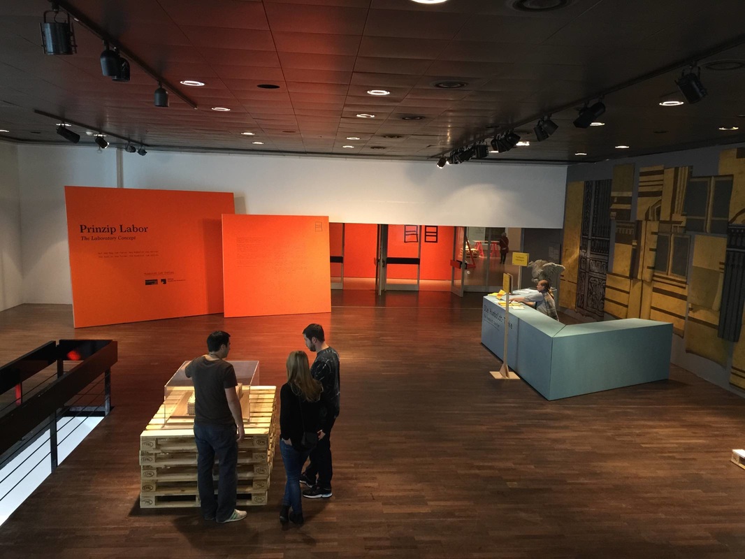
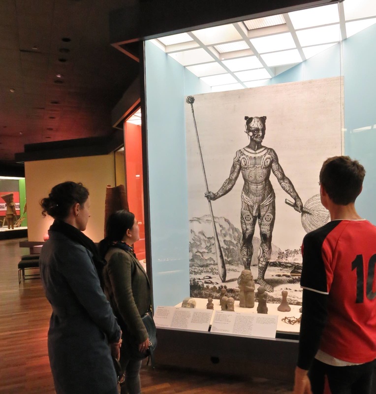
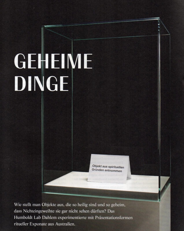
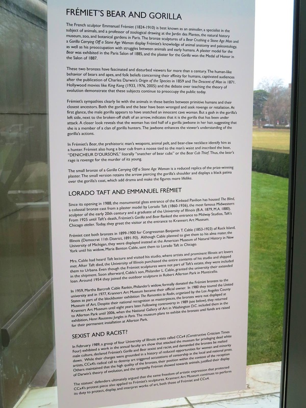
Yesterday saw the finale of an ambitious multi-year project in the National Museums of Berlin meant to probe the issues in displaying ethnographic collections today. This "Humboldt Lab" took place in Berlin's Ethnological Museum and raised some fantastically interesting questions—like the problem of displaying sacred objects not meant to be seen, the subject of an earlier post on this blog. The publication accompanying the seven "trial" exhibits constructed as part of the Lab is lovely too; I look forward to reading it. (For anyone interested in ordering a copy but undecided on which language, go for the original German—the text is much more readable than the English translation.) Although I'll be sad to see the old museum close (below is a view of the sleek South Pacific galleries, reopened in 2004), it will be exciting to see how the museum moves ahead with the results of this unique petri-dish opportunity!
This weekend sees the opening of the new Ancient Middle East gallery at the Detroit Institute of Arts. Cause for celebration on several levels: it is an immense coup for a museum too often brought up in talk of financial crisis; it highlights the importance of this material at a time of extreme crisis in the Middle East; and, most relevant for this blog, the new gallery forefronts a nice modern display concept for some very old material. The creamy gray palette of the walls, floor, ceiling, and cases offers a clean backdrop for the variegated shapes and colors of the objects. The lighting is masterful: it is stronger on the objects than in the rest of the room, yet still diffuse rather than spotlit—hard to achieve, but worthwhile! The cases also do a nice job of hiding the light sources, while the ceiling contains a few discrete lines of track lighting. Clear plastic signboards with black lettering signpost the side galleries (apparently organized by material: metalwork to the left, ceramic to the right). The Neo-Babylonian mushussu relief provides a lovely centerpiece. To my mind, the overall effect of the gallery is very pleasing; I hope someday to see it in person.
A recent silly post on The Poke (tagline: "time well wasted") offers an unexpectedly valuable glimpse into the heads of museum visitors. Among other things, it shows that visitors may have the most fun in a museum by using the exhibits to their own humorous ends. It's not exactly "making fun" of the objects, but using them to generate a laugh—something that the hard-working staff responsible for the exhibits might see as disrespectful, but which I would like to suggest is instead a useful jumping-off point for reconceiving how to make engaging displays. For example, a few themes reappear several times in the Poke article: people like imitating statues and paintings to comedic effect, whether by pointing out a resemblance to themselves or by creating a new context for the object (e.g., a music video by Beyonce!). It's also entertaining to add a funny attribute to the object: a hand puppet on a statue's hand, a cell phone positioned as if a portrait is taking a selfie, a modern caption to an old painting.
It seems to me that all of these interactions with objects could be turned from "pranks" (as they are presented by the very format of the Poke article) into sanctioned museum activities that leverage these visitors' energy and creativity, particularly when it comes to picture-taking. For instance:
Running across the article "Geheime Dinge" (page 46) this week was serendipitous because it aligns perfectly with the last post on how to display something too small to see. A similar display problem is facing the team behind the Humboldt Forum, a huge new cultural space being built in the center of Berlin. Among other things, the Ethnological Museum will move into this space—and has made this an opportunity to experiment with new, sometimes radical display ideas. Exhibiting objects from "non-European cultures" (the term used in all HuFo materials) is difficult to do tactfully, to say the least; and one of the most intriguing problems that has come up in this respect was addressed in an article from a promotional magazine put out by the Forum. The title and tag line say it all: "Secret Objects. How can you display objects that are so sacred, so secret, that the uninitiated are not even allowed to see them?" The sign in the case reads "Object removed for spiritual reasons."
One of the examples in the article, small inscribed stones from Australia that are considered sacred and "unshowable" in this way, was proposed for a display that included not the stones themselves but 3-D prints of them, along with authentic materials associated with how the stones were used (such as incense). This indeed follows the letter of the law by not showing the stones themselves—but is showing a perfect replica of them a respectful solution? Another proposal has the (real) objects in a case that is somehow clouded or shrouded, from which the veil is lifted for a few seconds every so many minutes to offer visitors a peek inside while still preserving the objects "unseen" for most of the time. This seems to me a dangerously titillating solution, encouraging a peeping-Tom voyeurism that would defeat any modicum of respect for the objects and their culture. It is an extremely difficult problem that the HuFo team is facing; I look forward, not without anxiety, to seeing their answer. Once upon a time in Berlin, there was a colossal statue of Lenin. His head alone weighed 3.5 metric tons. The statue was dedicated in 1970 (Lenin's 100th birthday), dismantled under the new regime in 1991, and condemned to be buried in a nearby forest, where it still lies to this very day. Now it is meant to go into a permanent exhibition; that is, it was meant to, until the Senate suddenly and mysteriously decided to forbid it just two weeks ago. (All of this is reported in an excellent Berliner Zeitung article.) Once the Senate ends its summer recess and comes back to the issue on September 23, I will be following this story, hoping that it ends the way it should: with this amazing piece of art on show, teaching visitors about the vicissitudes of power and the concomitant struggles over putting objects on display!
How about a display idea related to our recent switch onto daylight savings time? This room in Palazzo Massimo, Rome is one of my favorite places in the Eternal City. Not only does it house a gorgeous set of ancient Roman wall paintings (already a gold star in my book), but it is usually fairly empty and thus peaceful. Adding to this oasis of calm is the special lighting: reflected against the ceiling, it is beautifully diffuse—and what's more, it changes to replicate the time of day. It slowly, almost imperceptibly shifts from a low-light, slightly bluish tone through a warm bright midday and into a rosy sunset before repeating. The whole cycle takes around four or five minutes. It's an innovative way to bring the walls to life as well as create a meditative atmosphere.
Ideally, exhibitions don't exist only within the confines of a gallery: they can stay with the visitor for long afterward, perhaps with the aid of a souvenir. The booming development of gift shops in museums (or museums appended to gift shops, as it might seem at times) is a polarizing issue, but personally I always like browsing the selection of books in a museum shop. Often the supply include books you can't find anywhere else, and they tend to include superb pictures. So I was happy to see this table of books in the exhibition galleries of the Neues Museum in Berlin. In a long gallery that mostly serves as a passageway, this table wasn't competing for attention against any objects but presented the visitor with an array of books relevant to the adjoining galleries. I like the idea of being able to browse the books while you're still thinking about the objects on show, rather than having to wait until the end of your visit when other thoughts are pressing in (bathroom, next museum, lunch, etc.). The subjects ranged from the famous "golden hat" in the neighboring gallery to well-chosen books on astronomy (a theme integral to the hat) and early humans.
It took a visionary to put a vicious over-life-size gorilla statue in the entrance foyer of the Krannert Art Museum. Far from the most welcoming face to usher you into the beautiful glass entry, the gorilla is nevertheless one of the most powerful, memorable, even beautiful works in the collection. Its display here is therefore notable for several reasons, not the least of which is the way it straddles the line between luring and possibly intimidating visitors. Art can be scary, people! Come in and find out how! Personally, I love this bold address.
But what makes this display not only edgy but smart are the two ancillary pieces alongside. I don't mean the pendant sculpture by the same artist, which stands nearby: I mean the artist's smaller-scale practice piece and the thorough signage alongside. The tabletop version of the statue provides lovely harmony with the gargantuan final product, and shows that the artist had to carefully consider his monster — it wasn't just a nightmarish flight of fancy. Moreover, the signage explains much of the reasoning behind the artist's choice and portrayal of the subject. This is much needed, since the piece might at first look like a King Kong knock-off or, as the sign explains, an offensive piece of sexism and racism. Addressing these misconceptions right off the bat, while not making them the center of the interpretation, is a smart move. Knowing more about how this piece was painstakingly made and exhibited over many decades, as well as how it incited controversy, heightens our appreciation for the big bronze lout — as well as introducing us to the power of art. It's the perfect way to begin a museum visit. As a small museum trying to appeal to local families (leaving the tourists to crowd the nearby gator attractions), the Anne Kolb Nature Center in Fort Lauderdale, Florida has to serve a variety of functions. Its permanent exhibit centers on the recovered mangrove lake on which it stands, a marvel of a restoration story; but in order to stay lively for its visitors, it also has to be flexible. That's why these simple moveable walls are a stroke of genius. Three of them in a row provided the support for a temporary exhibition by a local artist. Just one bent wall set on three casters — could it get any simpler? And yet they are extraordinarily versatile and effective. It seems like a fundamental building-block that any institution interested in public engagement could keep in reserve for any time they need it. And not just for purpose-built exhibitions, either: such walls could just as well be wheeled into a foyer during a wine reception and be tacked with a few informational flyers for guests to look at while they sip.
Overview panels can be underrated. In its recent renovation of the European Painting galleries, the Metropolitan Museum of Art shifted its "room labels" from the walls to plaques on knee-high metal stands. For space considerations, this makes sense. But if wall space is not at quite such a premium, a nice big wall panel does wonders for communicating the Big Idea. "What is this all about?" I can hear a visitor asking, making a sweeping gesture, stepping into a gallery for the first time. Individual object tags don't help answer this question, but an overview panel sure does. It is magical for its ability to unite a wide range of objects into a comprehensible narrative.
Everything I love about overview panels inheres in this example from the Saint Louis Art Museum. At the top is written the most general category, the designation of the collection: American Art. Below, the thematic title for the room: Nostalgia and the Gilded Age. But the best part? Look to either side and you immediately encounter something obviously gilded, perfectly illustrating the name. Moreover, both gilded pieces are quite large and lavish, as if lending some (literal) weight to the idea that an entire age could be gilded. And finally, the subjects of both pieces subtly underline the idea of nostalgia. The woman at right sinks into her chair, surrounded by precious items, speaking with a man (the artist) swallowed by shadows. At left, a golden winged figure in Classical robes embodies the glorification of a past age. Following the thread that connects the objects with each other and the text could hardly be easier. Yesterday I had the pleasure of visiting the St. Louis Art Museum for the first time. Its gorgeous setting, collection, and signage and display (hurrah!) sent me swooning. To my mind, its success is all the more impressive because of the vast diversity of its objects and galleries that could easily lead to an incohesive experience. Like so many founded in the late nineteenth century, this museum's collections cover a lot of ground: "What began as a collection of assorted plaster casts, electrotype reproductions, and other examples of 'good design' in various media rapidly gave way to a great and varied collection of original works of art spanning five millennia and six continents." (Excerpt from the handbook as quoted here.)
How to give the visitor a coherent experience of an encyclopedic collection? Some variety from gallery to gallery is of course expected and even refreshing, but too much could be jarring. One way to finesse the transitions struck me between the ancient Roman gallery and the adjacent hall of European paintings. A visitor coming from the latter toward the former would see the view in the photo above: a stunning Roman bust and warm red walls drawing her in, and two figural paintings on the blue walls to either side. The genius here is the juxtaposition of figures: two chubby babes at left (a good Roman subject, moreover!) and a dour-looking man at right flank the bust in the middle. The marble and painted men even turn towards each other, as if they would converse were at least one of them not so grouchy. Entering the reverse way, from the Roman to the European gallery, we see the view below. Marble portrait heads are set off by the red wall, and beyond them a gathering of painted women echo the figures in both subject and shape: two solemn women at right, and a group of two and three figures at left. It's a subtle and effective way to smooth the transition from one room to the next while still allowing them their own distinctive characters. Today's post is inspired by a New York Times article about the booming number of visitors to a few national art museums and the measures the museums are taking in order to accommodate such crowds (and protect the objects). While not specifically discussed in the essay, one of the issues bundled up with this phenomenon relates directly to this blog: How can a museum effectively display its collection for a whopping 9.3 million visitors per year (Louvre), or 6.7 (British Museum), or 5.5 (Vatican)?
One solution is the "Venus de Milo" approach pictured above: a capacious room containing a single blockbuster object, allowing many visitors to stand and circulate throughout the large space. Extra elbow room is especially important when so many visitors are using audio guides that lead them to spend one or more minutes looking at the object. Another solution is the "Rosetta Stone" setup pictured below. Here the stone is displayed in the center of two intersecting galleries, protected by a glass case. This places the object in relation to the other materials nearby — in this case, other Egyptian works in stone — and therefore nicely contextualizes the piece. A concomitant drawback is the relative lack of space for the many visitors interested in such a famous piece. It's a difficult problem of spatial engineering which, if the predictions in the NYT article can be believed, will only become more pressing. |
Ideas on Display
A humble space to reflect on concepts of museum display as enacted across a wide range of subjects, countries, and approaches.
Archives
April 2020
Categories
All
|