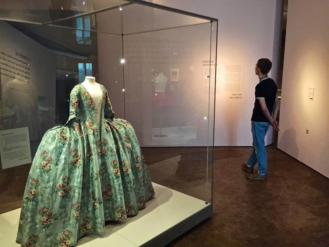
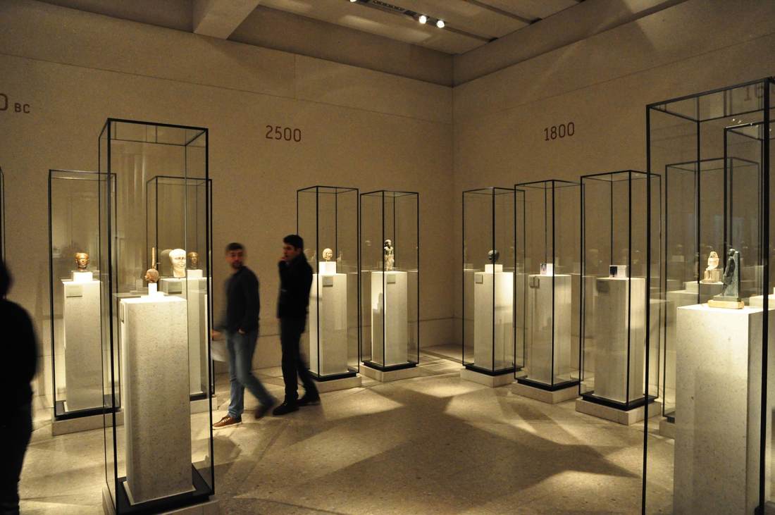
Until September 16, the Rijksmuseum in Amsterdam is showing an exhibition called KWAB. Kwab is the name given to fantastical furnishing designs featuring plant-animal fusions in the Dutch Golden Age. Refreshingly, the exhibition left the confinements of standard exhibition design and tried out some very eye-catching new things—paralleling the inventiveness of kwab design itself. The next few posts will highlight some of these elements.
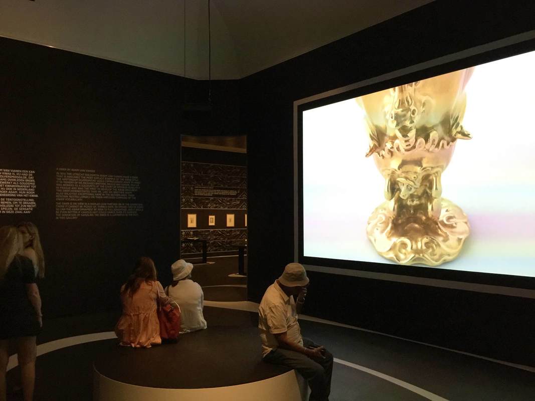
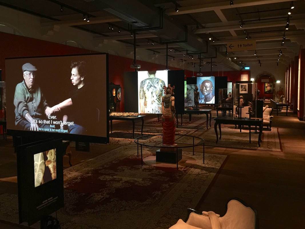
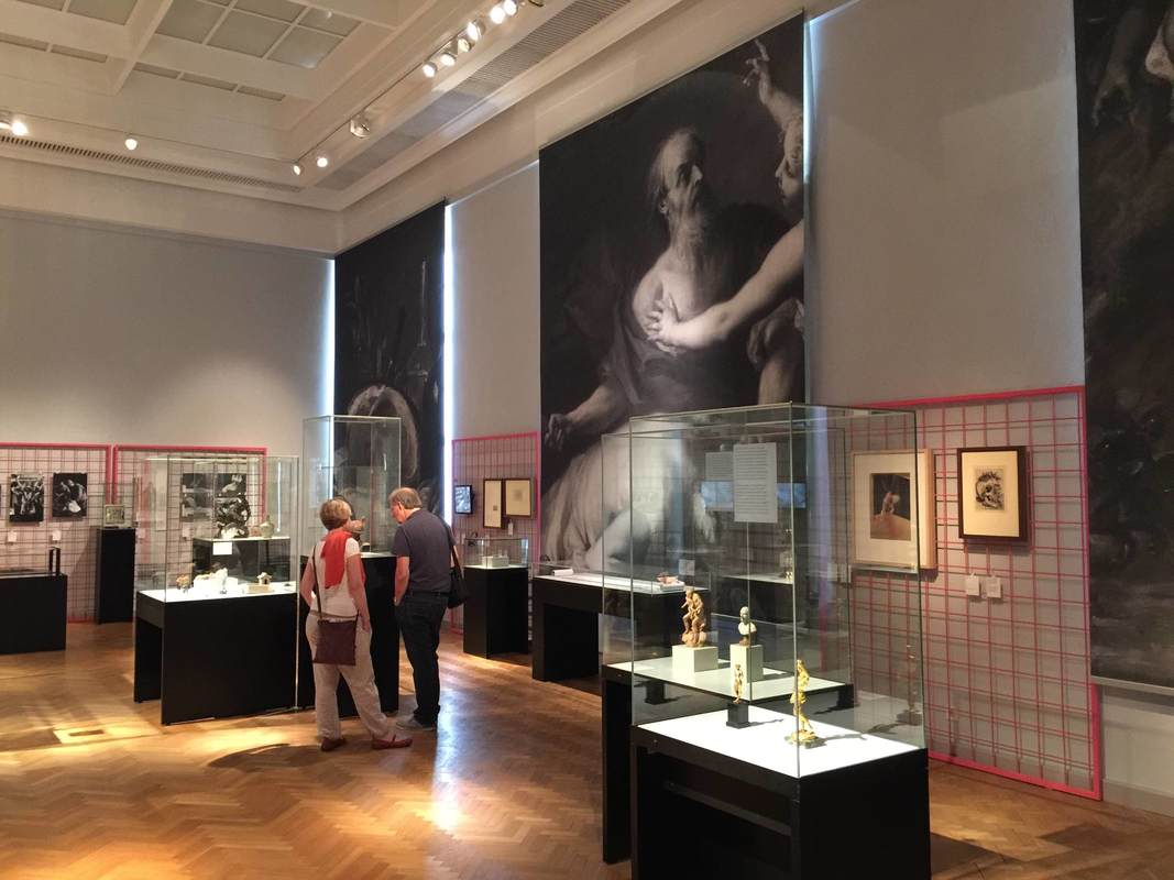
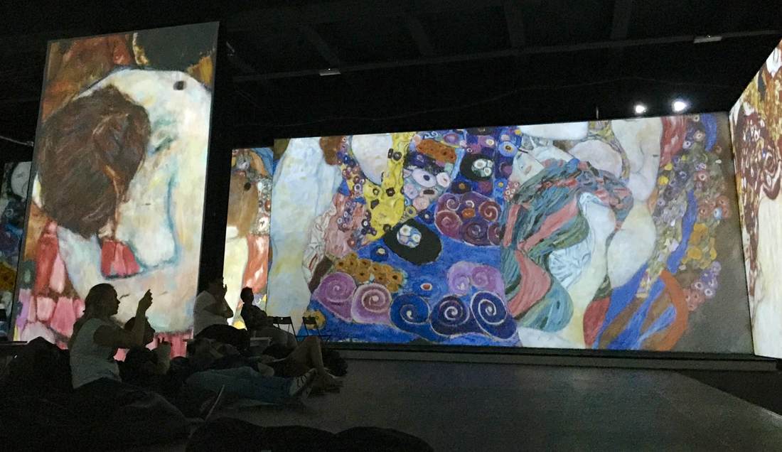
Entering the exhibition brings you face-to-face with the first dramatic device: a huge video sceen showing one of the exhibited objects, filmed in a constantly-moving, close-up pan in various directions. We swirl around, up, into, over, and down the golden vase. Although I'm wary of giving viewers a screen to focus on instead of the object itself, this was a good way to highlight some of the hard-to-see details of the intricate piece. It makes you want to go into the show and find it. Also, most objects in the show are fairly small or, because they are furnishings, not particularly arresting to a visitor expecting "art" in terms of huge Rembrandt paintings—so the massive screen and close-up perspective help draw attention to objects that need it. In the Rijksmuseum, any object that isn't The Night Watch needs all the help it can get!
Entering the exhibition brings you face-to-face with the first dramatic device: a huge video sceen showing one of the exhibited objects, filmed in a constantly-moving, close-up pan in various directions. We swirl around, up, into, over, and down the golden vase. Although I'm wary of giving viewers a screen to focus on instead of the object itself, this was a good way to highlight some of the hard-to-see details of the intricate piece. It makes you want to go into the show and find it. Also, most objects in the show are fairly small or, because they are furnishings, not particularly arresting to a visitor expecting "art" in terms of huge Rembrandt paintings—so the massive screen and close-up perspective help draw attention to objects that need it. In the Rijksmuseum, any object that isn't The Night Watch needs all the help it can get!

 RSS Feed