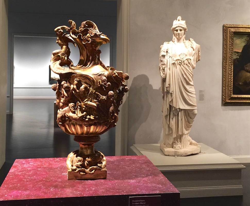
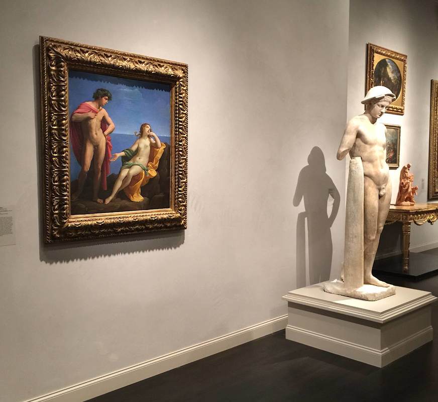
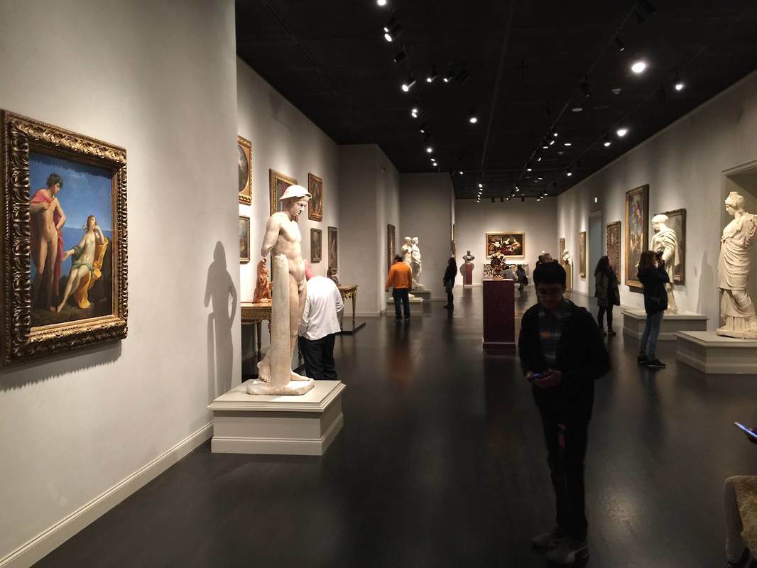
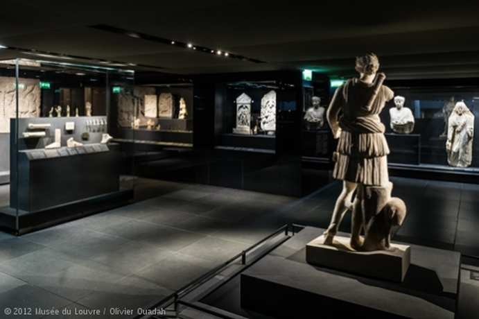
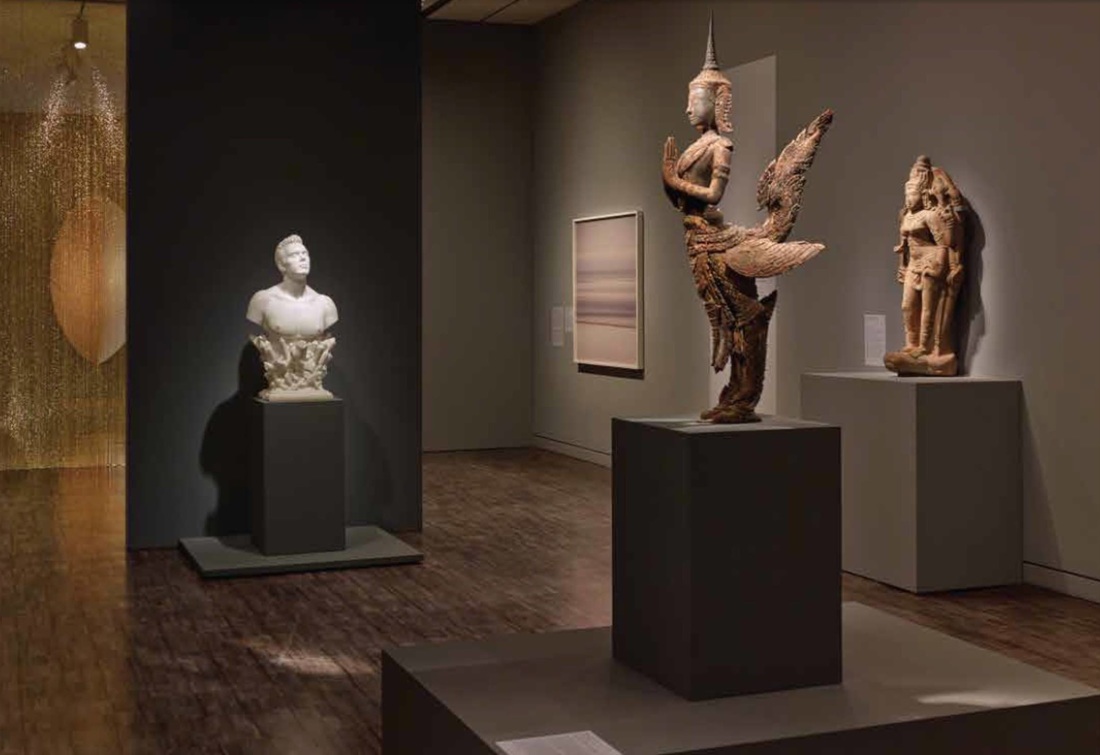
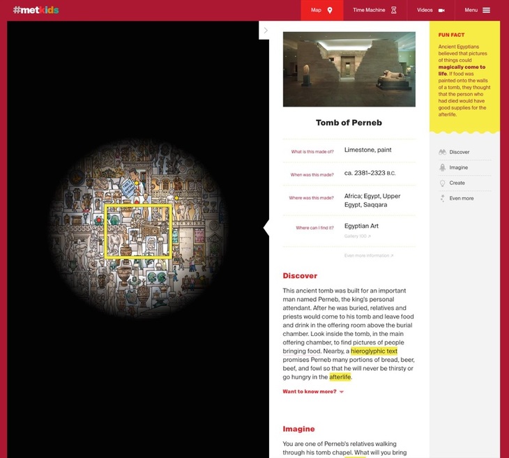
Visiting the Los Angeles County Museum of Art (LACMA) for the first time in many years, I was surprised (and admittedly, as a specialist in ancient art, dismayed at first) to find that the onetime gallery of ancient art has been disbanded. The Greek and Roman sculptures now stand in the galleries of European art—the ancient statues and vases joining the post-antique paintings, sculptures, and decorative arts (photo below). From my initial skepticism, however, I was completely converted to the curators' way of thinking: the pairing of old and new really works! It brings out similarities in the content, form, and even artistic style that would otherwise be lost; and the sheer visual variety of white statues with more colorful objects is beautiful and interesting (much more so than a room full of only white statues). What's more, bringing ancient art into the European art gallery underlines how fundamental it was to the artistic training of these later periods. This central art-historical concept can be grasped in a single glance because the pairings here so effectively highlight the parallels between the objects—as in the statue and painting below, both featuring classic male nudes in contrapposto. At the same time, the juxtapositions open up new ways of thinking about form—as in the second-century Hope Athena statue and ca. 1695 vase above, both with swirling drapery and twisting snake(like) edges.
Placing objects into an exhibition space requires thinking about them in a new way. While a individual piece might be the focus of art-historical research, when it enters a space shared with other objects, suddenly all the pieces become part of an interaction. Each piece plays with the other objects in the space and with the visitors. And the game is no longer just art-historical but also strictly formal (form-based)—in the sense that objects inhabiting a common space can be compared and contrasted simply in terms of their appearance, which for a single object would be impossible. Parallels and harmonies emerge; so too variations and dissonance.
This is especially obvious in a gallery of the Museum of Contemporary Art, Los Angeles (above). The objects in this room (part of the exhibition of the permanent collection) are all monochromatic, a unifying factor across the media of painting, metal sculpture, wood sculpture, and photography. What's more, the compositions of all the larger works have a strong vertical element: the paintings send up powerful black brushstrokes, while the two sculptures point long fingers skyward. The viewer's eye bounces from one to the next, drawing her in for a closer look into the black-and-white vortex. A display that blurs the boundaries between art, life, and even display itself is a wonderful and paradoxical thing. The Art Institute of Chicago achieved this by reconstructing the room depicted in Van Gogh's painting The Bedroom—and then listing it on AirBnB for interested renters! As a promotional tool for the Institute's Van Gogh exhibition, this is a cunning tactic; but more than that, it is an exemplar of how the content of an exhibition can inspire (or even become) the display method—and how both can give rise to an unusually vital visitor experience.
What does it mean when an art museum plans to expand into a sweeping green park space—with no art? That is precisely what the North Carolina Museum of Art is doing, according to a recent New York Times article. The large outdoor extension is emphatically not a sculpture garden, says the museum director, Lawrence J. Wheeler, but rather "a unifying idea of what people perceive as a museum and what they perceive as a park." This is one more step in the direction of museums as sites of experience above all else. It raises the question: If parts of the world such as parks can become parts of museums, what has a museum become? If a museum's ultimate role is to serve the community, then a park space is ideal; but what then differentiates a museum from a park, a library, a parking lot—or anything else of value to the community?
Remember the "talking statues" in London? Now the same folks (Sing London) have extended their project to Berlin. As they did in London, they are equipping numerous commemorative statues around town with audio clips that a visitor can access through small signs in front of the statue; snap the QR code and you're ready to listen. Two colleagues and I tried out the Lise Meitner statue and found it worked flawlessly. The voice actor brought a vibrant personal touch to the statue—a great way to bring it to life. One useful aspect of this concept is that such audio accompaniment can be overlain on any preexisting object; it does not have to be developed at the same time as the object installation. All that has to be added to the physical display space is a QR code (or a link to another technology—like Blinkster, used in Berlin's Ethnological Museum).
The recent release of a film about paintings by Goya highlights the increasing trend of using cinema as a complement to—not to say substitute for?—actually visiting museum galleries. For this film is not about Goya, nor about his paintings per se, but about an exhibition of his paintings in the National Gallery in London. This, as far as I know, is a new genre of filmmaking (although pointers to the contrary would be greatly appreciated!). It emphasizes the experiential aspect of an exhibition, somewhat like the Van Gogh Alive show that immerses its viewers in floor-to-ceiling projections of excerpted details from Van Gogh paintings—creating a surreal landscape in which experience, not the stuff of traditional exhibitions, takes center stage. The Goya film, like the others by Exhibition on Screen, does not go so far as this, but still does focus on a luscious experience of the exhibited material and its historical context (see the period reconstructions in the trailer) more than, say, Frederick Wiseman's film National Gallery, which centered on life in the museum itself. It seems a wonderful way to inspire audiences to visit museums (I'm in the camp that believes that people will mostly use resources like this as an impetus, not a substitute, for going to museums themselves). I wonder what the partnership looks like between the museums and the filmmakers, and what the audience numbers are for these films.
Well-designed signage is a rare and precious gem. In a museum, signage can set the tone for a visitor's entire visit: because if she starts by buying a ticket, checking her coat, using the bathroom, and then finally entering the gallery she most wants to see, she's already had to locate at least four separate areas of the museum, probably by following signs. And if that process was easy—i.e., well-signed—she'll ideally be in a fine mood; but if it was difficult, she may enter the galleries feeling grumpy or frazzled, and that will color her experience of the whole museum.
So kudos to Berlin's Kunstgewerbemuseum (the museum of decorative arts and design) for putting writing on the wall that no one can miss, and winning a design prize along the way. The eye-catching size and color of the signage creates a certain aesthetic effect that not all museums would want, but it accords well with the all-parts-visible idea behind Rolf Gutbrod's 1960s building. Even award-winning signage has two potential weak points, however. First, it has to be wriiten in a certain language—here German, which some visitors may not understand. Second, there is a compelling argument (nicely presented in an airport example in the addictive design podcast 99% Invisible) that the architecture itself, not just signage, should help guide the people in it. But since purpose-built buildings are not in the cards for most museums (and even if they are, wayfinding is only part of their mission), it's worth taking signage seriously. Who doesn't love a peek behind the curtains? At least when the venue is a museum, a look behind the scenes (or curtains, in the German idiom) is always thrilling. Making visible all the work that goes into readying objects for display is not only a highlight for visitors but a well-deserved kudos to the conservation teams whose hard work is rarely recognized by the public—because ideally, their work is invisible! The conservators at Berlin's Alte Nationalgalerie are now earning appreciation in a special exhibition about their three years of work restoring Caspar David Friedrich's two most famous paintings, Monk by the Sea and The Abbey in the Oakwood. Numerous series of photographs in the exhibition show the progression from yellowed, cracked, poorly-restored pieces to the radiant paintings now finally back on show. A few of the photographs even showed the conservators' coded markings and notes for planning the restoration, as well as the X-ray images they used to better understand the underdrawings and primer layers. Two full-size photographs of the unrestored paintings (seen above) allow viewers to compare the earlier with the present state (much clearer and less jaundiced!). It is an exciting story to see laid out like this—and today, at least, many people were there to enjoy it.
A catalog published by the Louvre, L'Orient romain et byzantin au Louvre, underscores the power of perhaps the most fundamental matter of display: which objects are next to which. The catalog accompanied the opening of a new set of galleries featuring objects from three different departments—Greek, Etruscan, and Roman; Egyptian; and Near Eastern—now displayed together in a permanent exhibition space. The goal, the Louvre said, was that "these long-dispersed items could at last be assembled in a single space, and thereby placed in their geographical, cultural, and artistic context." It's a poweful example of how simply juxtaposing certain objects allows them to communicate in ways that they cannot individually or in other groupings.
You can read the full press release here, including the museological mission statement and a room-by-room description, while this document offers more detail, photos, and spotlights on a few objects. Just as physical aspects of display ideally promote effective communication, so can the reverse be true. So I pricked up my ears when this blog post from the vibrant We Are Museums group reported on the British Museum using the app Periscope to give a virtual tour of a special exhibition (embedded above). As a mode of global communication based on visual material, Periscope is a logical next step to Instagram: succinctly defined by the British Museum website, "Periscope is an app from Twitter which streams video direct from a smartphone to a global audience online." The user gets to select which feed she wants to watch, as if looking through the eyes of another user anywhere in the world. Although it was released 10 months ago, the WAM blog post points out that only a few museums have harnessed its potential to broaden their global audiences; but it seems likely to grow in popularity. I wonder what the very globally-oriented and social-media-wrangling Met might decide do with Periscope.
Let's return to the splendid gallery of minerals and gems in the Carnegie Museum of Natural History to talk about shelving technology. (In a previous post we ogled the dramatic lighting that makes the objects sparkle like, well, jewels!) These shelves are designed on a simple principle: cables stretched from the bottom to the top of the case are fitted with small steel cylinders that can slide along them as well as clamp onto a corner of a glass shelf, allowing the shelves to be adjusted to an infinite range of heights. Here they are smartly deployed in a case with a glass front and back, so that you can look right through; the minimalist shelving helps this unobstructed view. The result is beautiful as well as clever—if not exactly transferable to earthquake country!
Last week the six powerful arches of the Kimbell Art Museum (Forth Worth, TX) entered my life as if a Piero della Francesca background had infiltrated my TV screen. Although they make only a brief cameo in the documentary film My Architect, which centers on the architect Louis Kahn (you can see clips of it here), their design is elegant, unusual, and—especially in light of these two qualities—astonishingly simple. From the outside, their length and clean lines seem to exaggerate their recession into space, as if perspective holds unusally strong sway over this building. From the inside, meanwhile (shown in the Kimbell's photo gallery), the barrel vaults are cunningly transformed into pointed arches by unbroken banks of lights, curving outward like a pair of mile-long petals opening down the length of each vault. The slabs of cement walls stand just out of line with the bottoms of the vaults as if independent structures. All in all, the architecture manages to harness the strength of brutalism and the grace of classicism simultaneously. The space it creates for the art is remarkable: understated, unprepossessing, a perfect backdrop—and yet utterly captivating you once you start looking at it.
What a stroke of good luck when a major credit card company uses your museum as the backdrop for its billboards! This advertisement appears right at the entry to the security check in Berlin's Tegel Airport, so it also has a captive audience. I wonder if the Bode Museum worked with MasterCard in order to get this exposure. Certainly the museum is working hard to expand its reach—particularly to a younger crowd, as shown by its new Instagram project.
Another element that struck me in the American Alliance of Museum's 2015 list of prizewinners in exhibition design and label-writing—beyond the two labels highlighted in the last post—was a diaphanous golden curtain. It appears in the AAM's photo of a gallery in the exhibition Gorgeous, which showed at the Asian Art Museum of San Francisco in 2014. Although it received no special mention by the AAM (this gallery was singled out for a label, not exhibition design per se), it is a remarkable feature. Is it tinsel? No, it hangs much too orderly for that. Strings of beads? Perhaps. But this is no bead curtain from a 70's hemp shop: it is slippery and glowing, enticing the visitor to approach this warm, silky wall. It serves as a divider in the space while also allowing a view through into the next—both providing structure and luring the viewer further. Considering that bead curtain technology has been around for millennia (see this bead net dress from c. 2400 BC), it's almost surprising that this technology doesn't crop up in museums more often (although fragility must go some way toward explaining this).
Every year the American Alliance of Museums confers awards for great exhibition design and label-writing (among other categories.) The 2015 lists are out! You can see the former here as a quick list and the latter here in a more expansive format with photos and descriptions. Of the many worthy entries, my personal favorite was a label by the Minneapolis Institute of Arts for the Zulu beer pot pictured above. (You might want to check it out in the MIA's beautiful online catalog, which is not only sleekly designed but includes audio clips and free image downloads.) As reproduced on page 6 of the AAM report, this label brings out the object's visual qualities and social importance at once—certainly deserving its prize.
My second-favorite label appears on page 9: an outdoor panel at the La Brea Tar Pits. It even has something in common with the beer pot label: vivid opening lines. Who could refuse to read further after "The stinky dead mastodon was irresistible" or "How is brewing beer like growing babies?" The German Archaeological Institute recently announced a new museum opening in Wukro (Wuqro), Ethiopia. This museum houses archaeological finds from the area, with one highlight being the 8th- to 6th-century BC sanctuary of a moon god. The altar and channel for libations is reconstructed in the museum (above). Just as striking as this reconstruction is the architecture of the museum building itself: it dosn't just recede into the background, but acts as part of the display. Its massive stone walls accentuate the objects more powerfully than the usual flat painted wall surface; they are a beautiful extension of the display.
To find out more: this document (in German) explains the museum project, including diagrams of the building, and this website presents nice pictures of the galleries, signage, and festive opening ceremony. Once a month the Käthe-Kollwitz Museum in Berlin offers a lunchtime tour by the director, Dr. Iris Berndt, and yesterday's provided the extra motivation for my first visit to the museum. Standing in the first room of the ground-floor galleries, waiting for the tour to assemble, I was struck by the "word cloud" on a wall right next to the entrance. Like the automatically generated word clouds on the Internet, this collection represents thought trends in a wide set of "users" (clustered around the name of the artist, nicely emphasized with extra lighting). But unlike the digital word clouds, these words have been carefully selected to educate. As Dr. Berndt explained, they all represent concepts widely understood to apply to the great German artist Käthe Kollwitz—but several of them are problematic or even false. By marking these four terms with question marks—Feminist? Jewish? Communist? An artist who depicts suffering?—the display indicates that these preconceptions need to be reexamined and possibly discarded. This seems to me a very simple yet effective way to ease a visitor into the experience to come: several key themes are named right at the beginning, setting the tone for the subsequent galleries and helping a visitor to frame the individual objects; and just as importantly, it introduces the idea of questioning stereotypes, clichés, and pat explanations. For such a complex, richly-textured life and oeuvre as Kollwitz's, this strikes just the right first note.
An article in the New Yorker alerted me to a current exhibition at The Metropolitan Museum, specifically in the newly-reopened Costume Institute. It takes as its focus the fashion figure Jacqueline de Ribes and presents her clothing designs in a number of displays, all lovely—but the one that particularly caught my eye is shown above (and linked through the picture; just click on it to see the original slideshow). Using reflective metal (aluminum?) as the backdrop and flooring for these dresses is a simple yet extremely effective way to emphasize the colors and reflect light upon them without distracting from them. As a display solution, in fact, it has much in common with the clothing designs themselves: it is deceptively simple, quite cunning, and above all elegant.
It's a tricky task to make nature itself into an exhibition. Nature walks (in botanical gardens and model farms, for instance) often rely not on a group of objects or other predetermined set of material, but on an unpredictable troupe of actors who may or may not be on stage that day. What a challenge to present material that the visitor might not even get to see! But certain display tactics can help smooth over the possible unevenness of this living exhibition. The Anne Kolb Nature Center in Hollywood, Florida centers on a boardwalk that winds through a section of mangrove habitat. (It also has a lovely visitor's center which, when I visited, included a display of contemporary art on spiffy movable walls.) At the start of the walk, large signs with vivid pictures of the animals (above) introduce the visitor to the point of the exhibition: to VIEW the plants and animals. Further, to help the visitor engage—and to help them see the critters tucked away in their hidey-holes—the Center offers a handout with a checklist of the plants and animals one might encounter on the walk. This is an easy, effective, low-cost way to encourage visitors (especially kids) to really look, and even to try to identify the things they see. It would be fantastic as an app for mobile devices too.
Airport exhibitions have the benefit of one thing that other exhibitions can only dream about: a captive audience! But they also have to address some challenges particular to their location. An exhibition on musical instruments titled "Wonderful Winds" at the St. Louis International Airport caught my eye because it is situated on a raised island right where arriving passengers turn the corner between the gates and the baggage claim. Its design is sleek and minimalist—I wonder if airport security regulations impose certain requirements on lines of sight?—and the wall space is small enough that a single wall panel fills the usable surface. The warm lighting and intense color of the back wall create a welcoming atmosphere and encourage you to step inside. Reduced to a few cases and a single wall panel, this exhibition contains all the necessities and is well-pitched to its audience—passengers and welcoming parties with a few minutes to spare, lured into this oasis amidst the usual airport ruckus.
A current exhibition at the Getty Center highlights precisely those things we usually don't look at in exhibitions: frames! It's a wonderful subject for a show, touching on questions of taste, stylistic development, craftsmanship, and even the psychology of frames as a concept—for instance, how do they achieve their goal of setting off something else without showing off themselves? Or, taking a look at these ostentatious Louis Style frames, are they in fact meant to show off? The answers to these questions are as intriguingly socially-, historically-, and culturally-dependent as any question about the art within the frames. (You can see a behind-the-scenes slideshow of the Getty exhibition here.) One of my all-time favorite articles in the New Yorker (subject of a previous post) addresses frames in the modern museum, reflecting on the considerations in picking the right frame for a piece, who makes the aesthetic decisions and how, and of course who makes the frames.
An online (or more broadly, a digital) platform is a great solution to the layers of information embedded in any exhibition, from the large-writ headers to the digging-deeper details for specialists and the especially interested. Formatting these layers so that they are both accessible and beautiful is a challenge—one that The Metropolitan Museum met with gusto in its #metkids project. This website, although meant to introduce children to the museum's collections, is a delight for any age. The cheery red background and lively graphics are pleasing to the eye, and the simple arrangement of text with clear headers makes information easy to find. Further info can be found by clicking the terms highlighted in yellow, another easy visual cue. This site seems like a good point of reference for anyone thinking about digital presentation, be it stand-alone or supplementary to a physical (brick-and-mortar? We need a term for this) exhibition.
"A good test of an art museum is how far you have to go into it before you see art." These are the wise words of Elizabeth Easton, director of the Center for Curatorial Leadership and a wonderful mentor for our cohort in the CCL summer program 2014. The Saint Louis Art Museum gives you art already in the beautiful grounds outside the museum, and more as soon as you walk in the door: the grand foyer with its lofty ceiling and vaulted bays perfectly frames a rotating assortment of large (appropriate to the space) pieces from the collection. But what struck me in particular about this foyer is that it contains not only art but large (again, the space demands it) floral arrangements. They provide a necessary humanizing touch to what might otherwise be a dauntingly grandiose space. Luckily enough, during my visit the florist was still there putting on the finishing touches; and when I struck up conversation, he mentioned the extra complexity of putting flowers in an art museum: all the vegetation has to be fumigated before being installed! Beyond that extra hurdle, I imagine that thinking up a flower arrangement to work alongside the art must be a refreshing challenge.
Yesterday saw the finale of an ambitious multi-year project in the National Museums of Berlin meant to probe the issues in displaying ethnographic collections today. This "Humboldt Lab" took place in Berlin's Ethnological Museum and raised some fantastically interesting questions—like the problem of displaying sacred objects not meant to be seen, the subject of an earlier post on this blog. The publication accompanying the seven "trial" exhibits constructed as part of the Lab is lovely too; I look forward to reading it. (For anyone interested in ordering a copy but undecided on which language, go for the original German—the text is much more readable than the English translation.) Although I'll be sad to see the old museum close (below is a view of the sleek South Pacific galleries, reopened in 2004), it will be exciting to see how the museum moves ahead with the results of this unique petri-dish opportunity!
This weekend sees the opening of the new Ancient Middle East gallery at the Detroit Institute of Arts. Cause for celebration on several levels: it is an immense coup for a museum too often brought up in talk of financial crisis; it highlights the importance of this material at a time of extreme crisis in the Middle East; and, most relevant for this blog, the new gallery forefronts a nice modern display concept for some very old material. The creamy gray palette of the walls, floor, ceiling, and cases offers a clean backdrop for the variegated shapes and colors of the objects. The lighting is masterful: it is stronger on the objects than in the rest of the room, yet still diffuse rather than spotlit—hard to achieve, but worthwhile! The cases also do a nice job of hiding the light sources, while the ceiling contains a few discrete lines of track lighting. Clear plastic signboards with black lettering signpost the side galleries (apparently organized by material: metalwork to the left, ceramic to the right). The Neo-Babylonian mushussu relief provides a lovely centerpiece. To my mind, the overall effect of the gallery is very pleasing; I hope someday to see it in person.
|
Ideas on Display
A humble space to reflect on concepts of museum display as enacted across a wide range of subjects, countries, and approaches.
Archives
April 2020
Categories
All
|