Dr. Stephanie Pearson
  • Home
  • Projects
    • museums.love
    • Uncertainty and Debate
    • Mithras Model & Audio
    • Weltverbesserer Interview
  • CV
    • Employment
    • Education
    • Museum Experience
    • Professional Training
    • Publications
    • Awards & Grants
    • Teaching
    • Invited Lectures
    • Workshops & Chaired Sessions
    • Conference Papers
    • Professional Engagement
    • Excavation
  • Exhibition Reviews
    • Anna Dorothea Therbusch
    • Making Ancient Art Contemporary
    • Cleopatra
    • Pompeii and Herculaneum
  • Tours
  • Ideas on Display (blog)

Simply Good Signage: Domäne Dahlem

11/14/2014

Comments

 
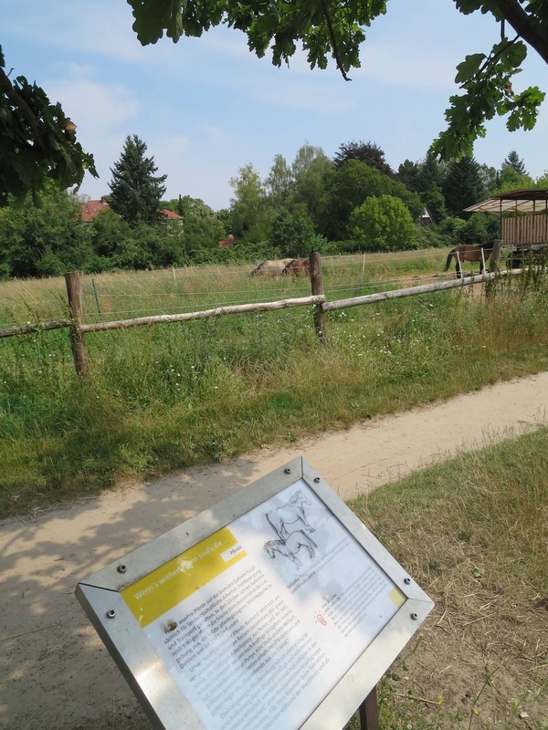
Horses and sign at Domäne Dahlem, Berlin
A successful display does not need a fancy new design idea or technology to be successful (indeed, sometimes those can really go awry!). Some of my favorite displays are very simple; their strength lies in being extremely well-conceived in terms of how they achieve their few basic goals. One great example is the signage at the Domäne Dahlem in Berlin, a charming set of fields and cottages meant to teach the visitor about old-time farming and artisanal trades. The signs scattered around the grounds are excellent in several simple but important respects:
  1. They are sturdy. Look at that metal frame! The text is protected by a thick sheet of plastic (not yellowed or scratched; is that a special kind of plastic?). And the sign stands on two very firmly embedded poles. These things are equipped to stand out in the sun and snow year-round. Moreover, they have to withstand eager kindergartners running over to them, slapping them in excitement, climbing on them, and many other things I can't even imagine but the kiddies definitely can. They are up to the task! (The signs, that is — but the kiddies too.)
  2. They clearly refer to their subject matter. Despite having to stand in the open air, and not on a wall obviously beside an object (see the previous post on botanical gardens), they are well-placed and -oriented so as to be clearly linked to their subject. The example above faces the horses and, as extra help, even shows the horses in a drawing.
  3. They start with perfect "hook" questions. You can imagine a kid and parent approaching the horse sign and the parent beginning to read the yellow box: "If it whinnies, then it's a...." "HORSE!" replies the kid. I really think this isn't just my fantasy; the sign is begging for this interaction. As for the sign below, which explains nitrogen binding among legumes, I had just wondered aloud what was growing in this big bushy field when I came across the sign that begins with a green box, "So what's growing here?" I call that perfect.
  4. The drawings are simple. Too often the graphics in signage get complicated or rely on colors that have long since faded. Not here! A basic but beautiful line drawing gets the point across in both signs. Even as a lover of color, I far prefer this style for clarity.
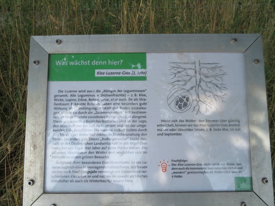
Legume sign at Domäne Dahlem, Berlin
Comments
    Ideas on Display
    A humble space to reflect on concepts of museum display as enacted across a wide range of subjects, countries, and approaches.

    Archives

    April 2020
    January 2020
    December 2019
    November 2019
    October 2019
    September 2019
    August 2019
    July 2019
    June 2019
    April 2019
    March 2019
    February 2019
    January 2019
    December 2018
    November 2018
    October 2018
    September 2018
    August 2018
    July 2018
    June 2018
    May 2018
    March 2018
    February 2018
    January 2018
    December 2017
    November 2017
    October 2017
    September 2017
    August 2017
    July 2017
    June 2017
    May 2017
    April 2017
    March 2017
    February 2017
    May 2016
    March 2016
    February 2016
    January 2016
    December 2015
    November 2015
    October 2015
    September 2015
    August 2015
    July 2015
    May 2015
    April 2015
    March 2015
    February 2015
    January 2015
    December 2014
    November 2014
    October 2014
    September 2014
    August 2014
    July 2014
    June 2014

    Categories

    All
    Amsterdam
    Anthropology
    Archaeology
    Architecture
    Art
    Article
    Audio
    Award
    Behind The Scenes
    Berlin
    Boston
    Bulgaria
    California
    Chicago
    China
    Color
    Conservation
    Copenhagen
    Denmark
    Diagram
    Difficult Heritage
    Digital
    Display Case
    Dresden
    Egyptian
    Exhibition Outside Museum
    External Website
    Fashion
    Florida
    Frame
    France
    Germany
    Greek
    Halle
    Hamburg
    Hands On
    Hands-on
    Hanover
    Illinois
    Interactive
    Islamic
    Italy
    Kids
    Lighting
    London
    Los Angeles
    Map
    Marketing
    Marrakech
    Minnesota
    Missouri
    Morocco
    Movement
    Munich
    Nature
    Netherlands
    New York
    North Carolina
    Nuremberg
    Outdoor
    Painting
    Paris
    Pennsylvania
    Photography
    Roman
    Rome
    Shelving
    Signage
    Space
    Spain
    Switzerland
    Texas
    Text
    Turkey
    UK
    USA
    Video
    Women
    World War 2

    RSS Feed

Contact
Stephanie Pearson
steph [at] stephpearson.com