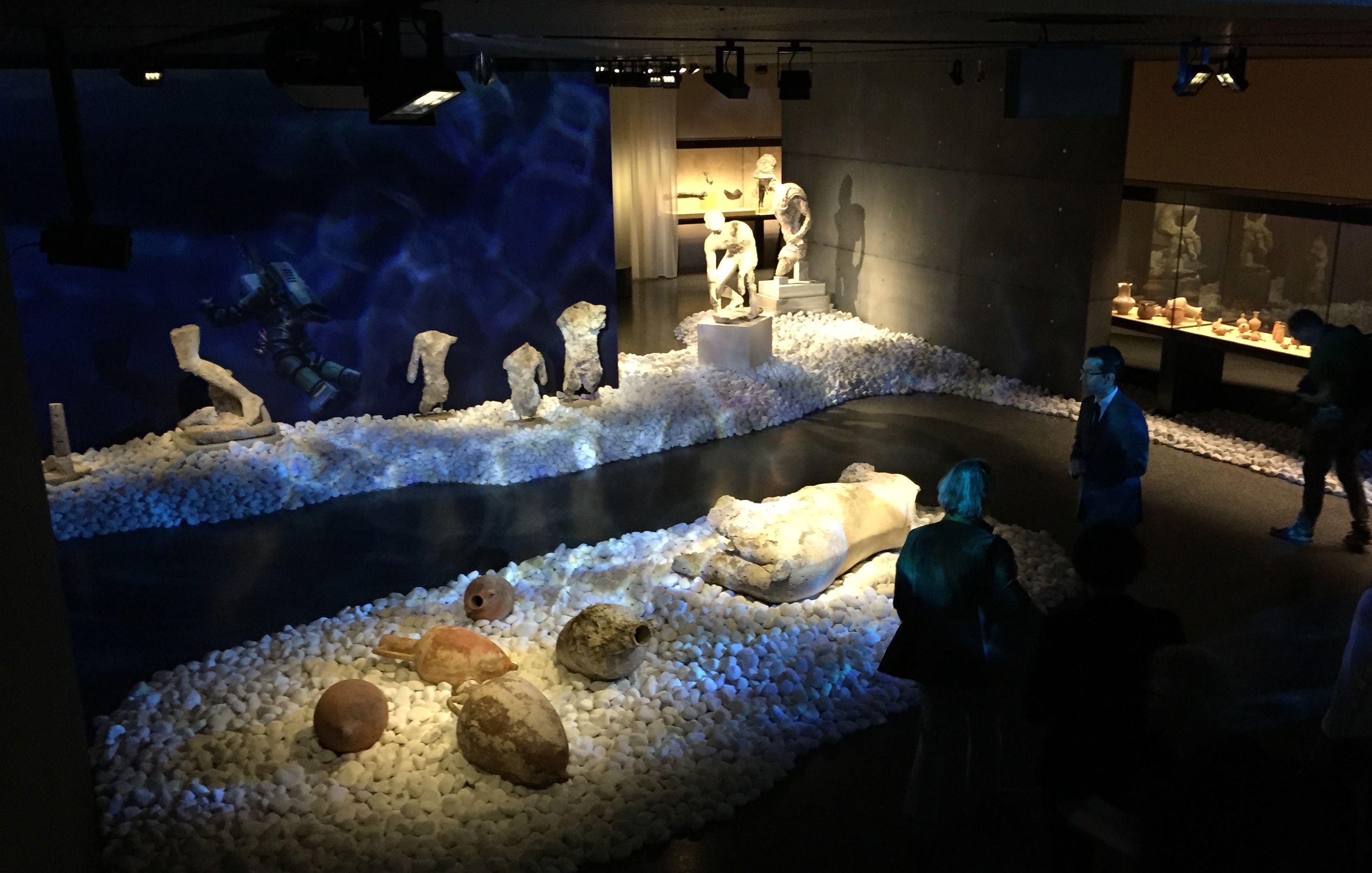
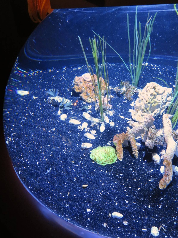
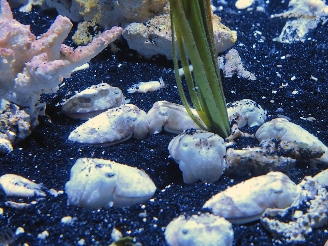
A beautiful display concept just surfaced (pun alert) in a new exhibition at the Basel Antikenmuseum, nicely photographed in this article. The exhibition focuses on a famous ancient shipwreck off the Greek island of Antikythera, and you can see how the exhibit design team incorporated the deep blue sea into the show: bluish light filtered into a watery pattern, objects set on beds of large white rocks, dim surrounds evoking the darkness of Davy Jones's locker. Although some of the most spectacular preserved evidence of ancient Greek art and science comes from this shipwreck, the display emphasizes that the focus here is not these star objects in isolation but the whole context of the wreck.
A recent silly post on The Poke (tagline: "time well wasted") offers an unexpectedly valuable glimpse into the heads of museum visitors. Among other things, it shows that visitors may have the most fun in a museum by using the exhibits to their own humorous ends. It's not exactly "making fun" of the objects, but using them to generate a laugh—something that the hard-working staff responsible for the exhibits might see as disrespectful, but which I would like to suggest is instead a useful jumping-off point for reconceiving how to make engaging displays. For example, a few themes reappear several times in the Poke article: people like imitating statues and paintings to comedic effect, whether by pointing out a resemblance to themselves or by creating a new context for the object (e.g., a music video by Beyonce!). It's also entertaining to add a funny attribute to the object: a hand puppet on a statue's hand, a cell phone positioned as if a portrait is taking a selfie, a modern caption to an old painting.
It seems to me that all of these interactions with objects could be turned from "pranks" (as they are presented by the very format of the Poke article) into sanctioned museum activities that leverage these visitors' energy and creativity, particularly when it comes to picture-taking. For instance:
Running across the article "Geheime Dinge" (page 46) this week was serendipitous because it aligns perfectly with the last post on how to display something too small to see. A similar display problem is facing the team behind the Humboldt Forum, a huge new cultural space being built in the center of Berlin. Among other things, the Ethnological Museum will move into this space—and has made this an opportunity to experiment with new, sometimes radical display ideas. Exhibiting objects from "non-European cultures" (the term used in all HuFo materials) is difficult to do tactfully, to say the least; and one of the most intriguing problems that has come up in this respect was addressed in an article from a promotional magazine put out by the Forum. The title and tag line say it all: "Secret Objects. How can you display objects that are so sacred, so secret, that the uninitiated are not even allowed to see them?" The sign in the case reads "Object removed for spiritual reasons."
One of the examples in the article, small inscribed stones from Australia that are considered sacred and "unshowable" in this way, was proposed for a display that included not the stones themselves but 3-D prints of them, along with authentic materials associated with how the stones were used (such as incense). This indeed follows the letter of the law by not showing the stones themselves—but is showing a perfect replica of them a respectful solution? Another proposal has the (real) objects in a case that is somehow clouded or shrouded, from which the veil is lifted for a few seconds every so many minutes to offer visitors a peek inside while still preserving the objects "unseen" for most of the time. This seems to me a dangerously titillating solution, encouraging a peeping-Tom voyeurism that would defeat any modicum of respect for the objects and their culture. It is an extremely difficult problem that the HuFo team is facing; I look forward, not without anxiety, to seeing their answer. A recent New Yorker article raises an interesting question of display: How can you fill a whole museum with exhibits exclusively about something microscopic? This is the task of Amsterdam's Micropia, a museum devoted to "invisible life"—that is, microbes. Among Micropia's solutions to this challenge are (as reported by the New Yorker, although the author does not focus on the display challenge in particular):
Once upon a time in Berlin, there was a colossal statue of Lenin. His head alone weighed 3.5 metric tons. The statue was dedicated in 1970 (Lenin's 100th birthday), dismantled under the new regime in 1991, and condemned to be buried in a nearby forest, where it still lies to this very day. Now it is meant to go into a permanent exhibition; that is, it was meant to, until the Senate suddenly and mysteriously decided to forbid it just two weeks ago. (All of this is reported in an excellent Berliner Zeitung article.) Once the Senate ends its summer recess and comes back to the issue on September 23, I will be following this story, hoping that it ends the way it should: with this amazing piece of art on show, teaching visitors about the vicissitudes of power and the concomitant struggles over putting objects on display!
One of the most frequent recommendations made by young visitors for improving museum galleries is to add music (at least, in one recent idea competition held by the Berlin Museums). Bringing music into a display is not just a way to entice a generation that craves nearly nonstop aural stimulation; it can enhance the display and the visitor experience across the board. One example that struck me is shown above, in the Musée de Marrakech in Morocco. I hadn't even noticed the instrumental music playing in the central courtyard until seeing the sign above, which informs the visitor, "You can buy this music on CD in the bookshop." What a nice idea! It draws attention to the music, increases the visitor's sensory perception of the whole space, and (ideally) generates revenue in the shop. What's more, the music suits the display and even the museum as a whole insofar as it too is a product of cultural heritage, which is the focal point of this museum.
What do these two photos have in common? True, both were taken inside museum galleries—even if the location is obscured in the lower photo by the throngs of people, completely lacking in the top photo. The main point in common is the large dark object on display in both galleries: the Rosetta Stone. The "stone" in the top photo, taken in the Deutsches Museum in Munich, is actually a plaster cast of the original; the original stands in the British Museum, shown in the lower photo. The crowds illustrate the value we place on authenticity—but could it also be symptomatic of the different display concepts? The cast of the Rosetta Stone in Munich is certainly no crowd magnet, but it is also not set up to be one: rather, it is a supporting actor in the gallery on writing and printing technologies. In the British Museum, by contrast, the Stone is displayed right at the entrance to the ancient art wing (creating traffic problems), telling visitors (as well as expecting them to know already) that it is a highlight. Cues like this definitely affect the way visitors clump and move among the displayed objects.
Within the city-sized complex that is the Deutsches Museum in Munich, one gallery is devoted to ceramic technology. This room houses a model of an ancient Roman pottery production center, an enormous vat for transporting acids, and many smaller wonders of ceramic that we encounter (mostly unknowingly) in our everyday lives. The ceramic knife and roller skate wheels are mounted with small pieces of clear plastic onto a clear plastic sheet standing vertically in the back of the display case—a good way to make the display more legible and interesting than simply laying out the objects on a tabletop. They seem to "float" in front of the very colorful orange backdrop.
Impeccable timing! This news story came out in Deutsche Welle just after I wrote the last post, and highlights precisely the same idea of viewer engagement as discussed there. In this case it's not a victory podium but a chair to stand on, and it invites you to stand on it by virtue of the three chairs next to it with people (statues) standing on them. These people all "stood up" for what they believe in, and spoke out—so here's your soapbox: what will you speak out about?
How can museums effectively engage their visitors? It's a huge question with myriad answers—and sometimes it seems that each answer only raises more questions. Over the past six weeks or so I've gotten to participate in some rousing discussions about public engagement in museums (one was this scintillating symposium in Cambridge) and was deeply affected by the ideas presented there. Many of them involved staging events in the museum, making the museum a hub of activity and an agent in the lives of the community. One of the most moving ideas came from our colleagues in the National Archaeological Museum in Athens, who have worked with a correctional center to create opportunities for young offenders to connect and grow with art.
Yet public engagement can work on much smaller levels. Three levels made of white plastic, for instance. I saw these steps on the sidewalk outside a restaurant, simply standing there beside the tables and stools, and thought it was a very clever way to invite a passerby to stop and engage. Nothing says "we need a person here, and it should be you!" like an empty victor's podium! Can't you imagine a group of friends vying to be #1? In that moment, they have stopped to engage and have fun as we can only hope they would at a museum display. In this case the restaurant must be hoping for a bit more face time with potential customers—but a museum could surely use this tactic for another purpose. These steps act almost like a large wooden cut-out with a hole for the face: it is practically magnetic. So purpose-made, missing only the human ingredient. And someone to take a photo of that human, of course. How about a display idea related to our recent switch onto daylight savings time? This room in Palazzo Massimo, Rome is one of my favorite places in the Eternal City. Not only does it house a gorgeous set of ancient Roman wall paintings (already a gold star in my book), but it is usually fairly empty and thus peaceful. Adding to this oasis of calm is the special lighting: reflected against the ceiling, it is beautifully diffuse—and what's more, it changes to replicate the time of day. It slowly, almost imperceptibly shifts from a low-light, slightly bluish tone through a warm bright midday and into a rosy sunset before repeating. The whole cycle takes around four or five minutes. It's an innovative way to bring the walls to life as well as create a meditative atmosphere.
One of the most inspiring ideas on display that I've seen recently was produced and beautifully documented by the Oregon Museum of Science and Industry (OMSI). An innovative team at the museum wanted to put science in the path of everyone in town, and decided that small exhibits at transit centers would reach the best cross-section of community members. Through many trials, redesigns, and retrials, they came up with two stellar ideas for engaging the public with scientific material. They explain their motivations, processes, and results in a wonderfully informative booklet that is free to download (below; also available here, for example): these are people who really put their words into action!
Ideally, exhibitions don't exist only within the confines of a gallery: they can stay with the visitor for long afterward, perhaps with the aid of a souvenir. The booming development of gift shops in museums (or museums appended to gift shops, as it might seem at times) is a polarizing issue, but personally I always like browsing the selection of books in a museum shop. Often the supply include books you can't find anywhere else, and they tend to include superb pictures. So I was happy to see this table of books in the exhibition galleries of the Neues Museum in Berlin. In a long gallery that mostly serves as a passageway, this table wasn't competing for attention against any objects but presented the visitor with an array of books relevant to the adjoining galleries. I like the idea of being able to browse the books while you're still thinking about the objects on show, rather than having to wait until the end of your visit when other thoughts are pressing in (bathroom, next museum, lunch, etc.). The subjects ranged from the famous "golden hat" in the neighboring gallery to well-chosen books on astronomy (a theme integral to the hat) and early humans.
It took a visionary to put a vicious over-life-size gorilla statue in the entrance foyer of the Krannert Art Museum. Far from the most welcoming face to usher you into the beautiful glass entry, the gorilla is nevertheless one of the most powerful, memorable, even beautiful works in the collection. Its display here is therefore notable for several reasons, not the least of which is the way it straddles the line between luring and possibly intimidating visitors. Art can be scary, people! Come in and find out how! Personally, I love this bold address.
But what makes this display not only edgy but smart are the two ancillary pieces alongside. I don't mean the pendant sculpture by the same artist, which stands nearby: I mean the artist's smaller-scale practice piece and the thorough signage alongside. The tabletop version of the statue provides lovely harmony with the gargantuan final product, and shows that the artist had to carefully consider his monster — it wasn't just a nightmarish flight of fancy. Moreover, the signage explains much of the reasoning behind the artist's choice and portrayal of the subject. This is much needed, since the piece might at first look like a King Kong knock-off or, as the sign explains, an offensive piece of sexism and racism. Addressing these misconceptions right off the bat, while not making them the center of the interpretation, is a smart move. Knowing more about how this piece was painstakingly made and exhibited over many decades, as well as how it incited controversy, heightens our appreciation for the big bronze lout — as well as introducing us to the power of art. It's the perfect way to begin a museum visit. As a small museum trying to appeal to local families (leaving the tourists to crowd the nearby gator attractions), the Anne Kolb Nature Center in Fort Lauderdale, Florida has to serve a variety of functions. Its permanent exhibit centers on the recovered mangrove lake on which it stands, a marvel of a restoration story; but in order to stay lively for its visitors, it also has to be flexible. That's why these simple moveable walls are a stroke of genius. Three of them in a row provided the support for a temporary exhibition by a local artist. Just one bent wall set on three casters — could it get any simpler? And yet they are extraordinarily versatile and effective. It seems like a fundamental building-block that any institution interested in public engagement could keep in reserve for any time they need it. And not just for purpose-built exhibitions, either: such walls could just as well be wheeled into a foyer during a wine reception and be tacked with a few informational flyers for guests to look at while they sip.
Octopuses were my favorite cephalopod until I learned more about cuttlefish. Many more people now have the chance to get excited about these remarkable little undersea hovercrafts in a new special exhibition at the Monterey Bay Aquarium, Tentacles. Brand-new and quite lavish, this exhibition features rich colors on every wall, several video screens masquerading as aquaria, and of course tanks of the live wonders themselves. This vaguely hemispherical tank was striking for the contrast between pearly white cuttlefish and supernaturally sparkly black "sand." The sand has clearly been chosen to set off the bright white of the animals. They gleam against it.
The funny thing is, they also bury themselves in it: fluttering a single delicate fin, they dig into the sand and bivouac in the depression, tossing a sprinkling of sand onto their backs. Naturally, they do this to hide from predators. But no predator would be fooled by a glaringly white fleshy nugget sitting atop a black dinner plate! Although in the wild cuttlefish burrow into tropical sand as gorgeously white as they are, for the sake of the exhibit the chosen sand is black. It's an instance in which altering the actual natural context of the "object" on display helps the visitor better appreciate it aesthetically, although not conceptually (as in these examples); the intricate beauty of the camouflage that nature has wrought is subordinated to the visual WOW factor of white-on-black. This post has been a long time in coming, insofar as this particular display idea was one of the motivations to create this blog in the first place: that's how beautiful, simple, and effective I think it is. With it, the wonderful Airborne Museum Hartenstein in Arnhem (the Netherlands) has tackled the difficult problem of making primary-source documents approachable — in this case, eye-witness accounts of life in Arnhem during World War 2. The Dokumentationszentrum Berliner Mauer addressed this problem in a different but also very effective way. Still, for simplicity, this arrangement takes the prize. Aesthetically it's quite nice too, as if presenting the visitor with a bouquet of flowers that happen to be written on; it does attract a person's attention, far more than texts set flat on a wall. Although the metal stems are permanently fixed to the metal "blossoms" of text, I can imagine a variation on this idea that would allow the texts to be switched out periodically — perhaps even replaced with the occasional object, a hands-on addition to the textual bouquet.
With this display — one of the many excellently-signed ensembles in the Museo Archeologico di Milano — the museum has accomplished two difficult but worthwhile tasks. First of all, it presents Roman costume in a physical yet not actually tangible way. Seeing these reconstructions of ancient clothes is a fun inroad to imagining life in that period, and this is helped by the fact that the clothes are standing before you rather than drawn on paper or a screen. Placing the mannequins in a doorway (or beside it, as in the case of the male figure) atop the mosaic floors sets them away from the reach of visitors, improving their longevity. Which brings us to the second point: the use of figures enlivens the otherwise very flat and space-hogging mosaic floors, as well as drawing attention to the fact that the floors used to be walked on and once formed part of a house. Simple but important points, presented here in a simple but effective way.
To conclude this brief series of posts on the Museum of Arts and Crafts in Hamburg, let's return to the Aegean blue galleries of ancient art. This room struck me for two reasons. First of all, such a cluster of display cases (at right in the photo) rising up to a pinnacle is not very common. It seems to me a nice way to provide some height to what could otherwise be a row of cases stultifyingly alike in size, shape, and disposition. The way it incorporates a strong vertical element reminds me of the upright burial in the Neues Museum in Berlin: an economic use of space as well as an interesting break from the usual case distribution.
The other aspect I liked about this room is the high ledge along the lefthand wall. Supporting a set of Greek funerary monuments, it acts like the original base that would have elevated these objects far above the ancient viewer's eye level (as in the example of the Dexileos stele, a replica of which can be seen here in the original context). Like the columbarium in the Altes Museum in Berlin, this gives the museumgoer a better idea of the original display context of these objects than if they were set at ground level or in a case. The trade-off is that their details are not easy to see from this distance and angle; but this seems a fair trade, in that it makes excellent use of large marble objects that don't need the climate control or protection that a case provides. Don't fret, your eyes are not going half-fuzzy: this is the next innovative display idea from the Museum of Arts and Crafts in Hamburg. In a special exhibition on provenance (itself very nicely done, with all the right questions and answers about provenance written into the wall and object texts), this case stood out for several reasons. First of all, the construction-worker orange color under the silver objects. Like the bright purple in the Cabinet of Curiosities display or the cerulean blue in the Greek galleries, I'm not convinced that the color enhances the objects; but it does a fabulous job of acting like a tractor beam to reel in the viewer. Bright! Shiny! Must get closer!
The second feature that struck me is the use of stickers on the glass walls of the case. As in the bubble effect in the Egyptian gallery, here too it seems that vinyl stickers were smoothed onto the panes in order to direct the eye in certain ways. Here the stickers are more subtle than the circular cut-outs: they are clear and just barely textured so as to give the glass a frosted appearance. Cut into large triangles and laid at irregular angles, they create an almost hallucinatory effect as you look into the case. The photo below shows how the stickers echo the geometric gray printed background on the back and base of the case, while the upper photo illustrates the sometimes dizzying effect of looking at an object half-obscured by fog. Yet I loved it, despite feeling vaguely disoriented. As an optical illusion of sorts, it asks the viewer to look closely to figure out just what she's seeing; and in so doing, it gets her to stay put, scrutinize, change viewpoint, look again. That is a great achievement. And in my experience, even if my attention was first focused on the case, it certainly shifted to the objects. Some of the oldest material in the Museum of Arts and Crafts in Hamburg is displayed in one of the freshest ways. Stepping into the first gallery of Egyptian art feels a bit like entering an underwater world: the walls are a deep turquoise-blue, the lights are dim, and there are luminous bubbles floating before your eyes. Or so it seems! The bubbles are actually circular windows in the wall that look onto one huge recessed case. The back wall of the case is painted light yellow, which in the dark room practically glows. Like the bright purple cases in the Cabinet of Curiosities, these spots of color attract the eye and draw the visitor in for a closer look.
What's more, this display made me realize that circles are not a shape we often see in museums. I suppose this is partly dictated by the fact that glass display cases almost have to be rectilinear (and although advanced plastics can be molded into all sorts of shapes, I don't know if they are being used in display case technology). It seems to me that using circles to give the eye a break from linear geometry and to highlight certain objects could be implemented with normal cases, too: how about a big vinyl sticker with a circular cut-out in it, stuck onto a glass display case? As a kid I loved playing with the thin, translucent plastic shapes that stuck to windows and easily peeled off again; could we translate that technology? Continuing the thread from last time, this post takes us again to the Museum of Arts and Crafts in Hamburg for a look at another of its colorful displays. This bold black-and-purple gallery presents a "cabinet of curiosities" in which the objects are grouped according to aesthetic criteria rather than geographic or cultural origin or the like. Part of the aesthetic effect in this Kunstkammer is achieved not just by the objects but the display: the strongly contrasting colors and recessed cases are very eye-catching. The radiant cases drew me toward them, a moth to the flame. (A similar concept of colorful cubes sunken into a black wall appears in the Neues Museum in Berlin.) What I find so smart about the flashy display concept in this instance is that it actually advances the theme of the room: like the original Kunstkammer, it elevates aesthetic effect to the highest priority. This space demands to be experienced on an aesthetic level first and foremost. Indeed, you can hardly do otherwise — because in keeping with the original Kunstkammer concept, the only text in the entire room is the name of the room printed on the wall!
Last week I had the pleasure of going goggle-eyed at the Museum für Kunst und Gewerbe (Museum of Arts and Crafts) in Hamburg. Room after room in this museum offered new, bright, lively ideas for displays that had me alternating smiles with scooping my jaw off the floor. Needless to say, I was very excited and merrily snapped photos of a few of my favorites. Today we see the first of five (yes!) highlights.
The large display case at right in the photo above houses ancient Greek objects that represent aspects of Classical Greek warfare. I liked the use of this theme to unify a set of varied objects differing in size, material, and shape, from small clay vases to imposing bronze armor. And although I'm not sure that the radiant blue augments the objects per se, I love that it adds a splash of vibrancy to a set of objects that is otherwise largely bichromatic (red and black/gray). More striking, however, is the juxtaposition of the large case at right with the smaller one at left. It holds a relief from Benin, Africa. (Although the relief looks minuscule, this is just an effect of the photograph: the relief is several meters farther from the camera. In reality it is a bit bigger than the bronze breastplate at right.) The Benin relief was made approximately a millennium later than the Greek pots, yet it too depicts warefare — in a remarkably different way. Together, the two cases in this room draw connections across time and space to show how very different cultures can share a common social convention (if we can call war a social convention) as well as a desire to express it visually. How they each express it, and why their means of doing so should differ in some ways and align in others, is the basis of precisely the sort of cultural comparison that I think enriches our human experience. It sparks insight, demonstrates connectedness — a profound result from a simple but insightful display concept. A successful display does not need a fancy new design idea or technology to be successful (indeed, sometimes those can really go awry!). Some of my favorite displays are very simple; their strength lies in being extremely well-conceived in terms of how they achieve their few basic goals. One great example is the signage at the Domäne Dahlem in Berlin, a charming set of fields and cottages meant to teach the visitor about old-time farming and artisanal trades. The signs scattered around the grounds are excellent in several simple but important respects:
Botanical gardens are a special kind of museum. By their very nature they have certain restrictions and opportunities that are foreign to a "brick and mortar" museum — for instance, walls. Walls are both a restriction and an opportunity, really, and one that is rather lacking in at least the outdoor portion of any botanical garden. With walls come wall texts, as well as the ability to encourage certain directions of movement. Lacking walls, botanical gardens (again, speaking of the outside area; the greenhouses and possible visitor center or attached museum are a different story) miss these opportunities even as they gain others.
What potential repercussions a lack of walls might have on a plant display struck me at the Ökowerk Berlin, which includes several garden spaces on its extensive grounds. Labeling the display is tricky when there isn't a wall to support the labels; the solution here is to print small paper labels and slip them into metal and plastic holders staked into the ground. The stakes are well-conceived insofar as they can be placed anywhere, and presumably even moved as the plants grow, unfurl leaves that then cover the signage, or drop their leaves and retreat to a mere husk, requiring the signage to be set nearer in order to look relevant. Unlike larger signs too, they can be stuck right in the middle of a bed of plants, making very clear what they refer to. Conversely, the portable size restricts the amount of information that can be given: so in this case, QR codes have to do almost all of the legwork. |
Ideas on Display
A humble space to reflect on concepts of museum display as enacted across a wide range of subjects, countries, and approaches.
Archives
April 2020
Categories
All
|