But that's not all! The walls are able to be so dissolvingly black because all the signage and supplementary 2-D materials has been laid on the ground under the corresponding model. You could step on them if you weren't careful. But the thing is, you are careful, because the ground inserts itself constantly into your awareness—through the crushed lava stones covering it. You walk across the room with a glassy crunch-crunch underfoot. It's astonishing how strange this feels in a museum context. To my mind it evokes the natural environment of Bangladesh that is simultaneously Chowdhury's golden muse and his greatest hurdle. This Laufgefühl (sensation of walking) is a marvelous intervention, a way to heighten all the senses together. It definitely deserves more experimentation. |
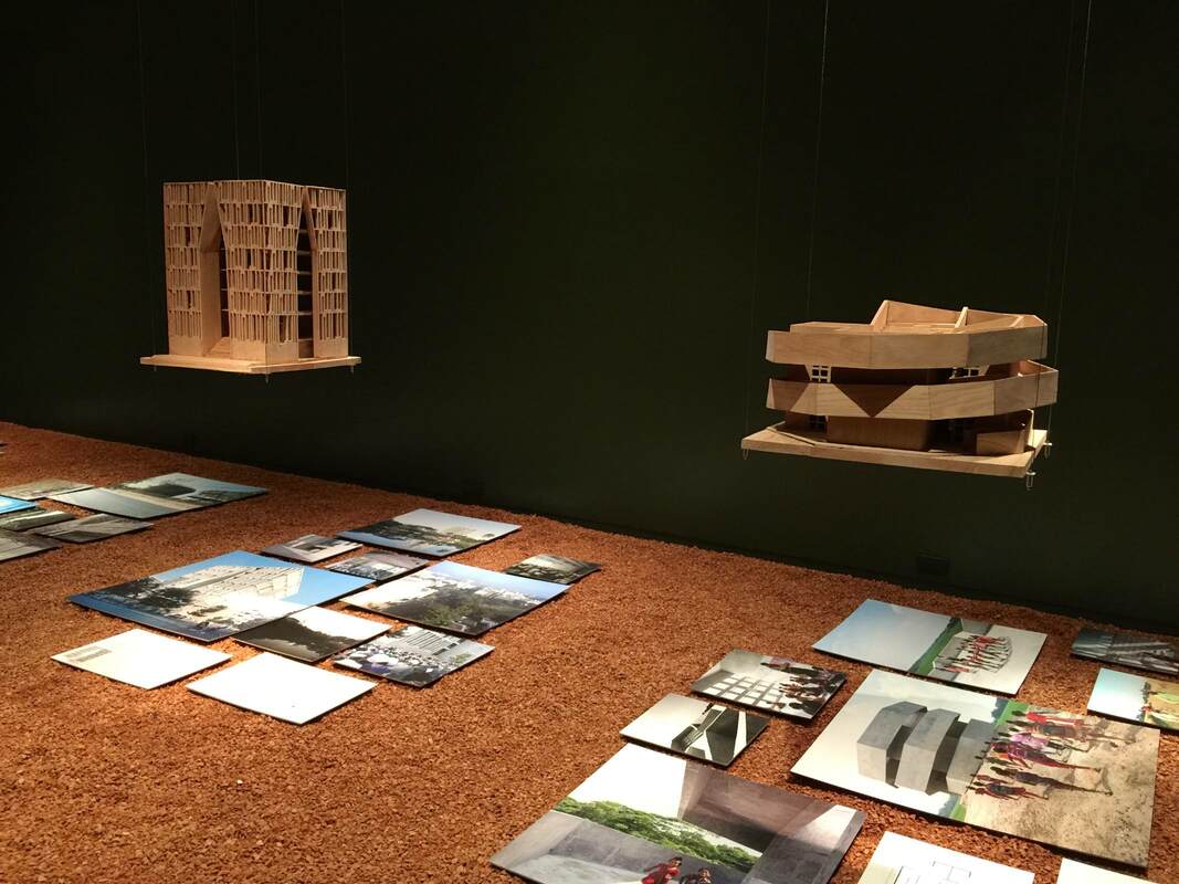
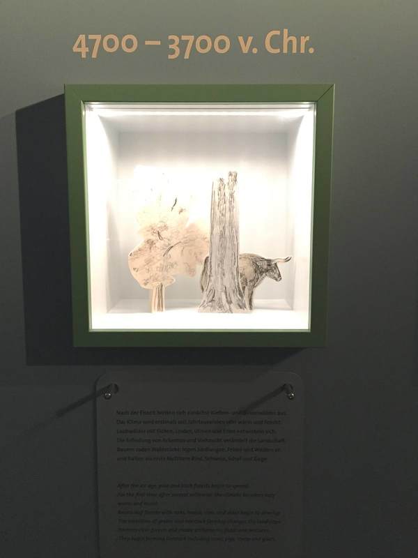
A revelatory multisensory exhibition is on view now at the Aedes Architecture Forum in Berlin. The show FARAWAY SO CLOSE. A Journey to the Architecture of Kashef Chowdhury / URBANA, Bangladesh takes wooden models of the architect Chowdhury's buildings, designed to meet the climatic challenges of Bangladesh, and hangs them from nearly invisible cables. Hovering against the black walls like UFOs highlights the otherworldly nature of the buildings' shapes; it emphasizes the literally out-of-the-box thinking behind the designs. A polygonal snailshell (above right), walls in concentric circles with aligned or offset entrances, or whole islands with central pools engineered to beat the constant floods—these are forms of elevated creativity. 
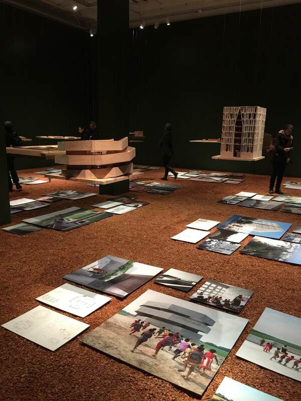
This experience meshed well with the symposium next door on museums in urban space, Extrovert Interior: Publicness and the Contemporary Museum. Asking how the museum mission is being relocated increasingly outside a single building (museum-in-a-box programs for schools, mobile museums on wheels and water, biennials in unexpected venues), the program was a poetic inverse to the exhibition's bringing-gravel-inside idea. All in all a very stimulating day at Aedes, and certainly not the last. I'm already looking forward to their next show, on Archi-Tectonics (Netherlands/New York).
Berlin's Museum of European Cultures (Museum Europäischer Kulturen), whose ethnographic collections spread over an impressive range, currently has an exhibition on wool. I was eager to see it primarily because the subject seems a hard sell for the public; how can it be presented in a lively way? Secondly, cloth culture looms large (ha!) in both of my main projects right now. Luxury textiles in the ancient Mediterranean are one touchstone of my book-in-progress; and textile production as a female activity is a current focus of my gender studies research, connected to my role as Women's Representative in two departments.
The exhibition turned out to have several tricks up its sleeve. (The puns just won't stop!) I quite liked the rack of woolen knitwear hung from the ceiling (above) as a way to invigorate the space and use that lofty ceiling. The wall graphic of a thread connecting the exhibition exponents is a good idea, although I admit I only noticed it too late—among other things, it visually links demo videos to otherwise inscrutable woolworking devices which I noodled over a while before realizing that the explanation was just a step away. My absolute favorite part of the show, however, is the DIY weaving station (above; detail below). This was the perfect way to solidify some knowledge of the weaving process. Hands-on activities are underused educational devices for adults! We all have a bit of kinesthetic learner in us. Using the provided tablets loaded with demo videos of knitting, weaving, crocheting, and embroidering, I got a 1-minute overview of some weaving techniques and tried it out immediately. As you can see (below), my interest was in interweaving two colors of yarn. It's harder than it looks... This experience was enriching in several ways. I gained new respect for the skill and physical labor involved in weaving, and the fact that women worldwide have been charged with this incredibly taxing and important task for thousands of years. (This podcast episode from Classics Confidential, Weaving Women's Stories, is another fabulous way to gain appreciation for that!) In doing this tiny bit of weaving myself, I also realized how meditative weaving can be, how it keeps the hands and a part of the brain busy while allowing other parts of the brain to wander. The image of Penelope weaving every day takes on new meaning; this woman had a lot of time to think over her life, her husband, her suitors, her island kingdom. Relationships between women could be built up in the time spent spinning wool together, as demonstrated by two Hungarian grandmothers in a video in the exhibition. Suddenly the age-old (patriarchal, need it be said) associations of women spinning and knitting, plotting and gossiping makes more sense. Spinning yarns, embroidering tales—how enlightening! In laying out her art museum in Boston, which opened in 1903, Isabella Stewart Gardner sought to ellicit an emotional response in her visitors. Rather than teach them something intellectual about the works on view, she prioritized aesthetic impact. And she was able to realize this vision completely, being the sole visionary and financier of the museum—not to mention a seemingly headstrong personality.
Sometimes her touch seems more enthusiastic than professional, as in the tapestries that have been bent in order to fit into a corner (below), or the row of pictures hung on the short side of a cabinet, as if to use every possible inch of vertical space. The great achievement of this display concept is letting viewers really look at the pieces, make associations, think creatively and personally about what they are. We cannot be distracted by text or multimedia stations; we have to just look at the objects. And if the immense variety and quantity of objects can be overwhelming, this is in part a result of the ceaseless acts of imagination prompted by these pieces—just what Mrs. Gardner was going for.
Yesterday I finally made it to Museumsdorf Düppel in Berlin, an open-air museum that has been on my to-do list for years. It centers on an absolutely charming reconstruction of the 12th-century village excavated there primarily in the 1970s. The houses with reed roofs and mud walls are impressive for their craftmanship, as well as the feeling they give you of standing really and truly in a medieval village. The lightly damp, gray, freezing weather enhanced the effect. Hats off to the capable people who made it possible to live in such conditions, constructing surprisingly cozy houses and fashioning their own clothing, tools, candles, food, and on and on. Truly impressive!
As a supplement to the village, the small interpretive center is a gem. "Klein aber fein," small but fine—the description fits perfectly. One of the displays that caught my eye for being both economic and effective is the timeline: a series of small lit vitrines sunk into the wall boasts a series of colors, each vitrine framed by a different hue. These correspond to the colored bands on the timeline above, which stretches from 10,000 BC to the present day. Each vitrine holds a miniature diorama of the landschaft around the village in the indicated time period (a title for the whole wall would help convey this: Changing Landscapes, or some such). I went gaga over the grace of the dioramas—constructed of cardstock cut-outs with simple pencil drawings, they are outrageously simple yet communicative works of art. The three latest episodes of the podcast Working (tagline: "Slate interviews Americans about their jobs") are dedicated to the work processes in the Museum of Modern Art in New York City. One of them, "Working at MoMA: How Do Exhibition Designers Do Their Jobs?," features a conversation with Lana Hum and Mack Cole-Edelsack, the Director and Senior Design Manager respectively of MoMA's Exhibition Design & Production Department. (I was lucky enough to meet Lana Hum in 2014 as part of the Center for Curatorial Leadership/Mellon Foundation Seminar in Curatorial Practice.) It's a fun conversation to listen to: both the interviewees and interviewer (Jordan) have smart things to say and seem to be having a good time. A few novel points jumped out at me:
I look forward to hearing the other two episodes about MoMA's operations! My presentation on Friday led to a vibrant discussion—the most gratifying possible outcome of a talk! We discussed how displays of ancient art can achieve certain effects together with its visiting audience. Particularly in view of the warm reception it received, I hope that this presentation might spark further ideas in the online community; so here are the slides and talking points to look through as you like. I hope that the conversations will continue to grow and multiply, invigorating our museums and our communities. (Please enable Javascript in order to view the two PDFs below!) Ancient Images, Modern Projections. Displaying Complex Narratives in the Museum - this Friday!11/21/2018 This Friday is a very special day: I'll be giving a talk about museum displays of ancient art! In particular, how they can benefit from an injection of multivocality, uncertainty, complexity, non-traditional narratives, and other conversation starters. Please come and join the discussion! Complete information about the event is here.
Ancient Images, Modern Projections. Displaying Complex Narratives in the Museum by Dr. Stephanie Pearson, Humboldt-Universität zu Berlin and New York University Berlin on 23 November 2018 at the conference Image studies and museum practice: the image as the focal point of research versus the image as exhibited object. A conference run by the Ancient Objects and Visual Studies programme at the Berlin Graduate School of Ancient Studies in the Abguss-Sammlung Antiker Plastik der Freien Universität Berlin Schloßstraße 69b, 14059 Berlin In preparation for a public forum I'm co-organizing next week (Decolonize Mitte! Humboldt Forum, Museum Island, and Schloss—all are welcome to attend!) I've been thinking a lot about ethnographic museums. How can we make them spaces that "work for us," in the sense that they encourage learning, understanding, respect, tolerance, community building, engagement, discourse? Ethnographic collections are a focal point of current debates on provenance research and how to make museums for a modern, anticolonialist world; they are the crucible from which new metals will be poured, hopefully shaping other museums as well. Antiquities collections, more my area of expertise, can look to them for guidance not only in displaying provenance research, but in engaging visitors by telling human stories in a strikingly candid way.
Dresden's Museum für Völkerkunde seems to me exemplary in this respect. Even its online presence makes clear its priorities: connecting people through its displays of things. Its homepage centers on a wonderful statement of just this ("Erzählungen von Menschen, Dingen und Orten" = Stories of people, things, and places) and an introduction that cuts right to the chase: Where did all this stuff come from, and why is it in Germany? Museum visitors make this one of their first questions in the antiquities collections I've worked in, and especially in the current climate they are very likely to do the same in the Dresden ethnographic museum. They will appreciate the no-nonsense approach: "Today, the uniqueness of many of the objects goes hand in hand with the necessary questions regarding their origin. Who created them and why? How did they come to Dresden? Were these objects given as gifts, sold or even taken from their original owners during the colonial era?" This is a brave thing to put on the homepage of any museum, particularly with the final phrase raising the potential for repatriation claims. Just so the link to find out more about the collection history (pictured above), whose token photo is a Benin bronze depicting a European man aiming a rifle. A more succinct summary of the conflicted acquisition history could hardly be imagined—how honest to put it right up front! A lot of objects are at home in the dark. However, in art museums, we are used to illuminating objects in the same even, "objective," investigative manner in which we also write the labels (my critique of the attempt to be objective, and my suggestions for other tactics, are laid out e.g. here and here). How would it be to put on a whole exhibition about objects in the dark? Not utter darkness, but a recreation of the low-light conditions in which they were originally used. A photograph on the ICOM member page (above) got me thinking about this, offering a stunning example of how this idea might play out. A beautiful piece of Islamic tracery or woodwork illuminated from the inside shows its form infinitely better than if it were put under standard museum lighting. Look at the gorgeous pattern it casts over the visitors and walls! Roman sarcophagi are another genre that would benefit hugely from such a display. Their figures in relief would have danced in the lamplight of the tombs. The dramatic lighting of a sarcophagus in the archaeological museum in Antalya, Turkey gives some idea of how this enlivens the object, but really the lighting has to be flickering orange to achieve the right effect. Lamps themselves look very different when they are their own sources of light than when lit from an external source. The Idolino in Florence, who once held a functional lamp in his hand, may have looked like a real person trying to find his way in the dark! Religious items too would be abundant in this display, as they are so often used in enclosed spaces—temples, caves, household niches, etc. This would be a really fun show to put together!
Walls of text are daunting. We all know it; so why is it so hard to get away from them? Well, it's hard to reduce the things we want to communicate to little bite-sized chunks. But those nibblets are infinitely more digestible! Just look at this example from the archaeological park in Xanten, Germany. Here the signage is consistently structured into a few nuggets so small that even an overheated, weary visitor like yours truly could bring herself to concentrate for just a darn minute. Despite being a museum veteran, I often have to trick myself into reading signage: "Ok, just that one sentence next to the picture. And maybe that one standing by itself right at the end." That is precisely the sort of self-deception that the Xanten signage makes the most of! Each sign beguiled me into tricking myself three or four times over—until, without realizing it, I had read the whole thing! The easy structure with lots of empty space for your eyes to rest (and your brain to think there isn't too much work involved) makes a huge difference. This is just one of the wonderful visitor-friendly aspects of this park. Three cheers for Xanten!
This last post about the KWAB exhibition in Amsterdam's Rijksmuseum concerns lighting. This show got me and my partner-in-museology thinking about the potential for self-directed lighting in museum display. The impetus was this lovely, huge, embossed silver platter. Its fabulously fine relief is hard to see in any detail, not because the lighting is poor per se, but because it is static. Especially for objects that would have been handled, passed around, held up to the light, or simply displayed in a space where people could view it from different angles, the viewing conditions offered by a museum could hardly be more different. And it can be frustrating to try to make out what all those tiny relief people are doing on this silver thing; even I was inclined to give up and move on to something more decipherable. But adding a couple of pink hands as a reflecting screen (above right) changed everything—even more so when moved from side to side! The addition of not only light but color and movement made the relief eminently more legible. This is the reason that Reflectance Transformation Imaging works so well (here's the process): under different lighting conditions, especially ones we can adjust and move at will, we can perceive relief and texture much more easily.
So how about visitor-directed lighting? This could be as simple as offering visitors sheets of printer paper at the entrance and encouraging them to use it as a reflecting screen (on objects in glass cases only, if you're worried about paper and people getting near unprotected objects). But personally I think it would be exciting as a central element of a show; it could even be the main topic, "Old Things in New Light." You could experiment with little lights mounted on tracks in front of the objects, so the visitor can slide the light from side to side. Heck, grab that gooseneck lamp from your desk and mount it next to an object—there, you've got interactive, user-directed lighting! There are dozens of forms this could take, and just as many epiphanies about the objects in new light. Let's go wild and see what happens. Another notable aspect of the show KWAB in the Rijksmuseum, Amsterdam is the background painting. Walls and floors alike are painted with bold black-and-white designs carefully arranged to highlight the objects. This geniusly serves several purposes: 1. Emphasis The painting can be used to make an object really pop out at you. The beautiful ebony armoir above (left) gains a whole new life from the white moon behind it. The sinuous curves at the top of the chest stand out against the light background, and the hovering circle gives the piece a lively dynamic—almost as if it were a nocturnal creature standing in a moonlit landscape. The tiny silver pitcher above (right) gets an injection of energy from the white rays radiating out across the floor. They turn the pitcher into the source of a geometric explosion, and who doesn't want to look closer at that?? 2. Context The same black-and-white painting technique on the walls is used in another way, namely to recreate a sense of the objects' original context. Keeping the monotone palette is a nice way to keep the "reconstruction" attempt from becoming distracting, while at the same time contextualizing objects rather unfamiliar to a modern viewer. In the photo below, the oval painting in an elaborate wooden frame is hard to imagine wanting to hang on your living room wall; but with the illusionistic swags of drapery emanating from it, it gains the elegance and appropriateness to the opulent display context it was originally meant for. In the room below, a different pattern is used to imitate the wall decorations of the time, which in richer houses included embossed leather (!) wallpaper and wooden paneling: 3. Directing Movement In both the room above and that shown below, the wall and floor painting is used to encourage us to move through the exhibition in certain ways. Above, a long white band leads us from the bottom right (a doorway is just off the photo to the right), along the wall of drawings, and over to the paintings at left, where the half-circle of white under the center painting encourages us to linger. White stripes and circles similarly guide our movement between these two glass cases, this time reinforced by a subtle white curve on the rear wall: Such a simple and effective device as these paintings seems worth keeping in mind. Certainly, painting the floor will not often be possible in an exhibition, depending on the space (the Getty Villa's marble floors...). But for the wall paintings at least, I would be curious whether the extra cost and time for installation makes them practical or prohibitive.
Until September 16, the Rijksmuseum in Amsterdam is showing an exhibition called KWAB. Kwab is the name given to fantastical furnishing designs featuring plant-animal fusions in the Dutch Golden Age. Refreshingly, the exhibition left the confinements of standard exhibition design and tried out some very eye-catching new things—paralleling the inventiveness of kwab design itself. The next few posts will highlight some of these elements.
Entering the exhibition brings you face-to-face with the first dramatic device: a huge video sceen showing one of the exhibited objects, filmed in a constantly-moving, close-up pan in various directions. We swirl around, up, into, over, and down the golden vase. Although I'm wary of giving viewers a screen to focus on instead of the object itself, this was a good way to highlight some of the hard-to-see details of the intricate piece. It makes you want to go into the show and find it. Also, most objects in the show are fairly small or, because they are furnishings, not particularly arresting to a visitor expecting "art" in terms of huge Rembrandt paintings—so the massive screen and close-up perspective help draw attention to objects that need it. In the Rijksmuseum, any object that isn't The Night Watch needs all the help it can get! The feedback room of the Hamburger Bahnhof in Berlin impressed me with its way of cleanly showcasing visitor responses in multiple languages. In answer to a prompt (how would you define a certain term - values, trade, border, echo), visitors write their responses on paper sheets, some of which, presumably, then get printed onto the big colorful sheets you see on the wall. Emphasizing that the visitors respond in many languages, the museum has hung a copy of the original language beside one translated into English—overlapping, so that they are visually clearly joined.
For two more days, the Hamburger Bahnhof in Berlin is showing its critical exhibition Hello World. Divided into "chapters" which all have their own titles and are housed in different arms of the building, the exhibition as a whole addresses one question: What would a collection of contemporary art like the HB's look like if it weren't so Western-focused? Needless to say, particularly with the Humboldt Forum being built not far from here, this topic is urgent. Because I want this blog to continue focusing on design elements (for now, anyway), here I'll just point out a few sources for reading more about the immense debates that this show takes on. The "chapter" formed around a part of the permanent collection (the Erich Marx Collection, above), titled The Human Rights of the Eye, features the works of Rauschenberg, Warhol, Twombly, and others that don't fit into the exhibition's diversity- and global-oriented themes. To frame them in the terms of Hello World, the curators invited the graphic arts duo cyan to intervene. The artists created collages beside the Marx Collection paintings, each collage reflecting visual aspects as well as content from the painting nearby in order to "trace the multilayered cultural interweavings" in the paintings. I did not feel that this was successful to the point of recasting the collection as "global;" nonetheless, I liked very much the dialogue between modern masterpieces and contemporary collages offering a cloud of associations. I can imagine this format—particularly the large shapes like speech bubbles emerging from the artworks—for all sorts of material relevant to the object, including the usual label information, relevant archival material, or even calendar listings for related events in the museum. Here of course the focus was rather on the collages as art themselves. Still, one collage included archival material in the form of a letter by Rauschenberg about his teacher Albers, which I found philosophically inspiring; see below.
Another wonderful current exhibition at the Tropenmuseum in Amsterdam is Fashion Cities Africa. Like the Body Art show described in the last post, Fashion Cities presents a rainbow of human creativity—and of dyed fabrics! The use of cloth in the show cleverly highlights the theme and at the same time subdivides the space into cozy sections. At the entrance (above), sheets of whitewashed plywood are used as backings for introductory images and texts. Each panel introduces a local designer of African fashion, photographed on the street as if you had just run into them personally; once again it's that intimate human connection that flows throughout the museum. The boards are hung up with thick ropes at top and bottom, a very tactile nod to the cloth-and-design theme.
The second room (or second-to-last, if you entered at the other end) is encircled with hanging yards of cloth in various patterns. With pillows and chairs inside, it offers an alluring spot to tuck yourself into—the museum version of a sofa-cushion fort! Panels outside the ring of cloth explain how the colorful patterns came originally from, for instance, Indonesia (batik cloth), reached the Netherlands through colonial exchange, and from there was sent to Africa. It's a much more complex, indeed global history than one might expect. And it stays with you much more when you can touch this stuff of history, feel it, wrap yourself in it! *stuff: from Old French estoffe = material, furniture. The German word for fabric is in fact Stoff. There's your cocktail-party knowledge for the day! Last week a new museum topped my list of favorites: the Tropenmuseum in Amsterdam. All too rarely does a museum visit energize you—but, for me, this one did! Instead of museum fatigue and an aching back, I felt revived. The energy and freshness of this museum come from a beautiful openness of worldview, reflected in both the chosen themes and the carefully-written texts (not to mention the program of events). Even the permanent exhibition about slavery manages to sound considered and non-judgmental while at the same time exposing the horrific facts.
This openness is the ideal, indeed necessary complement to the museum's main focus: people. Period. To such an extent that both the website and the museum itself refuse to limit this focus further by mentioning the "tropical" cultures which originally gave the museum its name, or any other restrictive vocabulary. The mission statement is staunchly about people, for people. It obviously intends to take a stand against the colonialist agenda that informed the museum's foundation. Still, at first I found it almost too vague—until stepping inside. People really are the focus of the exhibitions, and it's fantastically invigorating. Encountering so many vibrant cultures feels like standing in the sun streaming through a stained-glass window, all the blues and reds and greens painting and warming your skin, touched by the cosmic light. But maybe I just came up with that metophor through the inspiration of one of the beautiful human-based current exhibitions, Body Art. Typical of the Tropenmuseum is the human focus and breadth of people included here. Bodily modifications and clothing are examined not by culture or time but according to the desired effect, from making a person feel "different to the others" (above left, extreme piercings and makeup), expressing a group identity (below center, mafia tattoos), or displaying wealth. This grouping allows for striking juxtapositions: under the title "Eigenzinnig" = "Self-Determined" or "Quirky" (above right) are, on one side, a shockingly tiny belt from the days of corsets; and on the other, a contemporary photograph of a woman with a split tongue. Just so can unexpected differences be drawn, as for instance with tattoos. Facial tattoos were carried out on the beautiful girls in a southeast Asian village so that they would appear too strange or ugly for the local ruler to claim as a wife, and could thus remain safely in their communities. A grandson of a Holocaust survivor had his grandfather's concentration camp tattoo reproduced on his own forearm as a permanent reminder (below left). For all these reasons, I was deeply affected by this exhibition. Even more so because of the intimacy of the setting, arranged like a living room from last century. The homey feeling gives our bodies a safe, comfortable space to inhabit while we reflect on how we use them to express ourselves. At the show Luxury in Silk (Luxus in Seide) in the Germanisches Nationalmuseum Nürnberg, the subject of yesterday's post as well, this wall caught my eye. Clearly the arrangement of words is based on the word clouds now used on websites to visualize the most frequent search terms and clicks. But here the cloud serves to show the plethora of jobs in the 18th century that had to do with creating clothing, shoes, and jewelry ("Mode-Metiers im 18. Jahrhundert"). It's interesting to see such an aesthetic transition from an online space to a physical one.
Salon and Black Box - Painting and Photography at the Germanisches Nationalmuseum Nürnberg7/11/2018 The second stunning exhibition I got to see recently at the Germanisches Nationalmuseum Nürnberg concerns painting and the birth of photography. Light and Canvas. Photography and Painting in the 19th Century does a wonderful job of presenting a complex subject: how did the invention of photography change painting, and how did the long tradition of painting influence early photography? The display underscores the dual protagonists of the story: the paintings are hung on vaguely kohlrabi-green walls, while the photographs inhabit black-walled chambers separated off from the main gallery space. The walls framing the entrance to the chambers are reflective silver overlain with black images, recalling early silver prints (visible above left). This is a genius conception for several reasons:
Overall I was hugely impressed by the effective presentation of such a complex subject and such a challenge in terms of display. You're in for a treat if you get a chance to go; it's open through September 9, 2018. Over the weekend I got to visit two beautiful exhibitions in the Germanisches Nationalmuseum Nürnberg. The one about painting and the birth of photography will be the subject of a future post; today it's all about silk dresses! The show Luxury in Silk (Luxus in Seide, through Jan. 6) centers on a newly acquired silk dress from the 18th century. It is displayed in a chamber of its own in the center of the square exhibition room, with the "supporting actors" surrounding it: brooches and other period jewelry, old books and caricatures documenting fashion trends, and several pieces of clothing and shoes in unfinished form.
Displaying a pair of soccer star Mo Salah's shoes in the middle of a gallery of ancient Egyptian sculpture—as reported in this article in The Guardian, screenshot above—is a display tactic all of its own. Capitalizing on World Cup fever is just one element. What's more, the incursion of such a colorful, everyday, clearly modern material into a room full of old, imposing, monochromatic statues is eye-catching. In this case it's also a powerful statement about cultural heritage: keeper Neal Spencer says that "The boots tell a story of a modern Egyptian icon, performing in the UK, with a truly global impact." The same could be said of the ancient colossi surrounding the shoes. As museums are increasingly confronted with dissatisfaction about cultural colonialism and claims of presenting a "global heritage," such displays trying to engage the debates are on the rise. Successful or not, the fact that they engage at all is a first step toward improving how we teach and learn about culture through objects.
A current special exhibition at the Altes Museum in Berlin called "Fleisch" (Meat) focuses on the cultural significance of meat. Ranging from the religious rites of animal sacrifice to the lustful gaze directed at nude female bodies, the theme is perhaps overstretched; but as an interdepartmental intitiative it is exemplary, and its design is beautiful. The most striking component is industrial-grade rebar lattices painted a fleshy pink, serving as the mount for signage and pictures; these are attached with simple S-hooks reminiscent of meathooks. It's a simple, cost-effective device which here also highlights the theme of the show—very tasteful!
Paging through Edward Tufte's book Visual Explanations (1997) is instructive not only for graphic designers, but anyone creating—or even reading!—visual displays. In a distinctly personal, engaging voice, Tufte explains what makes effective visual presentations for all sorts of information. He does not feel compelled to hide his disdain for a bad design, and he openly celebrates a good one. One example is the diagram of an ear at the top of the page above. Tufte so loathes the design at left, with its heavy lines almost indistinguishable from the ear itself and its cryptic letter labels, that he compares it to a Renaissance drawing of a man being stuck with swords (below). He juxtaposes the bad design with one he finds preferable, in which the indicator lines are finer than those delineating the ear and the nonsense letters are replaced with the names themselves. The thickness of the lines is highly significant, Tufte points out: one thickness should be used for the drawing of the ear (the object being explained), another for the indicator lines (the metalevel of our knowledge). The two grids at the bottom of the page show this again with two different thicknesses of line used in the background pattern; the diagonal lines overlying them are harder to distinguish in the lefthand example because they are nearly the same thickness as the background lines. The facing pages shown below illustrate not only Tufte's exasperation at bad design and his acerbic wit at its expense, but also the huge range of applicability of his principles. At left is a painting by Ad Reinhardt, which Tufte uses as another illustration of how subtle differences can have great meaning (here in the shades of blue rendered in three nearly imperceptible vertical bands; Reinhardt wanted to focus the viewer's attention on these simple and subtle differences).
Art historians, of course, are very accustomed to comparing two objects (a cornerstone of the discipline since Wölfflin), but they do it differently than people who are not trained to look for certain details or to already know certain things about the objects. This can lead to the display of a group of objects which makes art-historical sense but not intuitive, repeated-image-viewing sense. In the Neues Museum in Berlin (below), one room has a timeline written on the wall behind a row of Egyptian sculptures. The intent is to show how humans were portrayed in Egyptian art over time. But the earliest objects happen to be just heads, while the later ones represent entire bodies. The repetition of heads at first, and the subsequent break with this repetition, gives the false impression that what changed around 1600 BC is that the Egyptians started depicting people with bodies. Or perhaps in a different color of stone? Meaningful similarities and differences are hard to notice because of the many other factors at play beyond just the one meant to be highlighted.
Recently the Berliner Zeitung published an interview with me in their series of "Berliner Weltverbesserer" ("Berliners Bettering the World")—a title I can only hope to aspire to! I'm especially proud to be one of the first humanities scholars interviewed for the series. Archaeology can stand up to nanotechnology in bettering the world! That is my view, anyway, as I try to show in this short text about what I find important about my research. The understanding of other cultures is something I try to underscore in my work, since I think it helps us to better understand and respect our modern multicultural world. Greek, Roman, and Egyptian interactions 2000 years ago can tell us a surprising amount about our intercultural interactions today!
|
Ideas on Display
A humble space to reflect on concepts of museum display as enacted across a wide range of subjects, countries, and approaches.
Archives
April 2020
Categories
All
|