 |  |
Another notable aspect of the show KWAB in the Rijksmuseum, Amsterdam is the background painting. Walls and floors alike are painted with bold black-and-white designs carefully arranged to highlight the objects. This geniusly serves several purposes:
1. Emphasis
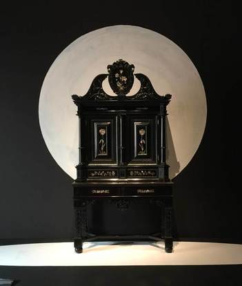
The painting can be used to make an object really pop out at you. The beautiful ebony armoir above (left) gains a whole new life from the white moon behind it. The sinuous curves at the top of the chest stand out against the light background, and the hovering circle gives the piece a lively dynamic—almost as if it were a nocturnal creature standing in a moonlit landscape.
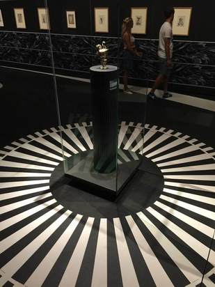
The tiny silver pitcher above (right) gets an injection of energy from the white rays radiating out across the floor. They turn the pitcher into the source of a geometric explosion, and who doesn't want to look closer at that??
1. Emphasis
The painting can be used to make an object really pop out at you. The beautiful ebony armoir above (left) gains a whole new life from the white moon behind it. The sinuous curves at the top of the chest stand out against the light background, and the hovering circle gives the piece a lively dynamic—almost as if it were a nocturnal creature standing in a moonlit landscape.
The tiny silver pitcher above (right) gets an injection of energy from the white rays radiating out across the floor. They turn the pitcher into the source of a geometric explosion, and who doesn't want to look closer at that??
2. Context
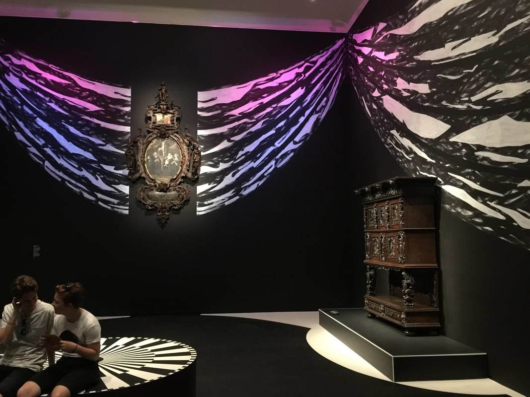
The same black-and-white painting technique on the walls is used in another way, namely to recreate a sense of the objects' original context. Keeping the monotone palette is a nice way to keep the "reconstruction" attempt from becoming distracting, while at the same time contextualizing objects rather unfamiliar to a modern viewer. In the photo below, the oval painting in an elaborate wooden frame is hard to imagine wanting to hang on your living room wall; but with the illusionistic swags of drapery emanating from it, it gains the elegance and appropriateness to the opulent display context it was originally meant for.
The same black-and-white painting technique on the walls is used in another way, namely to recreate a sense of the objects' original context. Keeping the monotone palette is a nice way to keep the "reconstruction" attempt from becoming distracting, while at the same time contextualizing objects rather unfamiliar to a modern viewer. In the photo below, the oval painting in an elaborate wooden frame is hard to imagine wanting to hang on your living room wall; but with the illusionistic swags of drapery emanating from it, it gains the elegance and appropriateness to the opulent display context it was originally meant for.
In the room below, a different pattern is used to imitate the wall decorations of the time, which in richer houses included embossed leather (!) wallpaper and wooden paneling:
3. Directing Movement
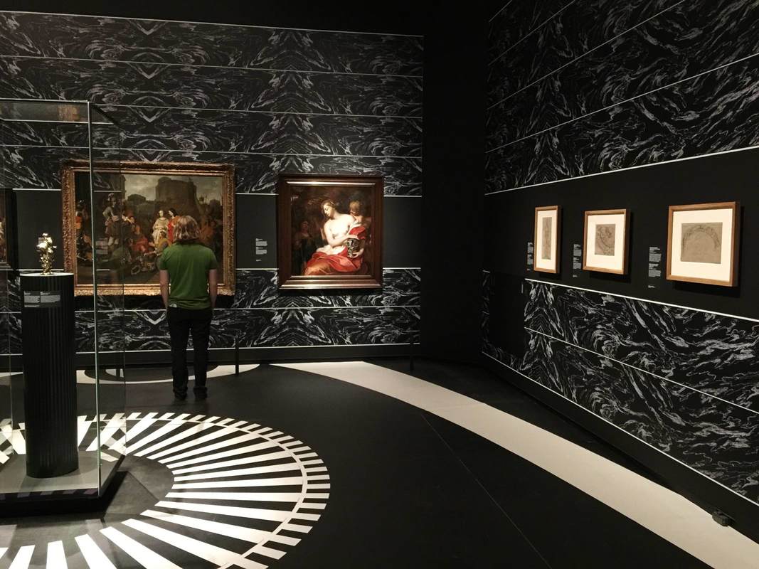
In both the room above and that shown below, the wall and floor painting is used to encourage us to move through the exhibition in certain ways. Above, a long white band leads us from the bottom right (a doorway is just off the photo to the right), along the wall of drawings, and over to the paintings at left, where the half-circle of white under the center painting encourages us to linger.
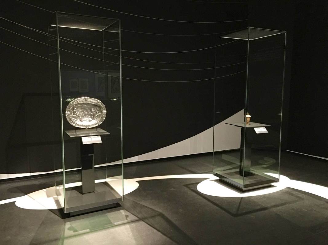
White stripes and circles similarly guide our movement between these two glass cases, this time reinforced by a subtle white curve on the rear wall:
In both the room above and that shown below, the wall and floor painting is used to encourage us to move through the exhibition in certain ways. Above, a long white band leads us from the bottom right (a doorway is just off the photo to the right), along the wall of drawings, and over to the paintings at left, where the half-circle of white under the center painting encourages us to linger.
White stripes and circles similarly guide our movement between these two glass cases, this time reinforced by a subtle white curve on the rear wall:
Such a simple and effective device as these paintings seems worth keeping in mind. Certainly, painting the floor will not often be possible in an exhibition, depending on the space (the Getty Villa's marble floors...). But for the wall paintings at least, I would be curious whether the extra cost and time for installation makes them practical or prohibitive.
 RSS Feed