All the videos featured on the homepage are also on the YouTube channel—go on and subscribe! Let me know what you think in the comments sections below the videos, the blog posts, the reviews, and of course the Forum. It would be wonderful to hear from you. I'll see you there!
|
It's been a long time coming: my new website about museums, museums.love, is up and running! The recent silence here has been due in part to the wealth of new material I produced for museums.love—check it out! If you've enjoyed the in-depth analyses here on Ideas on Display, I think you'll love the reviews and analyses over here. For instance, recently I did a roundup of "virtual tours" that museums are offering in these #stayhome days, exposing how extremely varied the ideas and their execution can be. There are also reviews of museums and exhibitions, there's a Forum to exchange your own ideas with other museum lovers (What's your favorite museum? What are your favorite digital museum resources?), and there's even a shop for buying a certain piece of special swag...
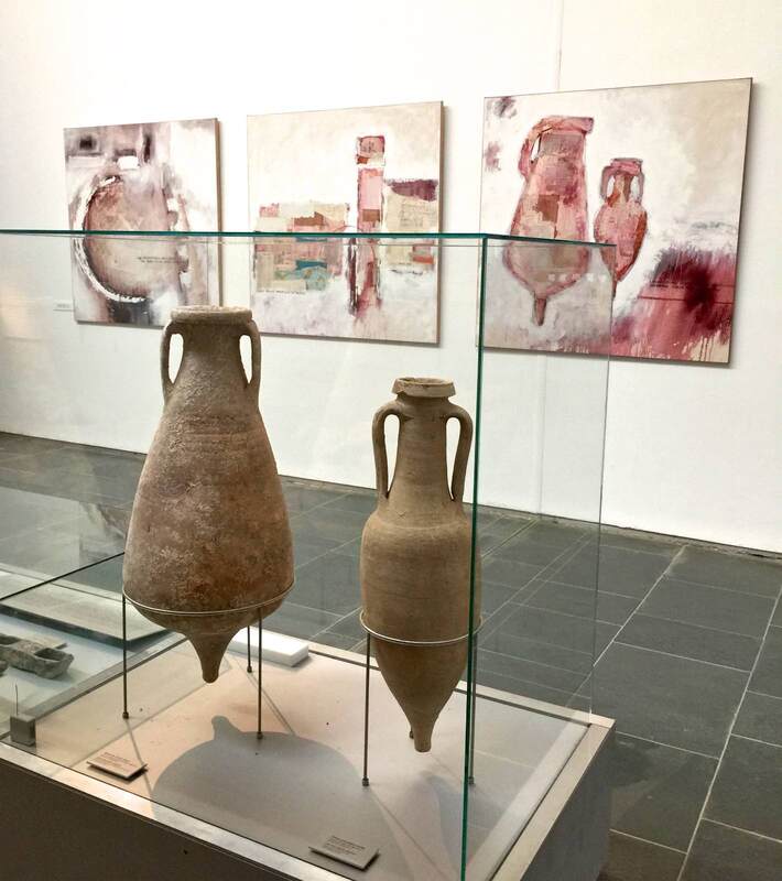
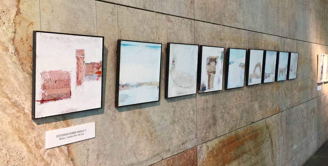
All the videos featured on the homepage are also on the YouTube channel—go on and subscribe! Let me know what you think in the comments sections below the videos, the blog posts, the reviews, and of course the Forum. It would be wonderful to hear from you. I'll see you there! Are creative display ideas more likely to pop up in small museums than large ones? Sometimes it seems that way; perhaps they are more flexible and more closely in touch with their community, opening doors for conversations and collaborations. In any event, the small museum at the archaeological site of Baelo Claudia (modern Bolonia) in southern Spain offers a heartwarming display that seems to come from this sort of background. Contemporary two-dimensional artworks inspired by the site and the excavated objects are tastefully hung on the limestone walls. The works give a wonderfully lively impression of the site through the artist's eyes. The paintings of amphorae (above) encourage you to consider the shapes and colors in new ways, while the paintings of a famous arch at the site (below right) alert you to a now rather degraded feature that you might otherwise walk right by. As you know, I'm a big proponent of juxtaposing ancient and modern art for exactly these reasons: in complementing each other, they enrich our experience greatly!
Amazingly enough, you can visit this museum on Google Arts & Culture - but this exhibition isn't on show in that version. An essay of mine about museum displays of antiquities appeared today in Museum and the City, the official blog of the Staatliche Museen zu Berlin (Berlin State Museums)! You may recall that I led a student workshop in the temporary museum called "Pergamonmuseum. Das Panorama." This essay is a writeup of the themes I presented there and then workshopped with the students in the exhibition. Archaeology, museum methodology, and teaching - just my cup of tea!
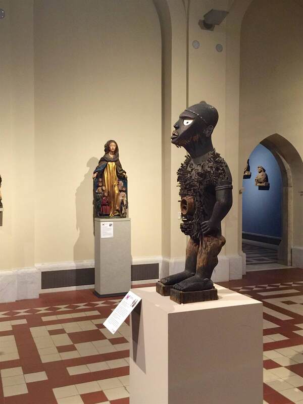
Because the essay is in German, an English summary is in order (see also this previous post): The antiquities we see on display in museums constitute only a tiny part of the objects found in excavation, and those in turn form only a tiny part of the material that actually existed back then. The selection process between being buried in the ground and being exhibited in a museum is rigorous. It includes the decision of where to excavate, what to do with the excavated material, and what material is chosen for exhibition—based on money, available space, and the personal interest of museum staff and visitors. Sometimes the decisions are carefully made, while sometimes coincidence or luck takes over (it does happen that excavations miss an important find by just a few centimeters, leaving it undiscovered). Realizing that there is a complex process behind the scenes is one step towards understanding museums as a laboratory, not a finished presentation of a topic we know everything about. The "Pergamonmuseum. Das Panorama" exhibition is great for driving this home because the explanatory texts often mention uncertainty or differing scholarly opinions. For visitors this can be exciting, or unnerving—but either way it promotes the critical thinking skills we need to deal with our modern world. Last chance to see the exhibition "Beyond Compare" (Unvergleichlich) in Berlin's Bode Museum! The show closes this coming Sunday. In terms of display, this was an interesting intervention into the medieval collections: African objects were set up near pieces that they could have a dialogue with, about one topic or another. The Congolese statue above served as a way to maintain order and ward off evil, just as, the curators suggest, the Mary statue in the background did. The direct visual juxtaposition helps make the point clear, and it certainly opens new avenues for thinking about the function of such pieces: they were not merely "art" in the very modern way we might think of it, but had a concrete purpose almost akin to magic. At the same time, the exhibition text notes that such comparisons are inherently biased and thus problematic. Yet the display asks us to compare.... It's worth visiting for both its innovations and problems!
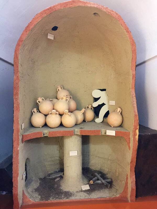
Making the past feel present is tough, and can be helped along with all sorts of sensory cues. In the historical museum in Écija, Spain - the Museo Histórico Municipal housed in the Palacio de Benamejí - there were several visual cues that I quite liked because they border on the tangible. One is a Roman pottery kiln reproduced in the museum at roughly half size; as the text explains, they could be up to 6 meters tall! The area of modern Écija was a prime site of Roman amphora production because the olive oil industry there was also booming, and required transport vessels to be made locally in great number. Over 20 kilns have been found between Écija and the Guadalquivir river alone, in just 25 kilometers! Being able to see the structure of a kiln, complete with a tiny paper cut-out man checking on the wares, helps to make this massive production feel more real.
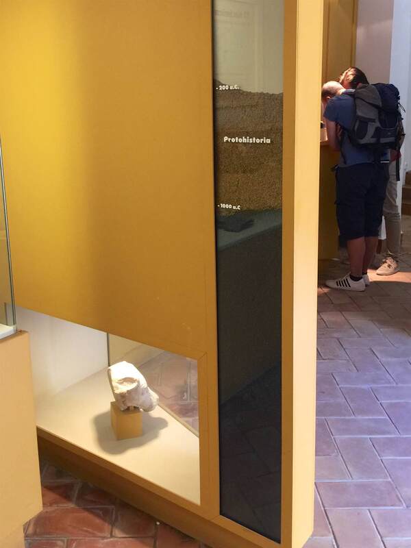
Another such trick is the recurring use of a tall glass box filled with different layers of dirt serving as a timeline. The relevant dates for a specific gallery are marked on the box in each case. Along with the different colors alloted to each time period, this is a useful visual marker of the rather abstract time periods in question. Using a dirt timeline is effective not only because it is three dimensional, verging on the tangible as well as the visual, but also because it recalls the physical location of the objects when they were discovered, as well as the archaeological methods by which we learn about them. On a study trip with students recently, I got to visit the wonderful historical museum in Écija, Spain - the Museo Histórico Municipal housed in the beautiful Palacio de Benamejí. Both the town and the museum are less well-known than they should be; they are not only beautiful, but full of treasures waiting to be discovered! As archaeologists we were thrilled by the artifact collections and the exciting excavations that took place under the main plaza, once the Roman forum. In addition, the museologically oriented among us delighted in the presentation in the museum. Thanks to a tour by museum director Antonio Ugalde, we got an in-depth look at the history of the area from the prehistoric to the late Roman periods. The school groups that come through here can hardly know how lucky they are!
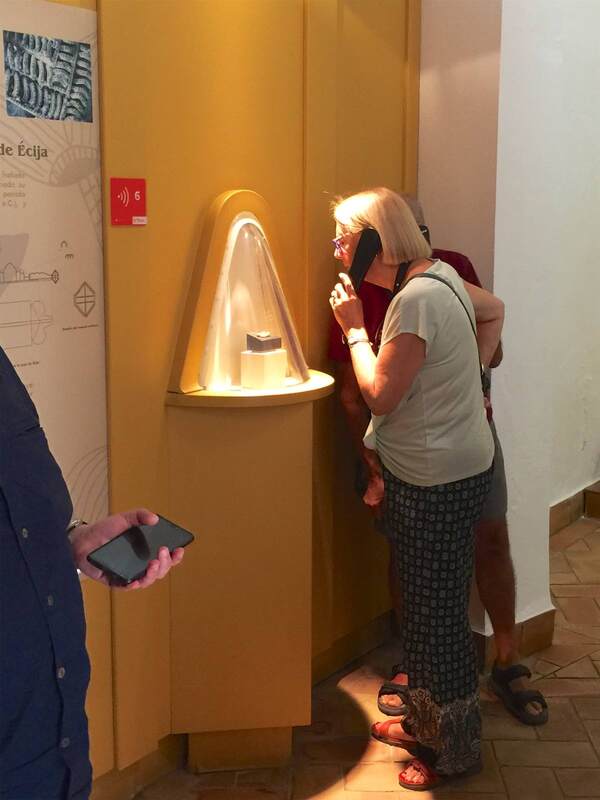
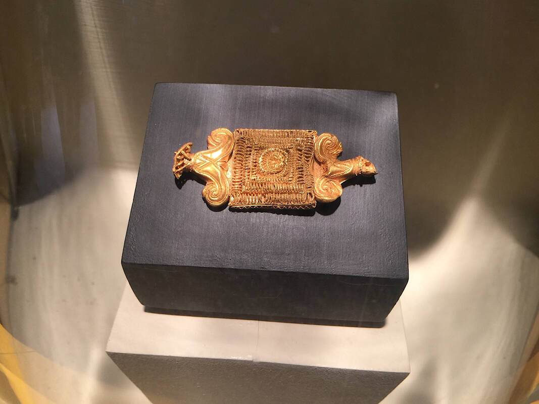
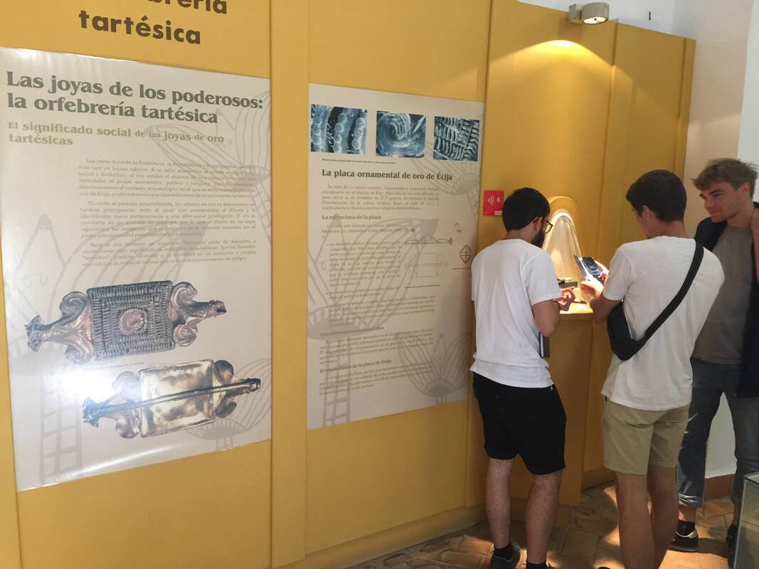
Including a hugely enlarged photo of the piece (see below) is a good way to help viewers appreciate the detail. At the same time, it's important to lure them to look at the piece itself rather than stopping at the picture alone. This is done by the special case and lighting on the gold piece: the case is a cone shape projecting from the wall, highlighting the tiny treasure in a way that lures you irresistibly to take a closer peek. The conical bubble draws you in like a magnet! It is helped by the single light from overhead, lighting it in a golden glow. We were pulled toward it like a moth to the flame.
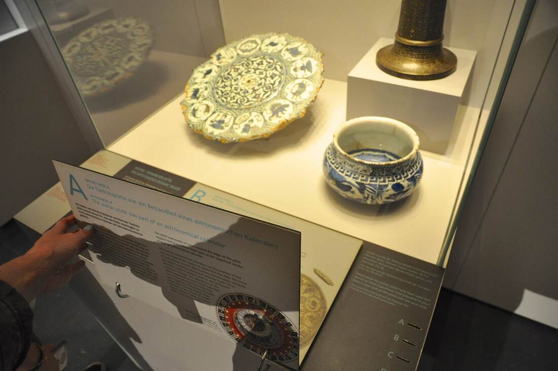
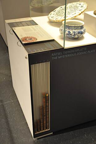
Museum displays can do so much more than simply present information. They can get us thinking about some of the most important questions there are: What do we really know? How can we know that? How can we find out more? To my mind, encouraging people to ask these questions is one of the most important tasks of a museum. (I'm a broken record!) That's why I was thrilled to see a display in the Museum of Islamic Art in Berlin that aims in this direction—the second of two hands-on displays that struck me. A gorgeous plate from 16th-century Iran offers the starting point. It is painted with a zodiac, leading to questions about its function—which have led to multiple hypotheses, which so far have yielded no definitive answer. How to show this uncertainty in the museum texts? (Another favorite topic of mine!)
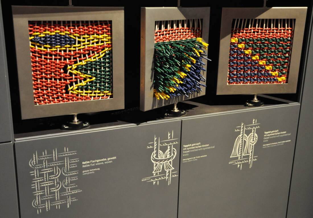
The Museum of Islamic Art in Berlin is proud of its carpet collection. Rightly so: not only are the carpets special in themselves, but they have a tumultuous history. The permanent display that opened last year (well, permanent until it shuffles around again for the reopening of the Pergamon Museum) conveys some of how the objects came to the museum—many through private collectors involved in the "oriental" research popular in late 19th- and early 20th-century Germany—and how they fared in World War II. While the carpet exhibition is fairly traditional in its display, a couple features stood out to me. One is pictured above: large panels demonstrating three different weaving techniques. Thick colorful plastic cord is used instead of the usual fine threads to make the technique more visible. Visitors can turn each panel to see both sides and thus discover the difference between kilim and pile rugs. Namely, kilim (left) are woven such that both sides are flat, while pile rugs (with symmetrical or asymmetrical knots, center and right) result in one side being bristled with the ends of the knots poking out. It's one of the few hands-on displays in the museum, and certainly fun to play with! It's vaguely reminiscent of the weave-it-yourself activity in the Museum of European Cultures in Berlin, but better suited to the far greater number of visitors passing through the Pergamon Museum.
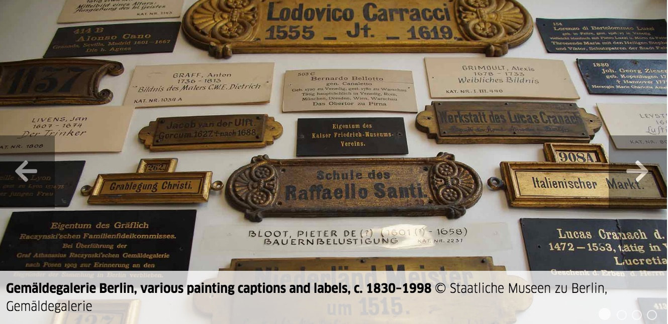
I'm a sucker for exhibitions about making exhibitions! And who doesn't love a peek behind the curtain into the inner workings? A show at the Gemäldegalerie in Berlin until the end of this month focuses on the "Labels of an Exhibition"—how they changed over time and what this tells us about changing priorities. Reminds me of other shows, about nose jobs and frame games of the past...
Just across the canal from Berlin’s Museum Island is a stately building that has just joined the museum family. The Haus Bastian was designed by architect David Chipperfield, like the Neues Museum and the brand new James-Simon-Galerie that it faces across the water. The Bastian family long used this lofty building as a gallery of modern and contemporary art—last year I got to see its last show, which included Wim Wenders’ photographs and Dan Flavin’s lights. Now, however, the family has donated the building to Berlin’s state museums for use as an educational center. It celebrated its opening two nights ago with a first glimpse at the spaces and materials available for experience-hungry kids, families, adults, and teachers.
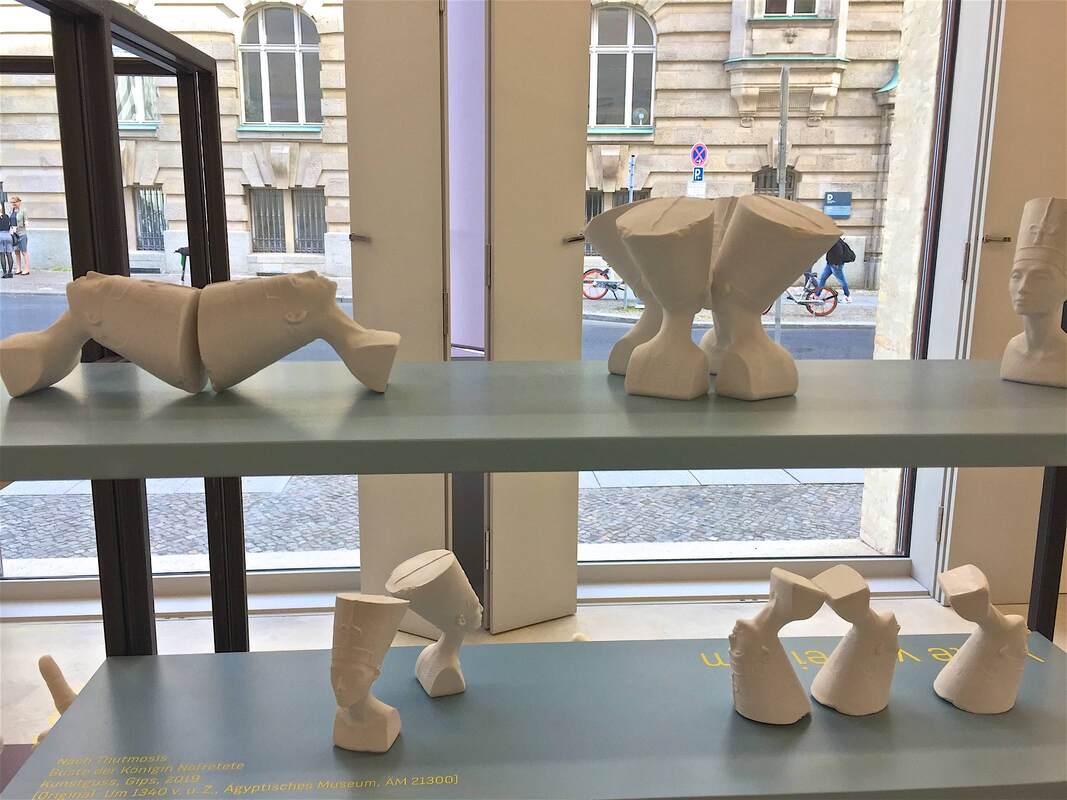
One of the current programs is titled "One to one? Pictures and Copies" (Eins zu eins? Von Bildern und Abbildern). Kids are invited to partake in "Project Days" exploring form through clay and plaster impressions, sometimes of their own bodies. The project materials include little busts of Nefertiti (above), miniatures based on the Neues Museum’s blockbuster portrait of the ancient Egyptian queen. Exhibiting multiple tiny white copies of the portrait is a playful way to draw attention to its physical characteristics: these Nefertitis are not like the original, not the face to launch a thousand posters and coffee mugs—but physical things with certain lines, curves, and volumes. (Replicas were also used in stimulating ways in this show.) The arrangement of the busts in various positions emphasizes this even more. In groups of four, they form a pattern that obscures the uniqueness and importance of The One Irreplaceable Treasure. Upside-down, the busts turn into weird forms like Wall-E or a large rubber stamp with an offset handle. Playing with museum objects like this builds visual skills and creativity—just what this center hopes to do in many other ways as well. I’m eager to see how this endeavor proceeds. Through Monday you can still catch the wonderful show My Dearest Sweet Love: Christopher Isherwood & Don Bachardy at the Schwules Museum in Berlin. What a wonderful compliment to the experience of reading Isherwood's books. What's more, Bachardy's paintings are truly stunning; the male nude series (here are some examples from 2002) took my breath away. He paints with such economy, capturing complex muscles in scant brushstrokes. His use of color also blew my mind—and he must paint very quickly, since the many colors that bleed into one another could only do so if all wet at once. I wanted desperately to buy a catalog of the show, but sadly there isn't one.
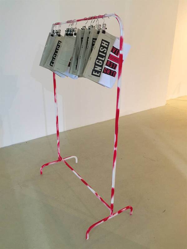
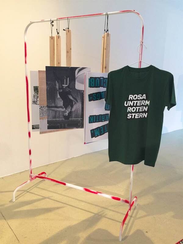
What I was able to take home with me, however, was an idea on display! In the exhibition LOVE AT FIRST FIGHT! Queer Movements in Germany since Stonewall (through fall 2020), the display is based entirely on simple clothes racks. They were spray-painted in red, a nod to the protests and homemade signs of the movements in the title. The racks were used in three ways:
This is an incredibly simple and effective means of display, not to mention cost-effective; IKEA sells clothes racks like this for under $10! Three cheers for the Schwules Museum and these two wonderful exhibitions. I'll definitely be coming back for future shows. I'm delighted to have discovered a short essay, newsletter, and indeed entire company devoted to themes like those I explore here! The director of KOCMOS design firm in Leipzig wrote a great piece with the title "What does good exhibition design have to do with changing perspectives?" (Was hat gute Ausstellungsgestaltung mit Perspektivwechsel zu tun?). In it, he sketches the power that exhibitions have—if they are effectively built--to communicate and make us reflect on our own lives. I couldn't agree more (also thinking back to my lecture on this topic), and am looking forward to the newsletter to learn more about how KOCMOC uses design to achieve these very worthwhile goals.
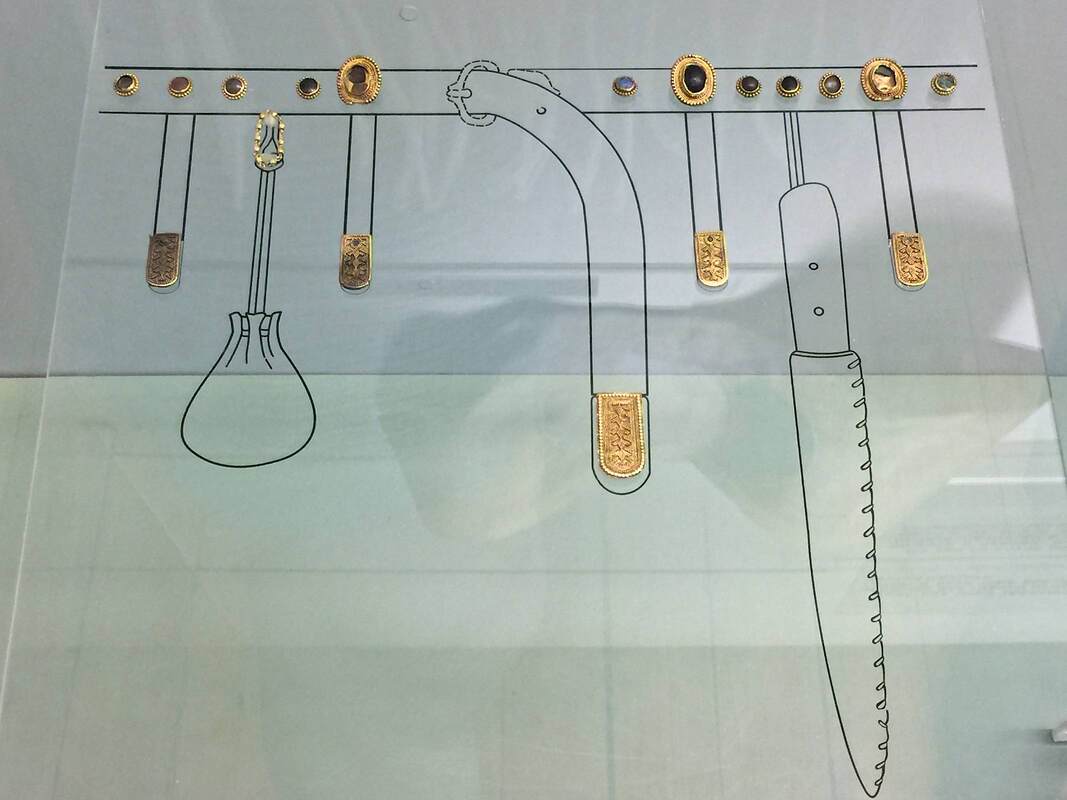
Sometimes even the simplest hint of context can make an object come alive. In the National Archaeological Museum in Sofia, Bulgaria, the collection of gold is fantastic—yet if the objects stand in isolation, the way they were used in the past (and the very fact that they were used at all!) can get lost. One solution to this problem is seen above. The medieval gold objects are put into context immediately with a simple line drawing: they were attached to a belt, serving as ornament among the useful everyday objects like a pouch and a knife. It is richly informative in one glance, and far better than a more complicated reconstruction like, say, a full-body dummy!
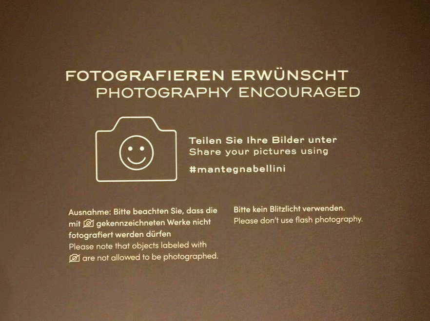
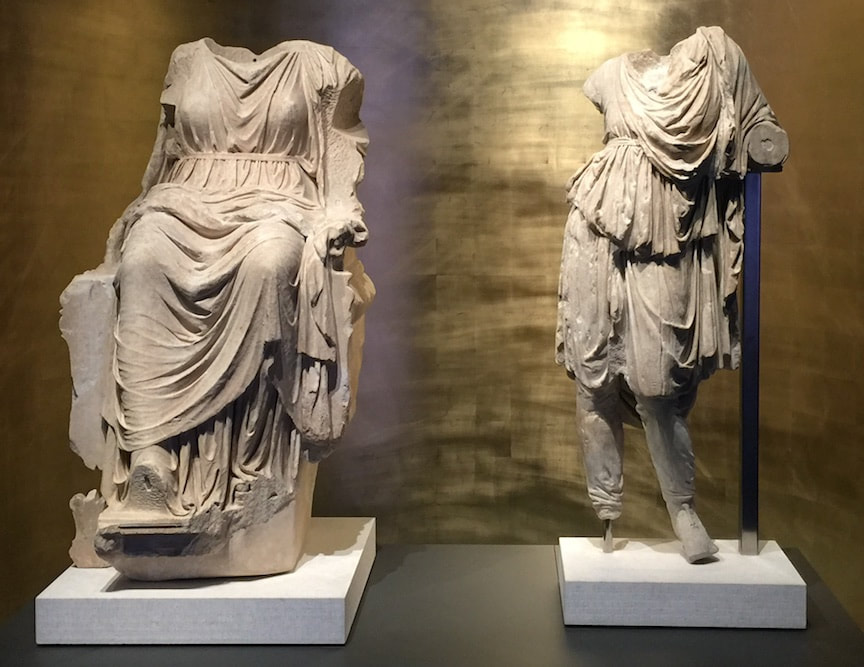
Last week I was treated to a special tour of the current Mantegna + Bellini show at Berlin's Gemäldegalerie, thanks to a generous friend and colleague over at ART-THINKING. Because it was a whirlwind of intense looking and learning, I didn't take any pictures until the last second—upon leaving the gallery, seeing the sign above. The design of the sign is good, using a happy face to communicate nonverbally. The encouragement to share images using the museum's hashtag is a clever way to crowd-publicize. More than that, I was impressed that the curators managed to get permission from all of the loaning institutions to allow visitors to photograph these incredible artworks! They deserve extra cheers for that.
This beautiful show is still open for five more days, closing June 30. Museum display is just the last step in an ancient object's long life. This is the topic of a student workshop I'll be leading on Saturday in Berlin's Pergamonmuseum. Das Panorama. What is selected for display? What is researched, and how? What gets left out? How is the "knowledge" that the museum finally decides to communicate created? All of these are subjective processes, despite the impression that the "knowledge" presented in museums is singular, objective, and perfectly known. As Ian Hodder famously said, "Interpretation begins at the trowel's edge"—at the moment of excavation. (And, I argue, actually before that, since excavations are sited and carried out based on decisions as well.)
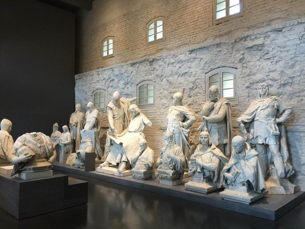
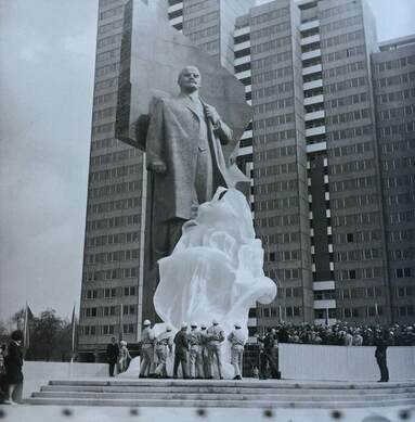
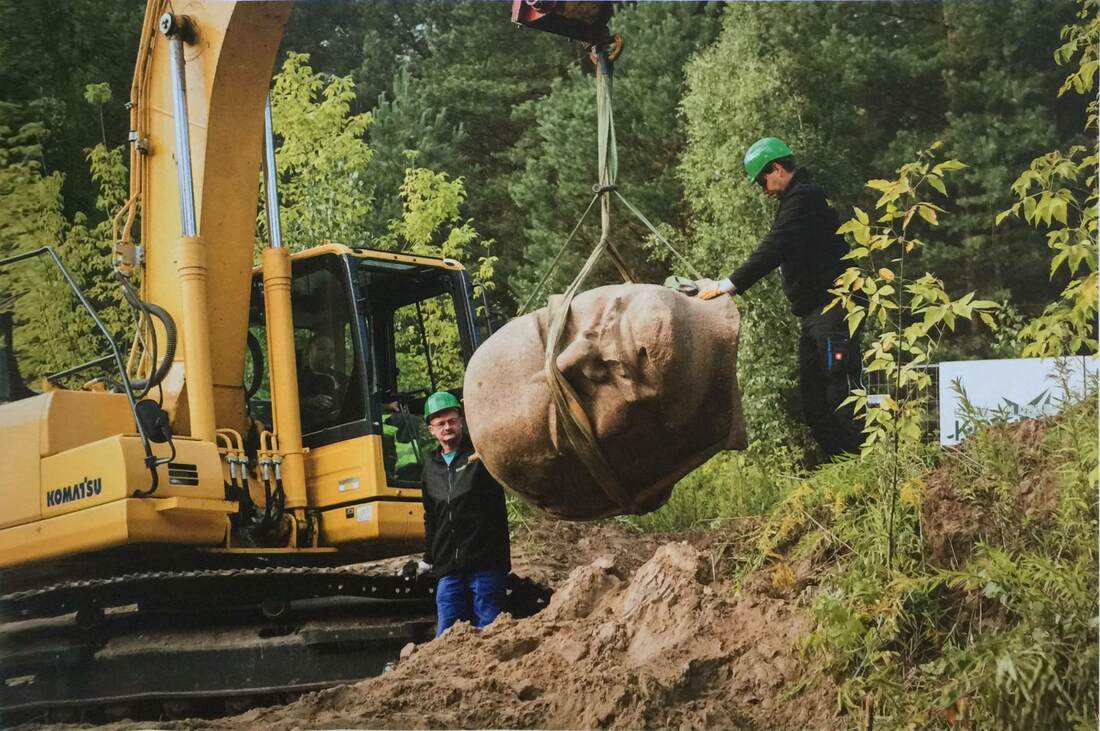
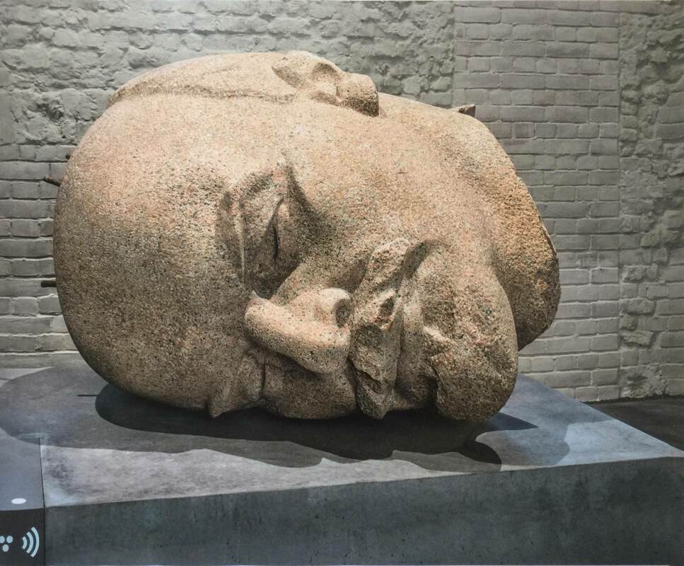
As part of our exploration we'll closely examine the museum labels. I was inspired by those in the interim Pergamonmuseum because they often express a certain uncertainty or scholarly debate about the objects, which I found refreshing. Not just refreshing: it brings us to think critically, one of the most important things a museum display can bring us to do! (But I repeat myself.) All Berlin higher-ed students are welcome! The details (in German, as the event will be): Unsicherheit und Debatte in Museumstexten: Wissen zur Antike gemeinsam bauen Sa / 8. 6. 2019 / 15 – 17.30 Uhr Treffpunkt: Pergamonmuseum. Das Panorama, Besucherinformation Keine Anmeldung erforderlich. Die Teilnahme ist für Studierende kostenfrei. Das Format TISCHGESPRÄCH findet im Rahmen von ABOUT THE MUSEUM statt, einer Initiative des Referats Bildung, Vermittlung, Besucherdienste. Weitere Informationen: studierende.smb.museum und auf Facebook: ABOUT THE MUSEUM. A permanent exhibition in the Zitadelle Spandau puts not only honorific statues but display itself in the spotlight. Unveiled: Berlin and Its Monuments thematizes the city's long history of erecting statues of various personalities, only to remove them later when the political landscape changes. What deserves to stand on public display, and when? Looking at these statues from the 19th, 20th, and 21st centuries makes clear how changeable the landscape of monuments is.
In 2015, the city decided to raise Lenin from the dead (below) and bring his head into this exhibition. Now it is exhibited on its side (bottom), emphasizing its fall from grace and current status not as an item of honor but a fallen relic.
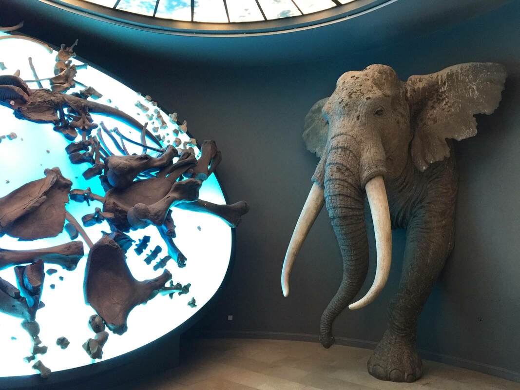
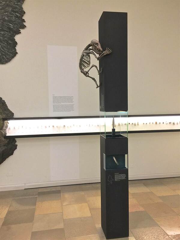
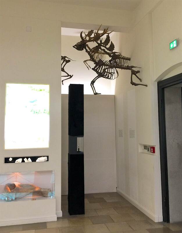
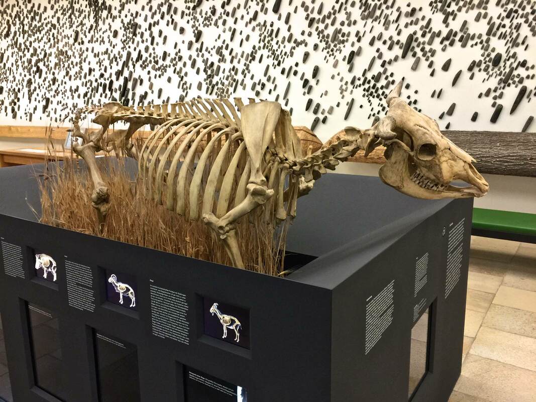
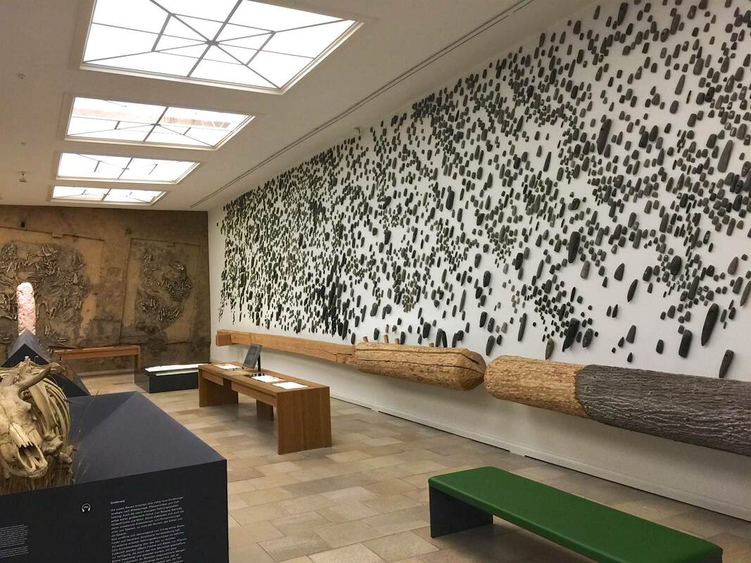
Another wonderful trick of display at Halle's State Museum of Prehistory (Landesmuseum für Vorgeschichte) are the fossilized skeletons displays in poses and places as if they were alive. A mammoth (above) crashes through the wall into the room housing his bones on a light table. A prehistoric mammal climbs a display case (below left) like a monkey up a tree, while some early elk (below right) soar through the air into the light well. A large grazing animal (bottom) stands chest-deep in dry savannah grass. (The striking display of axe heads in the background featured in the last post.) It is not only much more fun to look at these "living" animals, but educational—for the movement is part of the animal! When reindeer fly...
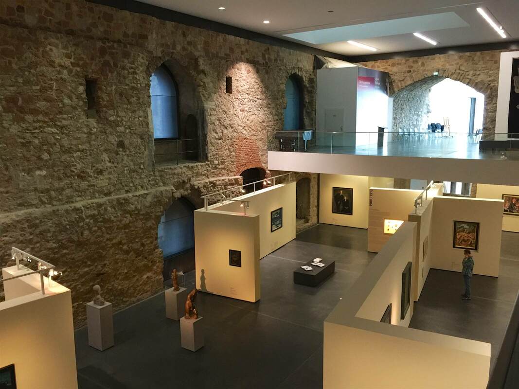
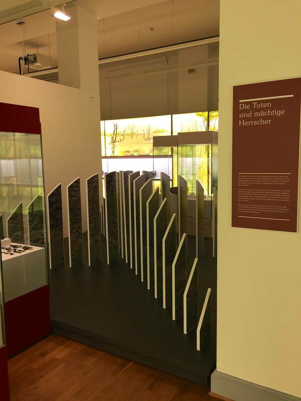
This is where cunning display tactics come in handy. The museum erected a series of freestanding interior walls to serve the needs of art display within the architectural shell (and constraints) of the castle. Many of the walls even have lighting rigged along the top, providing closer and more dirigible light than anything hung from the mile-high ceiling could:
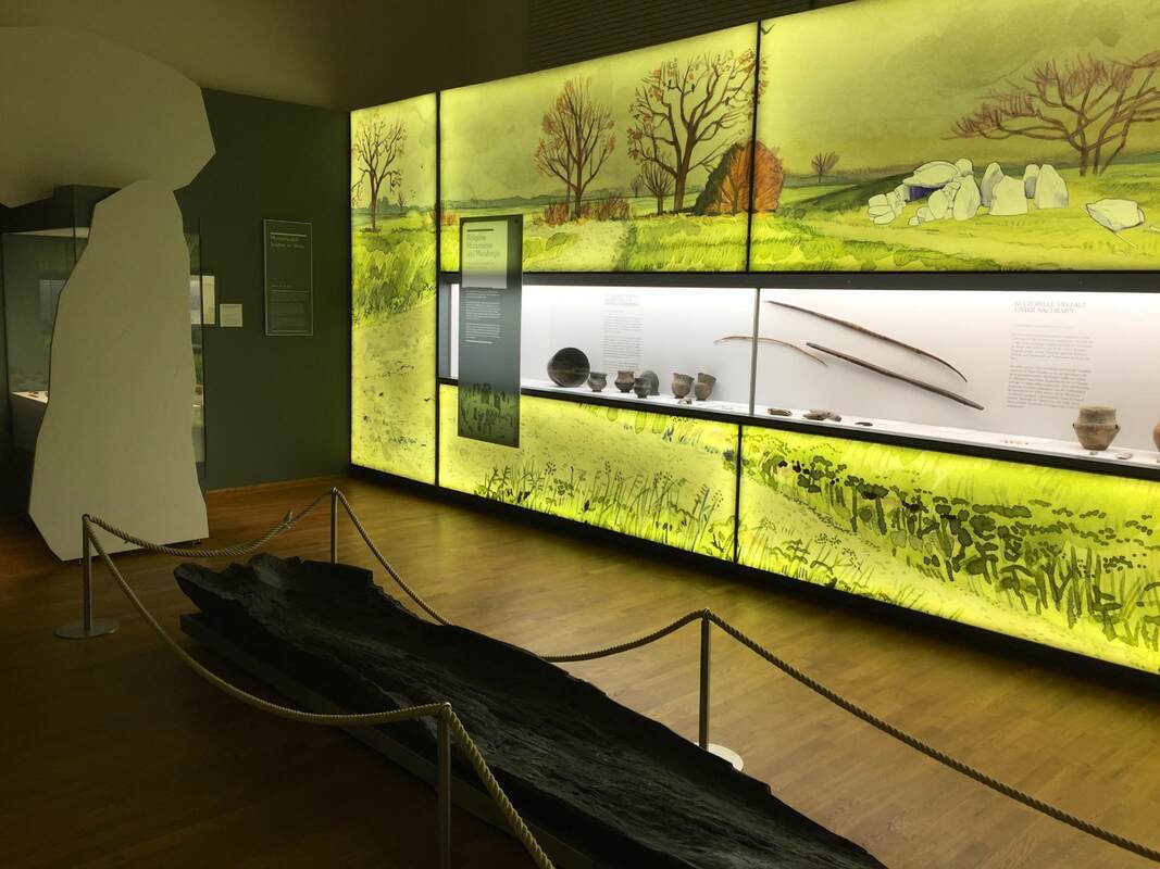
One last post will conclude this series on the Landesmuseum Hannover. These expansive walls of watercolor landscapes, lit from behind with an even glow, run throughout the exhibition of Saxon archaeology. As an artist, art historian and admiring niece of a wonderful mural artist, I fell in love with these immediately. But they operate beyond the realm of personal preference, I swear! Not only do they add color to the display without complicating the view of the objects themselves—which remain on a white ground—but they flesh out the objects' use contexts. Each mural is crafted to show the phase of prehistory that the objects belong to. The type of housing shown is accurate to the time; so is the state of nature or agriculture. But to be honest, it is so bewitching to see a gorgeous watercolor at this scale that I could care less about the content... Oh wait, not really! Bad art historian!
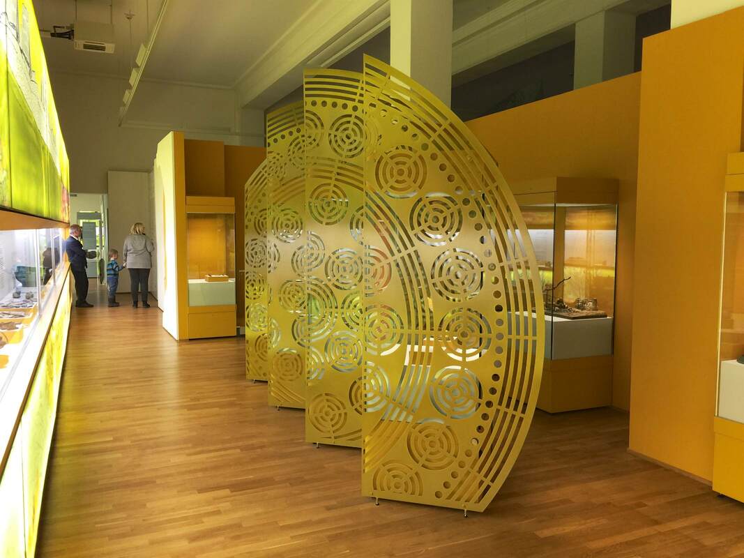
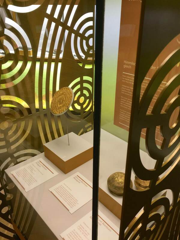
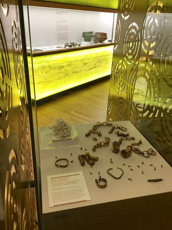
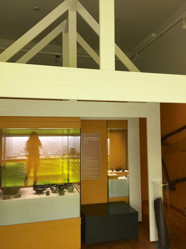
The keen-eyed will have seen that the white cutouts of boulders at left are represented in the painting at right—and that this sort of construction to contextualize the objects was discussed in the last post. Another pleasing aspect of the Landesmuseum Hannover's galleries are the framing devices for the objects. Archaeological objects in particular can be small, withered, corroded, or otherwise unimpressive; sometimes they need a little help to get their due. These gold partitions affixed to the cases of gold jewelry and precious objects from Bronze-Age Germany (Lower Saxony, to be precise—of which Hannover is the capital) serve this end. With their color and concentric-circle design, they draw attention right away—and perfectly echo the objects in the cases! Both the spiraling gold wire of the jewelry (below right) and the circles on the astrological discs (below left) become more obvious with this big visual hint. What is more, the cutouts in the gold screens offer a peekaboo with the objects that makes looking more fun (just like the dividing wall from this post!). A similar but distict tactic can be seen in the architectural frames erected around other artifacts. These serve not just to highlight but also to contextualize the objects. A house-like construction (below left) emphasizes that these objects came from a domestic context. For the grave goods, a wonderfully sculptural and minimalist tumulus points to the original context. They are restrained indicators, but so large and physical that they might even work subconsciously...
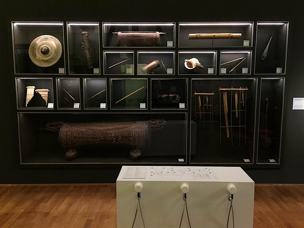
Another element of the Landesmuseum Hannover's ethnographic displays that I quite liked was this wall of musical instruments from Sumatra and Papua New Guinea. It's not only a beautifully minimalist, vertical display—an unusually artistic layout for such practical objects—but it is brought to life by recordings of each instrument at the touch of a button. Seated at the white podium, you can put an earpiece to your ear and select an instrument from the diagram to listen to. Watching two girls do this together, taking turns choosing, was a sight to warm any curator's heart! Plus, this display is in the same room as the complete gamelan instrument ensemble, which is even used in concerts. Now that's really bringing the displays to life!
Many museums are currently asking themselves how to appropriately deal with their ethnographic collections (see links in my previous posts on the subject). Some major European museums, although notably not all, are now openly acknowledging the role that colonialism played in their acquisitions. Reading the work and watching the lectures of Bénédicte Savoy on this topic would be an absorbing job for a wonderful few months. Some museums are even putting on exhibitions about their colonial past, such as Voices from the Colonies at the National Museum of Denmark. While it has been rightly pointed out that ethnographic material is not the only site of colonialism in museums—that museums themselves are colonialist structures—it is certainly one of the most obvious. And if the museums themselves do not take action, others will: the "Guerilla, Activist-Led Tour of Looted Artifacts at the British Museum" made headlines last year.
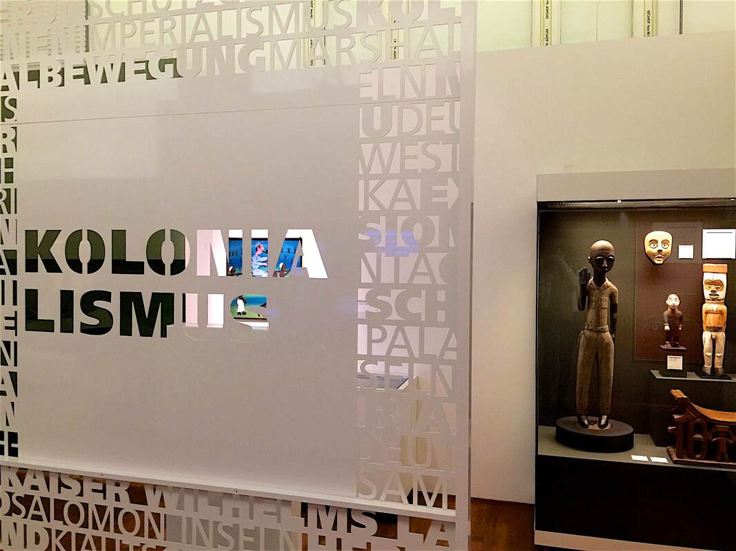
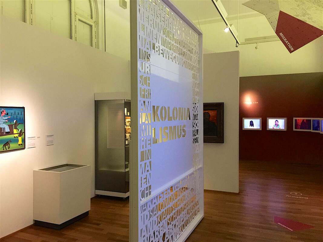
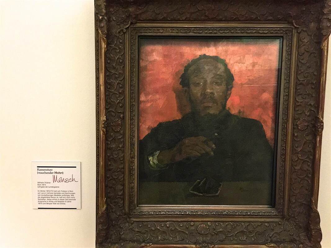
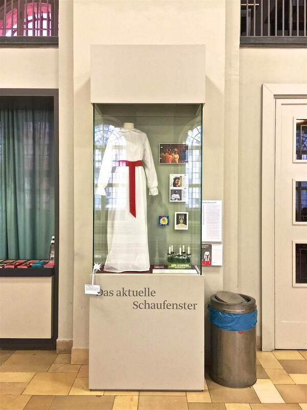
Against this background, the Landesmuseum Hannover has taken commendable action in its own ethnographic displays. Particularly striking is the section marked off by a decorative metal dividing wall stamped with the word "Kolonialismus" in the center. This is an imposing marker of the surrounding area, and invites a curious new way of looking through the cutout letters (see photo above). On display here are objects presented in a story of colonial interaction, from depictions of visiting Europeans made by Africans whose lands were being colonized, to a 19th-century painting titled "Smoking Moor" for which the Landesmuseum has provded a modified label: "Moor" has been crossed out and "Human" (Mensch) added instead. It is a small but effective way to reframe objects we might otherwise pass over, and to make us question the metanarratives of museum exhibitions. Such a simple yet effective idea: an object-of-the-month display at the museum entrance. Here it's the Museum of European Cultures in Berlin, and the object in "Das aktuelle Schaufenster" (the current showcase) is a contemporary Swedish dress used in the celebrations of Saint Lucy. You can see the doors of the main entrance just to the right. What a great way to bring out of storage some objects that may not fit into the other exhibitions, and draw in the visitors as soon as they step over the threshold!
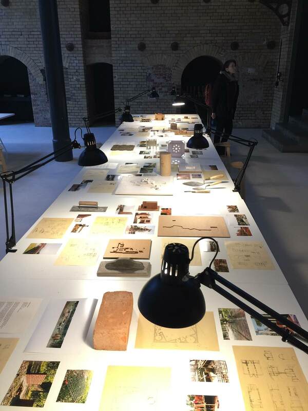
Another beautiful and effective display concept at Aedes Architecture Forum (if less mind-blowing than the subject of the last post) belongs likewise to the show FARAWAY SO CLOSE. A Journey to the Architecture of Kashef Chowdhury / URBANA, Bangladesh. Here the architect Chowdury's drawings, models, and materials (or photos of them) are laid out on drafting tables lit by arm lamps, as if you were looking over his shoulder as he works. It is an intimate way to experience the material, far more so than if it were hung on a wall, let alone pressed behind glass. The openness of the display couldn't directly translate to a bigger venue, where the chance that pieces would go missing is higher, or to an exhibition with originals that would be severely damaged by being touched. But it is such a lovely way to encounter the material on human terms, I wonder if it couldn't be adapted to more venues. Peeking into the artist's studio is, after all, endlessly alluring.
|
Ideas on Display
A humble space to reflect on concepts of museum display as enacted across a wide range of subjects, countries, and approaches.
Archives
April 2020
Categories
All
|


 RSS Feed