One of the display techniques that cleverly underscored this message consisted of pools of plaster under the objects on the glass shelves. These slightly irregular blobs form a much-needed opaque backdrop and injection of color to frame the pieces, which, many in shiny metal, would otherwise melt into a sea of reflections in the glinting vitrines. Moreover, the plaster pools (as curator Felix Sattler explained on a tour) recall the process of molding and pouring plaster replicas of the ancient objects. Thus the theme of the show is reinforced by its display. Definitely worth a visit, as is the Theater building itself; it's up through the end of March.
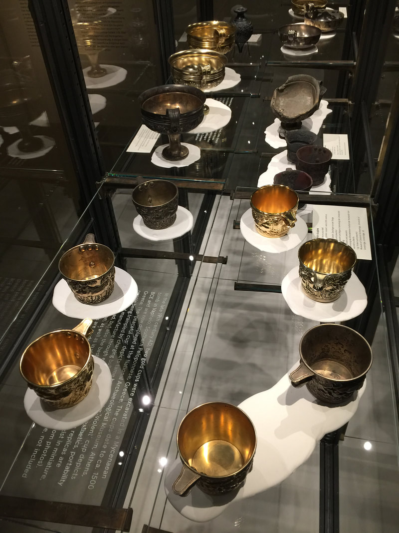
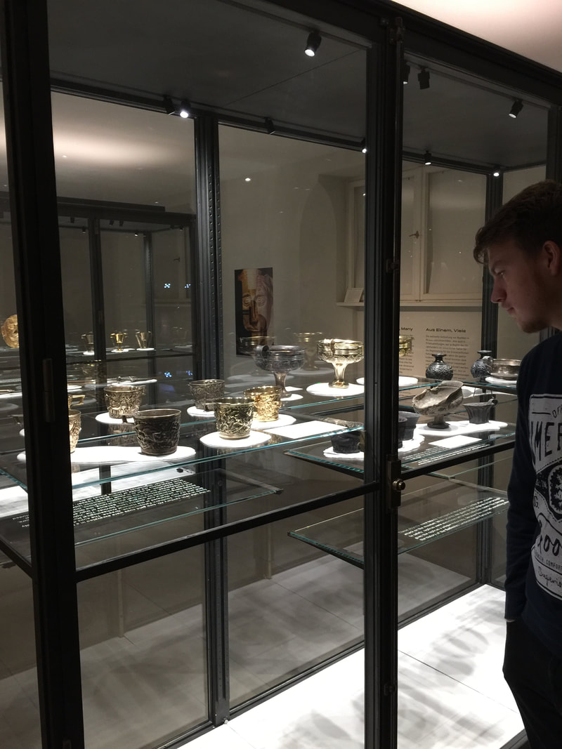
In the exhibition Repliken Wissen = Replica Knowledge, currently in Berlin's Tieranatomisches Theater, all of the objects are original—and none of them are. The exhibition displays modern replicas of Minoan and Mycenaean art in order to point out that replicas, far from being simply reproductions of some much more interesting "originals," have their own stories to tell. Their lifetimes may not be as old as that of the archaeological objects they copy, but they are complex, thrilling, and illuminating in their own way. Displaying multiple replicas made from the same model (such as the drinking cups above) highlights this theme of copying.
One of the display techniques that cleverly underscored this message consisted of pools of plaster under the objects on the glass shelves. These slightly irregular blobs form a much-needed opaque backdrop and injection of color to frame the pieces, which, many in shiny metal, would otherwise melt into a sea of reflections in the glinting vitrines. Moreover, the plaster pools (as curator Felix Sattler explained on a tour) recall the process of molding and pouring plaster replicas of the ancient objects. Thus the theme of the show is reinforced by its display. Definitely worth a visit, as is the Theater building itself; it's up through the end of March. An exhibition on Chinese antiquities currently in Berlin's Neues Museum uses a couple of display tricks worth noting. One consists of long banners stretching from the first few display cases up to the two-story-high glass ceiling—a wonderful use of the cavernous space! It's simple, cheap, and very eye-catching. The black banners are printed with the name "Egypt" in several languages; the red ones with "China." In this way the banners serve as the introduction to the second display tactic that caught my eye: throughout the exhibition (no photography allowed beyond the atrium, sadly), the Chinese objects are always placed on red risers or red squares as a background. The Egyptian objects get the same treatment but in black. Because the exhibition is arranged by theme rather than culture (e.g., how each culture respectively approached currency, votive offerings to gods, and so on), the red and black color-coding is a very useful visual cue for which culture produced any given object.
A new sort of art exhibition opened in Berlin about a month ago (running until January 28). From Monet to Kandinsky - Visions Alive is a similar presentation to last year's Van Gogh Alive exhibition in the same space (mentioned in this post on art as sensory experience). Using a combination of multiple projectors, sophisticated animation, and music in surround sound, the developers offer a way to experience art quite different from a gallery visit. The focus here is on sensory impact, not traditional pedagogy; all information about the artists whose work is shown is limited to a room on either side of the display space, each hung with a daunting set of text-dense posters. Really the viewer is meant to linger in the main exhibition space, a single large room with many folding chairs and bean bags—an invitation to relax and enjoy the sights and sounds.
The exhibition consists of moving images of paintings projected onto all four walls (and onto a freestanding, screen-clad A/V tower, at left in the photos here). Music plays. Various paintings by a single artist are shown on the multiple walls, at varying degrees of "zoom." The real variety, though, comes with the animation: every painting has been reworked into a psychedelic moving image. Lillies from Monet's waterlily series have been cut from their paintings and now tumble lightly from ceiling to floor over a background of other Monet gardenscapes. Mondrian's squares gain shadow and thus depth, first flickering on like so many lit windows in an apartment building at night, then becoming hundreds of wooden blocks tumbling through outer space like celestial child's toys. Klimt's spirals and gilded squares break free of their canvases and swirl like confetti. After 60 minutes the film starts over again; and to my own surprise, I found that I could have gladly stayed for another round, so complex and beautiful is the imagery. Not only nice for the eyes, but food for the brain. For although text in this room is limited to a short phrase from the artist projected over the door, the animation shows a firm knowledge of the artworks and artists. The animators were not just strutting their technical stuff; they implemented effects to enhance the art according to its content or even the artist's biography. Thus Van Gogh's painting Wheatfield with Crows is the last of his works to be shown (to the sound of cawing as the birds float over the horizon), just as it was the last work he ever painted. Toulouse-Lautrec's segment opens with silhouettes of the heads of various spectators he painted, as if seated in a theater, a spotlight playing across them as their voices titter—underscoring the importance of spectatorship and nightlife to the artist's repertoire. The many Van Gogh self portraits that morph into one after the other after the other emphasize the artist's obsessive nature, perhaps visible in the repeated attempts to capture his own likeness. By the end, I was enraptured. Quite a shift from my initial skepticism; I'm embarrassed to admit that at first, I was horrified by what seemed like an overly showy spectacle at the expense of an apparent substance (ahem, text?). How lucky that my companion convinced me to stay and relax into the colors and sounds—which indeed turned out to be wonderful, but also by far not the only merits of this exhibition. In one gallery of Berlin's Natural History Museum, all the video installations are plain white. They illuminate the taxidermied bison like the lights for a fashion shoot, but otherwise betray no special function. But if you grab a playing card from the big bin at the entrance, and you look through the little circle of polarizing filter that occupies half of the card, suddenly the white screens spring to life! Each one plays a captioned video about animals, some of which are also shown in taxidermied form nearby. Through the filter you can watch the video as usual—or watch the people around you as they realize, squint, look, and learn! It's a cute trick to get people to stop and engage in a concentrated way with video material. I certainly would have breezed past a lot of these screens if not for the polarizing gimmick to draw me in (on a visit last weekend during the 20th iteration of the Long Night of the Museums).
Wandering around Berlin's Bode Museum yesterday led past plenty a Medieval masterpiece of wood sculpture. The above pairing of two pieces is an especially delightful part of the exhibition because of the narrative it creates. Although made in different parts of central Europe by different hands (around the same time, within a generation or two of 1500), here the sculptures are placed together as if they belonged to a common story. As the ever-alluring Saint Sebastian twists his nude body against the arrow wounds that would make him a martyr, four apostles crane their necks from the adjoining wall to get a better look. The label for the latter piece tells us that the four men originally belonged to a scene of the death of the Virgin Mary; but their dramatic LOOKING makes them powerful directors of our attention to another piece in the museum gallery. They channel our gaze around the corner to the beautiful wind-blown Sebastian. The interaction between the two pieces encourages us to compare, contrast, appreciate—and maybe even chuckle at the insatiable human desire to look, look, look.
Arranging objects in a gallery so that they communicate with each other (and with the visitor caught in their crosstalk) can take many forms. A unified color scheme among the individual vitrines can do it, as can a monochrome or gold color to the objects themselves, or a similarity in shape. The above pairing of paintings in Berlin's Alte Nationalgalerie highlights the similarly rosy tone of both pieces, but in an especially cunning way. The lefthand painting, August Kopisch's Pontine Marshes at Sunset, depicts a red sun sinking over the crimson wetlands like an ember. It smolders in the dome of clouds above it, a furnace between the eerie lunar landscape and the jaundiced sky. Lengthening toward the right, the red oval seems to cast its light upon the next wall—where it falls upon the straggling family painted by Eduard Magnus in his Return of the Palikares. The low sun cloaking this scene in pink lies just off the canvas to the left, allowing us to imagine that it might be the very same sun that sets over the Pontine marshes. Not only the warm color, then, connects the paintings, but the very light source itself; it calls for the two pieces to be looked at together, dynamically.
Remember the "talking statues" in London? Now the same folks (Sing London) have extended their project to Berlin. As they did in London, they are equipping numerous commemorative statues around town with audio clips that a visitor can access through small signs in front of the statue; snap the QR code and you're ready to listen. Two colleagues and I tried out the Lise Meitner statue and found it worked flawlessly. The voice actor brought a vibrant personal touch to the statue—a great way to bring it to life. One useful aspect of this concept is that such audio accompaniment can be overlain on any preexisting object; it does not have to be developed at the same time as the object installation. All that has to be added to the physical display space is a QR code (or a link to another technology—like Blinkster, used in Berlin's Ethnological Museum).
Well-designed signage is a rare and precious gem. In a museum, signage can set the tone for a visitor's entire visit: because if she starts by buying a ticket, checking her coat, using the bathroom, and then finally entering the gallery she most wants to see, she's already had to locate at least four separate areas of the museum, probably by following signs. And if that process was easy—i.e., well-signed—she'll ideally be in a fine mood; but if it was difficult, she may enter the galleries feeling grumpy or frazzled, and that will color her experience of the whole museum.
So kudos to Berlin's Kunstgewerbemuseum (the museum of decorative arts and design) for putting writing on the wall that no one can miss, and winning a design prize along the way. The eye-catching size and color of the signage creates a certain aesthetic effect that not all museums would want, but it accords well with the all-parts-visible idea behind Rolf Gutbrod's 1960s building. Even award-winning signage has two potential weak points, however. First, it has to be wriiten in a certain language—here German, which some visitors may not understand. Second, there is a compelling argument (nicely presented in an airport example in the addictive design podcast 99% Invisible) that the architecture itself, not just signage, should help guide the people in it. But since purpose-built buildings are not in the cards for most museums (and even if they are, wayfinding is only part of their mission), it's worth taking signage seriously. Who doesn't love a peek behind the curtains? At least when the venue is a museum, a look behind the scenes (or curtains, in the German idiom) is always thrilling. Making visible all the work that goes into readying objects for display is not only a highlight for visitors but a well-deserved kudos to the conservation teams whose hard work is rarely recognized by the public—because ideally, their work is invisible! The conservators at Berlin's Alte Nationalgalerie are now earning appreciation in a special exhibition about their three years of work restoring Caspar David Friedrich's two most famous paintings, Monk by the Sea and The Abbey in the Oakwood. Numerous series of photographs in the exhibition show the progression from yellowed, cracked, poorly-restored pieces to the radiant paintings now finally back on show. A few of the photographs even showed the conservators' coded markings and notes for planning the restoration, as well as the X-ray images they used to better understand the underdrawings and primer layers. Two full-size photographs of the unrestored paintings (seen above) allow viewers to compare the earlier with the present state (much clearer and less jaundiced!). It is an exciting story to see laid out like this—and today, at least, many people were there to enjoy it.
What a stroke of good luck when a major credit card company uses your museum as the backdrop for its billboards! This advertisement appears right at the entry to the security check in Berlin's Tegel Airport, so it also has a captive audience. I wonder if the Bode Museum worked with MasterCard in order to get this exposure. Certainly the museum is working hard to expand its reach—particularly to a younger crowd, as shown by its new Instagram project.
Once a month the Käthe-Kollwitz Museum in Berlin offers a lunchtime tour by the director, Dr. Iris Berndt, and yesterday's provided the extra motivation for my first visit to the museum. Standing in the first room of the ground-floor galleries, waiting for the tour to assemble, I was struck by the "word cloud" on a wall right next to the entrance. Like the automatically generated word clouds on the Internet, this collection represents thought trends in a wide set of "users" (clustered around the name of the artist, nicely emphasized with extra lighting). But unlike the digital word clouds, these words have been carefully selected to educate. As Dr. Berndt explained, they all represent concepts widely understood to apply to the great German artist Käthe Kollwitz—but several of them are problematic or even false. By marking these four terms with question marks—Feminist? Jewish? Communist? An artist who depicts suffering?—the display indicates that these preconceptions need to be reexamined and possibly discarded. This seems to me a very simple yet effective way to ease a visitor into the experience to come: several key themes are named right at the beginning, setting the tone for the subsequent galleries and helping a visitor to frame the individual objects; and just as importantly, it introduces the idea of questioning stereotypes, clichés, and pat explanations. For such a complex, richly-textured life and oeuvre as Kollwitz's, this strikes just the right first note.
Yesterday saw the finale of an ambitious multi-year project in the National Museums of Berlin meant to probe the issues in displaying ethnographic collections today. This "Humboldt Lab" took place in Berlin's Ethnological Museum and raised some fantastically interesting questions—like the problem of displaying sacred objects not meant to be seen, the subject of an earlier post on this blog. The publication accompanying the seven "trial" exhibits constructed as part of the Lab is lovely too; I look forward to reading it. (For anyone interested in ordering a copy but undecided on which language, go for the original German—the text is much more readable than the English translation.) Although I'll be sad to see the old museum close (below is a view of the sleek South Pacific galleries, reopened in 2004), it will be exciting to see how the museum moves ahead with the results of this unique petri-dish opportunity!
Running across the article "Geheime Dinge" (page 46) this week was serendipitous because it aligns perfectly with the last post on how to display something too small to see. A similar display problem is facing the team behind the Humboldt Forum, a huge new cultural space being built in the center of Berlin. Among other things, the Ethnological Museum will move into this space—and has made this an opportunity to experiment with new, sometimes radical display ideas. Exhibiting objects from "non-European cultures" (the term used in all HuFo materials) is difficult to do tactfully, to say the least; and one of the most intriguing problems that has come up in this respect was addressed in an article from a promotional magazine put out by the Forum. The title and tag line say it all: "Secret Objects. How can you display objects that are so sacred, so secret, that the uninitiated are not even allowed to see them?" The sign in the case reads "Object removed for spiritual reasons."
One of the examples in the article, small inscribed stones from Australia that are considered sacred and "unshowable" in this way, was proposed for a display that included not the stones themselves but 3-D prints of them, along with authentic materials associated with how the stones were used (such as incense). This indeed follows the letter of the law by not showing the stones themselves—but is showing a perfect replica of them a respectful solution? Another proposal has the (real) objects in a case that is somehow clouded or shrouded, from which the veil is lifted for a few seconds every so many minutes to offer visitors a peek inside while still preserving the objects "unseen" for most of the time. This seems to me a dangerously titillating solution, encouraging a peeping-Tom voyeurism that would defeat any modicum of respect for the objects and their culture. It is an extremely difficult problem that the HuFo team is facing; I look forward, not without anxiety, to seeing their answer. Once upon a time in Berlin, there was a colossal statue of Lenin. His head alone weighed 3.5 metric tons. The statue was dedicated in 1970 (Lenin's 100th birthday), dismantled under the new regime in 1991, and condemned to be buried in a nearby forest, where it still lies to this very day. Now it is meant to go into a permanent exhibition; that is, it was meant to, until the Senate suddenly and mysteriously decided to forbid it just two weeks ago. (All of this is reported in an excellent Berliner Zeitung article.) Once the Senate ends its summer recess and comes back to the issue on September 23, I will be following this story, hoping that it ends the way it should: with this amazing piece of art on show, teaching visitors about the vicissitudes of power and the concomitant struggles over putting objects on display!
Impeccable timing! This news story came out in Deutsche Welle just after I wrote the last post, and highlights precisely the same idea of viewer engagement as discussed there. In this case it's not a victory podium but a chair to stand on, and it invites you to stand on it by virtue of the three chairs next to it with people (statues) standing on them. These people all "stood up" for what they believe in, and spoke out—so here's your soapbox: what will you speak out about?
How can museums effectively engage their visitors? It's a huge question with myriad answers—and sometimes it seems that each answer only raises more questions. Over the past six weeks or so I've gotten to participate in some rousing discussions about public engagement in museums (one was this scintillating symposium in Cambridge) and was deeply affected by the ideas presented there. Many of them involved staging events in the museum, making the museum a hub of activity and an agent in the lives of the community. One of the most moving ideas came from our colleagues in the National Archaeological Museum in Athens, who have worked with a correctional center to create opportunities for young offenders to connect and grow with art.
Yet public engagement can work on much smaller levels. Three levels made of white plastic, for instance. I saw these steps on the sidewalk outside a restaurant, simply standing there beside the tables and stools, and thought it was a very clever way to invite a passerby to stop and engage. Nothing says "we need a person here, and it should be you!" like an empty victor's podium! Can't you imagine a group of friends vying to be #1? In that moment, they have stopped to engage and have fun as we can only hope they would at a museum display. In this case the restaurant must be hoping for a bit more face time with potential customers—but a museum could surely use this tactic for another purpose. These steps act almost like a large wooden cut-out with a hole for the face: it is practically magnetic. So purpose-made, missing only the human ingredient. And someone to take a photo of that human, of course. Ideally, exhibitions don't exist only within the confines of a gallery: they can stay with the visitor for long afterward, perhaps with the aid of a souvenir. The booming development of gift shops in museums (or museums appended to gift shops, as it might seem at times) is a polarizing issue, but personally I always like browsing the selection of books in a museum shop. Often the supply include books you can't find anywhere else, and they tend to include superb pictures. So I was happy to see this table of books in the exhibition galleries of the Neues Museum in Berlin. In a long gallery that mostly serves as a passageway, this table wasn't competing for attention against any objects but presented the visitor with an array of books relevant to the adjoining galleries. I like the idea of being able to browse the books while you're still thinking about the objects on show, rather than having to wait until the end of your visit when other thoughts are pressing in (bathroom, next museum, lunch, etc.). The subjects ranged from the famous "golden hat" in the neighboring gallery to well-chosen books on astronomy (a theme integral to the hat) and early humans.
A successful display does not need a fancy new design idea or technology to be successful (indeed, sometimes those can really go awry!). Some of my favorite displays are very simple; their strength lies in being extremely well-conceived in terms of how they achieve their few basic goals. One great example is the signage at the Domäne Dahlem in Berlin, a charming set of fields and cottages meant to teach the visitor about old-time farming and artisanal trades. The signs scattered around the grounds are excellent in several simple but important respects:
Botanical gardens are a special kind of museum. By their very nature they have certain restrictions and opportunities that are foreign to a "brick and mortar" museum — for instance, walls. Walls are both a restriction and an opportunity, really, and one that is rather lacking in at least the outdoor portion of any botanical garden. With walls come wall texts, as well as the ability to encourage certain directions of movement. Lacking walls, botanical gardens (again, speaking of the outside area; the greenhouses and possible visitor center or attached museum are a different story) miss these opportunities even as they gain others.
What potential repercussions a lack of walls might have on a plant display struck me at the Ökowerk Berlin, which includes several garden spaces on its extensive grounds. Labeling the display is tricky when there isn't a wall to support the labels; the solution here is to print small paper labels and slip them into metal and plastic holders staked into the ground. The stakes are well-conceived insofar as they can be placed anywhere, and presumably even moved as the plants grow, unfurl leaves that then cover the signage, or drop their leaves and retreat to a mere husk, requiring the signage to be set nearer in order to look relevant. Unlike larger signs too, they can be stuck right in the middle of a bed of plants, making very clear what they refer to. Conversely, the portable size restricts the amount of information that can be given: so in this case, QR codes have to do almost all of the legwork. A recent exhibition idea came to me not from a museum but a beer garden. Yes! — and whyever not? As we see the boundaries break down between museums and other cultural institutions — museums are inviting in theater companies, yoga practitioners, and Michelin-star chefs for their restaurants, all in the name of innervating their public programs — ideas for exhibition design should come from non-museum institutions as well. This one struck me as I walked through the cultural hub atop the Pfefferberg in Berlin, with an outdoor tango stage to my left and this gravel-floored beer garden to my right. Above the tables were hung several dozen glowing orbs, dangling from the tree canopy. They ranged from about 50 cm to 150 cm in diameter, in varying shades of mottled yellow-orange. The effect stopped me in my tracks. Cosmic, certainly: it's like seeing the heavenly bodies descend to within touching distance (almost!). It made me think that such a mesmerizing display could just as well serve in an art museum gallery, simply as an accent to the exhibition down at ground level. Because the orbs are so eye-catching, they would have to be deployed thoughtfully in order that the art not be outshined; but carefully placed in a dimmed gallery with a few lit cases of sculpture, for instance, they would make magic. They would encourage lingering and looking, precisely what we aim for in museums. And they would use some of that tall vertical space at ceiling height that rarely gets used anyway. Pairing the orbs with beautiful visual material seems an obvious choice; pairing them with beer is optional.
Verticality is a leitmotif of the Neues Museum's new exhibition of its collection of Prehistory and Early History. As discussed in the last two posts, the simple yet unusual tilting of the usual axis of display invigorates the objects: not only are they easier to see than if they stretched back into the recesses of a large horizontal case, but this visibility acts like a visitor magnet. The photo above is indicative: I couldn't manage to take a photo of this case without people in front of it! Of course, the morbid subject boosts the interest of this particular case (none of the other cases in this gallery enjoyed such a constant stream of viewers) — but in any case, I bet that it wouldn't see nearly the same traffic if it were laid out flat. I would love to see a study in which the same set of bones was displayed horizontally for one test group and vertically for another, with the aim of comparing the number and duration of visits to each.
Standing an archaeological quadrant on its head as above is more than a spectacular feat of conservation. It also makes plain a big question about displaying archaeological material: specifically, whether the display should represent artifacts in a context reminiscent of their original one, or rather in a highly aestheticized one. Neither possibility is right or wrong; they are simply two points on the spectrum of approaches. The Neues Museum has opted for the latter to stunning effect. The case below is one of the best examples: axe heads arrayed in a 14 x 11 grid make no claim to conveying use or find context but rather make an arresting visual package. Yet the pedagogical potential is in no way diminished. Quite to the contrary — the display perfectly underscores the thesis of the case. The text describes the value of metals in the Bronze Age, which is succinctly expressed by the sheer wealth of axe heads (and jewelry) placed on show. Disembodied as they are, with an emphasis on their number and physical form, the axe heads actually better represent the abstract idea of wealth than if they were displayed in a semblance of their archaeological context. Continuing the train of thought from the last post, today I want to share another method by which the Neues Museum in Berlin has chosen to exhibit its objects vertically. The concept seems simple, yet the effect is striking. In the case pictured above, shards of glass have been clipped into special wire holders that stick up from the plinth like flowers — although given the geometry of the pieces, they almost resemble cosmic debris shooting into space! With large, heavy lumps of glass providing visual weight at floor level, the projecting fragments provide a gorgeous contrast in weightlessness. As a way to use the full space of a case, from bottom to top, this is very clever. Moreover, it brings these rather humble pieces of history to life: by contrast, can you imagine the effect if they were simply strewn across the floor of the case? It would probably be stultifying. Instead, here we have a carefully choreographed play of shapes, colors, and space. The stunning effect is worth far more than the simplicity of the idea would let on; and what's more, the concept can be executed on the cheap: although this version is highly refined, a similar idea could practically substitute wire coat hangers. (Alright, just check with the conservators first!) For context, you can see this case in its ensemble of ultra-modern cubic peepholes in the photo below. (Subject for another post, this black box-with-hidey-holes approach.)
While the traditional mode of displaying an object in a museum has been to put it in a glass case, bringing an object out of the case — and therefore into the visitor's physical space — can make it much more powerful. Removing even a transparent barrier like a glass box makes the object instantly more immediate: it now inhabits our world, rather than some removed one whose distance in both time and space seems to be symbolized by the vitrine.
Making objects more accessible in this way has its own complications, of course — not least in that they become quite literally tangible! Not all objects can stand up to a curious visitor's stroking finger or spontaneous sneeze. Precisely this problem was debated between the curators (who wanted the case gone) and conservators (who were concerned about protecting the object) at The Metropolitan Museum, when Navina Haidar hoped to remove the vitrine from around a fabulous incense burner in the shape of a lion. In both that instance and the one pictured above, in the Neues Museum in Berlin, a large base below the object resolved some of the difficulty. The oversized base keeps people from approaching too closely while still allowing them to experience the object "up close and personal." In addition to the caselessness, two more factors add enormously to the Neues Museum's display of two Bronze-Age trumpets. One is that the base serves doubly as an audio station: by pressing a button on the front, the visitor is treated to a haunting chorus of blaring trumpets. Hearing the tones they would have emitted feels like a substitute for holding them and playing them yourself; it is a wonderful sensory experience. The second notable factor is that the trumpets are suspended rather than mounted to the base. Their twisting shapes lend themselves perfectly to such an ethereal effect, as if they were being propelled into the air by their bronze flagella. Many of the displays in the Neues Museum's newly-renovated galleries were conceived with a vertical rather than horizontal format in mind, which is not only space-saving but visually arresting. A future post will explore some of the other creative designs. An astounding number of museums sprinkle the Berlin landscape. By the city's own count, there are over 170. While some of the museums on that list are extremely well-known and heavily frequented — foremost being the Pergamon Museum, with some 1 million visitors per year — many are small, quirky, and practically undiscovered. Neighborhood museums belong to this genre. Off the radar for most tourists, these museums focus on the history and culture of the immediate locality (Kiez); they must be a dream for school groups, and offer the curious visitor too an unusual glimpse of local life.
Of the 20 Kieze in Berlin, more than 11 have their own dedicated museum. One of these, the Friedrichshain-Kreuzberg Museum, occupies several refurbished stories of a building in the geographical center of the Kiez. The third floor (or fourth, in the American system) is entirely devoted to a beautiful big map of the area marked by easy-to-read landmarks and colorful numbered circles. The clean white walls, ceiling, floor, and pillars lend an airy feeling, and the room almost feels empty — until you step into it and use it for what it was intended. Borrowing a set of headphones and an iPod, the visitor is meant to walk around the map listening to local Berliners tell their stories linked to specific locales. The stories have been grouped into ten themes, each marked by a different color and labeled on the wall: from "work" and "eating" to "belief" and "suffering," the themes are both straightforward and richly textured. The visitor can opt to follow a certain color to hear stories related by theme, or select a path of stories all told by the same person, or wander the map at will choosing stories of any color or location. It is a marvelous trick of kinetic learning, made even more effective by gorgeous graphic design. That the stories are personal and told by inhabitants of the Kiez rather than actors, specialists, or museum staff makes them very compelling. In fact, the introductory panel invites visitors to make an appointment to record their own stories in the museum's audio studio! So as it turns out, this spacious white room is filled with only half of a display: the other half comes from the visitor bringing in her own exhibition content, her personal history. Local engagement couldn't get any more local and engaging. Ancient Roman funerary urns were made to long outlast their cremated contents, and indeed survive today in the thousands. Italian museum in particular house an incredible number of these urns: the Museum of the Baths of Diocletian in Rome come to mind, as well as the lower floor of the Capitoline Museums. Because the marble chests are compact and often unassuming, they might be displayed on the ground outside (as at the archaeological museum at Aquileia) or in glass cases on the side of a gallery (The Metropolitan Museum in New York). Decorated with a profusion of miscellaneous imagery and an inscription in Latin or Greek, they are not the most accesible objects in a gallery of ancient art; they require some close looking to be properly appreciated.
This all serves as background to say that the Altes Museum in Berlin has hit upon a brilliant display technique for a selection of its urns. In reconstructing the arched niches of a columbarium, the tomb in which such urns were placed for burial, the display case here not only recreates the original context of the pieces but encourages the viewer to take a closer look at these elaborate objects. Framing them like this really draws the eye in a way that a simple display case (let alone a spot on the sidewalk!) does not. What's more, this case allows the urns to be stacked three high — making them more imposing as well as saving precious gallery space. |
Ideas on Display
A humble space to reflect on concepts of museum display as enacted across a wide range of subjects, countries, and approaches.
Archives
April 2020
Categories
All
|