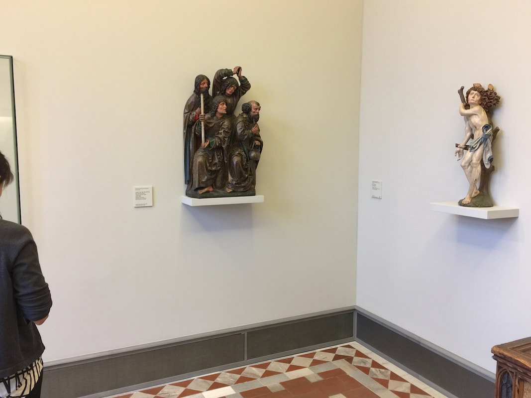
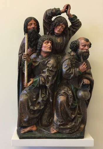
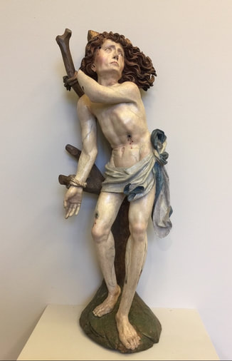
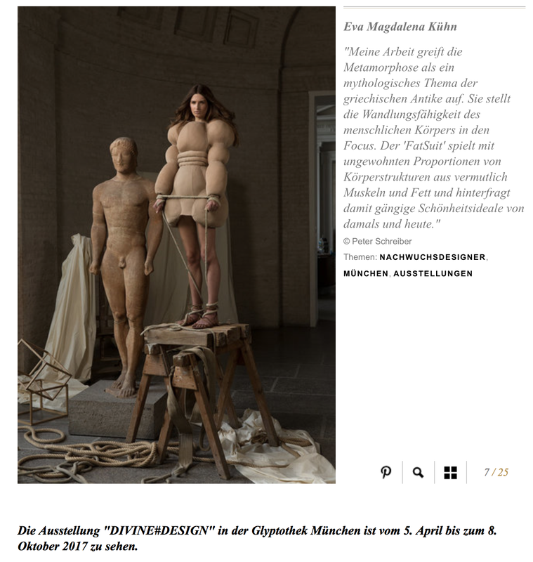
Over the last several months I've been impressed by a new trend in exhibitions pairing ancient art with modern and contemporary art in thoughtful, provocative ways. So much so that I wrote a position piece about it, now posted here under the exhibition reviews section. Please feel free to leave comments below; it's all about the dialogue!
Peeks behind the scenes are the best! Everyone loves a glimpse behind that institutional facade, whatever the institution. Museums are no different (see Wiseman's film on the National Gallery), and conservation in action is an increasingly popular way to give visitors a little look-see.
This case in the beautiful Ny Carlsberg Glyptoteket, Copenhagen is fondly knows as the Nasothek—the gallery of noses. (Although there are a few ears in there too.) These facial parts were once added onto ancient portrait sculptures in the modern period in order to fill in the missing parts. This was common practice in past centuries, when ancient art was considered best when flawless. Noses, as a protuberant and thus frequently knocked-off piece of sculpture, were restored by the dozens. Nowadays, however, the principle of object care has changed. Instead of restoring ancient sculpture to make it look perfect, museums consider their primary task to preserve what they have as best they can. This means no more gluing on modern additions, rhinoplastic or otherwise. In fact, it can even mean removing those additions from previous centuries. This was the Glyptoteket's decision, resulting in a lot of loose noses rattling around in a storage box somewhere. Why not display them in a striking array and thereby tell a bit of the history of modern receptions of ancient art? Still better with a Roman portrait head next to it, its own nose and brow additions removed, thus telling most of the story at the very first glance. It's tiny and Indecipherable...Make an animated Video about it! National Museum, Copenhagen5/23/2018
Of course, two decisions have to be made before the question of display tactics even arises.
Then, and only then:
This last question raises further questions about intended audience, etc.—the subject of immeasurable spilled ink already, and still flowing (good thing; we need the flood). The first question, about whether to display at all, is equally complex and has been addressed in a small way even on this blog. Let's turn to the second question. What is displayed has as much impact on the message of the exhibit as how it's diplayed. (Yes, all exhibits have a message, whether conscious or not. My students seem to grasp this better than many professionals.) The Museo Egizio in Turin is currently co-hosting an exhibition that makes this clear in the most laudable self-critical move I have ever seen a museum make. Please send other examples if you know of some; in my experience, this is unique. This archaeology museum has decided to highlight the problems of where its objects come from, under what circumstances of colonialism or other duress they were acquired, and what role or right a museum even has to create knowledge around them. How does it achieve this very tall order? By exhibiting works of contemporary art that raise these issues. Above (screenshot from the museums' Facebook site), a piece by Liz Glynn in her series "Surrogate Objects for the Metropolitan" imitates some of the look of a Greek vase while also announcing its collage-like materials as if for a humble craft project. It thus questions the value of Greek vases—after all, many were simply the red plastic cups of their day—as well as the way the museum literally puts them on a pedestal, and the effect this has on what we think of them, how we value them. A piece by Ali Cherri in the Turin exhibition positions a taxidermied hawk triumphantly spreading its wings over a table full of archaeological objects. This is a powerful image to highlight the potential predatory nature of dealing in antiquities. For an archaeological museum to champion awareness of these issues is as surprising and new as it is exemplary. It is a typically inspiring move by museum messiah oops I mean director Christian Greco. Hopefully he will inspire many, many other museums to follow suit.
The building of a large drainage pipe under Berlin's Mauerpark is a triumphant example of how simple display concepts can be transformative. Rather than making yet another annoying construction zone in the city, and this one right in at the entrance to the most popular park, the organizers decided to make it an attraction in itself. They achieved this by erecting a wooden wall around the main building area and decorating it with fun and informative panels. The biggest and most iconic is the cartoon cross-section of the pipe itself (above). The pipe introduces itself through a speech bubble: "I'm a drainage pipe with a 4.4-meter diameter"! More detailed panels describe the water system in depth. Around the corner, a spin wheel with exercise challenges on it ("do 5 pushups!" etc.) is a further attraction. Most surprising of all, you can see it all and learn more on a beautiful modern website devoted to the project! Way to go, Berliner Wasserbetriebe.
The brand new special exhibition at the Plaster Cast Collection in Berlin features this piece, a cast of an ancient sculpture depicting two wrestlers. Just the head of one wrestler and his hand intertwined with the hand of his opponent is preserved. The fragmentary preservation adds to the drama of the piece, as it leaves the modern viewer to decipher what is going on in this tiny excerpt of tumult. The display heightens this even more, with the stark white of the piece brightly lit against its dark pedestal; the effect is a further disembodying of these twisted human parts. The display fits the piece, as the Germans would say, wie die Faust aufs Auge: literally, "like a fist in your eye"— that is, like a glove.
In the exhibition Repliken Wissen = Replica Knowledge, currently in Berlin's Tieranatomisches Theater, all of the objects are original—and none of them are. The exhibition displays modern replicas of Minoan and Mycenaean art in order to point out that replicas, far from being simply reproductions of some much more interesting "originals," have their own stories to tell. Their lifetimes may not be as old as that of the archaeological objects they copy, but they are complex, thrilling, and illuminating in their own way. Displaying multiple replicas made from the same model (such as the drinking cups above) highlights this theme of copying.
One of the display techniques that cleverly underscored this message consisted of pools of plaster under the objects on the glass shelves. These slightly irregular blobs form a much-needed opaque backdrop and injection of color to frame the pieces, which, many in shiny metal, would otherwise melt into a sea of reflections in the glinting vitrines. Moreover, the plaster pools (as curator Felix Sattler explained on a tour) recall the process of molding and pouring plaster replicas of the ancient objects. Thus the theme of the show is reinforced by its display. Definitely worth a visit, as is the Theater building itself; it's up through the end of March. From time to time, of course objects have to go off display—to be conserved, to go traveling, to be studied. But for a visitor it's frustrating to see an empty space in the display case; so what are the options for filling it? Particularly if the object is coming back soon, replacing it may not be practical. Personally I like the simple-yet-effective photograph of the missing object with a little caption about what a great time it's having on tour (or whatever the reason it's absent; remember the spiritual objects that are not allowed to be seen?).
One variation on this predicament—and its solution—caught my eye at the archaeological site of Prima Porta, just north of Rome. The Roman villa here (the "Villa of Livia," built in the 1st century BC) has a nice big pool out in the garden that was once surrounded by columns, as well as a black-and-white mosaic floor depicting marine creatures. To protect the remains of the badly damaged floor, a wooden platform has now been built over it. But this hides the mosaic! And the traces of the columned porch! So it was decided to adorn the platform with wooden discs representing the position of the columns, and black paintings of the mosaic sea creatures still frolicking beneath the plywood. The result gives an impression of the original layout while still protecting the remains. An exhibition on Chinese antiquities currently in Berlin's Neues Museum uses a couple of display tricks worth noting. One consists of long banners stretching from the first few display cases up to the two-story-high glass ceiling—a wonderful use of the cavernous space! It's simple, cheap, and very eye-catching. The black banners are printed with the name "Egypt" in several languages; the red ones with "China." In this way the banners serve as the introduction to the second display tactic that caught my eye: throughout the exhibition (no photography allowed beyond the atrium, sadly), the Chinese objects are always placed on red risers or red squares as a background. The Egyptian objects get the same treatment but in black. Because the exhibition is arranged by theme rather than culture (e.g., how each culture respectively approached currency, votive offerings to gods, and so on), the red and black color-coding is a very useful visual cue for which culture produced any given object.
The upper floor of Hamburg's Archaeological Museum doesn't plunge the visitor into an immersive landscape as the lower floor does (subject of the last post). Rather than turning windowless walls into a black cave, this floor uses walls of windows to leverage its position on a park and pedestrian walk, bringing inside the natural light and greenery.
In one section of this airy space is an exhibit highlighting artifacts found around the museum. Arranged on a transit map of the area (similar to this room of Berlin's Friedrichshain-Kreuzberg Museum), the objects each have a grab bar near them like those in a bus or tram—complete with the red STOP button! When you push the button, a voice from the speaker in the pedestal first announces the name of the transit stop and then tells you about the artifact found there. It's a playful and effective way to show the visitor that history really comes from the places she commutes every day. Announcing the name of the stop reinforces this, as well as the transit theme itself. And ask any five-year-old: who doesn't love pressing those buttons!? Hamburg's Archaeological Museum in Harburg is a gem. The first-floor gallery, pictured above, is relatively small but packed with wildly creative displays. An artificial dirt-and-rock floor (all glued down, safe to walk and scramble on) strikes the right tone for the prehistoric collections. Just so the dark ceiling, recalling a cave or perhaps the night sky. It's atmospheric, certainly; but more than that, the playfulness helps to emphasize the content rather than distracting from it. Who could expect otherwise from the creative team, Ravensberger Freizeit und Promotion, famous for their educational board games! Here are just a few examples:
A new sort of art exhibition opened in Berlin about a month ago (running until January 28). From Monet to Kandinsky - Visions Alive is a similar presentation to last year's Van Gogh Alive exhibition in the same space (mentioned in this post on art as sensory experience). Using a combination of multiple projectors, sophisticated animation, and music in surround sound, the developers offer a way to experience art quite different from a gallery visit. The focus here is on sensory impact, not traditional pedagogy; all information about the artists whose work is shown is limited to a room on either side of the display space, each hung with a daunting set of text-dense posters. Really the viewer is meant to linger in the main exhibition space, a single large room with many folding chairs and bean bags—an invitation to relax and enjoy the sights and sounds.
The exhibition consists of moving images of paintings projected onto all four walls (and onto a freestanding, screen-clad A/V tower, at left in the photos here). Music plays. Various paintings by a single artist are shown on the multiple walls, at varying degrees of "zoom." The real variety, though, comes with the animation: every painting has been reworked into a psychedelic moving image. Lillies from Monet's waterlily series have been cut from their paintings and now tumble lightly from ceiling to floor over a background of other Monet gardenscapes. Mondrian's squares gain shadow and thus depth, first flickering on like so many lit windows in an apartment building at night, then becoming hundreds of wooden blocks tumbling through outer space like celestial child's toys. Klimt's spirals and gilded squares break free of their canvases and swirl like confetti. After 60 minutes the film starts over again; and to my own surprise, I found that I could have gladly stayed for another round, so complex and beautiful is the imagery. Not only nice for the eyes, but food for the brain. For although text in this room is limited to a short phrase from the artist projected over the door, the animation shows a firm knowledge of the artworks and artists. The animators were not just strutting their technical stuff; they implemented effects to enhance the art according to its content or even the artist's biography. Thus Van Gogh's painting Wheatfield with Crows is the last of his works to be shown (to the sound of cawing as the birds float over the horizon), just as it was the last work he ever painted. Toulouse-Lautrec's segment opens with silhouettes of the heads of various spectators he painted, as if seated in a theater, a spotlight playing across them as their voices titter—underscoring the importance of spectatorship and nightlife to the artist's repertoire. The many Van Gogh self portraits that morph into one after the other after the other emphasize the artist's obsessive nature, perhaps visible in the repeated attempts to capture his own likeness. By the end, I was enraptured. Quite a shift from my initial skepticism; I'm embarrassed to admit that at first, I was horrified by what seemed like an overly showy spectacle at the expense of an apparent substance (ahem, text?). How lucky that my companion convinced me to stay and relax into the colors and sounds—which indeed turned out to be wonderful, but also by far not the only merits of this exhibition. In one gallery of Berlin's Natural History Museum, all the video installations are plain white. They illuminate the taxidermied bison like the lights for a fashion shoot, but otherwise betray no special function. But if you grab a playing card from the big bin at the entrance, and you look through the little circle of polarizing filter that occupies half of the card, suddenly the white screens spring to life! Each one plays a captioned video about animals, some of which are also shown in taxidermied form nearby. Through the filter you can watch the video as usual—or watch the people around you as they realize, squint, look, and learn! It's a cute trick to get people to stop and engage in a concentrated way with video material. I certainly would have breezed past a lot of these screens if not for the polarizing gimmick to draw me in (on a visit last weekend during the 20th iteration of the Long Night of the Museums).
Wandering around Berlin's Bode Museum yesterday led past plenty a Medieval masterpiece of wood sculpture. The above pairing of two pieces is an especially delightful part of the exhibition because of the narrative it creates. Although made in different parts of central Europe by different hands (around the same time, within a generation or two of 1500), here the sculptures are placed together as if they belonged to a common story. As the ever-alluring Saint Sebastian twists his nude body against the arrow wounds that would make him a martyr, four apostles crane their necks from the adjoining wall to get a better look. The label for the latter piece tells us that the four men originally belonged to a scene of the death of the Virgin Mary; but their dramatic LOOKING makes them powerful directors of our attention to another piece in the museum gallery. They channel our gaze around the corner to the beautiful wind-blown Sebastian. The interaction between the two pieces encourages us to compare, contrast, appreciate—and maybe even chuckle at the insatiable human desire to look, look, look.
SFMOMA's video about their "Send Me" program (link below).
I'm too excited about this news to omit it from this blog on the grounds of not being a display technique. Anyway, as a highly interactive medium to generate visitor interest in the collection, it is part of a synergy with actual displays—and, crucially, it works outside the museum as well as inside. So what is this all about? A recent article in the New York Times reports that the San Francisco Museum of Modern Art is reaching potential visitors via a text message program. Texting the museum at 57251 with the request "Send me ---" will retrieve an automated response of a photo of an artwork at SFMOMA captioned with its creator, title, and year. In a twist of modern hilarity, the "---" can be a word or, yes, an emoji. This has led to fascinating data on visitors' desires and interests:
Divine#Design, an exhibition running through October at the Antikensammlungen and Glyptothek in Munich brings contemporary fashion into dialogue with ancient sculpture (somewhat like the exhibit in Aidone, Sicily described in a recent post). Students at the AMD Akademie Mode & Design were invited to create clothing inspired by the highlights of the antiquities collection. The juxtaposition of old and new is meant to raise questions about the social relevance and effect of clothing, makeup, and hairstyle. For perhaps the first time, an antiquities show has earned a slideshow in Vogue magazine! Flipping through the slides shows the many ways the students responded to the ancient objects: in texture ("swallowtail" folds in a hemline), color (lots of whites and beiges), content (a real snake posed beside a head of Medusa), and form (a petticoat cage shaped like a vase; a "fat suit" to imitate musculature). The sheer imagination of these designers brings new life to the collection.
As if a cave-turned-gallery weren't cool enough, what if the cave is in a fantastical Cappadocian fairy chimney? It sounds (and looks!) straight out of Dr. Seuss, but it's real: the Cappadox art festival comprises dozens of art installations in and around these otherworldly stone towers. As Emma Stone in Hyperallergic reports, the installations range from single sculptures to multimedia ensembles. The piece pictured above fits particularly well into the rock-hewn environment; a space once used for graves and chapels now houses these vaguely steampunky arachnocreatures. It's a superb way to spotlight both the living, breathing contemporary art and the (UNESCO-listed) historic cultural site.
Arranging objects in a gallery so that they communicate with each other (and with the visitor caught in their crosstalk) can take many forms. A unified color scheme among the individual vitrines can do it, as can a monochrome or gold color to the objects themselves, or a similarity in shape. The above pairing of paintings in Berlin's Alte Nationalgalerie highlights the similarly rosy tone of both pieces, but in an especially cunning way. The lefthand painting, August Kopisch's Pontine Marshes at Sunset, depicts a red sun sinking over the crimson wetlands like an ember. It smolders in the dome of clouds above it, a furnace between the eerie lunar landscape and the jaundiced sky. Lengthening toward the right, the red oval seems to cast its light upon the next wall—where it falls upon the straggling family painted by Eduard Magnus in his Return of the Palikares. The low sun cloaking this scene in pink lies just off the canvas to the left, allowing us to imagine that it might be the very same sun that sets over the Pontine marshes. Not only the warm color, then, connects the paintings, but the very light source itself; it calls for the two pieces to be looked at together, dynamically.
The first clue that the curators at The Huntington Library have thought long and hard about the presentation of their History of Science exhibition (which curator Daniel Lewis kindly showed us) is in the entryway, pictured above. The blue, curving wall on the right is a subtle mechanism for attracting people through the door—what is this surface? what is written on it?—and guiding them into the first gallery. Imagine a large flat wall panel in its place: it would produce a very different effect! Curves define the first gallery space as well. These beautiful curving vitrines were conceived to echo the "heavenly sphere" that is the subject of this room, dedicated to astronomy. (Yes, the ceiling is vaulted too!) Dr. Lewis installed low cases so that the visitors can get up close to the books, as if they were holding them. But since this means that people bend over the cases to look inside, the lights had to be specially mounted inside the cases so that the viewer's head wouldn't interrupt a light source shining from overhead. Detailed planning that bespeaks years of experience. . . or unusual design foresight. The next room also employs a great device for luring viewers close to the books. Dedicated to the central role of observation and illustration to the development of natural history, the walls are a vivid red that highlights the beautiful reproductions of book illustrations hung in a sort of collage style. To convey a progression through time, the earlier drawings are hung at left, followed by later lithographs, color lithographs, and prints. The ensemble is not only beautiful but inspires curiosity in the books below, which contain further illustrations and, of course, text. The presentation functions on both the level of immediate impact (beautiful wall design) and closer encounter (approaching the objects and delving into the information presented). As the curators plan to reinstall this exhibition in the coming years (it certainly doesn't show its age; it is already nine years old), I look forward to seeing what they come up with for the new incarnation.
The brand-new archaeological museum at Pully (near Lausanne) is dedicated to an ancient Roman villa discovered at this site, overlooking Lake Leman. Fragments of fresco that decorated the villa's walls are exhibited in cases dedicated to certain themes—shown here is "Aux bains," "At the baths." Displayed within are pieces of fresco from the villa's bath complex, which was painted with marine scenes in keeping with the watery function of the rooms. Not only is the graphic design of the panels clean and bright, but the cases feature a cute pedagogical concept: small stickers on the glass are shaped like speech bubbles, some with tails pointing to fresco fragments as if they were talking! In the photo above, a painting of a fisherman seems to call out, "It's fresh, my fish is fresh! The fishing was good today." The bubbles at the top right introduce an authentic Roman recipe for fish sauce, quoting an ancient author, while the small bubble at left asks, "Did you know that fish farming was invented by the Romans?" It's a playful way to draw attention to individual objects, and particularly well-designed to engage young museum visitors.
The archaeological museum at Aidone, Sicily presents a juxtaposition of very old (6th century BC) and very new (2009) that is at once provocative and instructive. The decision to display the remains of two remarkable ancient Greek statues in a reconstruction by contemporary Sicilian fashion desigenr Marella Ferrera is symbolic, underscoring the equal value of (and even a unity of) Sicily's ancient and modern heritage. In Ferrera's concept, the marble heads, hands, and feet of the statues of goddesses Demeter and Kore/Persephone are affixed to metal wire armatures swathed in transparent rust-red cloth. (Some tweaking has been done over the years; an earlier version used a pale off-white cloth and included a stalk of grain in Kore's left hand. At the time of the first installation, Ferrera's human models were similarly swathed in her Winter 2009 collection.) The result is much more striking than the exhibit for the statues in Virginia, where they were housed until a repatriation claim in 2007 lead to the return of the statues in December 2009. What is more, Ferrera's "in-corporation" of the heads and extremities creatively recreates the original context of the statues: as acroliths, these statues had stone heads, hands, and feet, but their bodies were carved in in wood which no longer survives. Setting the remaining stone pieces back into bodies gives the viewer a proper sense of the powerful physical presence of the original statues—an important factor in their function as figures of worship.
This unusual touch surely gave a smile to many visitors to the special exhibition Il Nilo a Pompei at the Museo Egizio in Turin, Italy. In keeping with the theme of this show—how Egyptian culture was taken up by Romans in Pompeii—the standard fire escape signs were replaced by these Egyptian-inspired ones! A whimsical bit of humor that gives a glimpse of the real (fun!) people behind the exhibition. Director Christian Greco cheerfully admitted to being quite amused. This balance of fun and scholarly is characteristic of the museum's seriously impressive public outreach campaigns.
Museum Exhibition Reviews return to AJA: J. Shaya on the Museo Arqueológico Nacional, Madrid3/16/2017 Given that the mechanics of museum exhibitions can make all the difference between an effective show and an ineffective one, reviews of museum exhibitions are surprisingly hard to come by. In the scholarship on Greco-Roman civilization, at least, exhibition catalogs are much more commonly reviewed than the exhibitions themselves. This is a shame because exhibitions can communicate just as powerfully as books—and sometimes, of course, more so. They are an invaluable tool of scholarship that can propel research forward as well as public interest in it! Taking them seriously is a win for scholars, museums, visitors, everyone.
So three cheers for the resumption of museum exhibition reviews in the leading U.S. journal of Mediterranean archaeology, the American Journal of Archaeology. In the newest issue, Josephine Shaya evaluates the recent renovation of the Museo Arqueológico Nacional in Madrid, Spain. An online photo gallery accompanies her article. The same issue, in fact, includes a review of an exhibition catalog that illustrates how productive the synergy (or unity?) of brand-new scholarship and groundbreaking exhibition can be: Power and Pathos (Getty Museum, 2016) by Jens M. Daehner and Kenneth Lapatin. |
Ideas on Display
A humble space to reflect on concepts of museum display as enacted across a wide range of subjects, countries, and approaches.
Archives
April 2020
Categories
All
|